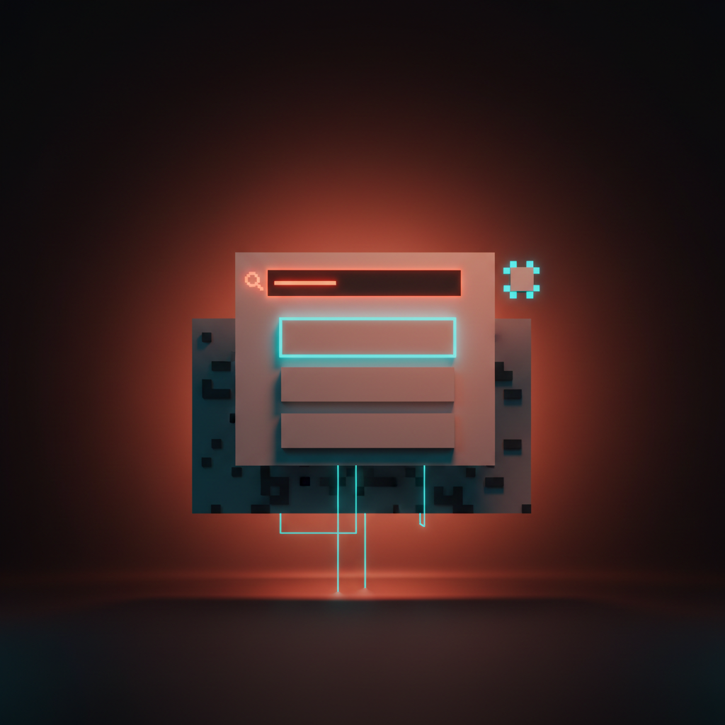
Navigation Design Patterns: 9 Menu Layouts for Web and Mobile
Nine navigation design patterns every designer should know, from the top bar to the command palette, with real examples and a clear call on when to use each.
Navigation Design Patterns: 9 Menu Layouts for Web and Mobile
Navigation is not a menu. It is a promise about where things live. When it works, users move through a product without thinking. When it fails, they leave.
Users do not read navigation. They scan it, trust it, and only notice it when it fails.
That is the real design problem. Navigation is not a feature to celebrate, it is infrastructure to make invisible. Choosing the wrong pattern for your information architecture or your user's context sets off a chain reaction: people cannot find sections, they cannot orient themselves, and they never build a mental model of how your product works.
Nine patterns cover almost every case. What follows is a direct breakdown of each one, what it is good at, where it breaks, and when to reach for it.
What navigation is actually for
Navigation answers one question for the user: where can I go from here? Answer it clearly and they move. Make them hunt and they leave.
The structural job of navigation is to represent your information architecture as a system users can trust. That means consistency, stability, and an honest reflection of what is actually in the product. Navigation that shifts between pages, shows different labels than the URLs, or buries primary paths under secondary ones is a design failure, regardless of how polished the dropdown animation is. Amazon keeps the same primary navigation on every page across hundreds of millions of products for exactly this reason.
The practical implication is that you pick a navigation pattern based on two inputs: how deep and wide your IA is, and what context people use the product in. Everything else, visual style, animation, color, follows from those two decisions.
The top navigation bar
The horizontal top bar is the default of the web for a reason. At desktop scale it fits roughly five to seven primary sections across the header, keeps them visible at all times, and mirrors how people read: left to right, top to bottom.
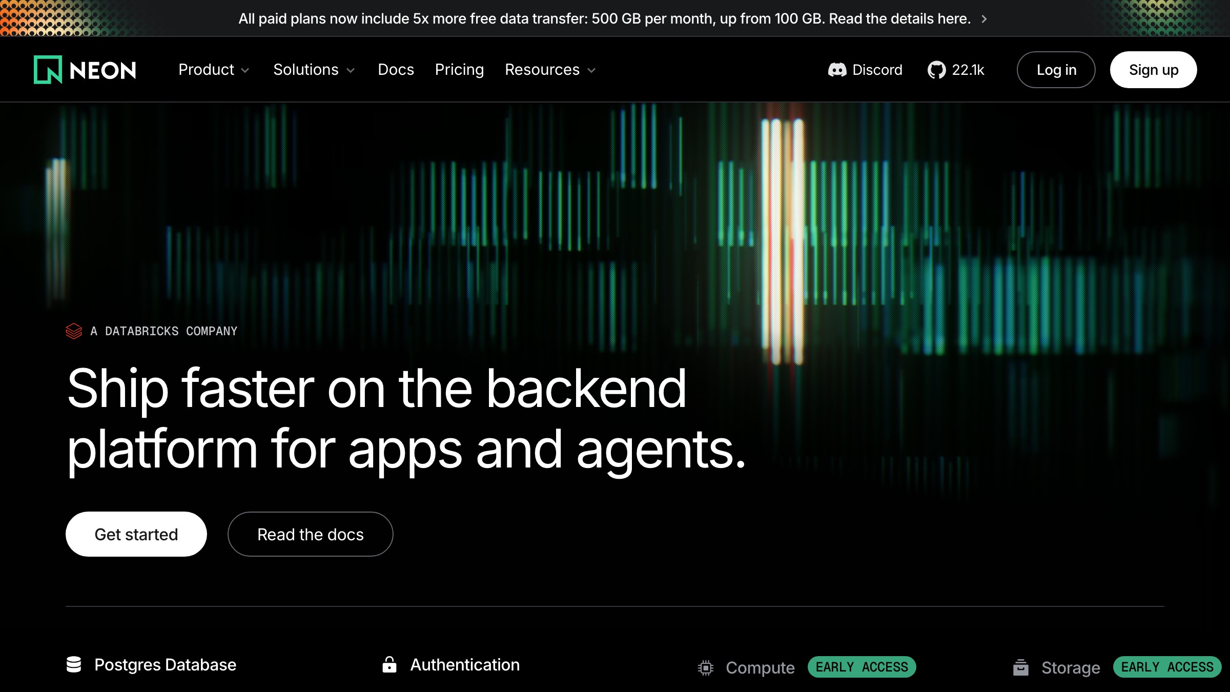
Neon (neon.tech) runs a clean version of this. Wordmark on the left, primary nav links centered, sign-in and a CTA button on the right. Nothing hidden, nothing nested, no cognitive overhead. At its best, a top bar tells the whole story of a site's structure in a single row without requiring any interaction.
The failure mode is cramming. A top bar with nine links, two dropdowns, a utility menu, and a search icon is not a navigation pattern, it is a panic attack. The pattern has a hard ceiling of around six or seven items before it needs restructuring.
Top bars also require a planned mobile fallback. On small screens the horizontal layout has nowhere to go. If you do not decide what the small-viewport experience is at design time, you will end up bolting on a hamburger menu as an afterthought, which introduces new problems.
The hamburger menu
The hamburger menu (three stacked lines, opens a drawer or overlay on tap) hides navigation behind one extra interaction. It saves screen real estate. It also makes every section of your product less discoverable.
The research on this is not ambiguous. NNGroup found that tabbed navigation on mobile consistently outperforms hamburger menus on discoverability and task completion rates. When you hide navigation, people use it less. Items behind the hamburger register as lower priority, because visually they are.
That does not make the hamburger wrong. It makes it a trade-off. For sites with deep, infrequently accessed sections, the trade-off is acceptable. For apps people open daily, it is usually a mistake.
Instagram tried putting primary navigation behind a hamburger and reversed course, moving core sections to a bottom tab bar instead. The lesson is clear: use a hamburger for secondary paths, settings, and infrequent destinations. Never use it for the actions that define why someone opened the product.
The persistent sidebar
A persistent sidebar pins a full navigation column to the left of the screen and stays visible while the user scrolls content. It is the dominant pattern for dashboards, design tools, and deep documentation, because the spatial permanence is the feature.
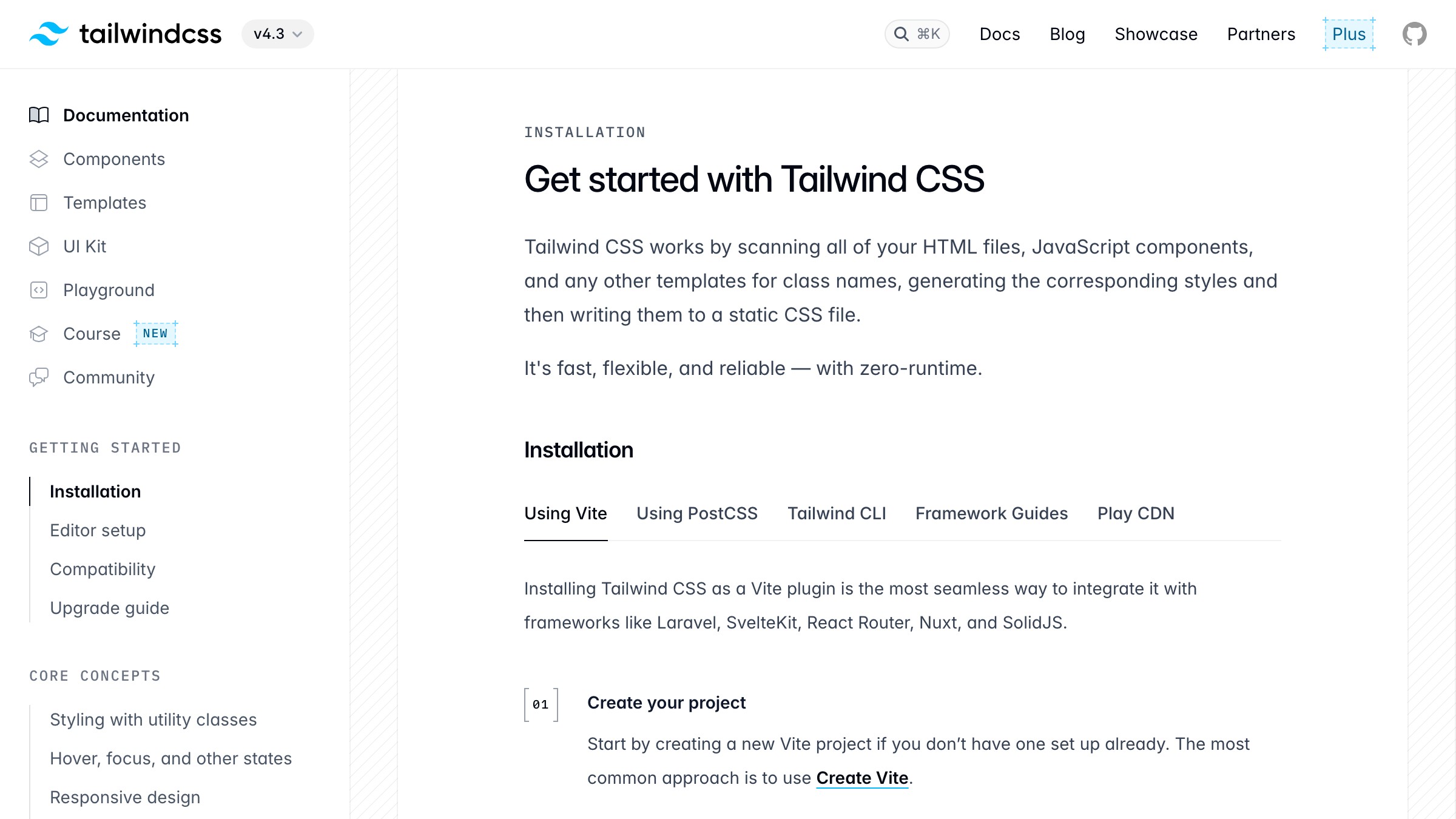
Tailwind CSS docs use it exactly right. The left sidebar holds every section of the documentation, grouped and scrollable, while the content occupies the remaining width. Users always know where they are, where they can go, and how the whole information space is organized. That spatial awareness is the entire point in deep reference material where people jump between sections constantly.
Slack, Notion, and Figma all use persistent sidebars at app scale for the same reason. The sidebar is the map. Removing it would mean users rebuild that mental model with every navigation action, which is cost they should not have to pay.
The cost is horizontal screen real estate. On a 13-inch laptop, a persistent sidebar uses 250 to 300 pixels of your content area. On mobile, there is no room for it at all.
Responsive sidebars collapse to a drawer or hamburger on small screens, reintroducing the same discoverability problems you were trying to avoid. Wire it to the tokens that keep a nav consistent from the start, or you will be patching it later.
The bottom tab bar
The bottom tab bar anchors three to five icons at the bottom of a mobile screen, directly inside the thumb zone. It is the standard for native mobile apps and, as of 2026, the default for any web product people open daily on their phones.

Instagram, Spotify, and YouTube all use this pattern for their primary mobile navigation. Those are not coincidences. The bottom bar exists because the top of a phone screen is the hardest area to reach with one thumb, and navigation is tapped constantly. Moving primary destinations to the bottom reduces physical effort in a way that compounds across thousands of daily sessions.
Five items is the hard ceiling. Beyond five, icons shrink and labels get cut. If your product has more than five primary sections, that is an information architecture problem disguised as a navigation problem. Restructure before you choose a pattern.
In 2026, the bottom tab bar is the default for any product people open at least daily on mobile. If you are designing a consumer mobile product or a mobile-first progressive web app and you are not using a bottom bar, you need a specific reason not to. "We designed for desktop first" is not that reason.
The mega menu
A mega menu expands a single top navigation item into a wide, multi-column panel of links, categories, and sometimes preview tiles. It is built for sites with large catalogs and complex hierarchies that do not fit into a simple dropdown without becoming unusable.
Amazon runs an extreme version of this under its "All" menu. Dozens of categories with subcategories, organized into columns and groups, all visible in one panel. The pattern works under catalog pressure because it surfaces depth without requiring multiple clicks down a hierarchy. Everything is scannable in one view.
The problem is that mega menus are a desktop-only pattern by design. A multi-column dropdown panel does not translate to mobile. Sites that use them need a completely separate navigation strategy for small screens, which doubles the design and maintenance surface area.
Mega menus also fail on shallow sites. Twelve pages do not justify a mega menu. The pattern implies a complexity you need to have earned through your actual content depth, not just optimism about future growth.
Breadcrumbs
Breadcrumbs show the path from the homepage to the current page: Home > CSS > Grid. They are not primary navigation. They are orientation navigation, and they serve a precise function.
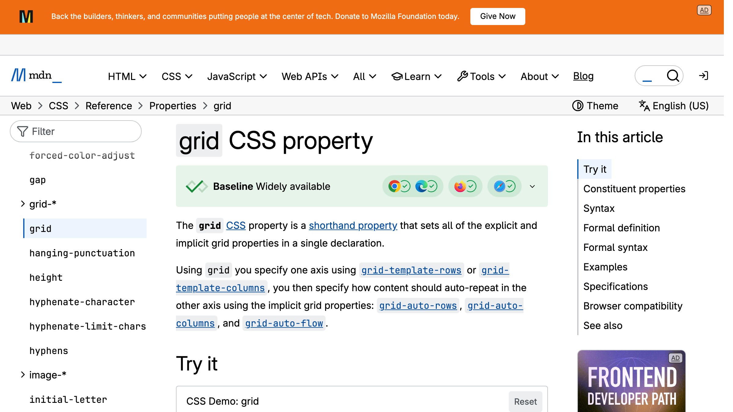
MDN uses breadcrumbs on every reference page. When you land on the CSS grid documentation from a Google search, the breadcrumb trail tells you instantly that this page lives inside CSS, which lives inside References. That context collapses a three-level hierarchy into a single line that requires no interaction to parse.
Breadcrumbs are useless on flat sites. If your entire product is two levels deep, breadcrumbs add visual clutter without providing any orientation value. They earn their place on documentation sites, e-commerce hierarchies like Home > Men > Jackets > Waterproof, and any site where users regularly land deep via search.
They pair with other patterns rather than replacing them. Breadcrumbs sit above the content, supplementing a top bar or sidebar. For more web and UI design breakdowns, the same logic applies: secondary navigation elements should support the primary pattern, not compete with it.
The command palette
The command palette is a keyboard-triggered overlay, typically summoned with Cmd+K or Ctrl+K, that accepts text input and returns ranked actions, navigation targets, and search results. Linear, Raycast, Slack, and Figma all ship it as a first-class navigation surface.
In 2026, the command palette has graduated from a power-user trick to a primary navigation mechanism in serious productivity software. Linear's Cmd+K gets you to any issue, project, or workspace action in under two seconds. Raycast is built almost entirely around this pattern. These products treat typed intent as a more direct path than any menu hierarchy, because for people with keyboard habits, it is.
The failure mode is invisibility. Users who do not know the shortcut exists will never discover it through exploration. Command palettes cannot replace visible navigation for first-time users or anyone who does not have keyboard-first habits. Products that hide all navigation behind Cmd+K leave every new user stranded.
The right use is augmentation, not replacement. Run a command palette alongside your sidebar or top bar. Let keyboard-native users skip the menu entirely.
Let everyone else navigate visually. Both paths need to exist.
Sticky and shrinking headers
A sticky header stays fixed to the top of the viewport as the user scrolls. A shrinking header does the same thing but reduces its height after the user passes a scroll threshold, reclaiming vertical space without sacrificing access to navigation.
Both patterns keep navigation accessible on long pages without requiring a scroll back to the top. On content-heavy pages, this is a real usability improvement. GitHub uses a sticky header across repository pages so that primary navigation, search, and repo context are always in view as you scroll through issues, code, and discussions.
The cost is vertical screen space. A sticky header of 60 to 70 pixels claims that height from every scroll position. On a 768-pixel-tall tablet, that is close to 10 percent of the viewport permanently occupied by navigation. Shrinking headers recover some of that by reducing to around 40 pixels after scroll, but they require careful implementation to feel intentional rather than broken.
Avoid sticky headers on short pages where the user reaches the bottom quickly. The pattern earns its keep on long, content-dense pages where returning to the top would require significant scroll.
The fat footer
The fat footer is a wide, multi-column footer that holds secondary navigation, link categories, legal pages, and contact information. It is not primary navigation. It is a second chance for users who scroll through the main content without finding what they needed.
Tailwind CSS, Stripe, and most SaaS marketing sites run fat footers with four to six columns covering product links, documentation, company pages, legal, and social links. They cost nothing in viewport height during the main content experience and provide a useful map for users who reach the bottom looking for something specific.
Fat footers matter more for SEO than for live navigation. Every link in a fat footer is a crawlable path. They are one of the main ways search engines discover secondary and tertiary pages on a site. From a pure usability perspective, most users never scroll to the footer, but the ones who do are on a deliberate search.
Skip the fat footer inside logged-in product experiences. Notion does not show you a marketing footer inside the editor. The pattern belongs to marketing sites and documentation hubs where anonymous and new users browse freely.
How to choose the right pattern
The right navigation pattern follows from two inputs: the depth of your information architecture and the context in which people use the product. Everything else is a consequence of those two factors.
| Product Type | IA Depth | Primary Platform | Recommended Pattern |
|---|---|---|---|
| Marketing site | Shallow | Desktop + mobile | Top bar + fat footer |
| SaaS marketing, large catalog | Medium to deep | Desktop + mobile | Top bar + mega menu (desktop), hamburger (mobile) |
| Documentation | Deep | Desktop | Persistent sidebar + breadcrumbs |
| Dashboard or design tool | Medium to deep | Desktop | Persistent sidebar |
| E-commerce | Deep | Desktop + mobile | Mega menu (desktop), bottom bar or hamburger (mobile) |
| Consumer mobile app | Medium | Mobile | Bottom tab bar |
| Productivity or developer tool | Deep | Desktop + keyboard | Persistent sidebar + command palette |
| Editorial or blog | Shallow | Desktop + mobile | Top bar + sticky header on long reads |
Combining patterns is normal and expected. Most serious products use two or three. Tailwind CSS documentation uses a top bar for site-level navigation, a persistent sidebar for docs navigation, and breadcrumbs for page-level orientation. Those three patterns address three distinct levels of the navigation hierarchy simultaneously without overlapping.
Brainy helps designers make sharper calls, faster, on the work that actually ships. See what we are building for creators.
Navigation mistakes that quietly kill usability
Hiding primary actions in a hamburger menu. If users need a feature daily, it cannot live behind an extra tap. Measure click-through rate on the hamburger itself. If it is under 30 percent, the paths inside are invisible to most of your users.
Inconsistent labeling across surfaces. "Insights" on the dashboard, "Reports" in the onboarding email, "Analytics" in the help docs, all pointing to the same destination. Navigation is a vocabulary. Every synonym is a question mark in a user's mental model.
No active state on the current location. Users need to know where they are. An active state on the current nav item is the most basic orientation signal available. Omitting it forces users to read the URL, which is a failure mode you designed into the product.
Navigation that shifts per page or section. If the sidebar rearranges based on which section the user is in, you have broken the spatial memory they built. Navigation should be a fixed map. Products where the map changes based on position do not build user confidence, they destroy it.
Overusing nesting. A three-level deep dropdown is almost always an information architecture problem surfaced incorrectly in the UI. Flatten the structure first. Nested menus are slow to scan, impossible to use on touch, and require precise mouse control to stay open on hover.
For layout patterns built to scan, the same principle applies: structure and orientation come before decoration. Navigation that fails to orient is decoration at best, friction at worst.
FAQ
What is the most commonly used navigation pattern on the web?
The horizontal top navigation bar is the most common pattern for desktop sites. For mobile apps and daily-use products, the bottom tab bar has become the standard. Most real products use both, a top bar on desktop and a bottom bar on mobile, over one consistent information architecture.
When should I use a hamburger menu?
Use a hamburger menu for secondary or infrequently used navigation on mobile, not for primary sections. If a user has to open the hamburger to do the core thing your product does, the architecture needs restructuring, not a better icon.
How many items should a navigation bar have?
Five to seven items is the accepted ceiling for a horizontal top bar, and five for a bottom tab bar on mobile. Beyond those counts the pattern starts to fail, items crowd together, labels get truncated, and scanning costs more than it returns.
Can I use multiple navigation patterns on one site?
Not only can you, you should. Most real products use two or three patterns that address different levels of the navigation hierarchy. Documentation sites commonly combine a top bar for site navigation, a persistent sidebar for section navigation, and breadcrumbs for page location.
Each pattern handles a distinct layer without overlapping. The mistake is using multiple patterns that compete rather than collaborate.
How does navigation affect SEO?
Links in your top bar, sidebar, and fat footer pass page authority and help search engines discover and index pages. Breadcrumbs add structured data that can surface path information directly in search results. Navigation is part of your SEO architecture and should be treated that way from day one, not patched on afterward.
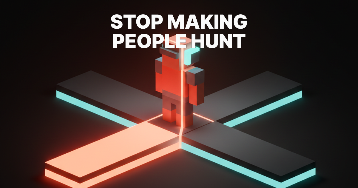
Stop making people hunt
Navigation is invisible when it works and infuriating when it does not. The goal is never a beautiful menu. The goal is users who arrive, orient, move, and return without a single moment of friction.
Nine patterns cover almost everything: the top bar for marketing sites and broad reference, the persistent sidebar for deep tools and documentation, the bottom tab bar for daily-use mobile, the mega menu for catalog depth, breadcrumbs for hierarchical orientation, the command palette for speed-first productivity tools, sticky headers for long-form content, the hamburger as a fallback for secondary paths, and the fat footer as a second-chance map for marketing sites.
Pick based on IA depth and usage context. Layer two or three patterns when your product has multiple levels of navigation hierarchy. Avoid the mistakes that quietly compound: hidden primary actions, inconsistent labels, missing active states, shifting nav structures, and excessive nesting.
Explore more web and UI design breakdowns on Brainy Papers, or build alongside the Brainy creator community and sharpen the craft alongside 2M+ designers who care about getting the fundamentals right.
Brainy helps designers make sharper calls, faster, on the work that actually ships. See what we are building for creators.
Get StartedNot ready to hire? Run the free Business Genome, an 11-dimension diagnostic for your venture.
Get your free GenomeGet new papers by email
New Brainy papers in your inbox. Confirm once, unsubscribe anytime.