The Death of the Sidebar in Modern SaaS App Design
Why the persistent left rail is dying, the five patterns replacing it, and how to design app shells in 2026 without falling back on a rectangle of links.
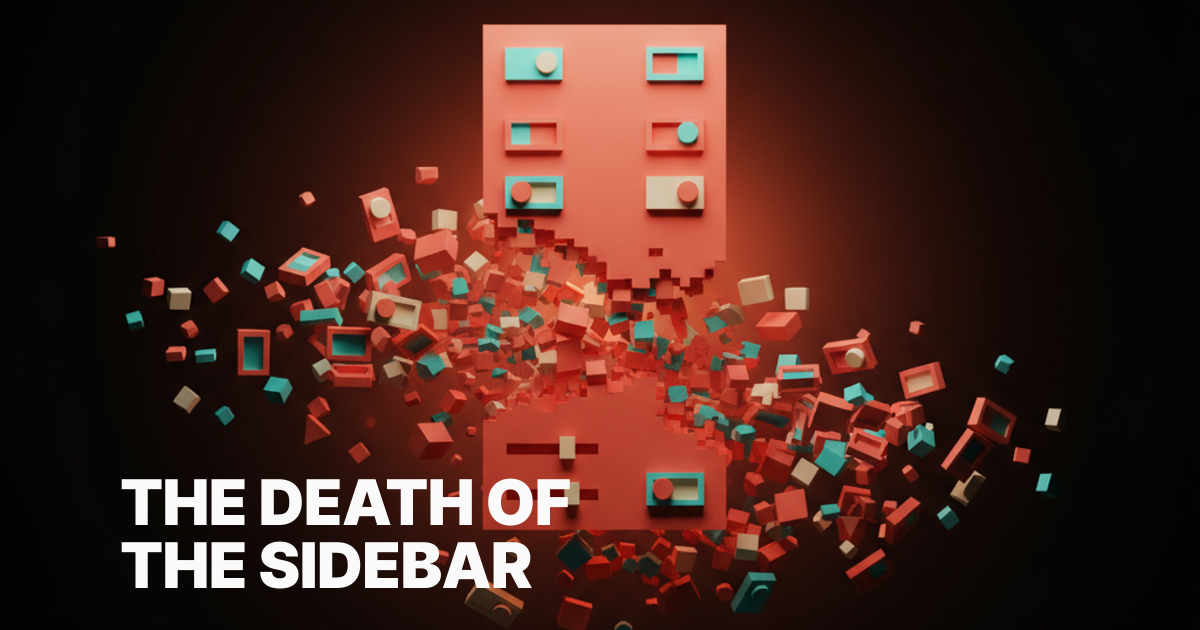
The sidebar is dying, and most product teams have not noticed yet. The persistent left rail of icons and labels, the thing every SaaS app has worn like a uniform since 2010, is being quietly retired by the apps people actually love using in 2026.
You can feel it the moment you switch from a tool that uses one to a tool that does not. Linear, Raycast, Arc, Granola, Cron, Cursor. They each made a different bet, but the bet rhymes. The shell got out of the way and let the work fill the screen.
This paper is about that shift. Why the sidebar earned its place for fifteen years, why it stopped earning its keep, the five patterns replacing it, the failure modes nobody warns you about, and the few cases where a sidebar still belongs.
Why the Sidebar Earned Its Place First
The sidebar made sense in a specific era. Apps were narrow, monitors were small, and most software was a CRUD database wearing a coat, with names like Salesforce, Basecamp, early Asana, classic Gmail, and every accounting tool ever built. You needed a fixed list of nouns down the left and a workspace on the right. The pattern shipped because it solved a real problem.
It also doubled as a status display. The sidebar was where teams wrote down what their product was, in product-manager order, with items like inbox, projects, reports, settings, and billing. The list told you what mattered, and the active state told you where you stood. That was useful when most users were learning the app for the first time every Monday morning.
For a long time, that tradeoff was fine. Discoverability was the hardest UX problem, and a visible menu on the left was a cheap, lazy answer that mostly worked. Designers cargo-culted the pattern into every dashboard, and we stopped questioning whether the rail still earned its rent.
Then a few things changed at once, and the math flipped.
What Killed the Old App Shell
Three forces broke the sidebar at the same time. Apps got wider, navigation collapsed into search, and AI made surfaces dynamic. Each one alone might have left the sidebar wounded but breathing. Together they ended its run as the default app shell.
Screens grew. The average designer monitor in 2026 is a 27-inch panel or a 14-inch laptop pushed to its native resolution, and the work people do inside SaaS got denser too. A 240-pixel rail eats serious real estate when your real product is a calendar, a canvas, a transcript, or a code editor. Every column you give to chrome is a column you take from the work.
Navigation also collapsed into one input. Once Spotlight, then Alfred, then Raycast and Linear's command bar trained a generation of power users to hit cmd-K for everything. If keyboard search is faster than reading a list, the list is dead weight. The command bar is not a feature anymore, it is the navigation system.
Then AI happened, and the question of what should be on screen stopped having a static answer. The right surface for the next ten seconds depends on what you just typed, what you are reading, what you selected. A fixed left rail cannot keep up with a panel that needs to be a chart now and a writer now and a diff now.
How Linear Quietly Set the New Default
Linear deserves more credit than it gets for making the command bar mainstream in B2B software. Before Linear, cmd-K palettes lived in IDEs and power-user tools. After Linear, every serious product manager started asking why their app needed a sidebar at all. The pattern jumped from developer hobbyware to default expectation in roughly two years, which is fast.
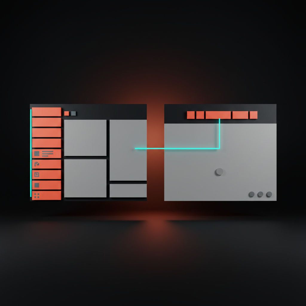
Linear still ships a sidebar, but it is a soft one, collapsible and low contrast and full of things you rarely click. The actual navigation happens in the cmd-K bar, where new issue, jump to project, change status, assign teammate, and reorder priority all live. Every action is one keystroke away, and the sidebar becomes a polite reminder rather than a traffic system.
That decoupling matters. It separated discoverability from primary navigation, and it gave designers permission to stop overloading the left rail with twelve things nobody clicks.
The sidebar got demoted from cockpit to glove compartment, which is exactly where it belongs in a product built for repeat use. The same pattern shows up everywhere now in Notion, Vercel, Height, Pitch, Superhuman, all of them leaning on a command bar as the spine and treating the sidebar as decoration. Once you start looking, you cannot unsee it. The cmd-K bar became the new default in less than half the time it took the sidebar to become one in the first place.
Pattern One: The Command Bar as Primary Navigation
The first pattern replacing the sidebar is the command bar as the primary way to move through an app. Raycast is the purest expression of this idea, Arc made it the spine of a browser, and Linear made it credible inside a normal product. Notion, Figma, and Vercel's dashboard all followed.
A real command bar is not a search box with autocomplete. It is a parser that knows your nouns, your verbs, and your recent context, and it surfaces actions, not pages. Type "in" and you get inbox, invoices, integration settings, the action to invite a teammate, and the issue you were last looking at. The keystrokes do the navigating, and the screen stays clean.
The craft skill nobody talks about is ranking. A sloppy command bar is worse than a sidebar because it punishes you with bad first results. A great one feels like the app is reading your mind, and it earns the right to remove the sidebar entirely.
Pattern Two: Contextual Panels
The second pattern is contextual panels. Instead of a fixed list of destinations on the left, the app shows you a panel on the right or in an overlay, scoped to the thing you are looking at. Linear's issue detail, Notion's page properties, Figma's right inspector, Vercel's deployment slide-over. The panel changes when the selection changes.
Contextual panels work because they put the controls next to the thing they control. A sidebar makes you walk back to a global menu to do a local action, which is a tax you pay on every interaction. A right-side contextual panel cuts the distance to zero and keeps the context visible.
The cost is discipline. Contextual panels collapse the moment the team stops being strict about what belongs in them. If everything global starts leaking into the right rail, you end up with two sidebars instead of zero, which is worse than where you started.
Pattern Three: Generative Surfaces
The third pattern is generative surfaces, and this is the one that genuinely could not exist five years ago. Cursor is the cleanest example, where the whole app is an editor and you summon whatever surface you need with a prompt, whether that is a diff, a search, a refactor preview, or a chat with the codebase. The shell does not predict what you will want, it generates it on demand.
Granola does the same thing for meetings. The transcript is the shell, and the AI generates summaries, action items, follow-up emails, and shareable notes inside that one canvas. There is no sidebar because there is no fixed taxonomy of outputs. The next surface is whatever you ask for.
This is the most disorienting pattern for veteran SaaS designers because it inverts the contract.
You no longer design a finite set of pages. You design a generator and a frame, and you trust the model and the user to compose the rest. The craft moves up a level, into rules and rails for what the AI can produce.
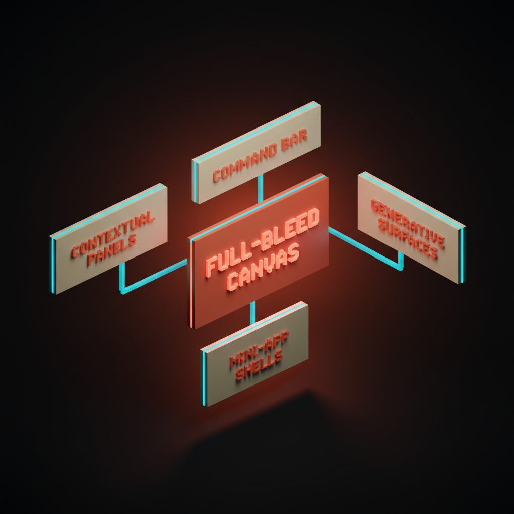
Pattern Four: Full-Bleed Canvas
The fourth pattern is the full-bleed canvas. Cron, now living as Notion Calendar, kills the sidebar entirely on smaller windows and lets the calendar grid run to the edges. Things 3 has been doing this in a quieter way for a decade with its chrome-light layout. Arc gave the browser a full-bleed treatment by hiding the URL bar and tabs into a tiny rail you summon with a keystroke.
The bet is that the work is the navigation. If the artifact in front of you is rich enough, you do not need a list of other artifacts to feel oriented. You need a great cmd-K to jump elsewhere when you want, and a great gesture to bring chrome back when you need it.
Full-bleed canvases also feel premium in a way that nothing with a 240-pixel rail does. Density of information goes up, ambient noise goes down, and the user starts treating the app like a tool instead of a portal. That is a hard feeling to fake, and a sidebar makes it almost impossible to achieve.
Pattern Five: Mini-App Shells
The fifth pattern is the mini-app shell, where the product is composed of small, self-contained surfaces that pop in and out instead of one monolithic page tree. Raycast extensions are the textbook case. Each command is its own tiny app with its own UI, and the shell is just a frame and an input.
Vercel's dashboard has moved in this direction too, with project pages that feel less like sections of one giant app and more like small tools that share an account. Slack's Canvas, Notion's databases, even modern banking apps are leaning into the same idea. You launch a small surface, do the job, and the surface goes away.
Mini-app shells fit how people actually work in 2026, which is in short, focused bursts across many tools, often handed off to or from an AI. A sidebar implies a settled architecture. A mini-app shell admits that the architecture is liquid and lets the user assemble it by intent.
When Sidebars Still Earn Their Keep
Honest moment. Sidebars are not dead in every context. There are three places they still belong, and pretending otherwise is design ideology.
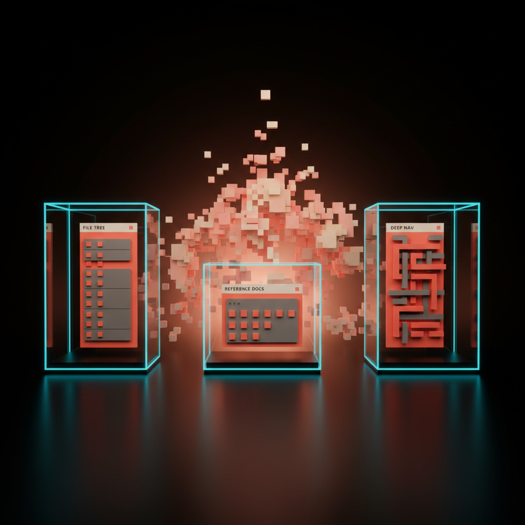
The first is file trees in code editors and design tools. VS Code, Figma's layers panel, Photoshop, Premiere. When the artifact is a hierarchical structure that you need to scan, expand, and drag from, a tree on the left is the right tool. The cmd-K bar complements it, but it does not replace it.
The second is reference content with deep, stable taxonomy. Documentation sites, learning platforms, internal wikis. When users browse rather than search, when the structure is the product, a left-side outline still wins. Stripe Docs, MDN, Linear's own docs site, all keep their rails for good reason.
The third is admin panels with twenty-plus distinct destinations that power users move between all day. CRMs, CMSs, support consoles. There the sidebar is a workbench, not a marketing menu, and removing it would slow the people who live inside the app.
Picking the Right Replacement
Here is a quick comparison of the five replacing patterns side by side, since the differences matter when you are choosing which one to lean on.
| Pattern | Best For | Risk | Real Examples |
|---|---|---|---|
| Command bar | Power users, action-heavy apps | Bad ranking kills trust | Linear, Raycast, Arc, Vercel |
| Contextual panels | Object-centric work | Becomes a second sidebar | Linear, Notion, Figma |
| Generative surfaces | AI-native workflows | Hard to discover, easy to overpromise | Cursor, Granola |
| Full-bleed canvas | Single-artifact tools | Discoverability without cmd-K | Cron, Things 3, Arc |
| Mini-app shells | Multi-tool ecosystems | Inconsistent UX between mini-apps | Raycast, Vercel, Slack Canvas |
The patterns are not mutually exclusive. Linear runs three of them at once. Cursor runs four. The best modern apps stack two or three patterns and let the sidebar shrink to a whisper or vanish entirely.
The Failure Modes Nobody Warns You About
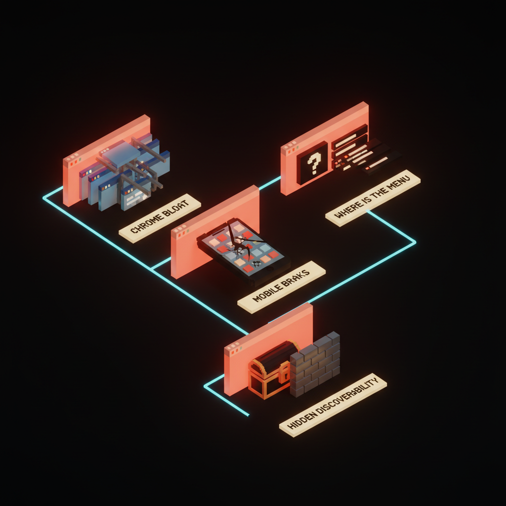
Sidebar replacements have their own ways of failing, and they are uglier than the problem they solved. There are four traps to watch for.
-
Chrome bloat in disguise. Teams remove the sidebar and then rebuild it as a cluttered top bar, a permanent right panel, and three floating action buttons. Net chrome goes up, not down.
-
Where-is-the-menu anxiety. New users land on a clean canvas, see no obvious nav, and bounce. The cmd-K bar is invisible to anyone who has not been trained to expect it.
-
Mobile breaks. Command bars and contextual panels assume keyboard and pointer. On a phone, the same patterns become sluggish overlays unless you redesign them from scratch for touch.
-
Hidden discoverability. Generative surfaces and mini-app shells can hide entire features behind prompts and shortcuts. Power users love it. Trial users churn.
You can solve every one of these, but only if you treat them as first-class problems on day one, not as polish at the end of the project.
How to Design App Shells in 2026
If you are starting a new product or redrawing an old one, design the shell in a different order than you used to. Start with the artifact, not the menu.
-
Pick the primary artifact. The thing the user looks at most. A document, a calendar, a board, a transcript, a canvas, a code file.
-
Give it the whole screen first, then claw back chrome only where it pays for itself.
-
Add a command bar before you add a sidebar. Make cmd-K a habit on day one of design, not a phase-two feature.
-
Decide whether your right panel is contextual or global, and never both. Mixing them is what creates two-sidebar products.
-
Decide your generative surface contract. What can the AI summon, what can it never summon, and how do those surfaces enter and leave the screen.
-
Design mobile in parallel, not after. If the desktop shell only works with a hover and a keyboard, your phone version will be a tragedy.
-
Add a sidebar last, and only if a real user need survives the first six steps.
That order matters. Most teams design the sidebar first because it is the easiest thing to draw, and the rest of the shell becomes a justification for it. Reversing the order is most of the work.
The New Craft Skills This Demands
This shift quietly raises the bar on what a product designer needs to be good at. The old skills still matter, but a new set sits on top of them.
You need to be good at ranking and search relevance, because a command bar is only as good as its top three results. You need to write microcopy for an empty canvas without panicking the user. You need to design for AI surfaces where the content is not yours. You need to know your way around keyboard interaction patterns deeply, not just as an accessibility checkbox.
You also need to be ruthless about chrome. Every pixel of persistent UI has to defend itself in court. The product designer of 2026 is part editor, part typographer, part stage manager, part keyboard-shortcut whisperer. The sidebar designer of 2015 was mostly just a list maker, and that is why the role has changed.
The good news is the apps that get this right feel obviously better. Users do not articulate why, but they reach for them first. The sidebar is not dying because designers got bored. It is dying because the audience grew up.
There is a hiring signal hiding inside this shift too. The teams shipping the cleanest shells in 2026 are the ones that stopped treating the sidebar designer and the search designer as separate jobs. They merged them. One person, or one tight pair, owns the entire navigation experience.
That single owner is why the result feels coherent, and why the apps that win this transition are the ones that treat the shell as one unified design problem instead of a federation of features. When ten different PMs each get to add a thing to the sidebar, you get a junk drawer. When one designer owns the cmd-K, the contextual panel, the canvas, and the gestures together, you get a tool.
Where This Leaves Your Product
The other quiet skill is taste in restraint. The hardest thing about killing the sidebar is leaving the space empty and trusting the user to find what they need, because empty space reads as confidence to a returning user and as confusion to a new one. The only way to thread that needle is a strong empty state, a visible cmd-K hint, and a first-run flow that teaches the muscle memory before the user even realizes they are learning. Most teams flinch and put the sidebar back at this step, while the teams that do not flinch end up shipping the products everyone else later copies.
If your product still leads with a sidebar in 2026, you have a choice. You can keep it because it genuinely earns its keep, which is a fine answer if you mean it. Or you can admit you kept it because nobody on the team had the energy to redesign the shell, which is the more common reason and the more dangerous one.
Either way, the next twelve months are when this gets settled. The pattern leaders are pulling away. The teams who treat the app shell as a first-class design problem will ship products that feel a generation ahead. The teams who treat it as legacy will look like they froze in 2018, with the same eight icons down the left and a workspace squeezed into what is left.
Pick the side you want to be on, and design like you mean it.
The sidebar had a great fifteen years. It earned its place, and then the world changed around it. Treat it the way you would treat any aging pattern in your product, by honoring what it did, studying why it worked, and replacing it with something that fits the way people actually use software now. The rectangle of links is not coming back, and the apps refusing to admit that are quietly losing a generation of users to the ones that already moved on.
If your product still wears a sidebar like a uniform, we can help you redesign the shell at /hire.
Get StartedNot ready to hire? Run the free Business Genome, an 11-dimension diagnostic for your venture.
Get your free GenomeGet new papers by email
New Brainy papers in your inbox. Confirm once, unsubscribe anytime.