Icon System Design: Building Iconography That Scales Past 50 Symbols
A working designer's guide to icon systems. Grid, weight, optical correction, naming, governance, and the rules that keep an icon library from rotting after the third designer touches it.
Most product icon libraries rot. The first designer ships a clean set of forty symbols. The second designer needs three more and freehand-traces them at the wrong stroke weight. The third designer downloads from a free pack to ship a feature on a Friday. By the second year of the product, the icon column on every screen reads as four different brands stitched into one navigation.
This paper is the working version. Grid, weight, optical correction, naming, governance, and the small set of rules that keep an icon system coherent past 50 symbols. No icon-of-the-week showcases, no templates pretending to be systems, just the decisions that make a real library survive a real team.
What an icon system actually is
An icon system is a coherent set of pictographs governed by shared rules. Grid size, stroke weight, corner radius, optical alignment, naming, and the process for adding new icons. The goal is not a folder of SVGs. The goal is a system any designer or engineer can extend without breaking the visual rhythm of the product.
A pile of icons is not a system. A figma file with 200 symbols and no rules is not a system. A system has constraints, named decisions, and a written process for what happens when someone needs an icon that does not exist yet.
The design systems guide covers the broader system that icons live inside. This paper goes deep on the iconography layer specifically.
Why icons matter more than they look
Icons are the densest piece of UI in any product. A single 24x24 pixel icon carries more meaning per square inch than any other element on the screen. Get the system right and the product reads as one thing. Get it wrong and every screen feels off in a way users cannot articulate.
Icons also scale weirdly. A typeface drift between two screens is easy to spot. An icon drift is harder to name but louder in feel. The brain processes pictographs faster than text, which means it processes icon inconsistency faster than copy inconsistency.
The product that ships icons as a coherent system reads as polished even when the rest of the work is rough. The product that ships icons as a free-for-all reads as cheap even when the rest of the work is sharp.
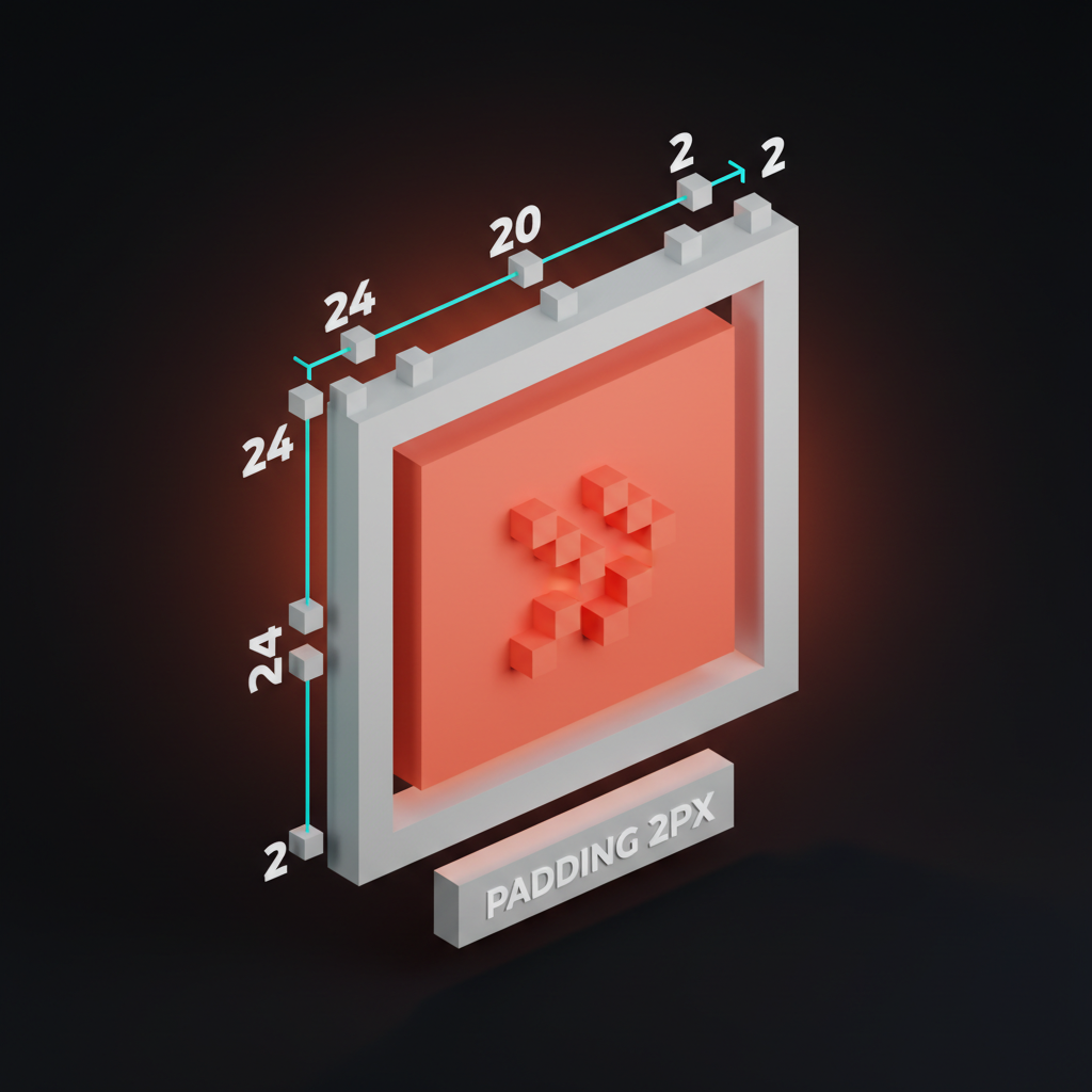
The grid is the system
Every coherent icon library starts with a grid. The grid is the invisible scaffold that every icon snaps to. Without it, icons drift in size, weight, and optical balance, and there is no way to enforce coherence at code review.
The base grid
Pick one base grid size and live inside it. The two defaults that work in 2026:
- 24 pixel grid for product UI icons. Standard size for most modern interfaces.
- 20 pixel grid for dense data interfaces, dashboards, and admin tooling.
A grid is not just the canvas size. It is also the live area inside the canvas where the icon actually sits. A 24-pixel grid has a 20-pixel live area, with 2 pixels of padding on each side. The padding gives the icon room to breathe and prevents it from looking cramped against neighboring elements.
Keylines inside the grid
The live area has internal keylines that govern shape. A 20-pixel live area gets four keyline shapes:
| Shape | Size | Use |
|---|---|---|
| Square | 18x18 px | Most rectangular icons (folder, document) |
| Circle | 20x20 px | Round icons (sun, info, avatar) |
| Tall rectangle | 16x20 px | Vertical icons (battery, phone) |
| Wide rectangle | 20x16 px | Horizontal icons (search, message) |
Each keyline produces a visually balanced icon at the same size. A circle drawn at 18 pixels looks smaller than a square at 18 pixels because the human eye reads circles as smaller. The keylines compensate for this perceptual quirk.
Stroke weight as a token
Pick one stroke weight and stick to it. Most product icon systems use 1.5 pixel or 2 pixel strokes at the 24 pixel grid. Choose based on the brand voice.
A 1.5 pixel stroke reads as light, technical, and modern. A 2 pixel stroke reads as confident, friendly, and accessible. A 3 pixel stroke reads as bold, kid-friendly, or print-style. Pick one. Document it as a token. Reject any icon contribution that uses a different weight.
The design tokens glossary covers how stroke weight slots into the broader token architecture.
Optical correction is the difference
Mathematical alignment is not visual alignment. Icons that snap perfectly to the grid often look wrong because the human eye does not measure pixels, it measures perceived weight and balance.
Why optical correction exists
A circle at 20x20 pixels and a square at 20x20 pixels do not read as the same size. The square has more visual mass because it fills its bounding box completely. The circle has empty space in the corners that the eye registers as a smaller object.
The fix is to draw the circle slightly larger than the bounding box, sometimes by 1 to 2 pixels. The math says wrong, the eye says right. Always trust the eye.
Common optical fixes
Five corrections cover most icon work:
- Circles render larger than squares. Bump circle keylines up by 1 to 2 pixels.
- Triangles render smaller than squares. Bump triangle keylines up by 2 to 3 pixels.
- Diagonal lines look thinner than horizontal lines. Add 0.25 to 0.5 pixels of weight to diagonals.
- Centers of asymmetric icons drift. Optically center play buttons, arrows, and chevrons by eye, never by bounding box.
- Sharp corners read as smaller. Round inside corners slightly to match the perceived weight of outside corners.
These fixes are not opinion. Test any icon with both math-perfect and optically corrected versions side by side at small sizes. The optically corrected version always wins. Always.
Style decisions that compound
Once the grid and weights are set, every other style decision needs to be made once and applied everywhere. Inconsistency in any of these reads as the library having been touched by too many hands.
Corner radius
Pick one outer corner radius and one inner corner radius. The two work in pairs.
A 1 pixel outer radius and 0.5 pixel inner radius reads as crisp and modern. A 2 pixel outer radius and 1 pixel inner radius reads as friendly and rounded. A square-edged set with no radius reads as architectural and serious.
The wrong move is mixing radii within the same library. Even one icon with sharper corners than the rest reads as borrowed from another set.
End caps and joins
Strokes have ends. End caps can be square, round, or projecting. Joins between strokes can be miter (sharp), round, or bevel (cut). Pick one of each and apply across the system.
Round end caps and round joins produce a friendly, approachable icon set. Square end caps and miter joins produce a precise, technical set. Mixed end caps in the same library produce a set that looks half-finished.
Filled vs outlined
Most modern icon systems ship two variants of every icon: an outlined version for inactive states and a filled version for active states. The outlined version uses the stroke. The filled version uses the same shape with the interior filled.
The two variants must be visually balanced. A filled version at the same size often reads as heavier and more dominant than the outline. The fix is to slightly reduce the filled version's footprint by 1 to 2 pixels so the visual weight matches the outline at the same scale.
The focus state glossary covers how the outlined-to-filled swap fits into broader interaction state design.
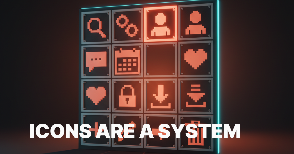
Naming icons is half the system
A library with 200 well-drawn icons that nobody can find is a library nobody uses. Naming is the discoverability layer, and bad naming kills adoption faster than bad drawing.
Naming patterns that scale
Use object-first naming, not metaphor-first. The icon of a magnifying glass is search or magnifier, never find or look. The object is stable. The metaphor changes by context.
Use kebab-case for multi-word icons: arrow-left, chevron-down, cloud-upload. Consistency in case lets engineers grep the library, autocomplete it in IDEs, and ship without typos.
Use directional suffixes only when needed. arrow is not enough. arrow-left, arrow-right, arrow-up, arrow-down is the minimum set. Same for chevrons, carets, and any other directional pictograph.
Variant naming
When an icon has multiple variants (outlined, filled, two-tone), append the variant as a suffix:
search(default outline)search-filledsearch-duotone
This pattern lets the engineer pull search-filled into a button without having to dig through a separate folder. Predictable naming is faster than perfect organization.
Synonym maps
The biggest naming failure is the icon a designer cannot find because they searched the wrong word. Build a synonym map alongside the library. cart also matches bag, shopping. home also matches house, dashboard. delete also matches trash, remove, bin.
Most modern icon search tools (Iconify, Lucide, Phosphor) build synonym maps into their search UI. Build the same into the internal library or accept that designers will keep adding duplicate icons because they could not find the existing one.
Governance keeps the system alive
The technical decisions above are reproducible by any competent designer. The governance decisions are what separate a system that lives from a system that dies in year two.
The single source of truth
Pick one place where icons live. Either a Figma library, a code repo with SVGs, or a hosted service like Iconify. Pick one. The library lives there. Every designer pulls from there. Every engineer pulls from there.
A system with two sources of truth has zero sources of truth. The Figma library and the code library will drift by week three, and from then on every screen ships icons that do not match the system.
The contribution process
Document the process for adding a new icon. The process must include:
- Search first. Confirm the icon does not already exist under a different name.
- Justify the addition. Write one sentence on what the icon represents and where it will be used.
- Draw to spec. Match the grid, stroke weight, corner radius, end caps, and joins of the existing library.
- Optical review. A second designer checks the icon at 16, 20, and 24 pixel sizes for visual balance.
- Name and ship. Name follows the naming pattern. Ship to both Figma and code in the same PR.
A system without a contribution process is a system that gets bypassed. The first time a designer needs an icon urgently, they will download from a free pack and ship it without asking. From then on the library has a fork.
The deprecation process
Icons get deprecated. A redesign retires an old style, a feature gets cut, a brand refresh changes the visual language. Document how icons leave the library, not just how they enter.
Mark deprecated icons in the library with a visible label. Keep them available for 90 days so existing screens have time to migrate. Then remove them. A library that never removes icons becomes a museum, and museums get ignored.
How icons ship to code
The handoff between design and code is where most icon systems break. The Figma library is pristine, the code library is a graveyard of inconsistent SVGs, and engineers stop trusting either.
SVG is the format
Ship icons as SVG. Not PNG, not icon fonts. SVG is vector, scales to any size without loss, supports current color inheritance for easy theming, and ships small enough to inline in components.
Each SVG has a viewBox matching the grid (24x24 or 20x20), uses currentColor for stroke and fill, and excludes redundant transforms or styles. A clean SVG is under 1 KB. Most icon libraries ship icons that are 3 to 5 KB because they were exported with default settings, which embeds metadata, transforms, and inline styles that nobody needs.
Optimization is non-negotiable
Run every SVG through SVGO before it lands in the code repo. SVGO strips metadata, simplifies paths, removes redundant attributes, and cuts the file size by 60 to 80% on average.
For a library of 200 icons, the difference between unoptimized and optimized is usually 400 KB on every page load. That is a Lighthouse hit, a core web vitals regression, and a slower mobile experience for no reason.
Component wrappers
Wrap each SVG in a typed component (React, Vue, Svelte). The component takes size, color, and accessibility props. The engineer never imports a raw SVG. They import an <Icon name="search" size={20} /> and the system handles the rest.
This pattern means the icon library can change its underlying export format (SVG, sprite, icon font) without touching consumer code. The component is the API, the SVG is the implementation.
The design handoff glossary covers the broader handoff discipline. Icons are one of the few cases where designers and engineers genuinely share ownership.
Common icon system failures
Every icon audit catches the same failures. If the system ships with any of these, the library is one redesign away from a full rewrite.
Three stroke weights in one library. Almost always means the library was assembled from multiple free packs. The fix is a forced redraw of the entire set at one weight.
Filled and outlined variants at different scales. The filled version reads larger than the outline because nobody compensated for the perceived weight. The fix is to shrink the filled version by 1 to 2 pixels until the two read as the same size.
Inconsistent corner radius. Half the icons have rounded corners, half have square. Almost always because two different designers contributed without a written rule. The fix is to define one radius and refactor.
Naming by metaphor. Icons named find, look, discover instead of the object they depict. Designers cannot find them. The fix is to rename to object-first conventions.
No deprecation process. The library has 350 icons, 80 of which are unused or replaced. The bloat slows search and confuses new designers. The fix is a quarterly audit and a 90-day deprecation cycle.
Icon systems in 2026 conditions
Three shifts changed how icon systems get built. The system has to survive them.
Variable icon fonts are real. New formats let one icon file carry multiple weights, fills, and optical sizes that interpolate smoothly. The technical advantage is enormous, the design risk is that teams ship every variant on every screen because they can. Pick the variants that ship. Cut the rest.
AI tools generate icons in seconds. Midjourney, DALL-E, and ChatGPT can produce a passable icon in one prompt. The risk is that designers stop drawing icons and start prompting them, which kills system coherence because every prompt produces a slightly different style. Use AI for first drafts. Refactor every output to match the system.
Lucide, Phosphor, and Heroicons set the baseline. These open libraries ship 1500+ icons at consistent grid, weight, and naming. For most products, starting from one of these and customizing is faster and better than building from scratch. Custom icons get drawn only for product-specific concepts the open libraries do not cover.
The wcag glossary covers the accessibility baselines that govern icon contrast and labeling. Icons in interactive elements need accessible names, not just visual labels.
FAQ
What size grid should an icon system use?
24 pixel grid for general product UI, 20 pixel grid for dense data interfaces. The grid has a 2 pixel padding on each side, leaving a 20 or 16 pixel live area where the icon actually sits. Pick one and live inside it for the entire library.
How thick should icon strokes be?
1.5 to 2 pixels at a 24 pixel grid. 1.5 pixels reads as light and technical, 2 pixels reads as confident and friendly. Pick one weight, document it as a token, and reject any contribution that uses a different weight.
What is optical correction in icon design?
The practice of adjusting icons so they look balanced even when the math says they are aligned. Circles render larger than squares, triangles render smaller, diagonals look thinner than horizontals. Optical correction compensates for these perceptual quirks. Always trust the eye over the bounding box.
Should icons be filled or outlined?
Most modern systems ship both. Outlined for inactive states, filled for active states. The two variants must be visually balanced, which usually means the filled version is 1 to 2 pixels smaller than the outline so the perceived weight matches.
How should icons be named in a design system?
Object-first, kebab-case, with directional suffixes when needed. Search, not find. Arrow-left, not back. Use synonym maps so designers can search by alternate words. Append variant suffixes (filled, duotone) so engineers can grab the right variant in one import.
When should you build custom icons versus using an open library?
Use an open library (Lucide, Phosphor, Heroicons) as the base. Custom-draw only the product-specific concepts those libraries do not cover. Building a 300 icon set from scratch in 2026 is almost always wasted effort. Customize the open base, document the additions, ship.
The system pays for itself
A coherent icon library is the cheapest way to make a product feel polished. A drifting icon library is the fastest way to make a product feel cheap. The cost of building the system is one to two weeks of disciplined work. The cost of not building it is a permanent visual tax on every screen the product ships, forever.
Pick a grid. Pick a weight. Pick a corner radius. Pick a naming pattern. Write the contribution and deprecation process. Optimize the SVGs. Wrap them in a typed component. Then enforce all of it at code review.
The icon column on every screen is one of the highest-density signals of product quality. Get it right once and it carries the rest of the design.
If you want a team that builds icon systems as part of the broader design system handoff, hire Brainy. Grid, governance, and code in one project, never bolted on at the end.
Related reading
- Design Systems Guide
- Visual Hierarchy Design
- Design Handoff Figma to Dev
- Web Accessibility Checklist
Want an icon library that holds up across 200 screens and four designers? Brainy ships icon systems built into the design system, with grid, governance, and code in one handoff.
Get StartedNot ready to hire? Run the free Business Genome, an 11-dimension diagnostic for your venture.
Get your free GenomeGet new papers by email
New Brainy papers in your inbox. Confirm once, unsubscribe anytime.