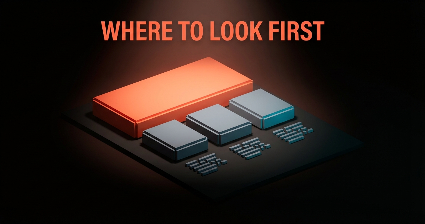
Negative Space: The Designer's Cheat Code
Negative space is not leftover. It is the most underused tool in design. Active vs passive, micro vs macro, the audit, the anti-patterns, and why every great brand uses it ruthlessly.
Negative space in design is not the part of the canvas left over after the elements are placed. It is the design. It carries the hierarchy, the rhythm, the focus, and the trust. Strip it away and the best typography in the world reads like a ransom note.
Most teams treat empty space like a bug. Executives see it and ask "can we put something there?" The answer is almost always no. The space is doing work, the work just looks like nothing because that is the entire point.
This piece is the manifesto for restraint. The reason every great brand uses negative space ruthlessly, and the reason most products do not.
Negative space is not leftover, it is the work
The mark of an amateur designer is filling every pixel. The mark of a senior one is removing them. Negative space is not absence. It is presence with a different job description.
Look at the Apple homepage on any given Tuesday. A single product, a headline, a subhead, and roughly half the screen doing nothing. That nothing is brand equity.
The void around the product tells the user this is the only thing that matters right now, and the company is confident enough to commit. A cluttered page communicates panic. A spacious page communicates control.
Robert Bringhurst put it cleanly in The Elements of Typographic Style. Typography exists to honor content, and the space around the content is part of the typography. Carve the space first, then drop the elements into the gaps you made on purpose. That is the entire move.
Active versus passive negative space
Two kinds of empty are working in any composition. Most designers can name one and ship the other by accident.

Passive negative space is the breathing room. The margins, the gutters, the line spacing, the padding around the button. It exists to keep elements from suffocating each other. Every design has it. Most designs do not have enough of it.
Active negative space is shape with no ink. The carved gap that becomes a face. The void inside the IBM stripes that reads as a grid.
The white between the letters in a wordmark that turns into a second meaning. The Guild of Food Writers logo where the negative space becomes a fork inside the spoon. Active negative space is design choosing to draw with absence instead of presence.
The shorthand: passive is the air, active is the architecture. A great composition uses both. A weak one uses neither and just stacks elements until the canvas is full.
Micro and macro whitespace work at different scales
Negative space operates at two distinct zoom levels, and confusing them is why most "spacious" designs still feel cramped.
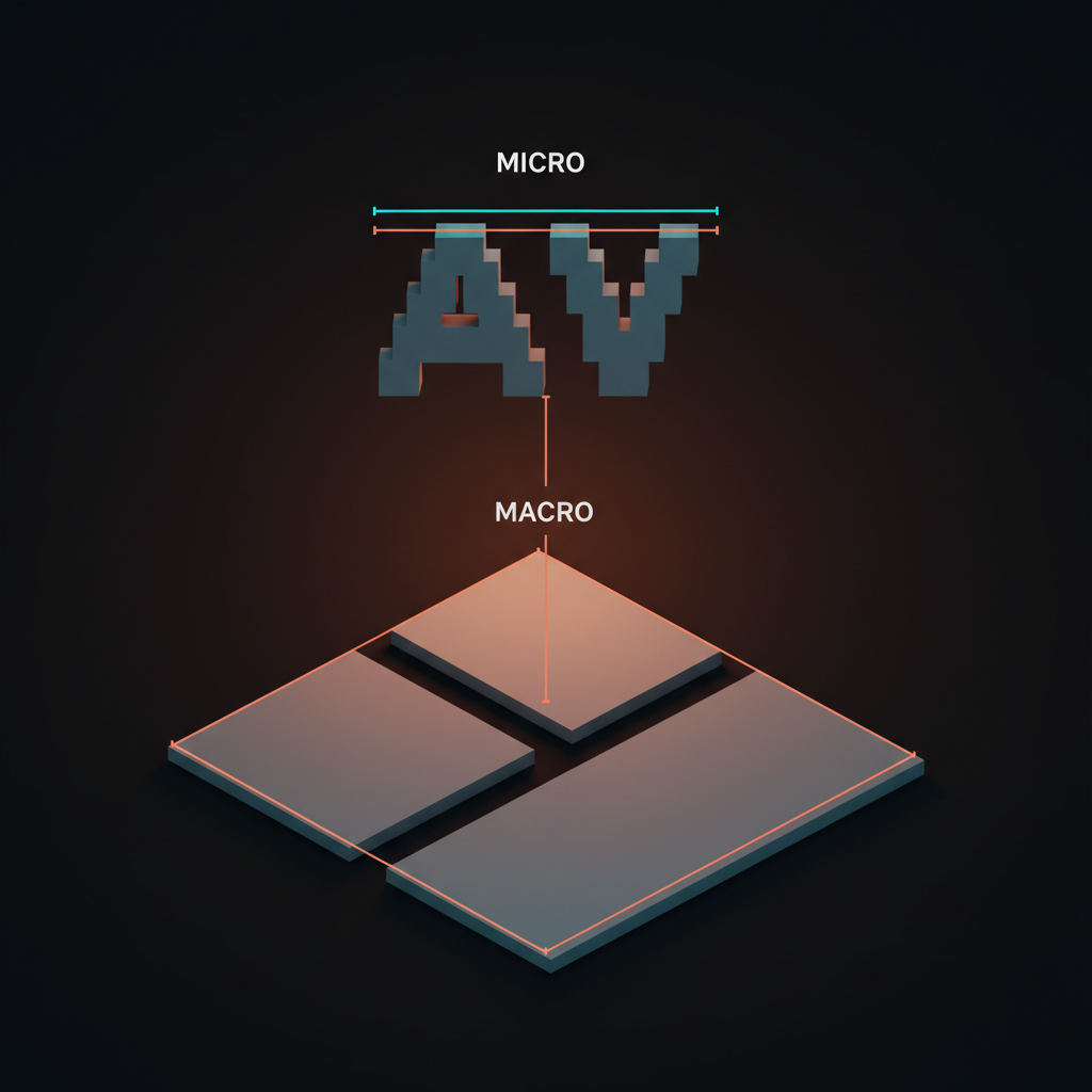
Micro whitespace is the space between letters, between lines, between a label and its input, between an icon and its text. Tracking, leading, padding inside a card, gap between a button and the next button. It is the space the eye crosses without thinking. When micro space is wrong, the page feels off and the user cannot tell why.
Macro whitespace is the space between sections, the size of margins on a marketing page, the gutter between columns, the air around a hero image. It is the space the eye uses to chunk the page into regions. When macro space is wrong, the page feels exhausting before the reader even starts reading.
Apple wins at both. The micro work is in the letterforms of San Francisco and the leading of every product page. The macro work is in the half-screen of nothing above the fold.
Stripe wins at both, with surgical micro padding inside dashboard cards and luxurious macro space between marketing-page sections. Most teams nail one and ignore the other. The result reads as polished but tight, or spacious but sloppy.
The eye reads space before it reads ink
Perception research is consistent across a hundred years of work. The eye groups elements by proximity, separates them by distance, and assigns importance by isolation. The space is the signal. The element is just what shows up after the signal lands.
That is why a button with sixty pixels of margin around it commands the page and the same button with eight pixels of margin disappears into the noise. Same button, different space, different product. If you only remember one thing about visual hierarchy, remember that the eye reads the space first and the content second.
Negative space in logos is a confidence move
Logos that breathe scale forever. Logos that do not, die at favicon size.
The Apple logo is roughly 60 percent negative space inside the bounding box. Nike's swoosh is mostly air. The Anthropic wordmark sits inside extreme padding everywhere it appears.
Vercel's triangle is so much negative space it feels architectural. None of those marks are optimizing for "filling the box." They are optimizing for being recognizable when shrunk to 16 pixels and surrounded by other brands.
Helmut Schmid spent his entire career on this. Swiss typographic discipline is not a style, it is a treatment of negative space as a primary material. The reason Schmid layouts still look modern in 2026 is that they were never designed for fashion. They were designed around the air.
The brand book version of this is the safe zone. Every well-built brand system specifies a minimum amount of clear space around the logo. That number is not decoration. It is the contract that says the mark is allowed to exist as itself, not crammed against a headline or a sponsor lockup. When teams violate the safe zone in production, the brand starts dying one banner at a time.
Layout is a negative space problem in disguise
A layout is not a collection of elements. It is a system of gaps.
Massimo Vignelli's 1972 NYC subway map is the textbook case. Vignelli stripped the geography, killed the parks, killed the streets, and used negative space to encode the relationships between stations. The map is famous for what it removed. A user trying to navigate the system did not need a city, they needed a diagram, and the diagram works because the white between the lines does the entire structural job.
The marketing-page version is Stripe. The Stripe homepage is mostly air, with content islands floating in deliberate macro space. Each section is given a full screen of breathing room before the next one begins.
The hierarchy is established by space alone. No section dividers, no decorative rules, no visual clutter. Just rhythm. The marketing site stack 2026 breakdown covers the broader pattern, but Stripe is the canonical example.
The product version is Linear. Linear's app is a master class in macro and micro space inside a dense interface. Cards have the right padding. Lists have the right row height.
The sidebar has the right gutter. None of it feels empty. All of it feels intentional. Compare it to a legacy enterprise tool with three columns of buttons, eight tabs, and a banner alert, and you can feel the difference before you read a single label.
Typography is 90 percent the space between the letters
Type is set in space, not on it.
Letter-spacing decides whether a wordmark feels luxury or budget. Leading decides whether a paragraph feels readable or exhausting. Paragraph spacing decides whether an article feels scannable or like a wall. Margin decides whether the page feels designed or thrown together.
Bringhurst's rule of thumb still holds. Body copy wants leading roughly 120 to 145 percent of the type size. Headlines want tighter leading.
Display type wants negative letter-spacing at large sizes. Caps want positive letter-spacing because the letters do not naturally have descender room. None of that is opinion. It is the math of where ink stops and space starts.
The shortcut for product designers: if a screen feels off and you cannot tell why, the answer is almost always leading or padding. Increase the leading by 4 percent. Increase the padding by 8 pixels. The screen suddenly looks designed instead of assembled. The fix lives in the glossary entry on whitespace too.
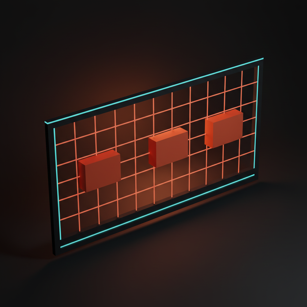
Six ways negative space ships meaning
Negative space is not one tool. It is six. A great design uses several at once. A weak one uses none and props the layout up with borders, dividers, and alert banners.

-
Hierarchy. Bigger gap above an H1 than above an H2. The space tells the eye which level matters more before the type weight does.
-
Focus. Isolate the primary element with extreme margin. Apple's hero pattern. The void points at the product.
-
Rhythm. Even spacing between repeated elements. The cadence of Linear's card layouts is what makes the dense view feel calm.
-
Grouping. Smaller gap inside a group, larger gap between groups. The Gestalt law of proximity, applied. The user knows what belongs together without a single border.
-
Breathing. Generous padding around input fields, buttons, and copy. The user does not feel rushed. The interface does not feel claustrophobic.
-
Trust. Confident emptiness signals confidence in the message. Crammed pages signal panic, spacious pages signal control. The brand reads it before the headline does.
Brand systems live or die on whitespace discipline
A brand system is not a logo, a palette, and a typeface. It is the negotiated agreement about how much space surrounds the logo, how much padding sits inside the buttons, how much margin frames the marketing pages, and how much gutter separates content blocks. Break the agreement and the brand stops looking like itself.
Notion, Linear, Anthropic, Vercel, Loops, Figma. Every brand on that list ships the same restraint across every surface. The marketing site, the app, the docs, the email templates, the social posts. The negative space is the through-line. Compare any two screens from any two of those companies and the proportion of air to ink is shockingly consistent.
The opposite pattern is the brand whose marketing page is spacious and whose dashboard looks like a 2014 admin console. The brand told the user one thing on the way in and a different thing on the way through. The mismatch shows up in churn before it shows up in any survey.
The piece on why every SaaS looks the same in 2026 covers the surface symptom. The deeper cause is whitespace inconsistency. Same templates, different breathing rooms, different brands.
You do not need a 200-page guideline doc to enforce this. You need three numbers and a decision. Section padding. Card padding.
Margin around the logo. Get those three right across surfaces and the brand will hold even if the rest of the system does not need to be a full design system.
Density: before and after
Same content, two density profiles. The cluttered one is what clients ask for. The restrained one is what users come back to.
| Surface | Cluttered version | Restrained version |
|---|---|---|
| Marketing hero | Headline, subhead, two CTAs, a logo strip, a video embed, a banner promo, three social proof badges | Headline, subhead, one CTA, half a screen of nothing |
| Pricing page | Five tiers, eleven features each, three FAQ accordions above the fold, a chat widget, a sticky promo bar | Three tiers, six features each, ample margin, one CTA per tier |
| Dashboard home | Eight metric cards, two charts, a feed, an inbox, a banner upgrade prompt | Three primary metrics, one chart, a single secondary panel, the rest is air |
| Pricing card | Ten checkmarks, a comparison toggle, a discount badge, fine print, a featured ribbon | Five checkmarks, one CTA, generous padding, one badge if it earns the space |
| Settings page | Twelve toggles in two columns, no grouping, no spacing | Grouped sections, ample inter-section margin, one column, one decision per region |
The cluttered version always tests "informative" in client meetings. The restrained version always tests better in user behavior. The piece on the pricing page problem covers the trap on pricing pages specifically, and the settings page problem covers the same trap on settings.
Anti-patterns that kill negative space
Six failure modes ship constantly. Each one is fixable. Each one is currently in production somewhere.
Cramming the hero. The marketing-page hero with a headline, a subhead, two CTAs, three trust badges, a product screenshot, and a sticky banner. Every additional element steals from the hero section the one job it has, which is announcing the product cleanly. Cut everything except the headline, the subhead, and the primary CTA. Let the void carry the rest.
Border-driven grouping. Drawing a box around every section instead of letting space do the grouping. Borders are a fallback for designers who do not trust their spacing. Trust the space.
Equal margins everywhere. Every gap the same size means no gap is meaningful. Hierarchy requires unequal spacing. Bigger gaps for more important boundaries, smaller gaps for tighter relationships.
Filling the empty quadrant. The designer ships a page with deliberate negative space. A client asks "what about that empty area?" The designer adds an element. The page dies.
The fix is upstream, before the question gets asked, defending the void in the design review.
Padding that does not match the type scale. Buttons with 8 pixels of vertical padding next to body type set at 18 pixels of leading. The proportions clash. The button feels stuck on. Padding inside an element should relate to the type scale inside the element, not to a fixed pixel value the team copied from a tutorial.
Loud backgrounds eating the space. A gradient, a pattern, or a busy image behind a section that needed to breathe. The negative space technically exists but the eye cannot find it because there is too much going on in the canvas. Restraint includes the background. The piece on the loading state is the product is the perceived-performance version of the same idea, where ambient noise eats the signal.
The negative space audit

Eight questions. Run any screen you ship through them before the next release.
Eight questions to ship a clean screen
-
Is the negative space deliberate, or did it happen by accident? If you cannot defend why a gap is the size it is, you are decorating. Pros decide every measurement.
-
Are the gaps between groups bigger than the gaps inside groups? If not, the eye cannot tell what belongs together. Fix grouping with space, not with borders.
-
Does the macro space match the brand? A premium brand needs more macro space than the team is comfortable with. Double what you have, then trim it back if needed.
-
Is the micro space consistent? Every card with the same padding, every input with the same margin, every list row with the same row height. Variation is noise, consistency is design.
-
Does the logo have its safe zone in every surface? Marketing site, app, email, social. The safe zone is not optional, it is the contract.
-
Does the hero section commit to one message? One headline, one subhead, one CTA, and the rest is air. Anything else is the team failing to choose. Compare to onboarding without onboarding, where the same restraint pays off in product surfaces.
-
Does the contrast ratio work because of color, or because of space? Both should be doing the job. If the contrast is doing all the work because the elements are crammed together, the layout is leaning on a crutch.
-
Would a stranger know what matters most on this screen in three seconds? If yes, the space is doing its job. If no, the negative space is failing and elements are competing for attention.
A screen that passes all eight feels effortless even on a complex product. A screen that fails three or more reads as cluttered no matter how good the typography is.
Restraint is the move
Negative space is the most underused tool in design because it is the hardest one to defend. A new component is visible. A removed component is invisible. The work that does not show up on the page is exactly the work that makes the page work. Clients cannot point at it in a review.
Apple defends it. Linear defends it. Stripe defends it. Vercel defends it.
Anthropic defends it. Every brand that ships restraint as a core value has a senior designer in the room willing to look a client in the eye and say "no, the empty area stays." That is the entire job. The void is the brand.
Treat negative space as elemental, not stylistic. It does not go out of fashion because it never came into fashion. The Vignelli subway map looks correct in 1972, in 2026, and in 2046. The Apple homepage from 2008 reads as the same brand as the one from 2026. Restraint is not a trend, it is a law of physics that designers can either work with or fight, and fighting always loses.
FAQ
What is the difference between negative space and whitespace?
Whitespace and negative space refer to the same idea, the area in a composition not occupied by an element. Whitespace is the more common term in product and digital design. Negative space is the more common term in classical graphic design and logo work. Both can be active or passive, micro or macro, and both do the same structural work.
How much negative space is too much?
There is no fixed ratio. The right amount is the smallest amount that makes the hierarchy unambiguous, the focus obvious, and the rhythm consistent. If a stranger can scan the screen in three seconds and identify what matters most, the space is doing its job. If they cannot, add more space, not more elements.
Is minimalism the same as good use of negative space?
No. Minimalism is a style. Good use of negative space is a principle that operates inside any style.
A maximalist brand can use negative space well by giving the maximalism room to breathe. A minimalist brand can use negative space badly by leaving gaps that have no structural job. The principle is independent of the aesthetic.
How do I defend negative space to a client who wants to fill it?
Reframe the empty area as a working element. Tell the client the void is doing the job of focusing attention on the primary message and that adding an element to it will measurably reduce conversion on the primary CTA. If they push back, ship an A/B test. The restrained version almost always wins.
Can negative space hurt accessibility?
Only if it is used to hide structure. Generous spacing improves readability, scannability, and tap-target accessibility. The accessibility risk is the opposite, cramming controls so tightly that touch targets overlap or text contrast suffers because the layout has no breathing room. Negative space is an accessibility ally, not a tradeoff.
CTA
Want product and brand work where negative space does the heavy lifting instead of your client cramming six callouts into the hero? Hire Brainy. We design systems that respect the void. Restraint, hierarchy, and rhythm are core deliverables, not nice-to-haves we cut when the timeline gets tight.
Want product and brand work where negative space does the heavy lifting instead of your stakeholder cramming six callouts into the hero? Brainy designs systems that respect the void.
Get StartedNot ready to hire? Run the free Business Genome, an 11-dimension diagnostic for your venture.
Get your free GenomeGet new papers by email
New Brainy papers in your inbox. Confirm once, unsubscribe anytime.