Grid Systems: A Designer's Guide
From Müller-Brockmann to CSS Grid, the working designer's guide to grid systems. Five grid types, the 12-column system, baseline rhythm, plus real implementations from Linear, Vercel, Stripe, Apple, NYT, and Figma.
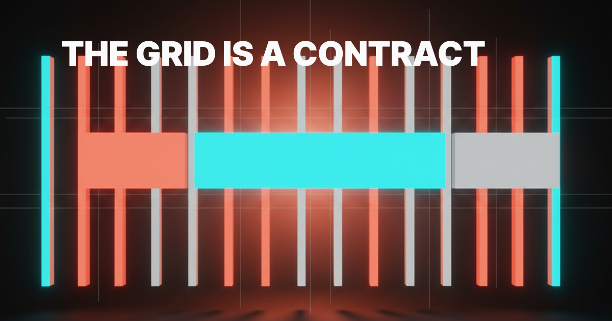
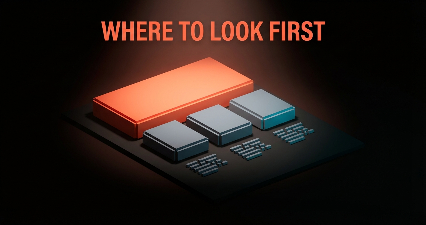
Grid systems are the part of design that does the most work and gets the least credit. Every product you respect has one, every product you scroll past does not. The grid is not decoration. It is the contract that holds typography, hierarchy, and rhythm together so the user can read the page in a single glance instead of decoding it.
The Swiss school proved this in print sixty years ago. Müller-Brockmann, Hofmann, Ruder, an entire generation of designers who treated the grid as a thinking tool, not a layout shortcut. The lesson aged better than almost any other piece of design theory. Every modern product grid, from Linear to Stripe to the New York Times, descends from the same idea. This is the working reference for the grid in 2026.
Müller-Brockmann gave the modern grid its grammar
Josef Müller-Brockmann's 1981 book "Grid Systems in Graphic Design" is still the spine of the discipline. Before that book, grids existed but the vocabulary did not. After it, designers had a shared language for columns, gutters, margins, and modules that traveled across studios, schools, and decades.
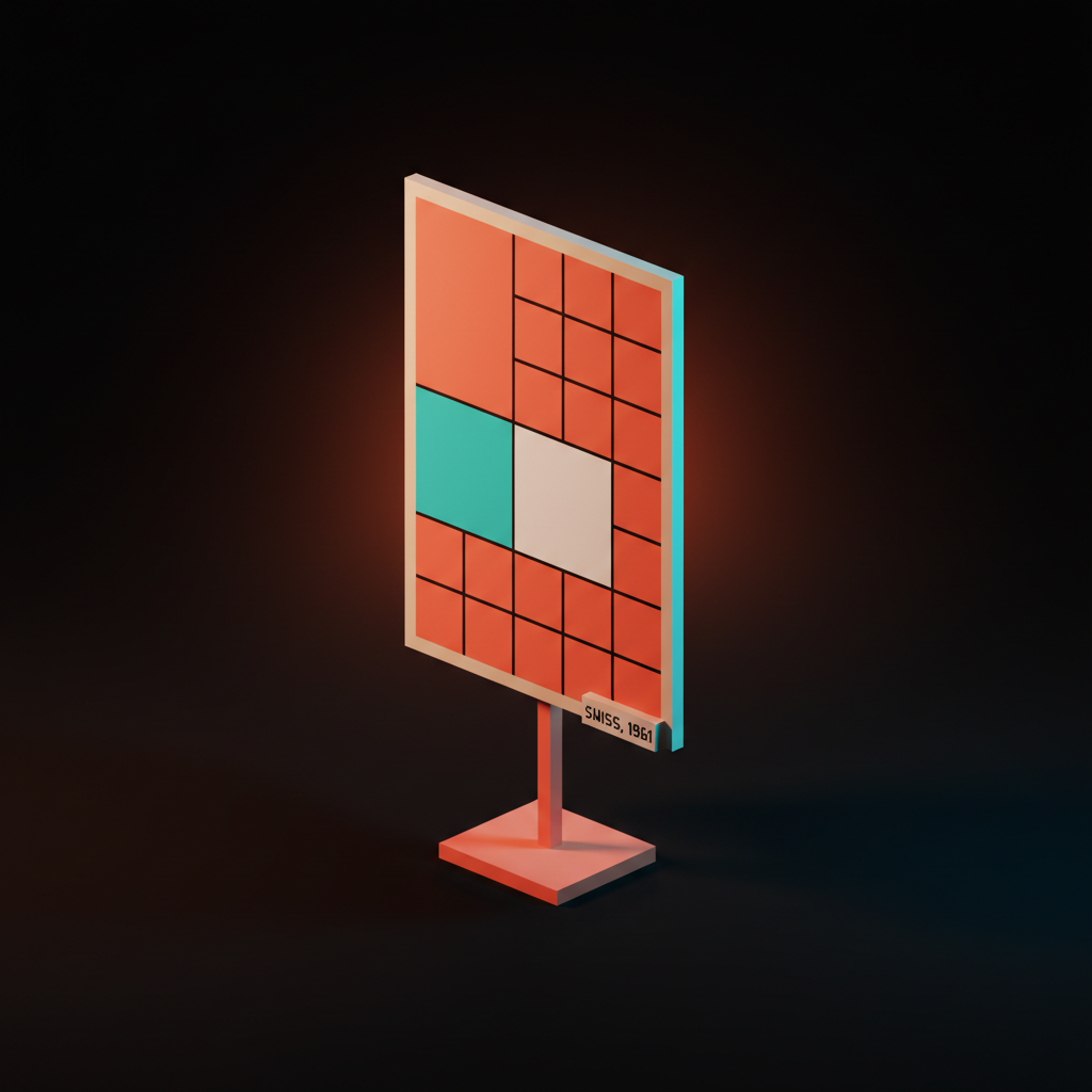
The Swiss school treated the grid as a constraint engine. Pick a system, hold it, and let the variation come from content, not from improvisation. Müller-Brockmann's posters for the Zurich Tonhalle look like product UI screenshots in 2026 because they are running the same logic.
Strong type on a fixed grid. Whitespace as a structural element, not leftover space. The same logic shows up today in pieces like why every SaaS looks the same in 2026, where the homogeneity is the grid winning, then losing its bite.
The web inherited this grammar slowly. CSS gave us floats, then Flexbox, then finally CSS Grid. Each step closed the gap between what print designers could do in 1961 and what front-end designers could do in a browser.
The vocabulary did not change. Columns are still columns. The tools just caught up.
Why grids work, in one paragraph
A grid works because it removes a thousand small decisions from the designer and gives them back to the user as predictability. The eye learns the rhythm in the first second of a page and uses that rhythm to navigate everything after.
Without a grid, every layout decision is novel. Where does the heading sit, where does the image stop, how wide is the body, how does the sidebar relate to the main column. With a grid, those answers are pre-decided.
The designer spends their attention on hierarchy and content instead of remeasuring every block. The user spends their attention on the message instead of decoding the structure. That is the entire deal.
The five grid types, in one place
Most teams treat "grid" as one decision. It is five. Each one solves a different layout problem and fails for a different reason. Pick wrong and the page fights you forever.

| Grid type | Best for | Failure mode | Canonical example |
|---|---|---|---|
| Column | Marketing pages, app shells, content sites | Treating it as the only grid you need | Stripe homepage |
| Modular | Dashboards, editorial layouts, dense product UI | Cells that vary in size with no logic | Bloomberg Terminal, NYT homepage |
| Baseline | Long-form reading, type-heavy product UI | Forgetting line-height math | Medium, Apple Newsroom |
| Hierarchical | Editorial covers, hero sections, magazine layouts | Hiding behind it instead of designing | Apple product pages, NYT features |
| Manuscript | Long essays, documentation, single-column reading | Ignoring it on mobile and shipping a wall | Notion docs, Stripe Press |
This table is the bookmark. Most disagreements about layout end the moment the team agrees on which of these five they are running.
The column grid is the workhorse
Column grids are the default for almost everything you ship on the web. Vertical columns, fixed gutters, optional margins. Content flows into the columns, layout blocks span one or more of them, and the rhythm is set by how many columns the canvas is divided into.
Stripe runs a 12-column grid across the entire marketing surface. Linear's app shell is built on a column grid that snaps to a single rail on mobile and expands to a sidebar plus main column on desktop. Vercel's marketing pages use a 12-column grid with deliberate negative space, the columns are visible if you squint at the dashboard pricing matrix or the deploy log layout. The same grid that ran posters in 1961 runs marketing sites in 2026, just with media queries underneath.
Skip the column grid only when the layout is fundamentally non-rectangular, which on the web is almost never. The breakdown of marketing site stack 2026 covers the framework choices that sit on top of this grid.
The modular grid is for editorial density
A modular grid divides the canvas into cells in both directions, columns and rows. It looks like a piece of graph paper, and it behaves like one. Layout blocks snap to cell boundaries, and density becomes a design lever instead of an accident.
The New York Times homepage is the canonical modular grid on the web. Headlines, photos, summaries, and ads all sit in cells that share consistent widths and heights, even though the visible composition looks varied. Bloomberg Terminal pushes the modular grid to its extreme, with information density that would collapse without strict cell discipline. Notion's gallery view ships a softer modular grid, with cards that snap to a fixed cell width while content adapts inside.
Use a modular grid when the page has many small, comparable units that need to read as a system. Skip it when the content is one or two large blocks, where a column grid does the same work with less ceremony. A modular grid running two cards looks like a column grid wearing a costume.
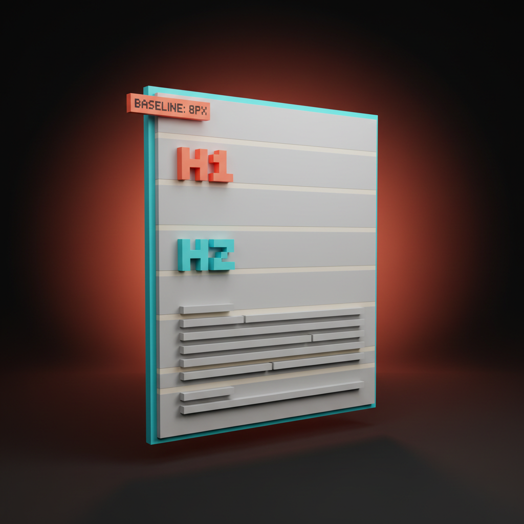
The baseline grid is the rhythm engine
A baseline grid is a horizontal grid that controls vertical rhythm. Every line of text sits on a baseline rule, every heading lands on a multiple of that rule, and the page reads with a quiet musical cadence the user feels but never names.
Apple's marketing pages run a strict baseline grid. Pull up any product page and look at how the headline, the subhead, the image, and the body copy all share a common vertical rhythm. Medium ships baseline alignment on its long-form template, which is why the reading feels effortless even on a 4000-word essay. Stripe Press, the publishing arm, runs baseline rhythm on every page they print and every page they publish to the web.
The web math is simple. Pick a base unit, usually 8 pixels. Set body line-height to a multiple, usually 24 pixels which is 1.5 of 16 pixel body type.
Headings land on multiples too, so an H1 at 48 pixels with 56 pixel line-height still snaps to the same rhythm. The whole page hums on a single beat.
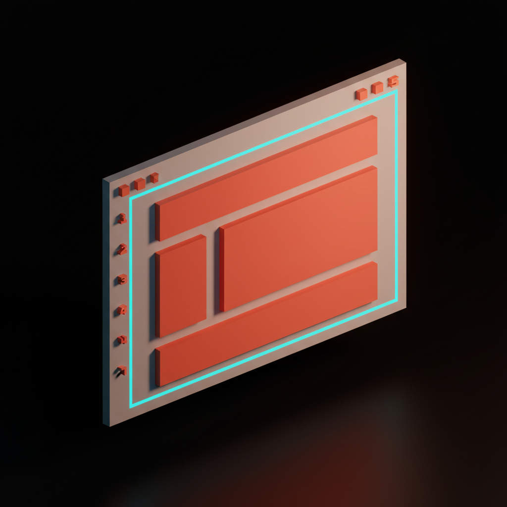
The hierarchical grid is for reading order
A hierarchical grid is a custom grid built around the content's intrinsic priority. Instead of starting from columns and rows, you start from what should read first, second, third. The layout snaps to those decisions, not to a generic template.
Apple's product launch pages are hierarchical grids in the wild. The hero element gets disproportionate space, secondary content sits in tight clusters, and tertiary content lives in a tighter column near the end. The New York Times' big features, the long-scroll multimedia pieces, are hierarchical grids designed scene by scene. Anthropic's homepage runs a hierarchical grid where one statement dominates and everything else is sized for support.
Hierarchical grids are the grid type that demands the most editorial judgment. They fail when designers use them as an excuse to skip the discipline of a column or modular grid. A hierarchical grid is not "no grid." It is a grid where the priorities set the geometry.
If your hierarchy is wrong, the grid is wrong. The deeper logic of priority sits in visual hierarchy design.
The manuscript grid is for long-form
A manuscript grid is one column. That is the whole grid. A single block of text running down the page with thoughtful margins, a deliberate measure, and nothing else competing for the eye.
Stripe Press books are manuscript grids on paper. Notion's doc pages are manuscript grids in the browser. Substack's reader view, the Apple Newsroom long-reads, the New York Times' Magazine pieces in single-column mode, all running the same grid. The book has known how to ship long-form reading for five centuries. The web caught up the moment we stopped trying to put a sidebar next to a 4000-word essay.
The constraint is the measure, the line length. Aim for 65 to 75 characters. Wider and the eye loses the line on the return. Narrower and the rhythm choppy.
The other constraint is the margin. Generous side margins are not wasted space, they are the frame that lets the reader's eye relax. The whitespace glossary entry covers why those margins do real work.
The 12-column system runs the modern web
The 12-column grid is the default because 12 is the most-divisible small number. It splits cleanly into 1, 2, 3, 4, 6, and 12. That covers almost every layout pattern a marketing site or product UI ever needs without resorting to fractions.
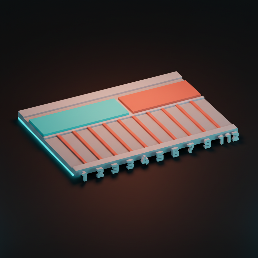
Bootstrap codified the 12-column grid for the web in 2011 and never had to apologize for the choice. Tailwind's grid utilities ship 12 columns by default. Material Design's responsive grid, Carbon Design's grid, Polaris from Shopify, all 12-column. The choice is not an accident, it is the math.
Here is the 12-column field guide most teams either use or reinvent badly:
- 12 full-width hero, banner, footer, edge-to-edge content
- 8 + 4 main content with sidebar, the canonical product app shell
- 6 + 6 two-up content blocks, marketing feature rows, comparison sections
- 4 + 4 + 4 three-up cards, pricing tiers, three-column feature grids
- 3 + 3 + 3 + 3 four-up logos, team grids, image galleries
- 9 + 3 content with thin meta column, common in editorial layouts
- 2 + 8 + 2 centered content with breathing room, used on marketing detail pages
Lock these patterns in early and the team stops debating layout in design reviews. The pattern picks the spans, the spans pick the math, the math ships the page. The argument that follows in you don't need a design system is partly that a tight grid does most of what a design system claims to do.
Baseline rhythm on screens, not just on paper
Baseline alignment is the part of grid theory most teams skip on the web because the browser does not enforce it. Skip it and the page feels jittery for reasons the user cannot name. Hold it and the page feels like a finished product.
The trick is to think in vertical units, not pixels. Pick an 8-pixel base. All padding, margin, line-height, and component height becomes a multiple of 8.
Body copy at 16 pixels with 24 pixel line-height snaps to the rhythm. H1 at 48 pixels with 56 pixel line-height snaps. Card padding at 24 pixels snaps. Section spacing at 96 pixels snaps. The whole page becomes a single instrument tuned to one note, and the eye can move through it without a single hitch.
Linear ships baseline rhythm in the issue list. Notion ships it in the doc reader. Figma's Slides product holds rhythm across both the slide thumbnails and the editor canvas. The teams who hold rhythm tend to be the teams who treat type as a system, not a stylesheet override.
Responsive grids without the panic
A responsive grid is the same grid running at different widths. It is not a different design at every breakpoint, it is the same composition collapsing intelligently as the viewport shrinks.
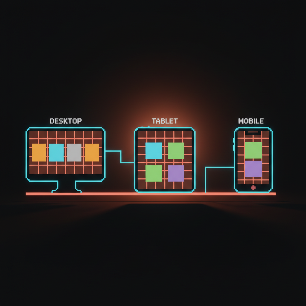
The standard approach is a 12-column grid on desktop, 8 columns on tablet, 4 columns on mobile. A 4 + 8 layout on desktop becomes a 4 + 4 on tablet and a single column on mobile. A 3 + 3 + 3 + 3 four-up layout becomes 4 + 4 (two rows of two) on tablet and 4 + 4 + 4 + 4 (four stacked) on mobile. The math is consistent because the column count drops by clean fractions.
Stripe's site is the textbook responsive grid in production. Linear's marketing pages reflow through three breakpoints without a single layout that feels squeezed. Vercel's pricing matrix reflows by collapsing the side-by-side comparison into a stacked accordion, which is the responsive trick most teams never figure out, that "responsive" sometimes means "change the component, not the columns." The pricing page problem covers that decision in detail.
The mistake is designing mobile and desktop as two unrelated layouts. The compositions diverge, the brand reads differently on phone and laptop, and the team ends up maintaining two products. Design the grid first, then design the breakpoints as collapses of that grid. The hero section glossary entry covers the part of the grid users see first across every breakpoint.
CSS Grid era: the print-grade tools finally arrived
CSS Grid is the first time the browser had a layout primitive that matches what print designers could do in 1961. Before CSS Grid, web designers had floats and Flexbox and a lot of patience. Now we have actual grid lines, named areas, gap control, and the ability to lay out a page the way Müller-Brockmann would have laid out a poster.
The shift matters because what was previously a build-time decision (which framework's grid am I using) is now a layout primitive built into the browser. display: grid plus grid-template-columns: repeat(12, 1fr) plus gap: 24px is a 12-column grid. No framework needed. No utility classes. Just CSS doing what CSS should have done a decade ago.
Tailwind's grid utilities are now thin sugar on top of CSS Grid. Bootstrap's grid is mostly a compatibility shim for a problem that does not exist anymore. The teams who get the most out of CSS Grid treat it like a design tool, not a fallback for Flexbox.
Linear's editor uses CSS Grid for the issue panel layout. Figma's web editor uses it for the canvas chrome. Vercel uses it across most of the marketing site. The tool is in the kit, the question is whether the design system is using it or running 2018 patterns on 2026 infrastructure.
Real product grids worth studying
The fastest way to internalize grid systems is to inspect the products that ship them well. Five worth a long look.
Linear runs a tight column grid in the app shell, a 12-column grid on the marketing site, and a baseline rhythm across both. The issue list, the project view, the docs panel, all snap to the same vertical and horizontal grid. It is the cleanest column-grid implementation in product UI right now.
Vercel runs a 12-column grid with intentional negative space. The marketing pages breathe, the dashboard runs a denser modular grid, and the deploy view, covered in the loading state is the product, runs a hierarchical grid where the build log dominates and everything else gives it room.
Stripe is the canonical 12-column grid on the marketing surface and a modular grid in the dashboard. The dashboard cards snap to consistent widths, the metric blocks share heights, and the whole product reads as one composition across thirty-plus screens. The anti-dashboard breakdown covers the philosophy that grid implements.
Apple ships hierarchical grids on product pages, baseline rhythm everywhere, and a modular grid in the App Store and the Newsroom. Apple's grid discipline is the closest thing on the web to Swiss-school print, and most product teams underestimate how much of the brand impression comes from the grid alone.
Editorial grids: NYT, Figma, and Anthropic
The New York Times runs a modular grid on the homepage, a hierarchical grid on big features, and a manuscript grid on long-reads. The same publication uses three grids deliberately, switching between them based on the editorial task. That is the lesson, that grid type is a design decision per surface, not a global setting.
Figma runs a column grid in the file browser, a modular grid in the team library, and a custom grid inside the canvas itself. Notion ships a manuscript grid for docs and a modular grid for databases. Loops and Resend, both newer products, ship clean 12-column marketing grids and tighter column grids in the app. Anthropic's site runs a hierarchical grid where a single statement dominates each section, modeled on editorial layouts more than product UI. The piece on onboarding without onboarding shows how grid discipline carries through to first-run flows that often get treated as one-off layouts.
When to break the grid (on purpose)
Breaking the grid only works when the grid is so visible that the break reads as a deliberate choice. Without a grid behind the break, the broken element is just a misaligned thing on a page.

The Apple product page that lets a hero image extend past the margin is breaking a grid that holds tight everywhere else. The NYT feature where a photograph blows out to full bleed mid-essay is breaking a grid that runs disciplined modules above and below. Anthropic's homepage occasionally lets a single quote sit off-axis at twice its expected size, and the move works because everything around it is buttoned up.
The rule is one break per surface. Two breaks read as no grid. The break should be the most-remembered moment on the page. If you cannot point to the grid that the element is breaking, you are not breaking a grid, you are decorating an unstructured layout. The wireframe glossary entry covers the early-stage decision of which grid you are committing to.
The settings panel discipline in the settings page problem is a related lesson. Settings pages tend to be where grid discipline collapses, because each setting feels different enough to deserve a different layout. It does not. Hold the grid, let the content vary inside it.
The grid is the brand, even when nobody points to it
If you stripped the colors, the type, and the imagery from any product mentioned in this article, the grids would still be recognizable. Linear's grid would still feel like Linear. Stripe's grid would still feel like Stripe. The grid is the deepest brand artifact a product ships, because it is the one the user feels without ever consciously seeing.
Pick a grid type, pick a column count, pick a baseline unit. Hold them across every surface for a year and the brand will start emerging from the structure, not from the surface treatment. That is the whole secret the Swiss school taught and most product teams keep relearning. The grid does the work. The rest is decoration that succeeds or fails based on whether the grid was there to hold it.
FAQ
What is the difference between a column grid and a modular grid?
A column grid divides the canvas into vertical columns only, so layout blocks span one or more columns and the rhythm is horizontal. A modular grid divides the canvas into cells in both directions, columns and rows, so blocks snap to cells and density becomes a designed property. Column grids handle marketing sites and most app shells. Modular grids handle dashboards, editorial layouts, and any UI where many small comparable units need to read as a system.
Why is the 12-column grid the standard?
12 is the most-divisible small number. It splits cleanly into 1, 2, 3, 4, 6, and 12, which covers almost every layout pattern (full-width, halves, thirds, quarters, sixths) without fractions. Bootstrap codified it in 2011, Tailwind ships it as the default, and every major design system since has matched the choice because the math is the math.
Do I still need a CSS framework now that CSS Grid exists?
For layout, no. display: grid with grid-template-columns: repeat(12, 1fr) and gap is a 12-column grid in three lines of CSS. Frameworks like Bootstrap and Tailwind add value through component conventions, utility shorthand, and team-wide consistency, but the layout primitive itself is now a browser feature. Use the framework if it speeds your team up. Do not use it because you think you need it for grids.
FAQ: shipping and breaking the grid
How do I keep baseline rhythm in a real product?
Pick a base unit, usually 8 pixels. Make every padding, margin, line-height, and component dimension a multiple of that unit. Body type at 16 pixels with 24 pixel line-height.
Headings at 32, 40, 48, or 56 with line-heights at 40, 48, 56, or 64. Section spacing at 96 or 128. The discipline is boring, the result is a page that reads like a finished product instead of a draft.
When should I break the grid?
Once per surface, when the grid is so visible that the break reads as deliberate. The break should be the most-remembered moment on the page. If you cannot point to the grid the element is breaking, the page does not have a grid yet, it has a layout. Fix the grid first, break it second.
CTA
If you want a team that designs grid systems as the spine of the product instead of the after-thought before launch, hire Brainy. We ship products where the grid does the work, the brand reads at a glance, and the rhythm holds across every surface. Müller-Brockmann would have approved. Your users will too, even if they never know which grid they are looking at.
Want a product where the grid does the work and the brand reads at a glance? Brainy designs grid systems as part of the product, not the after-thought before launch.
Get StartedNot ready to hire? Run the free Business Genome, an 11-dimension diagnostic for your venture.
Get your free GenomeGet new papers by email
New Brainy papers in your inbox. Confirm once, unsubscribe anytime.