Should Your Logo Show What You Sell? What Apple, Nike and Amazon Do
Apple does not sell apples, Nike sells shoes under a swoosh and McDonald's sells burgers under a letter. Why famous logos skip the product, and the four lines to put in your logo brief instead.
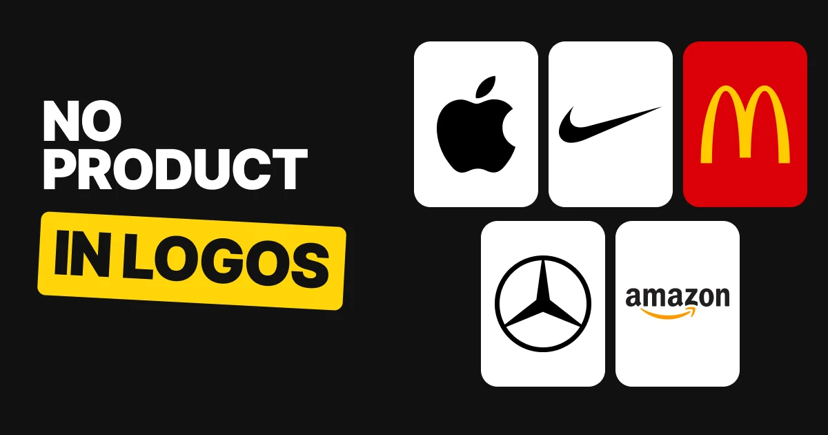
Almost every founder asks for the same thing in the first logo brief: put the product in it. A coffee cup for the coffee shop, a tooth for the dentist, a little house for the agent. The biggest brands in the world did not do that. Here is what five of them did instead, and what to ask your designer for.
| Brand | What it sells | What the logo shows |
|---|---|---|
| Apple | Phones, computers, services | An apple with a bite |
| Nike | Shoes and sportswear | A swoosh |
| McDonald's | Burgers and fries | A letter, the golden arches |
| Mercedes-Benz | Cars | A three-pointed star |
| Amazon | Almost everything | A smile that is also an arrow |
Apple: a fruit, for a computer company
Apple has never sold apples. Its logo is a fruit and its products are computers and phones, so the picture and the business have nothing in common. People still know exactly what it is, because the mark is simple enough to draw from memory. The full story of how it got there is in our Apple logo history.
What a founder should take from it: the logo does not have to be about the product. It has to be about being easy to recognise.
Nike: a swoosh, not a shoe
Nike sells shoes and its logo has no shoe in it. The swoosh was drawn by Carolyn Davidson in 1971, and Nike's own history says it was made for a fee of $35. A mark that cheap and that plain went on to sit on almost every sports product on earth. A drawing of a running shoe would have dated, and would have needed redrawing for every new sport.
What a founder should take from it: a simple shape can carry the whole brand when it is used everywhere, consistently, for years.
McDonald's: a letter that stands for the whole menu
McDonald's sells burgers and fries, and the logo is a yellow letter. There is no burger, no fry and no cow. The letter works on a bag, a tray, a roadside sign and a phone screen, which a picture of food would not do at every size.
What a founder should take from it: if you sell many things, or may sell more later, a mark tied to one product boxes you in.
Mercedes-Benz: a star for cars
Mercedes-Benz makes cars, and the logo is a three-pointed star in a ring. Cars would be an obvious thing to draw. A star is something you can put on a grille, a key, a showroom wall and a business card without it ever looking out of date.
What a founder should take from it: the less the mark depends on what you make today, the longer it lasts.
Amazon: a smile that is also an arrow
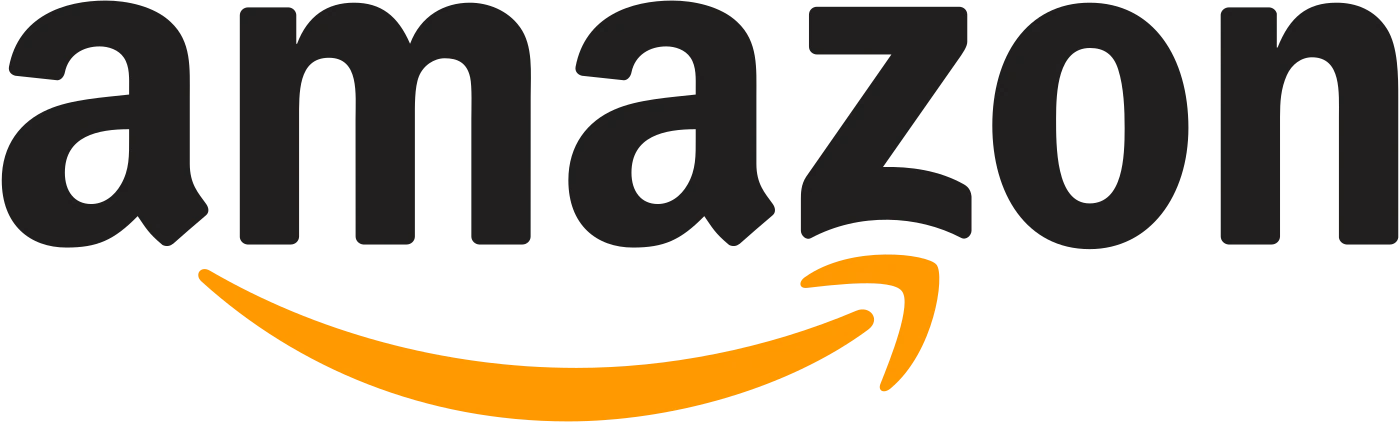
Amazon sells almost everything, so there was never going to be a product to draw. The 2000 logo by Turner Duckworth uses the name and adds one idea underneath: an orange smile that runs from the a to the z, an arrow that says everything from A to Z. Bruce Duckworth explained the thinking in an interview with The Drum. It is a single idea, and nothing is added to it.
What a founder should take from it: when the name carries the business, the mark only has to add one thing. For more on marks that hide a clever second idea, see hidden meanings in famous logos.
Why putting the product in the logo backfires
- It looks like everyone else. Every coffee shop has a cup. Yours is one of fifty.
- It dies at small sizes. A cup with steam and a saucer turns into a smudge in a browser tab. Our minimalist logo design paper covers why less holds up.
- It boxes you in. The day you sell tea, or sell online, or open a second business, the cup is wrong.
- It does the name's job. If people need the picture to know what you do, the name or the website is not doing its work.
What to ask your designer for instead
Bad
Put a coffee cup in it.
Describes your product and looks like every other cafe.Good
Make it easy to remember.
Gives the designer the real goal: a mark people can recall and draw.
Use these four lines in your brief. Each one replaces a request that sounds natural and causes trouble.
| Ask for this | Not this |
|---|---|
| Make it easy to remember. | Put a coffee cup in it. |
| Show one idea. | Show all our services. |
| Let our name say what we do. | It has to say what we do. |
| Add nothing it doesn't need. | Add our city skyline. |
If you are still choosing a name, our brand naming process covers a name that carries the meaning so the mark does not have to. For the brief itself, the steps around it are in the logo design process.
When showing the product is fine
A literal logo is not banned, it is just a weaker place to start. It can work when the name is hard to say or spell and a picture helps, or for a very local business where the sign out front does the work. Even then, keep it to one clear shape, test it at the size of a browser tab, and check it holds up in one color.
FAQ
Should a logo show what the business sells?
No. The best-known logos do not. Apple, Nike, McDonald's, Mercedes-Benz and Amazon all use a simple shape or letter that people can remember, and let the name and the website explain the business.
Why doesn't the Apple logo show a computer?
A computer would make a detailed, hard-to-remember picture. An apple with a bite is a single shape that anyone can draw, and that is what makes it work on every product and every size.
What does the Nike swoosh represent?
It is an abstract mark drawn by Carolyn Davidson in 1971. It does not show a shoe, which is the point: a simple shape can sit on any product the company ever makes.
What does the Amazon logo mean?
The orange smile under the name is also an arrow that runs from the a to the z, to say the store sells everything from A to Z. It was designed by Turner Duckworth in 2000.
What should I ask a designer for in a logo brief?
Four things: make it easy to remember, show one idea, let the name say what you do, and add nothing the logo does not need.
Can a small business logo show its product?
It can, but it is a riskier start. A product picture looks like your competitors, gets blurry at small sizes and stops fitting when you add anything new. A simple mark and a clear name usually serve a small business longer.
Sources
- Nike, "Never done leaving a mark: Swoosh", and Portland State University, "Legendary by Design": the swoosh, Carolyn Davidson and 1971.
- The Drum, interview with Bruce Duckworth of Turner Duckworth on the Amazon logo: the 2000 smile and the a-to-z arrow.
- Logo files from Wikimedia Commons, shown for commentary and never redrawn: Apple logo black, Logo NIKE, McDonald's Golden Arches, Mercedes-Benz Star, Amazon logo. Trademarks of their owners.
- "A logo's job is to be remembered, not to explain what you do" and the four briefing lines are our opinion and our wording. "A letter" and "a star" describe what the McDonald's and Mercedes-Benz logos show; no meaning is claimed.
- First published as a carousel on Logo Brainy.
Want one idea people remember, not a drawing of your product? Brief our team on your logo.
Get StartedGet new papers by email
New Brainy papers in your inbox. Confirm once, unsubscribe anytime.