Google Logo History: Every Change From 1997 to 2026, and Why
Google changed its logo six times after the 1997 original, and since 1999 every change took something away. Each version with its year, what changed and what it teaches a founder.
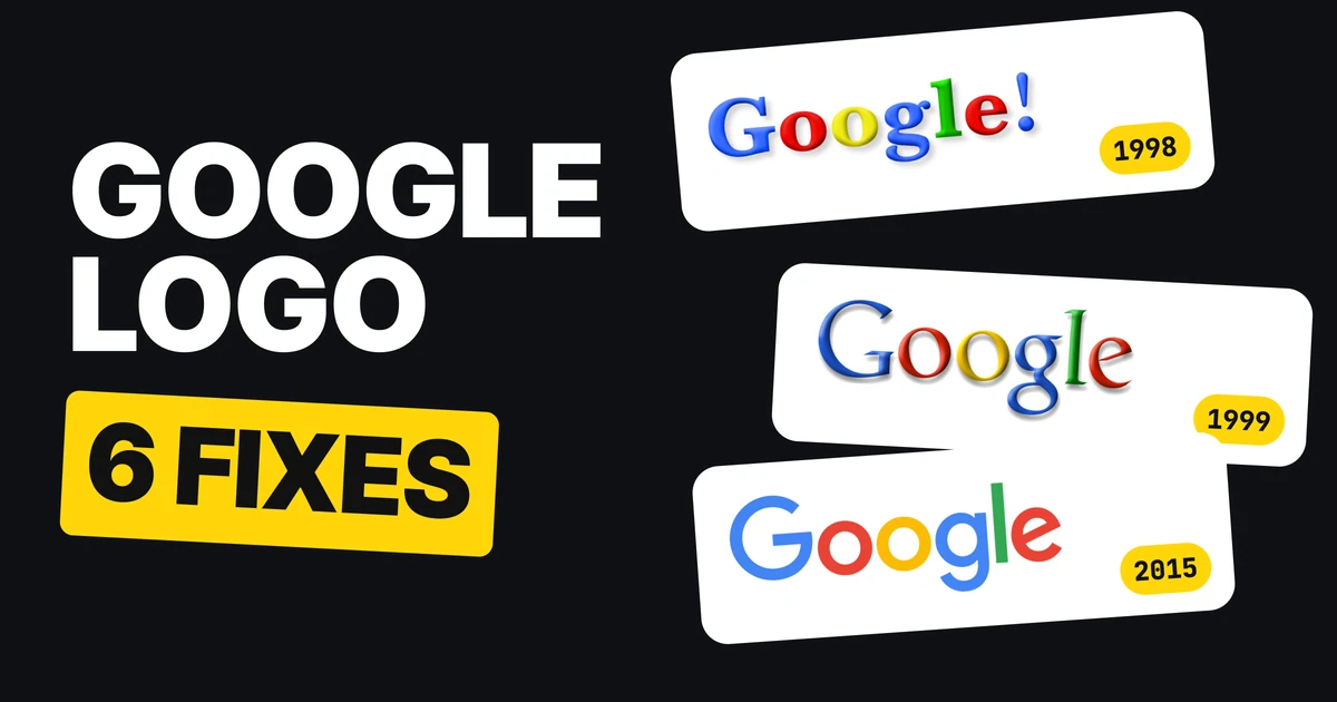
Google's first logo was made by one of its founders in a free image program. The logo on your screen today is a custom sans-serif in four flat colors. Six changes sit between them, and after the third one every change took something away. Here is each version, the year, and what it teaches if you are building a logo of your own.
| Year | What changed | What it did |
|---|---|---|
| 1997 | Made by a founder in a free program | Starting point |
| 1998 | New typeface and an exclamation mark | Borrowed a look |
| 1999 | Ruth Kedar sets it in Catull | A real font, and a rule-breaking L |
| 2010 | A subtler shadow | Smaller than it looks |
| 2013 | Flat, no shadow | Dropped the effect |
| 2015 | Product Sans, and a G icon | Dropped the serifs, built for small |
| 2026 | A modified Google Sans, brighter colors | A tune-up |
1997: the homemade start

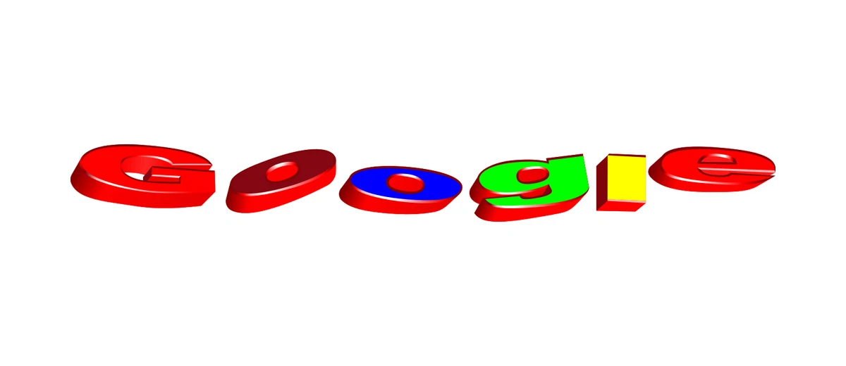
The first Google logo was made by a founder in GIMP, a free image editor. It is rough, tilted and heavily shadowed. It did the one job a first logo has: it gave the company a name people could see.
What it teaches: launch with what you have. Google did not wait for a designer.
1998: a borrowed exclamation mark
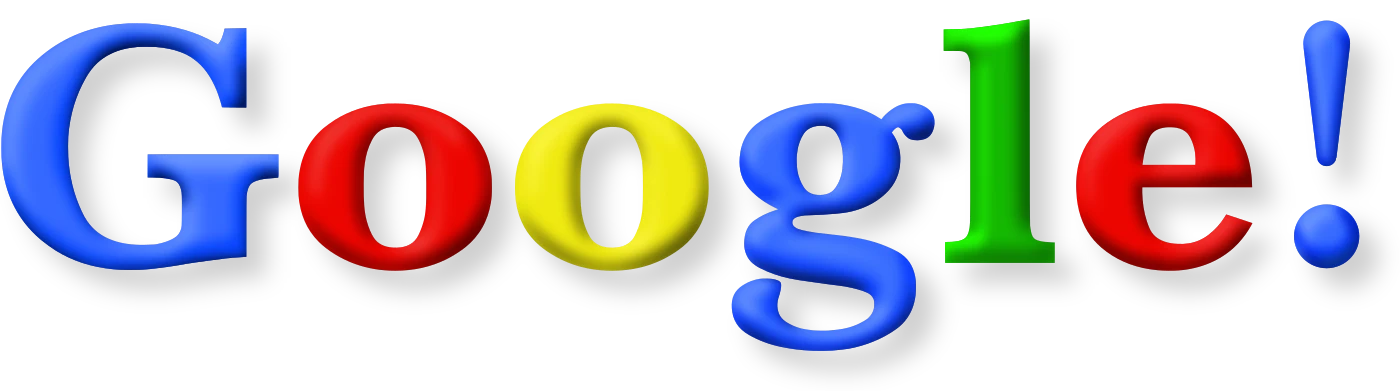
From 30 October 1998 the logo became a serif wordmark with an exclamation mark, "mimicking the Yahoo! logo" in the words of Wikipedia's history of the logo. What it teaches: borrowing a look can get you started, but it is a loan. Google dropped the exclamation mark the next year.
1999: a real font and a broken rule
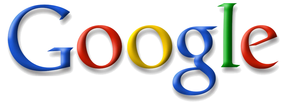
In May 1999 the designer Ruth Kedar gave the logo a proper typeface, Catull, and put a secondary color on the L. In Kedar's telling, reported by Wired, that last touch "brought back the idea that Google doesn't follow the rules."
It also kept the shadow, which becomes the thing to remove in the later versions.
What it teaches: one deliberate rule-breaker, like a single off-color letter, can carry a brand's attitude for decades.
2010: a softer shadow
On 6 May 2010 the shadow got subtler. We do not show this one because it changed too little to teach anything. It stays on the list because it is part of the count: the six changes include it.
2013: flat
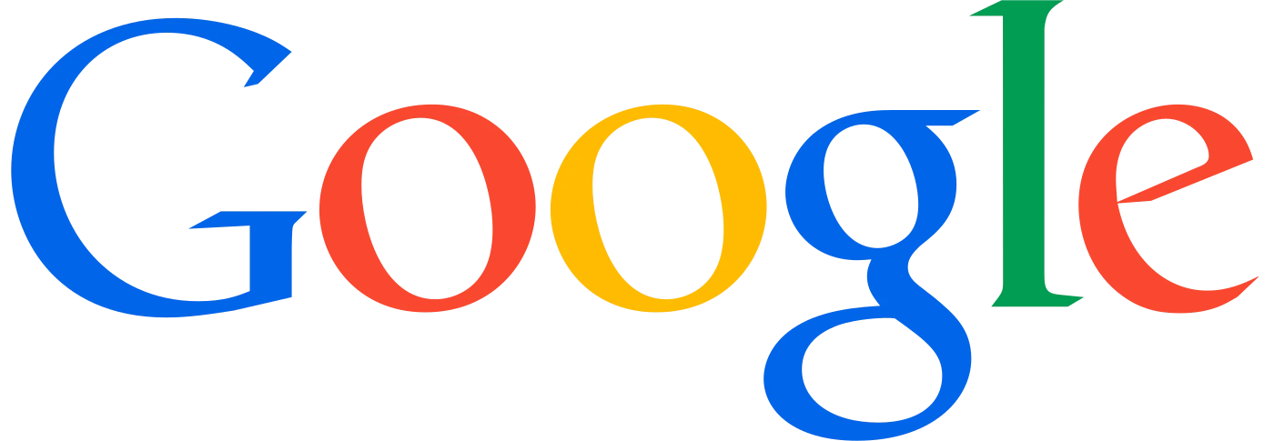
On 19 September 2013 the shadow was gone. The serif letters stayed, in four flat colors.
What it teaches: effects date a logo. Shadows and 3D belong to the year they were drawn, and a flat mark is easier to place on any ground.
2015: the serifs go, and a G appears
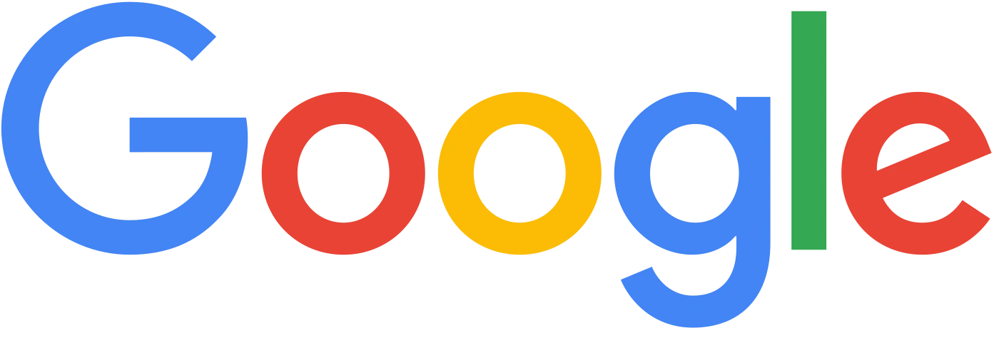
On 1 September 2015 Google moved to Product Sans, a typeface it made in-house. Its own announcement says why the change mattered: people use Google "whether it's on your mobile phone, TV, watch, the dashboard in your car." A logo that has to work in all of those cannot depend on fine serifs.
The same day the little blue "g" icon was replaced by the four-color G. Google Design describes it as "a compact version of the Google logo that works in small contexts."
What it teaches: design for small first. If the logo reads on a watch, it reads anywhere. That is also why a logo system needs a compact version next to the full one, which our logo variants paper covers.
2026: a tune-up
The logo in use since 19 May 2026 is a modified Google Sans with slightly brighter hues. Read from the logo files, the four colors moved like this.
| Letter color | 2015 | 2026 |
|---|---|---|
| Blue | #4285F4 | #3186FF |
| Red | #EA4335 | #FC413D |
| Yellow | #FBBC05 | #FFBE00 |
| Green | #34A853 | #00AF57 |
Every one of the four is a little more saturated. The shape of the logo barely moved, which is the point of a tune-up.
What it teaches: a mature logo changes in small steps, not in redraws.
First against last
1997
2026
Between these two sits the whole direction: from tilted, shadowed letters to an even, flat wordmark. The name is the same, the four colors are the same family, and the logo is far easier to use at small sizes.
What this means for your logo
- Start, then fix it. Google's first logo was homemade, and the company grew anyway. A logo is not final the day it ships. For the full process of changing one safely, see the logo redesign process.
- Drop the effects. Shadows and 3D date a logo faster than any other choice. If it works flat in one color, it will age better.
- Design for small. Test the logo at the size of a watch face or a browser tab before anything else. If it holds, it holds everywhere.
Whether a change is a small tune-up or a bigger move is its own question, covered in rebrand vs brand refresh.
FAQ
When did Google change its logo?
After the 1997 original: 1998, 1999, May 2010, September 2013, September 2015 and May 2026.
Who designed the Google logo?
The first logo was made by one of Google's founders in the free program GIMP. The 1999 version was designed by Ruth Kedar, in the Catull typeface.
What font does the Google logo use?
Today's logo is a modified version of Google Sans. From 2015 to 2026 it was Product Sans, made in-house. From 1999 to 2015 it was Catull, a serif.
Why did Google remove the serifs?
Google's 2015 announcement says people use Google on phones, TVs, watches and car dashboards, and the new logo was built to work across all of them.
When did Google's logo go flat?
On 19 September 2013 the shadow was removed. The serif letters stayed until 2015.
Why did the 1998 Google logo have an exclamation mark?
It mimicked the Yahoo! logo, according to Wikipedia's history of the Google logo. It was dropped in the 1999 redesign.
Sources
- Wikipedia, Google logo: the 1997 GIMP origin, the 1998 exclamation mark, the 2013 flat logo, and the May 19, 2026 refresh.
- Wired, "How Google Got Its Colorful Logo", February 12, 2008, and the Logo Geek podcast interview with Ruth Kedar, 2019.
- Google, Google's look, evolved, September 1, 2015, and Google Design, "Evolving the Google Identity".
- Logo files from Wikimedia Commons, shown for commentary and never redrawn: 1997, 1998, 1999, 2013, 2015, G icon, 2026. Trademarks of Google.
- Colors in the 2015 and 2026 table read from those two logo files.
- First published as a carousel on Logo Brainy.
Redesigning a logo? Our team fixes logos step by step, so the new one works at every size and keeps what people already recognize.
Get StartedGet new papers by email
New Brainy papers in your inbox. Confirm once, unsubscribe anytime.