One-Letter Logos: The Idea Behind McDonald's M, Netflix N, Pinterest P and 3 More
McDonald's, Netflix, Pinterest, Tesla, Hyundai and Airbnb all use a single letter or letter-shaped mark. The idea hidden in each one, who made it, and when a letter alone is enough for your logo.
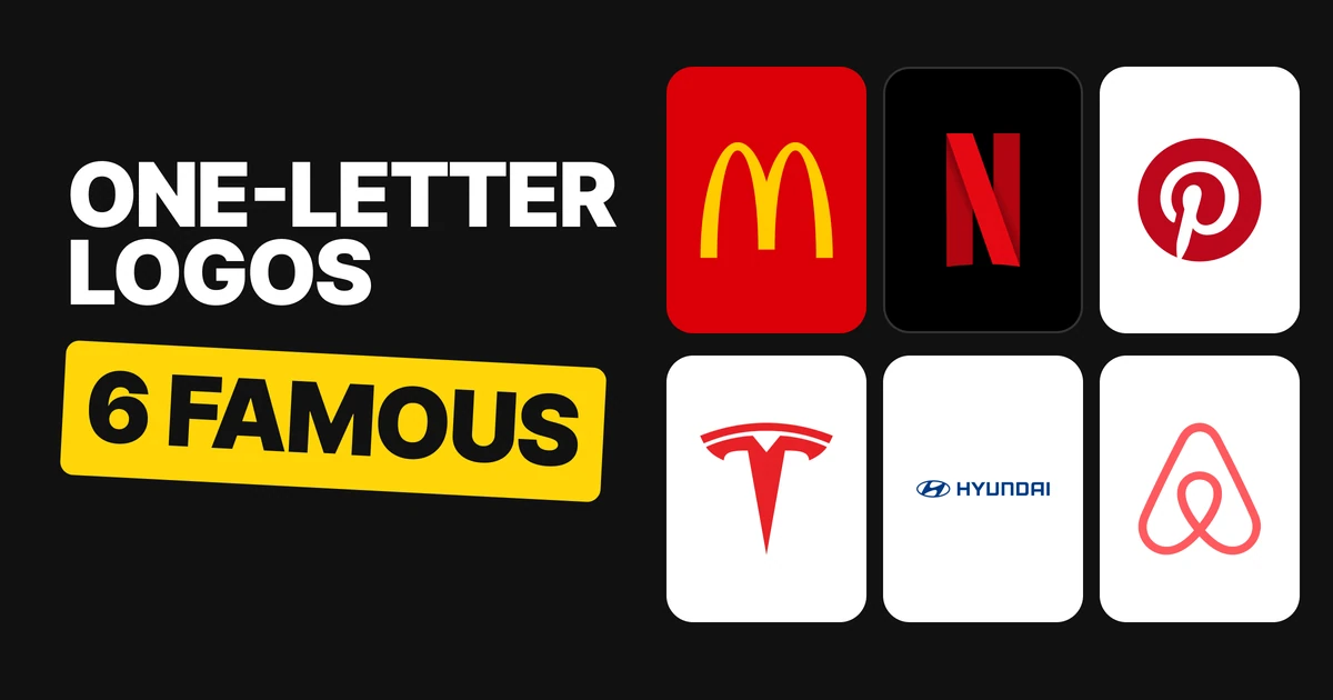
A letter on its own is just a letter. The famous one-letter logos work because each letter carries one idea from the business behind it: a roof, a map pin, a motor, a handshake. Here are six, with the idea in each, who made it and where it comes from, and what to check before you put your own initial on a mark.
| Logo | The letter | The idea inside it |
|---|---|---|
| McDonald's | M | Two arches from the first restaurant buildings |
| Netflix | N | A compact mark for small spaces |
| P | The point of a map pin | |
| Tesla | T | A cross section of an electric motor |
| Hyundai | H | Two people shaking hands |
| Airbnb | A (the Bélo) | People, places, love and the A |
McDonald's: the M that was a roof
The golden arches stood on the 1953 restaurant design by the architect Stanley Meston. In 1962 Jim Schindler turned them into the M logo (some sources say 1961). From certain angles the two arches read as an M, so the letter was already in the building before it was in the logo.
The idea: the arches. The letter is what the arches look like when you step back.
Netflix: an N for small places
In June 2016 Netflix introduced the N icon for small and square spaces such as app icons and social profiles. The full wordmark stayed. The N did not replace the name, it covered the places where the name could not fit.
The idea: a compact version that stands in for the full name where space runs out.
Pinterest: a P with a pin in it
The 2011 P was drawn by Juan Carlos Pagan with Michael Deal. In an interview the P is described as referencing "the map pin at the bottom of it", and the tail of the letter does end in a pin's point.
The idea: pinning. The stem of the P is the pin.
Tesla: a T cut from a motor
On 19 January 2017 Elon Musk wrote on Twitter that "the T is like a cross section of an electric motor." Motor1 credits the design to RO Studio.
The idea: the product itself. The letter is a slice through what the company builds.
Hyundai: an H that is two people

Hyundai says the slanted H is two people shaking hands, a company representative and a satisfied customer. The slant is what turns a plain letter into a gesture.
The idea: a handshake, and the promise behind it.
Airbnb: the Bélo
In Airbnb's own launch video the 2014 Bélo, designed by DesignStudio, stands for people, places, love and Airbnb itself.
The idea: belonging, with four meanings held in one mark.
What the six have in common
Each one starts from something the business really has: a building, a product, a promise or a tool. None starts from the initial. The letter arrives second, as the shape the idea happens to take.
Before you use your initial
- Find the idea first. Write down one thing the business does that can be drawn: a shape, a tool, a gesture. If you only have a letter, you do not have a logo yet.
- Check that the letter still reads as the letter. The M of McDonald's and the P of Pinterest are both readable as letters at a glance. If the idea bends the letter so far that people see only the idea, you have a symbol, which is fine, but it is a different job.
- Keep the full name nearby until the letter is known. Netflix kept its wordmark and used the N where the name would not fit. Do the same until the mark is recognized on its own.
For the difference between a letter mark and a full wordmark, see wordmark vs lettermark logos, and for every other style, types of logos.
FAQ
What does the McDonald's logo mean?
The golden arches come from the arches on McDonald's 1953 restaurant design. Jim Schindler turned them into the M logo in 1962, and from some angles the two arches read as an M.
What does the Tesla logo mean?
Elon Musk said in 2017 that the T is like a cross section of an electric motor. Motor1 credits the design to RO Studio.
What does the Hyundai logo mean?
Hyundai says the slanted H shows two people shaking hands, a company representative and a satisfied customer.
What does the Pinterest logo mean?
The Pinterest P was drawn in 2011 and its tail ends in the point of a map pin, which refers to pinning.
Why did Netflix make an N logo?
Netflix introduced the N icon in June 2016 for small and square spaces such as app icons and social profiles. The full wordmark stayed.
What does the Airbnb logo stand for?
In Airbnb's launch video, the Bélo stands for people, places, love and Airbnb. It was designed by DesignStudio in 2014.
Should my logo be just a letter?
Only if the letter carries one idea from your business. A letter on its own is just a letter.
Sources
- McDonald's: Wikipedia, Golden Arches; Wallpaper, Anatomy of a logo: McDonald's Golden Arches by Jim Schindler; Creative Bloq, the story behind the McDonald's logo.
- Netflix: The Next Web, Netflix just changed its logo, 20 June 2016; It's Nice That, Netflix's new icon, 29 June 2016; Android Police, 29 June 2016.
- Pinterest: Brands of the World, credits Juan Carlos Pagan and Michael Deal; Aspire Metro, Dinner Guest: Brand Identity Guru.
- Tesla: Electrek, Tesla logo is a cross section of an electric motor, 24 January 2017; Motor1, Elon Musk explains the Tesla logo.
- Hyundai: Jalopnik, the Hyundai logo is two people shaking hands.
- Airbnb: Creative Bloq, The Airbnb logo has 4 hidden meanings; Designboom, 16 July 2014.
- Logo files from Wikimedia Commons, shown for commentary and never redrawn: McDonald's Golden Arches.svg, Netflix 2016 N logo.svg, Pinterest.svg (vector trace, CC BY-SA 4.0), Tesla T symbol.svg, Hyundai Motor Company logo.svg and Airbnb Logo Bélo.svg. Trademarks of their owners.
- First published as a carousel on Logo Brainy.
Thinking of using your initial as your logo? Our team finds the idea inside a name and draws it into a mark that works at every size.
Get StartedGet new papers by email
New Brainy papers in your inbox. Confirm once, unsubscribe anytime.