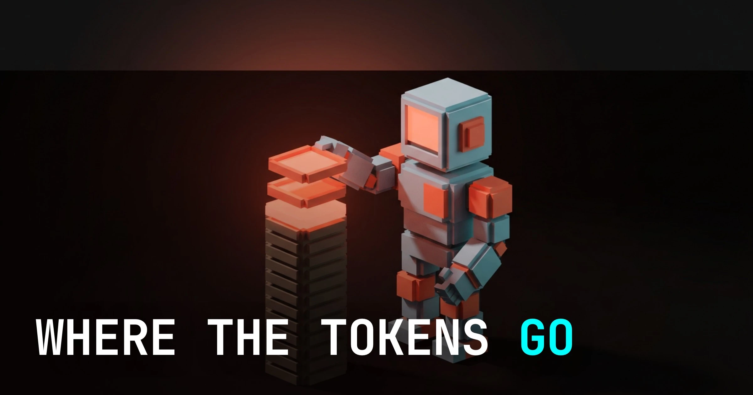
Wordmark vs Lettermark Logos: How to Choose the Right Type for Your Brand
A working designer's framework for picking between a wordmark and a lettermark. Real brand examples, legibility tradeoffs at small sizes, and a flowchart that maps your name length and industry to the right logo type.
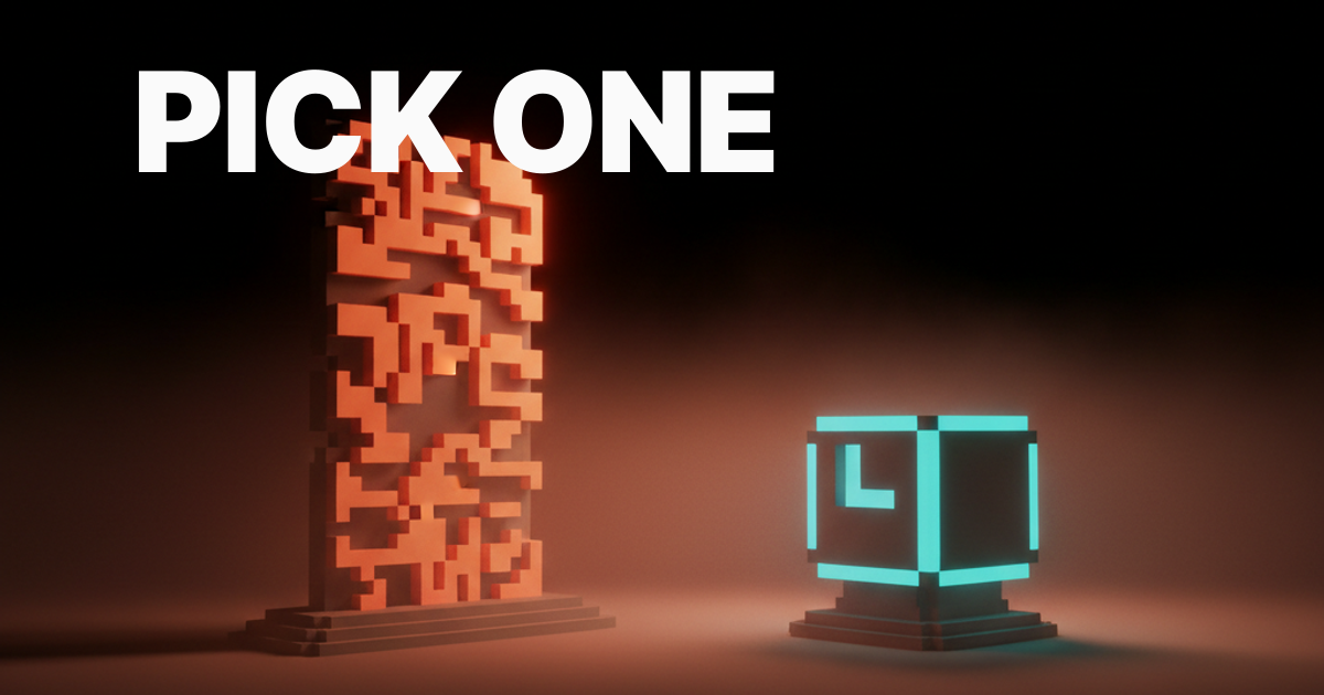
A wordmark is the brand name set as a logo. A lettermark is the brand's initials set as a logo. The whole rest of the decision is downstream of that. Pick a wordmark when the name is short, distinctive, and memorable enough to do the work. Pick a lettermark when the name is long, generic, or hard to say on the first try.
Most teams skip the structural decision and jump to taste. They sketch in both directions, pick the one that looks cooler on a Tuesday afternoon, and end up with a logo that fights the brand for the next decade. This piece is the framework that should come before the sketches. Four signals decide it. A flowchart turns those signals into a sixty-second answer. And twelve real brands show what each call looks like once it ships.
Wordmark vs lettermark, the actual difference
A wordmark spells out the full brand name as the logo. Google, FedEx, Coca-Cola, Disney, Visa, eBay. Read the logo, you read the brand. The typography is the brand asset.
A lettermark uses one to four characters, usually the brand initials, as the logo. IBM, HBO, CNN, NASA, GE, P&G. The full name lives somewhere else, the lettermark is the compressed visual handle that does the heavy lifting on every small surface.
Both are technically logotypes in the broader sense, both are letter-based. The difference is structural. A wordmark is the name. A lettermark is the abbreviation of the name. That structural difference is what controls everything else: legibility at small sizes, recognizability without context, the kind of typography that can carry the work, and the kind of brand that can pull each off.
Notice what is not on this list. Pictorial logos like the Apple apple or the Nike swoosh are a different category entirely. Combination marks like the Adidas wordmark plus three stripes are also a different category. This piece is just about wordmarks vs lettermarks, the two pure typographic logo types that most brands actually choose between.
The four signals that decide it for you
Most logo decisions are not taste, they are arithmetic on four signals.
Run the brand through these four questions before any sketching:
- How long is the brand name and how easy is it to read at a glance?
- How distinctive is the brand name on its own, without a logo doing any work?
- What logo type does your industry use as a default and what does breaking that convention signal?
- Where will the logo actually live, and at what physical sizes?
Each of those signals points at a wordmark or a lettermark, sometimes both. When three or four signals agree, the answer is obvious. When they conflict, you have a real design problem to solve, and you need to know which signal to weight hardest based on the brand's strategy.
The four signals are not equal. Use case usually wins on tiebreaks, because a logo that fails at favicon size fails everywhere downstream. Distinctiveness wins next, because a logo that nobody can recall has nothing to compress later. Length and convention come third and fourth. We will work through each.
Name length is the first filter
If the brand name is more than three syllables and not phonetic, a wordmark is fighting gravity.
Short, snappy names ride wordmarks well. Google. FedEx. Visa. Sony. Nike. Three syllables or fewer, easy to pronounce, easy to remember after one exposure. A wordmark on those names has room to breathe at every size, every medium. The brand name is short enough that it can be set huge and still read at thumbnail.
Long names struggle. International Business Machines is six words. Cable News Network is three words. National Aeronautics and Space Administration is seven words. None of those work as a wordmark on an app icon, a sock, or a watch face. Every one of them shipped a lettermark, and every one of them won.
Procter and Gamble is two short words but four syllables, and the brand sells consumer goods at corner-store shelf scale. P&G is two characters that fit on a label corner. The wordmark exists for legal and corporate use. The lettermark does the actual brand work.
The rough rule. If the brand name is two syllables or fewer and easy to pronounce, default to a wordmark. If the brand name is four syllables or more, or hard to read at a glance, default to a lettermark. The middle case, three syllables, is where the other signals start to matter.
Distinctiveness decides what carries the work
A name like Google can ride as a wordmark. A name like International Business Machines cannot.
Distinctiveness in this context is not how cool the name sounds, it is how unique the letterforms become when set as a logo. Google has six letters, two doubled, with two o's framing a g and an l. The shape silhouette of the wordmark is unmistakable. You could blur it to fifty percent and still recognize it.
Coca-Cola has the most famous wordmark in the world, partly because the name is two repeated syllables and partly because the script form is so distinctive that even a fragment of it reads as Coca-Cola. eBay does the work in four lowercase letters with a quirky cap letter sequencing that nobody else uses. Disney has a custom script tied to a specific cultural moment and to a specific lowercase d that has been refined for ninety years.
Now look at IBM. The name itself is three letters. There is no wordmark version that is more memorable than the lettermark, because the name was already an abbreviation when the company was founded. Forcing a wordmark would just be an italicized "International Business Machines" set at small size, which is exactly what IBM uses on legal documents and never anywhere else. The lettermark is the brand.
A useful test. Strip the typography down to a generic geometric sans, set the name as a wordmark, and look at the silhouette. If the silhouette is still distinctive, a wordmark is viable. If the silhouette looks like every other word set in that face, the name needs help, and that help is usually a lettermark.

Industry conventions are not optional context
Logo type carries category signals. Ignore them and the logo reads as out of place before the design is even judged.
Tech and consumer software lean wordmark. Google, Slack, Stripe, Airbnb, Spotify, Notion, Figma. The category is post-2008 and built on app icons that already carry pictorial weight, so the wordmark gets to be the calmer, more typographic anchor. A lettermark in tech reads as either old-school enterprise (IBM, HP, SAP) or as a deliberate signal of seriousness (OpenAI uses a wordmark, but Anthropic uses a wordmark too, while OpenAI's lettermark "OAI" never caught on for a reason).
Finance and insurance lean lettermark. JPMorgan Chase ships JPMC and Chase. Goldman Sachs uses GS. P&G, KPMG, EY, PwC. The category rewards initials that signal long institutional history without spelling it out every time. A wordmark in finance can work for newer entrants (Visa, Mastercard, Klarna, Affirm) but it consistently reads as challenger rather than incumbent.
Media and broadcast lean lettermark. HBO, CNN, BBC, ESPN, MTV, NPR, ABC. The format is short brand calls in screen corners, and three letters fit a screen corner better than three words. The wordmark equivalents (Hollywood Reporter, New York Times) survive in print where the wordmark gets to be set at editorial scale.
Fashion and luxury lean wordmark. Chanel, Gucci, Prada, Balenciaga, Hermes, Versace. The category sells the name as a status object, and the wordmark is the name. A lettermark in fashion either reads as legacy (LV for Louis Vuitton, GG for Gucci, CC for Chanel, all used as monograms not primary logos) or as cheap.
Aerospace, defense, and government lean lettermark. NASA, FBI, CIA, DOJ, DOD. Three or four letters carry institutional weight. Spelling out National Aeronautics and Space Administration on a rocket would be a category error.
Read your category. Then decide whether you want to fit it or break it. Both are valid moves, but only if you make the call deliberately.
Use-case scale is where lettermarks earn their keep
A wordmark might win the website hero and lose every favicon, app icon, and embroidered patch.
This is the underweighted signal in most logo briefs. Designers test the logo at one size, on a clean white deck, and miss the fact that the brand will spend ninety percent of its life at sub-thumbnail scales: app icons, favicons, social avatars, watch faces, business card corners, embroidered logos, branded merch, video bugs in screen corners, podcast cover art at thumbnail in a feed.
A wordmark at app-icon scale either fails to read or has to be cropped, distorted, or replaced. Google ships a lettermark "G" for the favicon and uses the full wordmark only on the homepage. FedEx ships an "Fx" mark and a wordmark version, and the wordmark gets used at billboard and side-of-truck scale where it has space. Coca-Cola has the rarest case where the wordmark itself works at almost every scale because the script is so distinctive that even a fragment reads as the brand.
Lettermarks win these surfaces by default. HBO at favicon. IBM at app icon. NASA at watch face. CNN at video bug. Each of those is two or three characters that hold up at sixteen pixels.
| Surface | Wordmark performance | Lettermark performance |
|---|---|---|
| Website hero (1920px) | Excellent | Good but underused |
| Billboard (large format) | Excellent | Good, can feel cold |
| App icon (1024px down to 60px) | Poor unless name is very short | Excellent |
| Favicon (16px) | Fails for most names | Excellent |
| Social avatar (200px) | Marginal | Excellent |
| Embroidery and merch | Marginal, depends on letterforms | Excellent |
| Video bug (screen corner) | Poor | Excellent |
| Document letterhead | Excellent | Good |
The smart move for many brands is a wordmark with a paired lettermark or monogram for small surfaces. Google does this. FedEx does this. Adidas does this with the wordmark and the trefoil. The "logo" is really a system: a wordmark for big surfaces, a lettermark or symbol for small ones. If you are designing one without the other, you are designing for half the brand's actual life.
If you are choosing a logo type and the brand is going to live mostly on small digital surfaces, weight the lettermark side hard. If the brand is going to live mostly on big editorial or retail surfaces, weight the wordmark side hard. If both, design both, and design them as a system.
Need a logo system that survives every surface? Hire Brainy. We ship full logo systems through the LogoBrainy product, and complete brand identities for teams that want the wordmark, lettermark, monogram, and the rules that govern when each one ships.
Wordmark vs lettermark in real brands
Twelve familiar brands, two columns, one pattern.
| Wordmark | Lettermark |
|---|---|
| Google (six letters, distinctive silhouette, post-2015 sans) | IBM (long name, three letters, striped slab) |
| FedEx (eight letters, custom kerning hides an arrow) | HBO (three short words, three sharp letters) |
| Coca-Cola (script, longest-running wordmark in commercial design) | CNN (three words, three condensed initials) |
| Disney (custom script, brand-as-typography) | NASA (six words, four geometric letters) |
| Visa (four letters, single bold sans, no embellishment) | P&G (two short words, ampersand becomes part of mark) |
| eBay (four lowercase letters, quirky cap mix, color block) | GE (two short words, two letters in a circle for ninety years) |
The pattern. The wordmark column is brands with short, distinctive, easy-to-pronounce names. The lettermark column is brands with long names or names that were always abbreviations in practice. Every one of these calls is the obvious one given the four signals.
Notice what does not appear in the lettermark column: any brand with a short, distinctive, pronounceable name. Nobody ships a lettermark for a name like Slack or Stripe, because there is no problem to solve. Forcing a lettermark on a wordmark-friendly name is the most common rookie mistake in logo design. It signals that the brand wishes it were a Fortune 500 company and is not, and audiences pick that up before they consciously process it.
The flowchart, in sixty seconds
If you cannot answer the four signals in a minute, you do not know your brand well enough to pick a logo type yet.
Run this in order:
-
Is the brand name three syllables or fewer and pronounceable on the first read? If yes, lean wordmark. If no, lean lettermark.
-
Is the brand name distinctive enough that a generic typographic setting would still read as the brand? If yes, wordmark holds. If no, lean lettermark.
-
What does your industry default to, and do you want to fit or break the convention deliberately? Fit usually wins for early-stage brands. Break wins for brands ready to take a position.
-
Where will the logo spend ninety percent of its life? Big editorial surfaces, lean wordmark. Small digital surfaces, lean lettermark or design a system that does both.
If three signals point one way, the answer is settled. If they split two and two, weight signal four (use case) hardest, then signal two (distinctiveness). If they split three and one, follow the three. If you are still unsure, the brand is not yet defined enough to pick a logo type. Go back to the brand naming process and the brand identity guidelines and come back when you can answer all four cleanly.

When to break the rules and run the opposite type
There are exactly three situations where the obvious choice is the wrong one.
First, when a long-named brand has founder mythology that the wordmark can carry. Walt Disney is two words and would normally get a lettermark, but the founder's signature became the wordmark and that signature carries a century of cultural weight that no lettermark could replace. The same logic applies to Tiffany, Cartier, Ralph Lauren, Tom Ford. Founder names with mythological weight earn wordmark treatment regardless of length.
Second, when a short-named brand wants to signal heritage or institutional gravity that a wordmark cannot carry. A new finance company called "Vault" might choose to ship a "V" lettermark in a circle to signal stability and tradition, even though the wordmark version would be perfectly readable. The lettermark borrows institutional cues that the wordmark would not.
Third, when the lettermark is already cultural shorthand. CNN does not need to spell out Cable News Network, ever, because CNN is already the name in practice. The wordmark version would be a regression. The same applies to BBC, ESPN, MTV, IBM, and any brand where the abbreviation has been the actual name in spoken use for decades.
Outside those three cases, the obvious choice is the right one. The signals exist for a reason.
FAQ
What is a wordmark logo?
A wordmark logo, sometimes called a logotype, is a logo built entirely from the brand's full name set in distinctive typography. Google, FedEx, Visa, Coca-Cola, and Disney are all wordmarks. The brand asset is the typographic treatment of the name, with no symbol or initials carrying the work. Wordmarks suit short, distinctive, pronounceable names and editorial-scale surfaces.
What is a lettermark logo?
A lettermark logo uses one to four characters, usually the brand's initials, as the primary logo. IBM, HBO, CNN, NASA, GE, and P&G are all lettermarks. The format compresses long names into a memorable abbreviation that survives small surfaces like app icons and favicons. Lettermarks suit long names, names that are hard to pronounce, or brands that want to signal institutional gravity.
Is a wordmark or lettermark better for small businesses?
It depends on the name. A small business with a short, distinctive, pronounceable name (two syllables or fewer) usually wins with a wordmark, because the name is the strongest brand asset and a wordmark amplifies it. A small business with a long, generic, or hard-to-pronounce name usually wins with a lettermark, because compressing the name to two or three characters makes the brand more memorable and more usable on small surfaces. Most early-stage brands also benefit from designing a wordmark and a paired lettermark or monogram together, so the brand has both tools from day one.
Can a brand use both a wordmark and a lettermark?
Yes, and most strong brand systems do. Google ships the full Google wordmark for editorial and brand surfaces and a "G" lettermark for the favicon and app icon. FedEx ships both. Adidas pairs the wordmark with the trefoil. Treating logo design as a system rather than a single mark is the right move for any brand that lives on more than one surface, which is every brand. The cost is small at design time and the upside is large across the brand's actual life.
What logo type is most common for tech startups?
Wordmarks dominate tech startup logos in the 2020s. Slack, Stripe, Notion, Figma, Linear, Vercel, Anthropic, Airbnb, Spotify, and most YC-style brand identities ship a wordmark as the primary logo, often with a paired symbol or lettermark for small surfaces. The convention is strong enough that a tech startup shipping only a lettermark reads as either deliberately old-school or trying too hard to look like an enterprise incumbent. Pick a wordmark unless you have a clear reason to break the convention.
The pattern most logos miss
The brands that get this right do not pick a type and force the brand to fit. They pick the type the brand was already telling them to pick.
Every logo type signal is downstream of brand strategy. Name length is downstream of naming. Distinctiveness is downstream of positioning and category. Industry convention is downstream of competitive analysis. Use case is downstream of product strategy and channel strategy. By the time you are choosing between a wordmark and a lettermark, the brand has already done most of the work for you, and the signals will be visible if you read them.
The mistake is treating logo type as the first decision. It is one of the last decisions in any well-run brand identity project. The signals come from the strategy, the strategy comes from the business, the business comes from a real understanding of what the brand is trying to do in the world. Skip those layers and the logo will fight everything else for the next ten years.
The shortcut works in the other direction. If your team is stuck between a wordmark and a lettermark, that usually means the strategy underneath is not finished. Go work on the strategy. Come back to the logo when the four signals can be answered cleanly. The right answer will be obvious in five minutes once the brand knows what it is.
If you want a logo system built on signals not taste, with a wordmark and a lettermark designed to work together across every surface, hire Brainy. We ship logo systems through LogoBrainy and full brand identities for teams that want the strategy, the typography, and the rules that hold the brand together for the next decade.
Need a wordmark or lettermark that survives every surface from a favicon to a billboard? Brainy ships logo systems and full brand identities, and runs the LogoBrainy product for teams that want a focused logo deliverable.
Get StartedNot ready to hire? Run the free Business Genome, an 11-dimension diagnostic for your venture.
Get your free GenomeGet new papers by email
New Brainy papers in your inbox. Confirm once, unsubscribe anytime.