Types of Logos: The 7 Logo Styles and When to Use Each
The seven logo styles every designer should know, from the wordmark to the emblem, with real brand examples and a clear rule for when to use each.
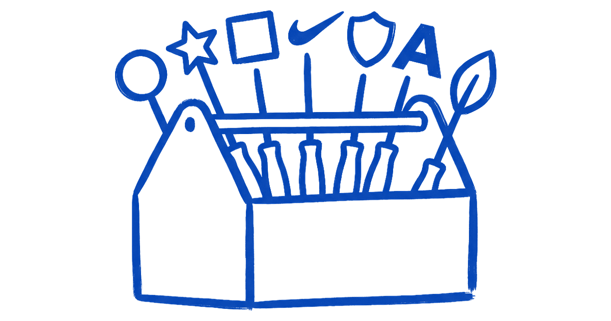
A logo is a format decision before it is a drawing. Before you sketch anything, you pick which of seven formats the mark will take, and that choice decides whether the brand is easy to recognize, easy to scale, and easy to trust.
Get the format wrong and no amount of polish saves it. Here are the seven styles, what each is good and bad at, and the rule for choosing.
What a logo style actually decides
The format controls how the mark behaves everywhere you cannot supervise it. The same idea can read as confident on a billboard and illegible as a phone notification, and the difference is usually the format, not the artwork.
| Format | Space required | Scales to app icon | Survives embroidery |
|---|---|---|---|
| Wordmark | Wide horizontal room | Poorly | Yes, clean type holds |
| Pictorial or abstract mark | Flexible, can run square | Yes, to 16 pixels | Depends on edge complexity |
| Emblem | Fixed, medium proportions | Rarely | Almost never |
So the first real decision is not what to draw, it is which container the brand lives in. Get that right and the drawing has a fighting chance. Get it wrong and you will be redrawing within a year.
The wordmark
A wordmark is the brand name set in distinctive type, and nothing else. Google runs a custom sans-serif that reads as friendly and plain at any size. Coca-Cola has kept its Spencerian script for over a century because the shape of the word is the asset. FedEx hides an arrow in the negative space between the E and the x, proof that a wordmark can carry an idea without a separate symbol.

Reach for it when:
- The name is short (one to three words), distinctive, and worth teaching to strangers
- The brand does not depend on a standalone app icon or favicon
- The letterforms themselves can be made ownable through custom type
Avoid it when:
- The name is long, generic, or hard to spell
- The brand needs a symbol that can function independently at small sizes
If your name is three forgettable words, a wordmark just makes the problem bigger.
The lettermark
A lettermark turns the name into its initials. IBM wears three letters striped by Paul Rand, while HBO and CNN earned their initials through decades of airtime. The format works because it shrinks a mouthful into a compact, repeatable mark.

Reach for it when:
- The full name is long or clumsy to say or read at a glance
- The initials are already easier to say than the whole thing
- The brand has enough reach to invest time teaching the abbreviation to strangers
Avoid it when:
- The brand is new and the initials carry no existing recognition
- The letters are a random combination that gives strangers nothing to hold onto
A new company calling itself three random letters is asking strangers to memorize a code with no reward.
The pictorial mark
A pictorial mark is a recognizable picture of a real thing. Apple uses a bitten apple, Target a literal bullseye, and Twitter rode a bird until the company became X. The strength is instant meaning and a shape that survives shrinking to an app icon.

Reach for it when:
- You want a symbol that can eventually stand alone without the name beside it
- The metaphor is clear to strangers without explanation
- A single recognizable object captures what the brand stands for
Avoid it when:
- The metaphor is muddy or too abstract to be decoded at a glance
- The icon needs a caption to read correctly
A picture nobody can read is just decoration. A clever icon that needs a caption is not doing its job.
The abstract mark
An abstract mark is a geometric form that stands for the brand without depicting any real object. The Nike swoosh suggests motion, the Adidas three stripes signal performance, the Pepsi globe is pure shape. Because it points to no literal thing, an abstract mark can mean whatever the brand spends years teaching it to mean.
Reach for it when:
- No single object captures what the brand does
- The brand operates across many categories and a literal metaphor would box it in
- You have the reach and timeline to invest meaning into a new shape
Avoid it when:
- The brand is early-stage with no budget to build association
- The shape is arbitrary rather than expressive of something real about the brand
With no investment behind it, an abstract mark stays meaningless.

The mascot
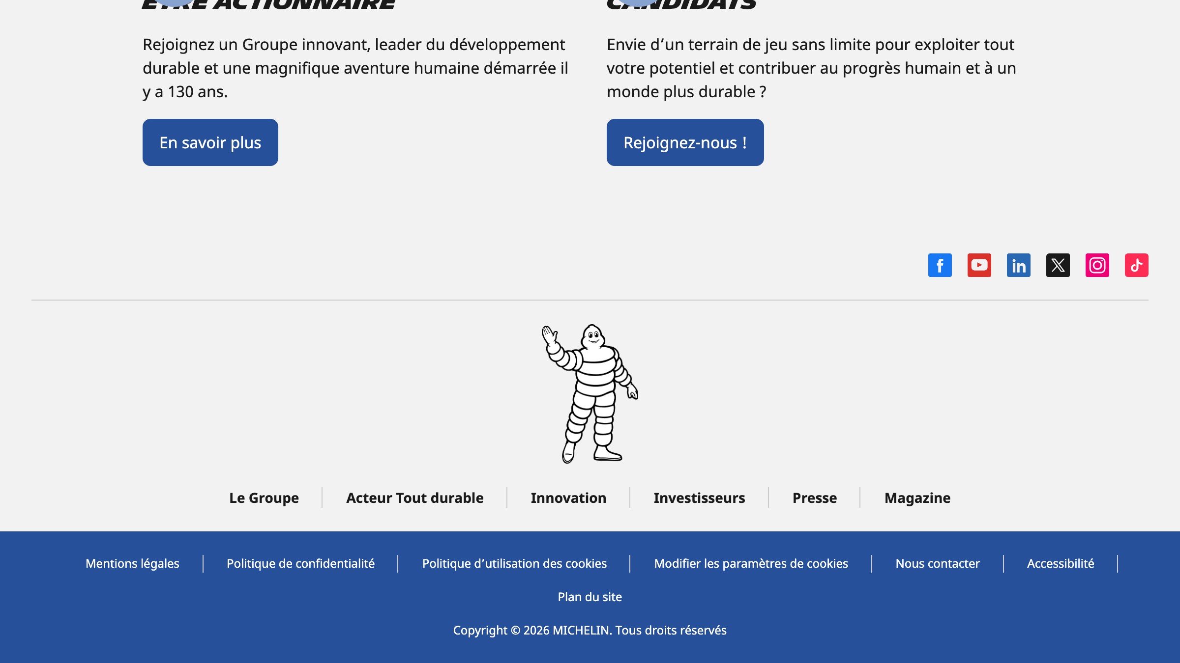
A mascot is a character that fronts the brand. KFC has Colonel Sanders, Mailchimp has Freddie the chimp, and Michelin has run on Bibendum, the figure built from stacked tires, for over a century. A character carries warmth and personality that flat type and geometric symbols cannot.
Reach for it when:
- The brand targets families, casual consumer markets, or audiences where warmth closes the sale
- Storytelling and character-driven campaigns are central to the marketing strategy, not a side tactic
- The budget consistently supports illustration, character licensing, and multi-application upkeep across years
Avoid it when:
- The brand needs a crisp standalone favicon or app icon as a primary digital asset
- The positioning is premium, minimalist, or serious in tone
- Ongoing illustration maintenance is not funded and staffed
A mascot ages fast and rarely shrinks to a clean favicon, so brands that run one usually keep a separate symbol for digital. It is a commitment to keep drawing, not a one-time mark.
The combination mark
A combination mark locks a symbol and a wordmark together. Burger King sits its name inside a bun, Lacoste pairs the crocodile with the name, Doritos joins its triangle to the type. You get the recognition of a symbol plus the clarity of the spelled-out name in one unit.

Reach for it when:
- The brand is new and needs the name to do the explaining while the symbol builds recognition
- The symbol is distinctive enough to eventually stand alone once the audience learns it
- Multiple touchpoints need the mark at very different sizes
Avoid it when:
- Space is extremely tight and a single-element mark is required
- The brand has already built enough recognition to run the symbol solo without confusion
This is the safest default for most new brands because the symbol builds recognition while the name teaches the audience who you are. Over time the symbol can earn the right to stand alone. The trade-off is more parts to manage and a lockup system to keep consistent across sizes.
The emblem
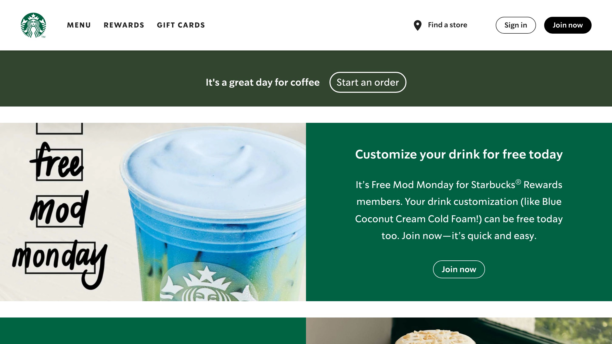
An emblem seals the name and symbol inside one enclosed shape. Starbucks puts its siren in a circle, Harley-Davidson uses a bar and shield, BMW lives in a roundel. The format signals heritage, authority, and craft, which is why it suits cars, coffee, schools, and beer.
Reach for it when:
- The brand wants to feel established and trustworthy rather than fast and modern
- Heritage, institutional authority, or craft are central to the positioning
Avoid it when:
- The brand needs a clean favicon at 16 pixels
- Embroidery or one-color print is a primary use case
- The level of detail will collapse at small sizes
Many heritage brands now ship a simplified emblem just to survive small screens. The detail that gives an emblem its authority is the same detail that makes it fragile at scale.
How to choose the right logo style
Start with the brand's constraints, not your taste. Answer four questions before you sketch.
- How known is the name today, new or already recognized
- How long and ownable is the name
- Does it need to live as an app icon or favicon
- Does it have to work in a single color
Map those answers to the table below and the format usually picks itself.
| Brand situation | Best style | Why it fits | Watch out for |
|---|---|---|---|
| New brand, unknown name | Combination mark | Symbol builds recognition while the name does the explaining | Heavier to maintain, needs a lockup system |
| Short, ownable name | Wordmark | The name carries the mark, nothing to decode | Dies if the name is generic |
| Long or awkward name | Lettermark | Initials shrink a mouthful into a tight mark | Initials mean nothing until you earn them |
| Strong app icon or favicon need | Pictorial or abstract mark | One shape survives at 16 pixels | An unclear metaphor reads as noise |
| Wants warmth and personality | Mascot | A character carries emotion type cannot | Ages fast, costs more to maintain |
| Single-color print and embroidery | Wordmark or emblem | Clean type or one enclosed shape holds up | Detailed emblems collapse small |
| Heritage and authority play | Emblem | The badge signals tradition and trust | Too much detail to scale down |
Want a second pair of eyes on calls like this? You can build a logo system with the Brainy creator community and pressure-test the format before you commit a single sketch.

Logo mistakes that quietly kill recognition
Most logo failures trace back to picking the wrong format, then trying to fix it with polish. The pattern repeats.
- A wordmark on a long, generic name, so nothing is memorable
- A pictorial mark with a metaphor only the founder understands
- A mascot that looks great on a hero shot and turns to mud as a favicon
- An emblem so detailed it collapses to a smudge at 16 pixels
Test every mark the way it will actually live. Shrink it to a favicon, strip it to one color, and view it on a phone at arm's length. If it survives all three, the format was right. For more teardowns like this, read our logo and brand breakdowns.
FAQ
What are the main types of logos?
There are seven core logo styles:
- Wordmark
- Lettermark
- Pictorial mark
- Abstract mark
- Mascot
- Combination mark
- Emblem
Almost every brand mark you can name is one of these or a blend of two. Picking among them is a format decision you make before any sketching.
What is the most popular type of logo?
The combination mark tends to be the most common choice for new brands because it pairs a recognizable symbol with the spelled-out name. That mix teaches strangers who you are while building a symbol that can later stand alone. Wordmarks are the runner-up for brands with short, ownable names.
Can a brand use more than one logo style?
Yes, and most mature brands do. They keep a full combination mark or emblem for primary use, then break out the symbol alone for app icons and the wordmark alone for tight spaces. The styles are not rivals, they are a system, and the primary format decides how the rest are built.
Which logo type is best for a small business or startup?
For most startups the combination mark is the safest first move because the name does the explaining while the symbol starts earning recognition. If the name is short and distinctive, a clean wordmark can be enough on its own. Avoid mascots and detailed emblems early, they cost the most to maintain and scale the worst.
Pick the format before you pick the mark
The seven styles are not a menu of looks, they are seven different tools for seven different jobs. Decide how the mark must behave, in one color, at favicon size, with or without the name, and the right format becomes obvious. Then, and only then, start drawing.
Brainy helps designers make sharper calls, faster, on the work that actually ships, logos included. See what we are building for creators.
Brainy helps designers make sharper calls, faster, on the work that actually ships, logos included. See what we are building for creators.
Get StartedGet new papers by email
New Brainy papers in your inbox. Confirm once, unsubscribe anytime.