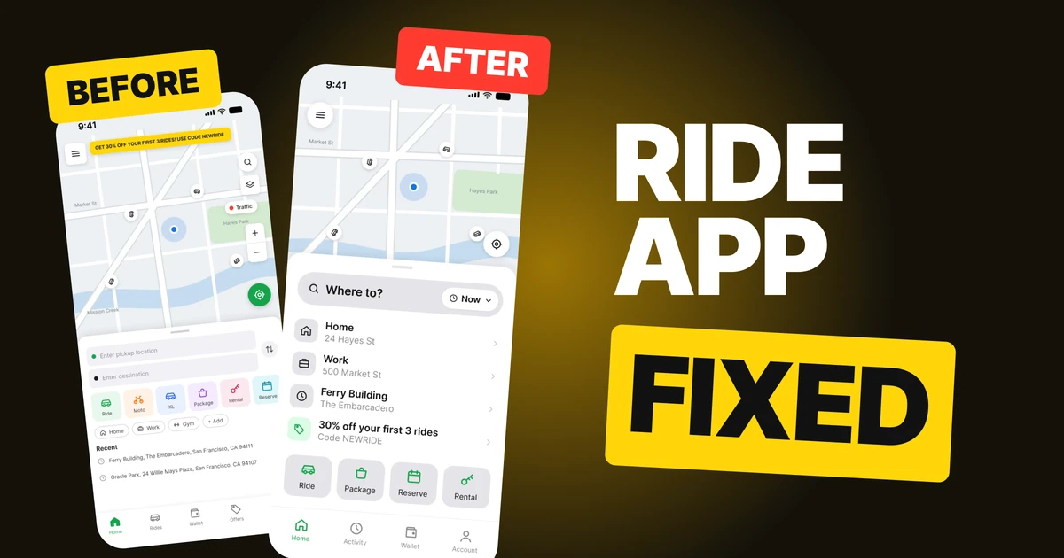
Navigation App Design: A Driving Screen Redesign, Before and After
A driving navigation screen with seventeen controls and an 11 px instruction, and the same screen fixed: one big turn card, two map buttons, a speed limit sign you can read in a glance and a trip bar with one red End. Every change side by side, with the free Figma file.

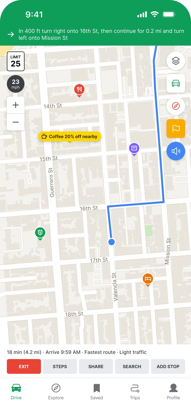
A driving screen has one rule: the driver gets about a second per look, and the next turn has to be readable in that second. The first draft below puts the turn in an 11 px sentence in a green bar, then surrounds the road with seventeen controls, an ad and four map pins. It has every feature a driver could want, and none of them can be read at speed.
The fix keeps every function. It makes the next turn the biggest thing on the screen and moves everything that is not about the next minute off the road.
The whole screen, before and after
Junior draft
Fixed
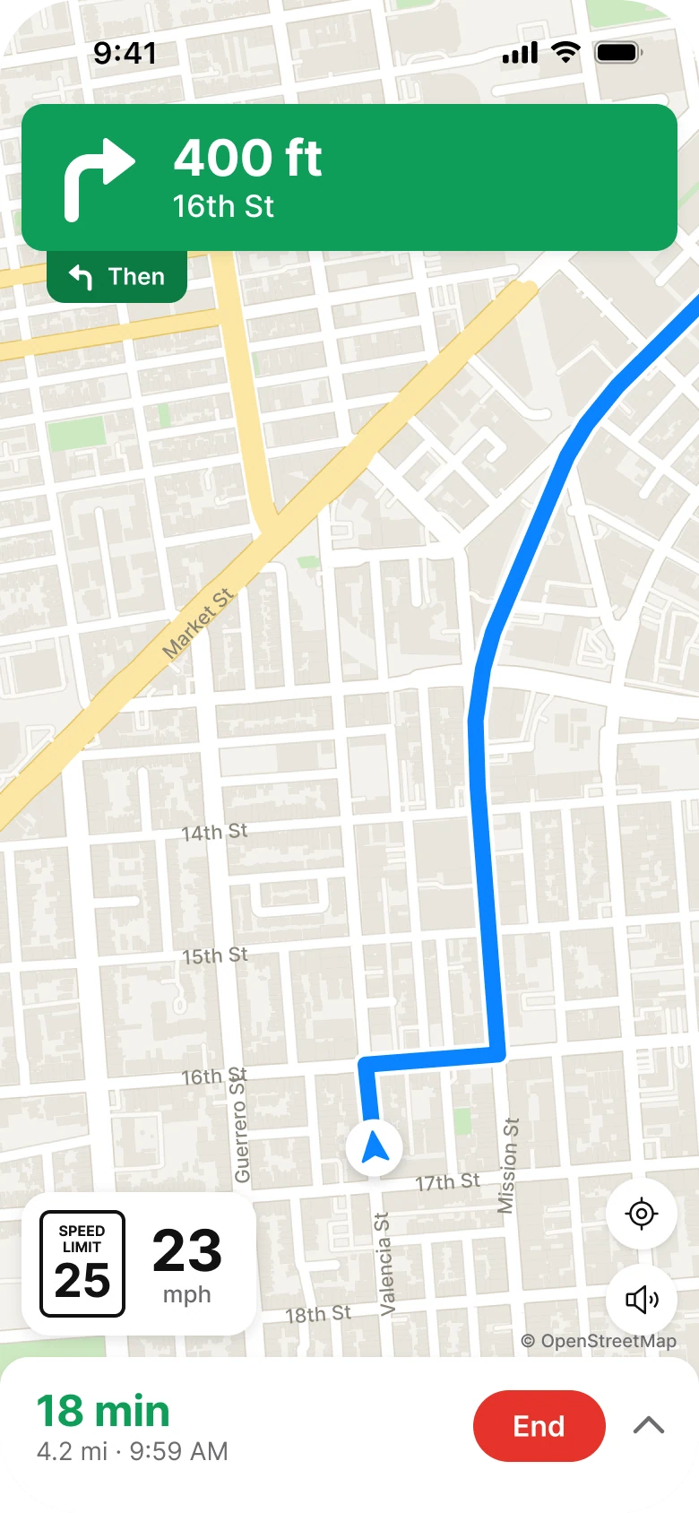
On the left, the instruction is a sentence. The driver has to read "In 400 ft turn right onto 16th St, then continue for 0.2 mi and turn left onto Mission St" at 11 px while the car moves. The route is a thin 4 px line, the car is a 13 px dot, and a coffee ad and four pins compete with the road for attention. The tab bar takes the bottom of the screen even though nobody switches tabs while driving.
On the right, the screen has three blocks: the turn at the top, the road in the middle and the trip at the bottom. The route is wide enough to follow, the car is a clear puck, and the map shows only the road.
What changed, measured
| Junior draft | Fixed | |
|---|---|---|
| Next turn | An 11 px sentence in a green bar | A card with a 52 pt arrow, 28 pt distance and 17 pt street |
| Turn after | Inside the same sentence | A small "Then" chip attached under the card |
| Route | 4 px line, 13 px dot for the car | 9 px blue route on a 14 px white casing, a 32 pt puck |
| Map buttons | Five at 38 px, circles and squares mixed, plus a zoom stack | Two 40 pt white circles: recenter and volume |
| Speed | A 36 px limit box and a 36 px speed circle | A 48 by 60 pt limit sign next to a 32 pt "23" |
| Trip bar | A 10 px line and five 30 px buttons in 9 px capitals | 24 pt "18 min" in green, the distance and arrival, one red End |
| Tabs | Five, with mixed filled and outline icons | None while driving |
| Controls on screen | Seventeen | Four |
Fix 1: turn the sentence into one big instruction
Before

After
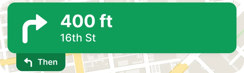
A thin green bar holding one line of small text that names two turns, against a green card with a large turn arrow, "400 ft" and "16th St", and a small "Then" chip with a left arrow attached under its left edge.
A driver needs three facts: which way, how far and where. The sentence holds them, but in the order a person speaks them, so the eye has to read left to right to find the one that matters. The second turn is buried at the end, where it gets read last or not at all.
The fix gives each fact its own size. The arrow says which way, the 400 ft says how far, and the street name sits below at a smaller size because it is the part you check against the street sign. The second turn becomes a small chip fixed to the card, so it reads as "and then" and not as a second instruction of equal weight.
Rule to reuse: when a person has one second, turn a sentence into a shape and a number.
Fix 2: keep two buttons on the map
Before
After
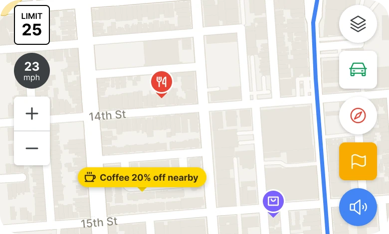
A map with five buttons down the right edge (layers, car, compass, flag and volume, some round and some square), a zoom stack on the left, a coffee ad and four pins, against a clean map with only two round white buttons at the bottom right: recenter and volume.
Every button on the road is something the driver can be tempted to tap while moving. The draft has five on the right, two for zoom on the left, and a mix of circle and square shapes that makes each one look like a different kind of thing. The ad and the four pins add more targets and more color on top of the route.
The fix keeps the two a driver uses mid-trip: recenter, when the map has been dragged, and volume. Zoom is a pinch. The layers, traffic, compass and report buttons move behind one chevron in the trip bar, so nothing was deleted, it was moved to where a passenger or a parked car can reach it. The ad and pins are gone from the road, because the route is the only thing that should be colored.
Rule to reuse: the fewer things that can be tapped while the car is moving, the fewer taps that happen.
Fix 3: draw the speed limit as the sign
Before
After
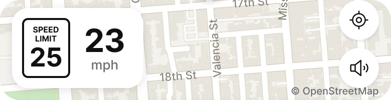
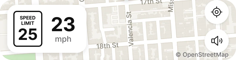
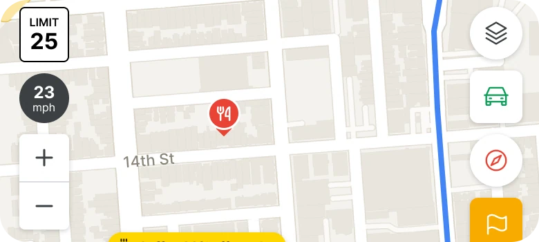
A small box reading LIMIT 25 and a dark circle reading 23 mph stacked on the left edge of the map, against one white chip holding a speed limit sign with SPEED LIMIT and a large 25, next to a large 23 and a small mph.
Drivers already know what a speed limit sign looks like: white, black border, the words SPEED LIMIT, a big number. The draft uses a tiny box and a dark circle that look like nothing the driver has seen, and puts them above each other so they have to be compared.
The fix draws the real sign at 48 by 60 pt, with a 2 px border and the number at 26 pt, and puts the current speed right beside it at 32 pt. Side by side, the two numbers answer one question: am I over? That takes a glance, with no reading.
Rule to reuse: when a real object already carries the meaning, draw the real object.
Fix 4: cut the trip down to what you check
Before

After
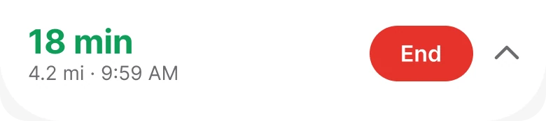
A 10 px line reading 18 min (4.2 mi), Arrive 9:59 AM, Fastest route, Light traffic, above five equal buttons: Exit, Steps, Share, Search and Add Stop, against a white sheet with 18 min in large green type, 4.2 mi and 9:59 AM below it, a red End button and a chevron.
During a trip a driver checks three things: how long is left, how far, and when do I arrive. The draft puts them in a 10 px line with two more facts, then adds five equal buttons in 9 px capitals, so "Exit", the one that ends the trip, looks the same as "Share".
The fix puts the time left at 24 pt in green, the distance and arrival under it, and one red End pill. Red because ending a trip is the one action with a cost. Steps, Share, Search and Add Stop move behind the chevron, one tap away for a passenger.
Rule to reuse: give the number people check the most the most room, and give the one costly action the one warning color.
The smaller fixes
- A second map. The fixed screen has its own map, cut wider and with the car low on the screen, so the route runs up and away from the car and shows the road ahead instead of the road just driven.
- A clean casing. The route has a 14 px white casing under a 9 px blue line, so it stays readable over yellow roads and gray blocks alike.
- No tab bar. The five tabs were removed from the driving view. Drive, Explore, Saved, Trips and Profile are for when the car is parked.
- One shape for buttons. Circles only, 40 pt, so the targets look like targets.
Audit your own driving screen
| Question | Why it matters |
|---|---|
| Can the next turn be read in one second? | A sentence is read, a shape and a number are seen |
| How many things can be tapped while the car moves? | Each one is a chance for a wrong tap |
| Is the speed limit drawn as the sign? | Drivers decode it without reading |
| Does the route stand out from the roads? | A thin line gets lost in a busy map |
| Is the one costly button the only red one? | Warning color works only once |
| Is anything on the map not about the next minute? | Ads and pins belong on the parked screen |
Get the Figma file
The free file has both screens, with every fixed part as a component.
Free Figma file
Driving navigation redesign, before and after
Both screens and every part as a Figma component. Free, view only, duplicate it to your drafts.
FAQ
What should a navigation app screen show while driving?
The next turn, the distance to it, the street name, the current speed and the speed limit, the time left and one way to end the trip. Everything else can sit behind one tap.
How big should the turn instruction be in a driving app?
Large enough to read in a glance: in this redesign the arrow is 52 pt and the distance is 28 pt. A one line sentence at 11 px has to be read, and a driver has no time to read.
How many buttons should a map screen have while driving?
Two is enough: recenter and volume. Zoom is a pinch, and layers, traffic and report can sit behind a chevron for a passenger or a parked car.
How should a speed limit be shown in an app?
As the sign drivers already know, with a border, the words SPEED LIMIT and a large number, next to the current speed so the two can be compared in a glance.
Why remove the tab bar from a navigation screen?
Nobody changes tabs while driving, and the bar takes space and attention from the road. It comes back when the trip ends.
What color should the End trip button be?
Red, and it should be the only red on the screen. Ending a trip is the one action with a cost, so it gets the one warning color.
Sources
- Both screens are our own, designed and measured in Figma. The app, Waymark, is made up, and 23 mph, a 25 limit, 18 min, 4.2 mi and 9:59 AM are illustrative and the same on both sides.
- The route follows real streets in San Francisco's Mission district: Valencia St, 16th St and Mission St. Map data: OpenStreetMap contributors.
- Icons: Phosphor Icons (MIT).
- First published as a carousel on App Brainy.
Want this for your own app? Our team redesigns app screens like this one, from the first audit to the finished components.
Get StartedGet new papers by email
New Brainy papers in your inbox. Confirm once, unsubscribe anytime.