Event Ticket App Design: A Home Screen Redesign, Before and After
A junior event tickets home screen with eight colored categories, a street address in 8 px and six facts on every row, and the same screen fixed on a dark ground. Every change side by side, the reason behind each, and the free Figma file.
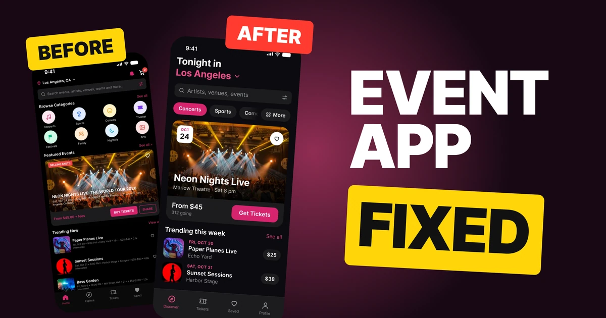
An event app sells one thing: a night out. The first draft below has the right events on it, then buries them. It opens with a 50-character search hint, eight colored categories, a street address at 8 px on the photo and six facts on every row. The fix keeps the events and the photos, and puts them on a dark ground that lets the photos glow.
The whole screen, before and after
Junior draft
Fixed
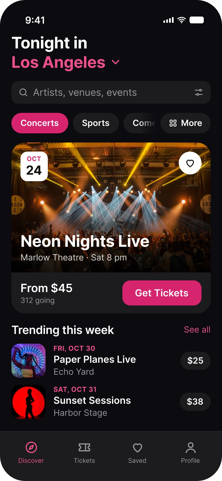
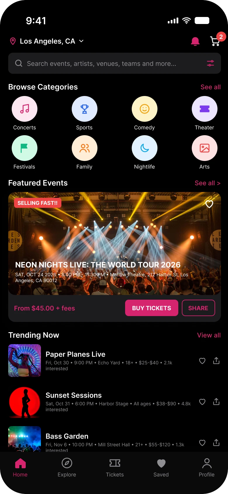
On the left, the screen has five sections and none of them is the star: a header with two icons, eight circles, a card with four things on its photo, and a list. On the right, the header is the question, the photo card is the star and the list is a list. Everything starts on the same 20 px edge, with 16 px between sections.
| Junior draft | Fixed | |
|---|---|---|
| Header | City, a bell and a cart | "Tonight in Los Angeles", 28 pt |
| Search hint | 50 characters | "Artists, venues, events" |
| Categories | 8 circles, 8 colors | 7 pills in one style, More pinned |
| Things on the featured photo | 4 | A date chip, a heart and the name |
| Buttons on the featured card | 3, in capitals | 1, "Get Tickets" |
| Facts on each trending row | 6 | Date, name, venue, price |
| Tabs | 5 | 4 |
| Text sizes | 8 to 13 px | 11 to 28 pt |
Fix 1: a big two-line header and one search field
Before

After
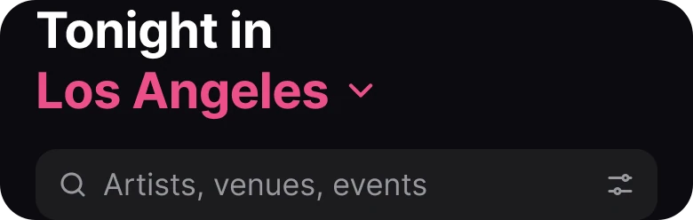
A small city label, a bell and a cart, against a large header that says what the screen is for.
The draft's top bar is a toolbar: the city in small bold type, a bell, a cart with a badge, then a search field with a 50-character hint, "Search events, artists, venues, teams and more...", and a filter icon. It tells the person where they are and gives them tools.
The fix gives them a sentence. "Tonight in" is white and "Los Angeles" is magenta with a small chevron, so it still changes the city. At 28 pt it is the biggest type on the screen.
The search field says "Artists, venues, events" and keeps its filter icon. The bell and the cart left the header, and this redesign does not draw where they go.
The rule to reuse: the top of a home screen should say what the screen is for, in words.
Fix 2: eight circles become one row of pills
Before
After

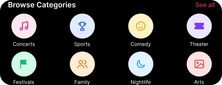
Two rows of eight different colors, against one row in one style with the chosen pill filled.
The draft's eight circles are pink, blue, yellow, purple, green, orange, light blue and rose, and they are the light-mode pastels left as they were on a black screen. They take two rows, and they ask the person to choose before any event has been shown.
The fix is one row of pills. Concerts is filled in the brand magenta, #D6246E, and the rest are plain dark pills. The row scrolls, so "Come..." is cut by the edge on purpose, which tells the person there is more to the right.
More is pinned at the end, so the full list is always one tap away. The category list changed from eight to seven pills, with the rest behind More.
The rule to reuse: filters should act like filters. One row, one selected state, one color.
Fix 3: one featured card with one button
Before
After
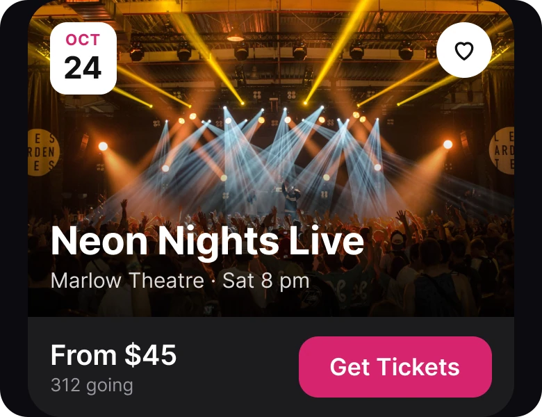
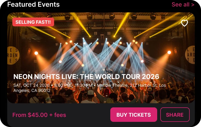
A photo with a tag, a long title, small details and two buttons, against a big photo, a name and one button.
The draft puts four things on the photo: a red "SELLING FAST!!" tag, a heart, a title in capitals, "NEON NIGHTS LIVE: THE WORLD TOUR 2026", and a line of date, time, venue and street address at 8 px. Below it sit a price with fees and two buttons, "BUY TICKETS" and "SHARE", in capitals. Most of the photo is covered by text.
The fix makes the photo 228 px tall and lets the stage show. The name sits on a soft black shade that runs from 0 to 78% under the title, so white type reads on any part of the photo. A white date chip, "OCT 24", replaces the date in the small line.
The venue and time shrink to "Marlow Theatre · Sat 8 pm". Under the photo, "From $45" and "312 going" sit on the left and one button, "Get Tickets", on the right. The tag, the street address and the Share button are gone.
The rule to reuse: one card, one action. The card's job is to get a tap, so give it one.
Fix 4: trending rows with a date, a venue and a price
Before
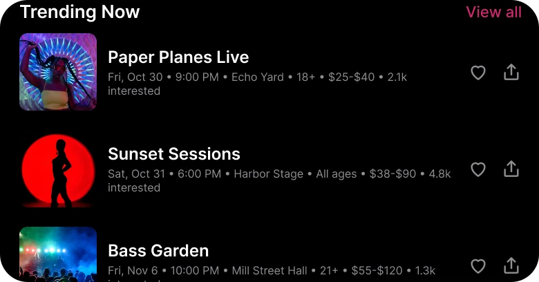
After
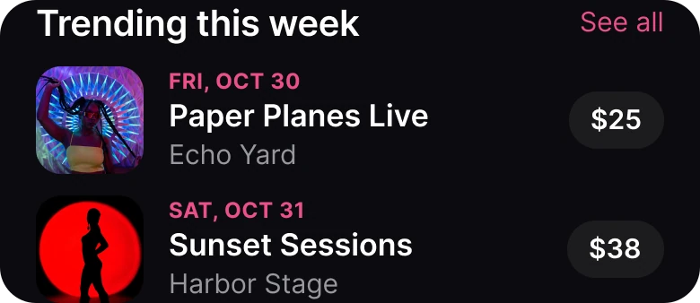
Six facts in one gray line and two icons, against a date, a name, a venue and a price.
Every row in the draft carries the name, the date, the time, the venue, an age limit, a price range and an interest count in one line of 8 px type that wraps. There is a heart and a share icon on every row, too. Read together they are a paragraph.
The fix gives each fact a place. The date sits on top in the brand color, in capitals: "FRI, OCT 30". The name is bold below it, the venue is gray below that, and the price sits at the right in a rounded chip, "$25", which is the starting price from the draft's "$25-$40".
The photo stays, as a square thumbnail. The age limit, the interest count, the heart and the share icon left the row, and a full app still needs a home for them.
The rule to reuse: when a row has many facts, rank them, and give the top four a place of their own.
The smaller fixes
- A dark ground that is not black. The draft sits on pure #000000 with the light-mode pastels left in. The fix uses a near black #0B0B0F with iOS dark surfaces, #1C1C1E, so cards lift off the ground.
- One accent, and a lighter one for text. The brand magenta #D6246E fills the selected pill and the buttons. A lighter tint, #EC4F88, is used for magenta text and icons on the dark ground, where the base magenta is too dim to read well.
- One left edge. The draft used 14 px on the left and 12 px on the right. The fix uses 20 px on both sides and 16 px between sections.
Audit your own event app
| Question | Why it matters |
|---|---|
| Does the header say what the screen is for? | A sentence orients faster than a toolbar |
| Are the categories one row in one style? | Eight colors read as eight choices |
| Does the featured card have one button? | Two buttons split the tap |
| Is any text on a photo smaller than 12 pt? | It cannot be read on the move |
| Can you name the four facts on a trending row? | Six facts in one line are read as none |
Get the Figma file
The free file has both screens as components, every fix as a before and after pair, the color variables and the iOS text styles.
Free Figma file
Event tickets home screen, before and after
Both screens and every fixed part as Figma components. Free, view only, duplicate it to your drafts.
FAQ
What should an event ticket app home screen show first?
A header that says what the screen is for, such as "Tonight in Los Angeles", then one search field and a row of category pills. The featured event comes straight after.
How do you design a featured event card?
One big photo, the event's name on a soft shade, the date as a chip, the price and one button. Keep the street address, the tags and the share button for the event page.
How many categories should an event app show?
Seven or so pills in a single scrolling row, with the selected one filled and More pinned at the end. Eight colored circles in two rows ask the person to choose too early.
Should an event app use dark mode?
It suits events, because stage and crowd photos glow on a dark ground. Use a near black such as #0B0B0F with lighter surfaces, not pure black with light-mode colors left in.
How do you show event details in a list?
Rank them: the date first in the accent color, then the name, the venue and the price. Leave the age limit, the interest count and the extra icons for the detail page.
Sources
- Both screens are our own, designed and measured in Figma. Event names, venues and the street address are made up; dates are checked against the 2026 calendar.
- Photos via Pexels by Thibault Trillet (the featured stage, on both screens), Sid Dalal, julio cesar resendiz resendiz, Maor Attias and Martin Lopez.
- Contrast checked with the WCAG 2.2 contrast formula: white text on #D6246E is 4.8:1, and #EC4F88 on the dark ground is 5.7:1, where #D6246E would be 4.1:1.
- Apple Human Interface Guidelines: Typography, for the iOS text sizes used in the fixed screen.
- First published as a carousel on App Brainy.
Want this for your own app? Our team redesigns app screens like this one, from the first audit to the finished components.
Get StartedGet new papers by email
New Brainy papers in your inbox. Confirm once, unsubscribe anytime.