Coffee App Design: An Order Home Screen Redesign, Before and After
A coffee ordering home screen with a 54-character store line, a loud points banner, eight tabs running off the edge and an ADD button under every photo, and the same screen fixed. Every change side by side, the reason behind each, and the free Figma file.

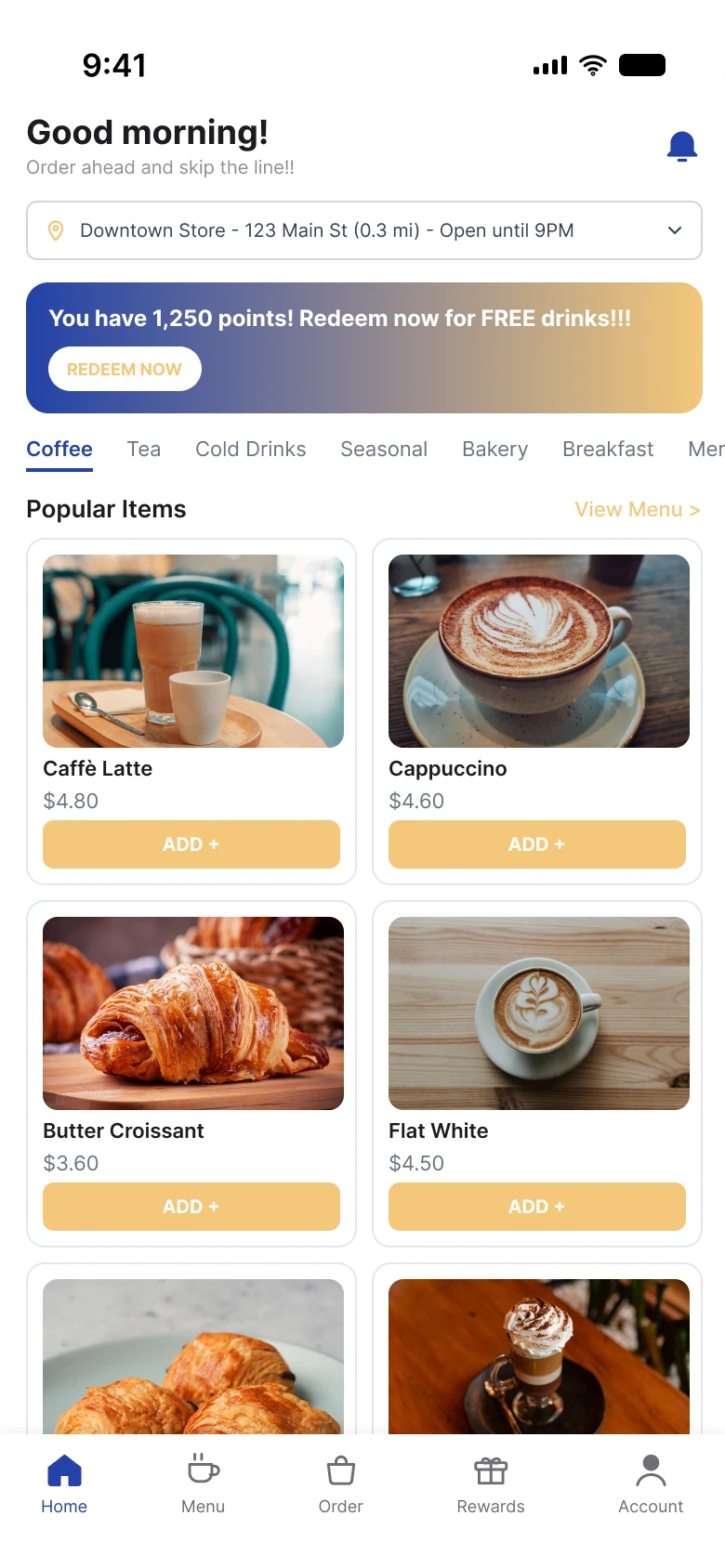
A person opens a coffee app to do one thing: order a drink and pick it up. The first draft below has the right things on it, and it says all of them at once: a long store line, a banner that shouts about points, eight tabs and an ADD button under every photo. The fix keeps the store, the points and the menu, and gives each one a single, quiet place.
The whole screen, before and after
Junior draft
Fixed
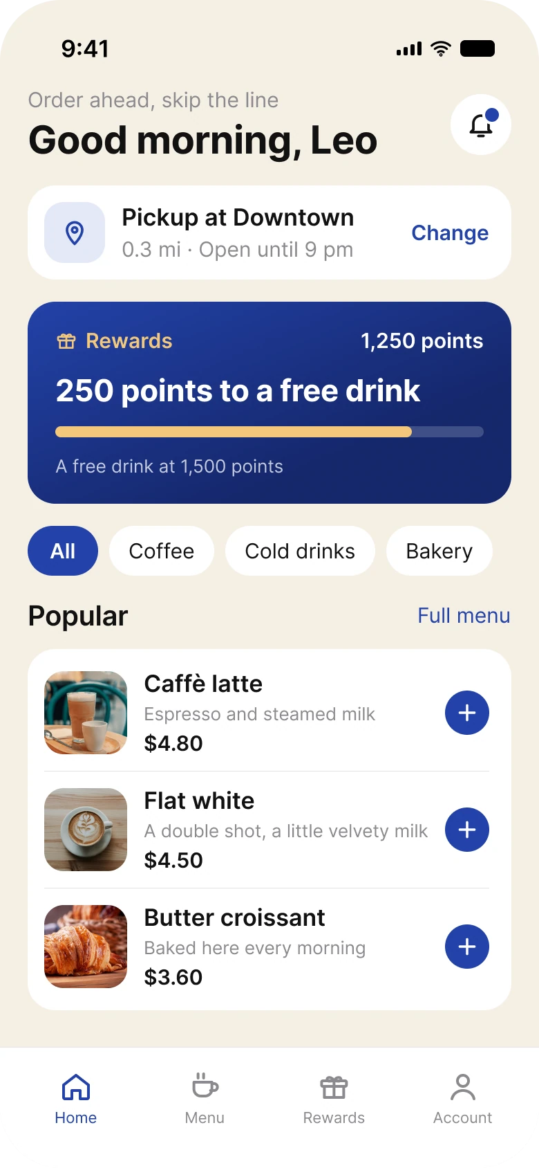
On the left, a person meets a greeting, a store line, a points banner, a tab strip and a grid of buttons, all at the same loudness. On the right, there is one thing to read per block and one action per row.
| Junior draft | Fixed | |
|---|---|---|
| Store | A 54-character line in a bordered box | One pickup card with a Change link |
| Points | A banner with three exclamation marks | A progress card: 250 points to a free drink |
| Category tabs | 8, running off the edge | 4 chips, one selected |
| Items | A 2 by 3 grid of cards | Rows with a 60 px photo |
| Add buttons | A wide butter ADD under every photo | One round button per row |
| Tabs in the bar | 5 | 4 |
| Side margin | 14 px left, 12 px right | 20 px, with 16 px between blocks |
| Text sizes | 9 to 18 px | 11 to 28 pt |
Fix 1: say where, once
Before
After
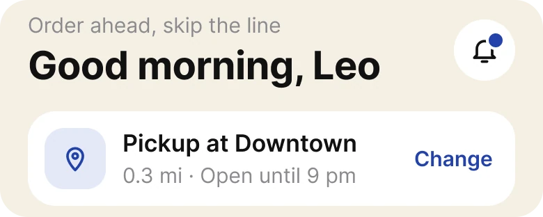
A store line packed into a box, against a pickup card.
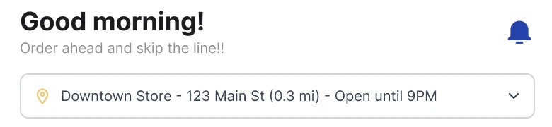
The draft packs the store into one line: "Downtown Store - 123 Main St (0.3 mi) - Open until 9PM", 54 characters in small type inside a bordered box with a chevron at the end. The name, the street, the distance and the hours all weigh the same, so the eye reads the whole line to find the one fact it needs.
The fix turns the line into a pickup card. "Pickup at Downtown" is the title, "0.3 mi · Open until 9 pm" is one gray line under it, and "Change" sits at the right in the brand blue as a real action. The street address is not on the home screen. The greeting grew to a large "Good morning, Leo", and the exclamation marks are gone.
The rule to reuse: split a long line into a title, one detail and one action. A box with a chevron says "tap me" less clearly than a word that says "Change".
Fix 2: points as progress
Before
After
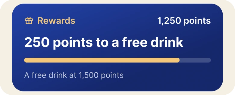
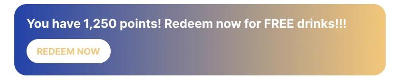
A shouting banner, against a progress bar.
The draft's banner fades from blue into butter yellow, and its white text sits on the yellow end, where it is hardest to read. It says "You have 1,250 points! Redeem now for FREE drinks!!!" and the Redeem Now pill below it is white with pale yellow text. It says they have points, but not how close they are to anything.
The fix is one deep blue card. "Rewards" and "1,250 points" sit on top, and the large line is "250 points to a free drink". A butter progress bar below fills 83%, which is 1,250 of 1,500, and the small line says where the free drink is. The person sees the distance, which is the interesting number.
The rule to reuse: a points balance is a number, and progress is a story. Show the story, then let the number sit on the side.
Fix 3: four chips, one selected
Before

After

Eight tabs running off the edge, against four chips.
The draft has eight categories: Coffee, Tea, Cold Drinks, Seasonal, Bakery, Breakfast, Merch and Gift Cards. They run off the right edge, so "Merch" is cut to "Mer", and the person has to scroll sideways to learn there are more. The selected one is marked by a thin underline.
The fix shows four chips: All, Coffee, Cold drinks and Bakery. All is filled in the cafe blue and the others are white, so the selected one is clear in a glance. The other categories are not on this screen; a real app would keep them in the Menu tab, one tap away.
The rule to reuse: a filter row should fit on the screen. If it needs a sideways scroll to show its own list, show fewer.
Fix 4: one row per item
Before
After
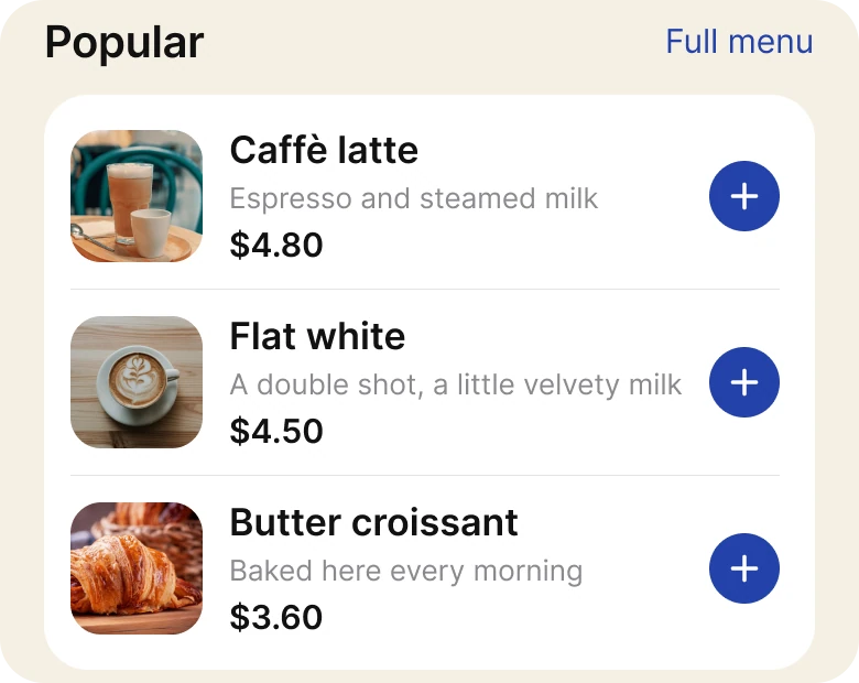
A grid of cards with a butter button under each, against three rows.
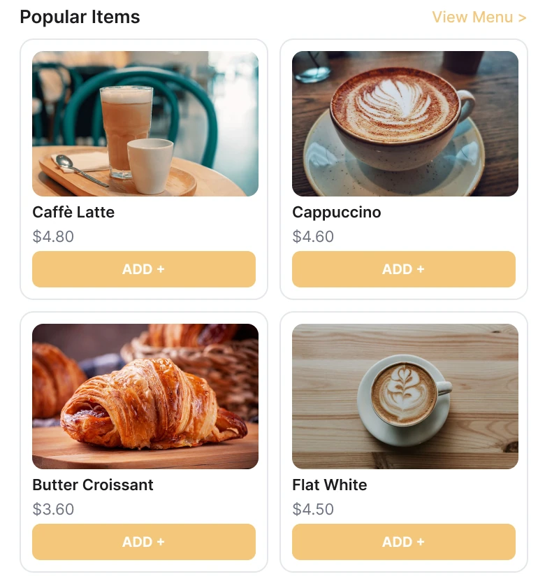
The draft shows items as a grid of cards: a large photo, a name, a price and a butter "ADD +" button in capitals. Two and a half rows of cards fill the screen below the tabs, the butter on the buttons repeats under every photo, and the "View Menu" link is pale yellow on white.
The fix makes each item a row with a 60 px photo, the name, one gray line and the price, and one round blue "+" at the right. Three rows fit in a card where the grid showed two and a half cards, and the only button in each row is the add button. "Full menu" is in the brand blue.
The rule to reuse: when every item has the same action, the action should be small and aligned, so the eye reads names and prices down one edge.
The smaller fixes
- One left edge. The draft's margins were 14 px on the left and 12 px on the right. The fix uses 20 px on both sides and 16 px between blocks.
- A real type scale. Text went from 9 to 18 px to iOS sizes of 11 to 28 pt.
- Four tabs, not five. Home, Menu, Order, Rewards and Account became Home, Menu, Rewards and Account. The Order tab left the bar.
- A palette of four. Cafe cobalt #2342A8, deep blue #15276B, butter #F3C77A and cream #F5EFE4 replace a gradient and a gray ground.
Audit your own ordering screen
| Question | Why it matters |
|---|---|
| Can the person read the pickup store at a glance? | It decides whether they can order at all |
| Do rewards show progress or only a balance? | Distance is the interesting number |
| Does the category row fit without a sideways scroll? | A cut off tab hides what else exists |
| Does every item repeat a wide button? | One small add button per row is enough |
FAQ
What should a coffee ordering app home screen show first?
The pickup store on one card with a Change link, then the rewards progress, then the categories and the popular items. The person should see where they are ordering before what.
How do you design a loyalty points section?
Show the distance to the next reward as a progress bar and a plain line, such as "250 points to a free drink", and put the balance on the side.
How many category tabs should a menu have?
As many as fit on the screen without a sideways scroll, usually four. Put the rest in the Menu tab, one tap away.
Should a menu use a grid or a list?
A list of rows works better for ordering, because the names and prices line up on one edge and each row needs one small add button. A grid suits browsing photos.
How big should an add button be?
At least 44 by 44 points to tap, even when the visible circle is smaller. The fixed screen uses one round blue button per row.
Sources
- Both screens are our own, designed and measured in Figma. The store, its address, the prices and the points are made up.
- Menu photos via Pexels by Duc Nguyen, Melissa Jansen van Rensburg, Marcelo Verfe, Juan Pablo Serrano, Skyler Ewing and Vinícius Vieira ft.
- Apple Human Interface Guidelines: Typography, for the iOS text sizes used in the fixed screen.
- Apple Human Interface Guidelines: Accessibility, for the 44 pt touch target size.
- Kivetz, Urminsky and Zheng, The Goal-Gradient Hypothesis Resurrected, Journal of Marketing Research, 2006, for customers buying more often as a loyalty card fills.
- First published as a carousel on App Brainy.
Want this for your own app? Our team redesigns ordering apps like this one, from the first audit to the finished components.
Get StartedGet new papers by email
New Brainy papers in your inbox. Confirm once, unsubscribe anytime.