Streaming App Design: A Dark Home Screen Redesign, Before and After
A dark streaming app home screen with six facts in one 9 px line, three buttons of the same weight and red mixed into a cyan brand, and the same screen fixed. Every change side by side, the reason behind each, and the free Figma file.

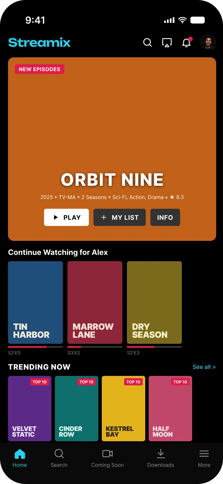
A person opens a streaming app to press play. The first draft below has a good show to sell, and it surrounds the one button that matters with other things: a header of four icons, a line of six facts in 9 px type, three buttons of the same weight, and red badges on a cyan app. The fix keeps the same show and the same rows, and makes the order of the screen match the order of what a viewer does.
The whole screen, before and after
Junior draft
Fixed
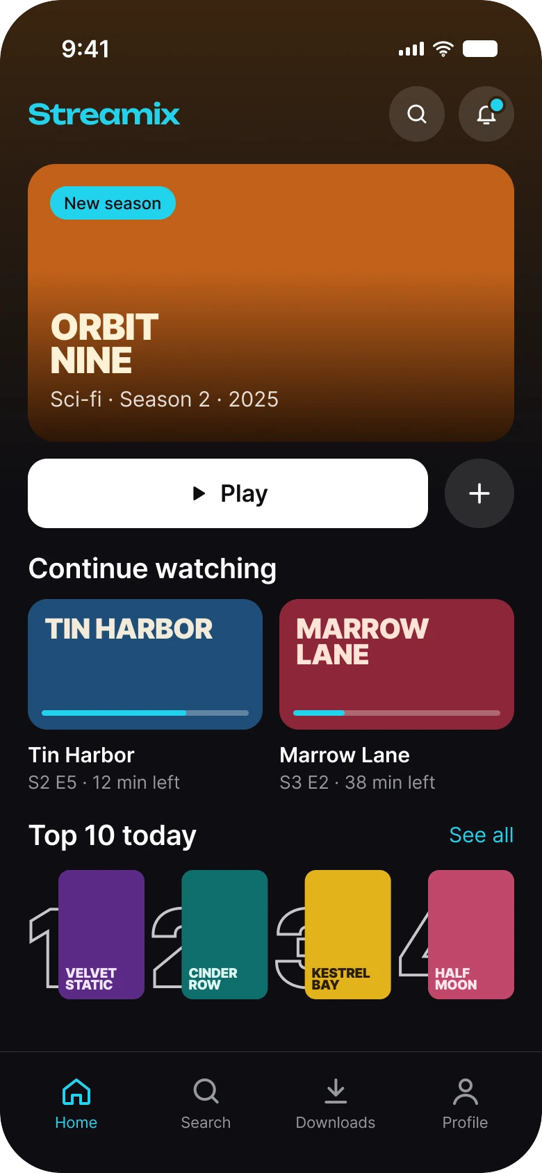
On the left, the first thing in the hero is a title in capitals and a line too small to read. On the right, the hero has a name, one line and one button.
| Junior draft | Fixed | |
|---|---|---|
| Header | Wordmark, 4 icons | Wordmark, 2 buttons of 40 px |
| Hero facts | 6 in one 9 px line | One short line |
| Hero buttons | 3 in capitals, same weight | 1 big Play, 1 plus button |
| Continue row | 3 tall posters, 10 px labels | 2 wide cards with the time left |
| Top row | 4 posters, each with the same TOP 10 chip | 4 posters with ranks 1 to 4 |
| Colors in use | Cyan, plus red badges and red bars | One cyan for progress and links |
| Ground | Pure black #000000 | Fades from amber #3A2510 to #0E0E12 |
| Tabs | 5 | 4 |
| Side margin | 14 px left, 12 px right | 20 px, with 16 px between sections |
| Text sizes | 7 to 30 px | 11 to 28 pt |
Fix 1: a header that does two jobs
Before

After

Four small icons, against two round buttons.
The draft's header holds search, cast, a bell with a red dot and the viewer's avatar, each about 20 px wide. The row is busy, and the avatar duplicates the Profile tab at the bottom.
The fix keeps search and notifications, as two 40 px round buttons, and drops the cast icon and the avatar. The bell's dot is cyan. The profile already has its tab, so the header does not need to repeat it.
The rule to reuse: every control should live in one place. If the tab bar has Profile, the header does not need a profile picture.
Fix 2: one Play button
Before
After
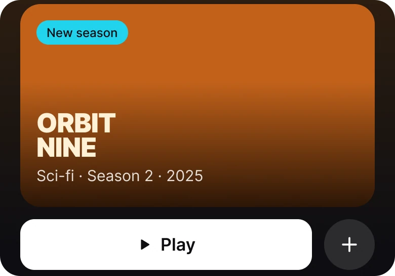
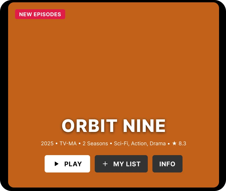
A title, a tiny facts line and three buttons, against a title, one line and one button.
The hero is the most valuable space on the screen, and the draft fills it. The title is set in capitals in the lower middle of the poster, under a red "NEW EPISODES" chip. Below it a 9 px line holds six facts: "2025 • TV-MA • 2 Seasons • Sci-Fi, Action, Drama • ★ 8.3". Then come three buttons, PLAY, MY LIST and INFO, all in capitals and all about the same weight, so the viewer has to pick before pressing.
The fix moves the title to the lower left of the image, with a dark fade under it so it stays readable, and one short line under the title: "Sci-fi · Season 2 · 2025". The chip says "New season" in the brand cyan.
Under the image, one wide white "Play" button takes most of the width, and a round "+" sits beside it for the list. INFO is not on the screen.
The rule to reuse: a hero needs one action. Give it the biggest button on the screen and make everything else smaller.
Fix 3: wide cards that say how much is left
Before
After
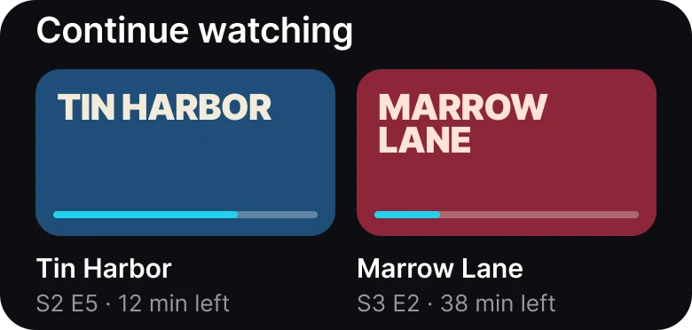
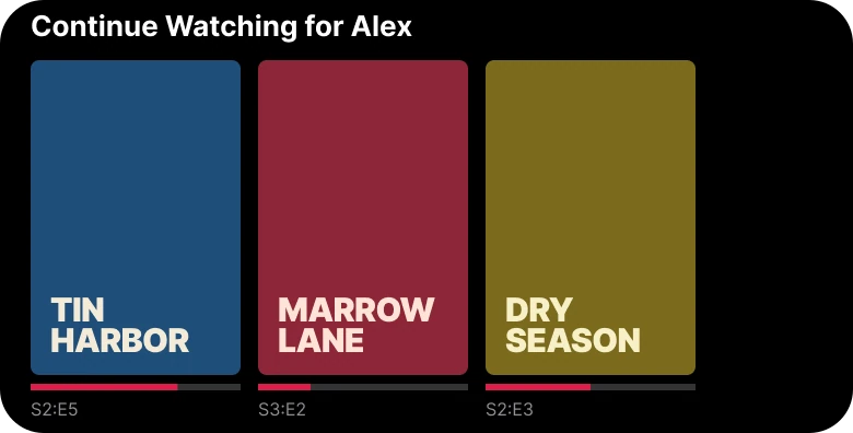
Three tall posters with a thin red bar, against two wide cards with the time left.
The draft's "Continue Watching for Alex" row shows three tall posters. Each has a 3 px red progress bar under it and a label such as "S2:E5" in 10 px type. A poster says what the show is. It does not say where the viewer stopped, and the red bar is a second color in a cyan app.
The fix uses two wide cards, with the progress bar inside the image in cyan and a title under each. The line under the title says "S2 E5 · 12 min left", which answers the question a person asks when they pick something up: do I have time for this?
The rule to reuse: a continue row is for the viewer's place. Show the time left, not only the episode code.
Fix 4: ranks you can read
Before
After
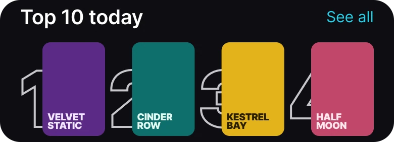
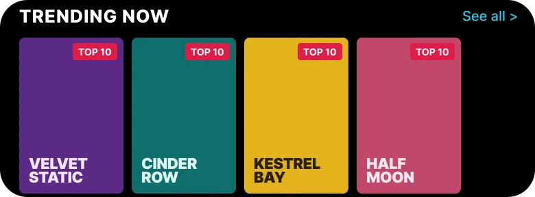
Four posters with the same chip, against four posters with their ranks.
The draft's "TRENDING NOW" row has four posters, and each wears the same red "TOP 10" chip. The chip says every one of them is in the top ten, and it does not say which place. The viewer cannot tell the first from the fourth.
The fix renames the row "Top 10 today" and puts a large outlined number beside each poster: 1, 2, 3, 4. The row now has an order to read from left to right. The "See all" link uses the brand cyan, the same color as the progress bars.
The rule to reuse: a ranking should show the rank. A badge that is the same on every item is decoration.
The smaller fixes
- One brand color. The fix uses cyan #22D3EE for the wordmark, progress and links. The red badges and red progress bars are gone.
- A ground that matches the hero. The fix fades from the hero's amber, #3A2510, into #0E0E12, so the first screen feels like one image. The draft sits on pure black, #000000.
- One left edge. The draft's margins were 14 px on the left and 12 px on the right. The fix uses 20 px on both sides and 16 px between sections.
- A real type scale. Text went from 7 to 30 px to iOS sizes of 11 to 28 pt.
- Four tabs, not five. Home, Search, Coming Soon, Downloads and More became Home, Search, Downloads and Profile.
Audit your own streaming screen
| Question | Why it matters |
|---|---|
| Does the hero have one button that is bigger than all the others? | A hero needs one action |
| Does the continue row say how much is left? | It answers whether there is time |
| Does a ranking row show the rank? | A chip that repeats says nothing |
| Does the screen use more than one accent color? | A second accent competes with the first |
FAQ
What should a streaming app home screen show first?
A hero with the show's title, one short line of facts and one big Play button. The viewer's own place, the continue watching row, comes right after it.
How many buttons should a hero banner have?
One main button, and at most one small secondary button such as a plus for the list. Three buttons of the same weight make the viewer choose before they press play.
How do you design a continue watching row?
Use wide cards with a progress bar, the title and the time left, such as "12 min left". A tall poster shows what the show is, and a wide card shows where the viewer stopped.
How do you design a Top 10 row?
Put a large rank number beside each poster so the row has an order. A badge that reads "Top 10" on every poster does not say which place the show holds.
What colors work for a dark streaming app?
One accent color for progress and links, on a dark ground. The fixed screen uses cyan #22D3EE on a ground that fades from the hero's amber to #0E0E12.
What font size should a streaming app use?
The platform text scale. The fixed screen uses iOS sizes from 11 to 28 pt, so nothing in the hero is under 11.
Sources
- Both screens are our own, designed and measured in Figma. The viewer, the shows and the Streamix app are made up, and every poster is a flat color with a title set in type.
- Avatar photo via Pexels by Amir SeilSepour.
- Apple Human Interface Guidelines: Typography, for the iOS text sizes used in the fixed screen.
- Apple Human Interface Guidelines: Dark Mode, for designing an interface that works on a dark ground.
- First published as a carousel on App Brainy.
Want this for your own app? Our team redesigns streaming and media apps like this one, from the first audit to the finished components.
Get StartedGet new papers by email
New Brainy papers in your inbox. Confirm once, unsubscribe anytime.