Ride App Design: A Ride Hailing Home Screen, Before and After
A junior ride hailing home screen with six map controls, a promo banner and two address fields, and the same screen fixed. Every change side by side, the reason behind each, and the free Figma file.
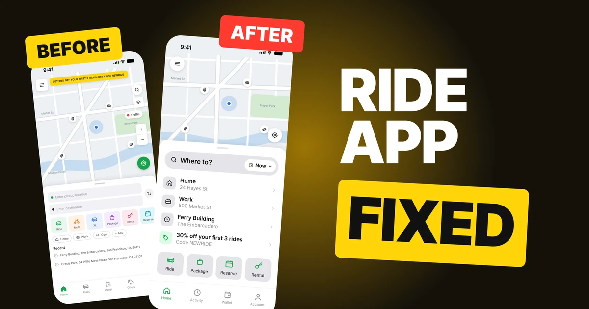
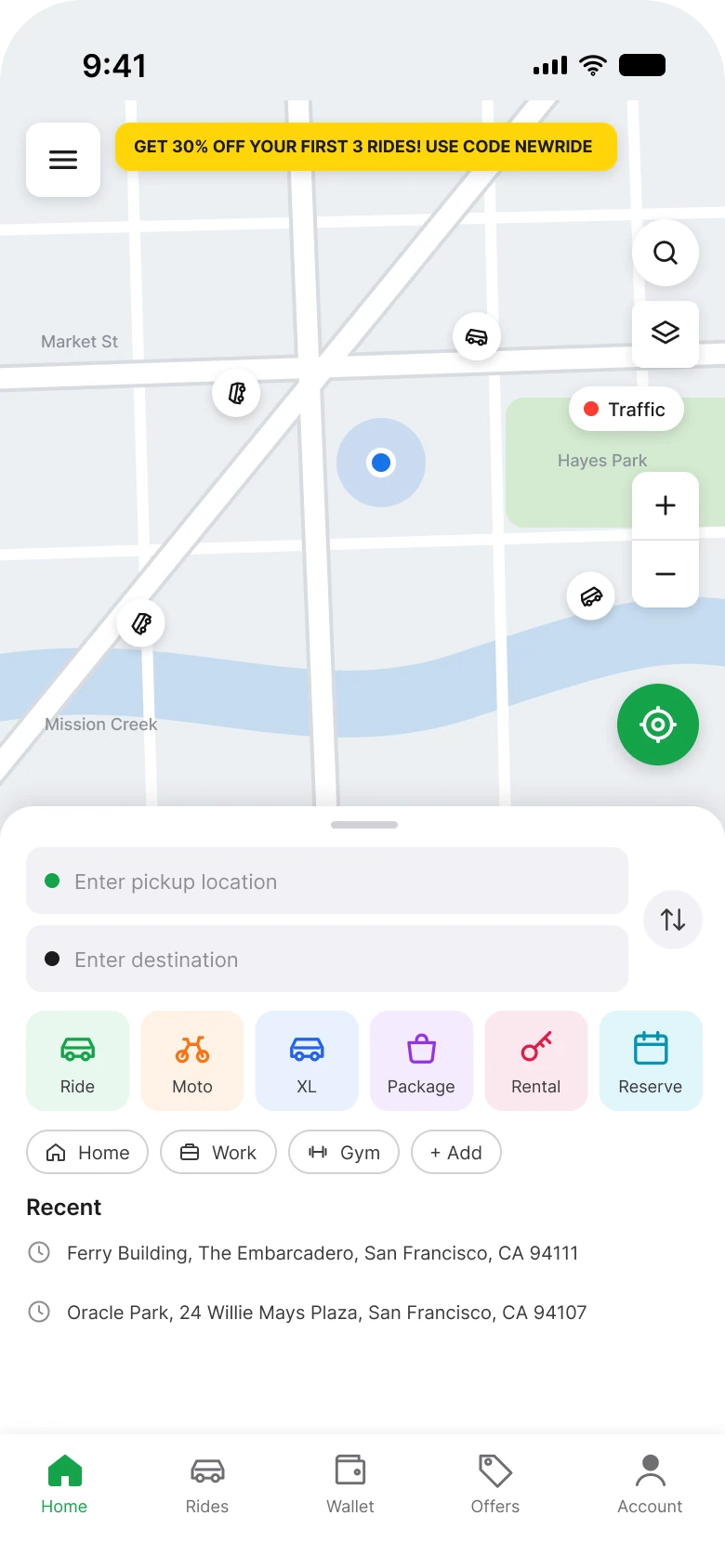
Someone opening a ride app is usually standing somewhere and wants to be somewhere else. The first draft below works, and it asks a lot of them before the first tap: a map wearing six floating controls and a yellow banner, a sheet with two address fields, six services in six colors and a row of chips. The fix keeps every capability that matters and asks one question.
The whole screen, before and after
Junior draft
Fixed
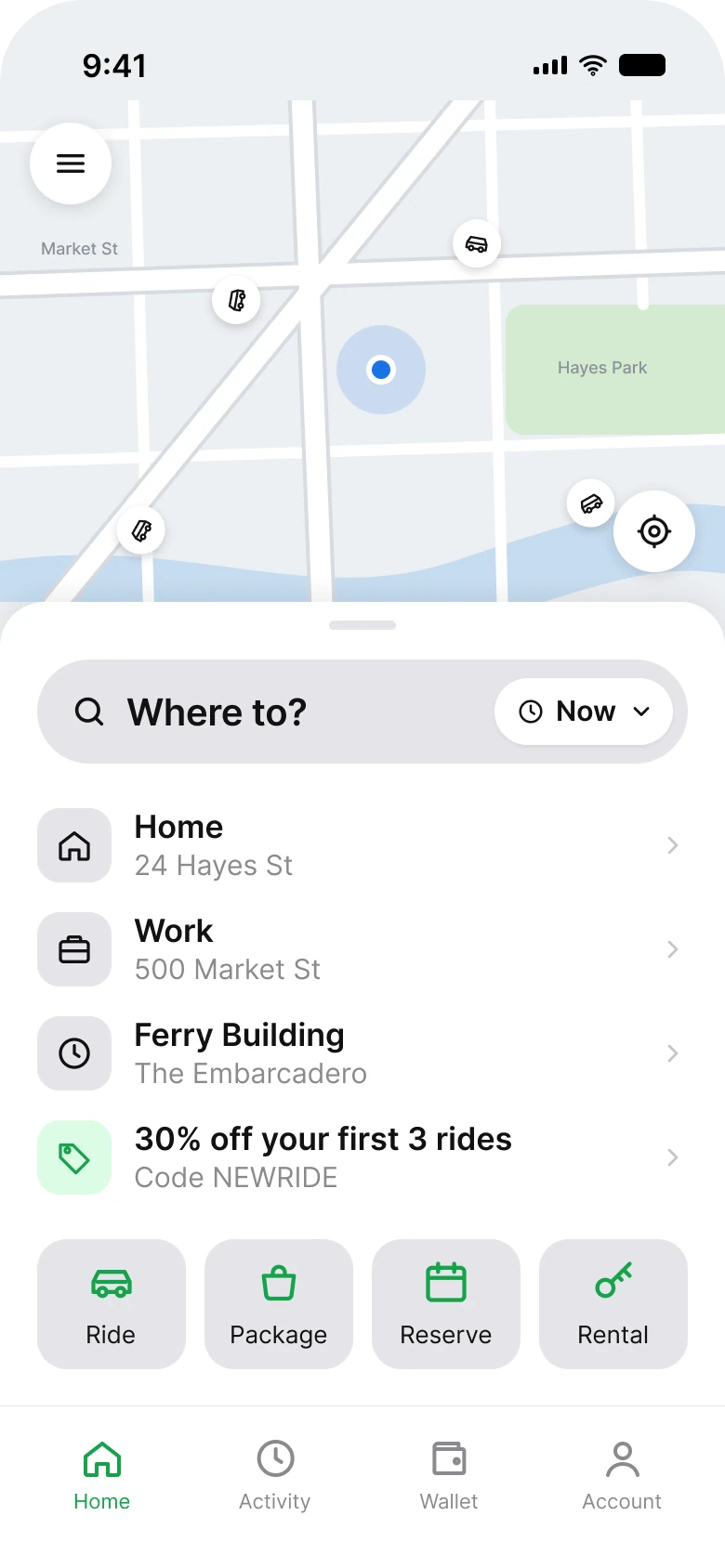
On the left, the map is covered in controls and the sheet is a form. On the right, the map is a map, and the sheet has a field, four rows and four services. The map also got shorter, from 380 px tall to 270 px, so the sheet that matters starts higher.
| Junior draft | Fixed | |
|---|---|---|
| Map controls | 6, in four shapes | 2 |
| Address fields | 2 and a swap button | 1, "Where to?" |
| Services | 6, on six tinted grounds | 4, in one style |
| Promo | Yellow banner in capitals | One row, "Code NEWRIDE" |
| Recent places | 2, full addresses on one line | Rows with a name and a short address |
| Tabs | 5 | 4 |
| Side margin | 14 px left, 12 px right | 20 px on both sides |
| Text sizes | 9 to 12 px | 13 to 17 pt |
Fix 1: two buttons on the map
Before
After
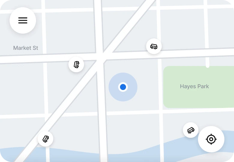
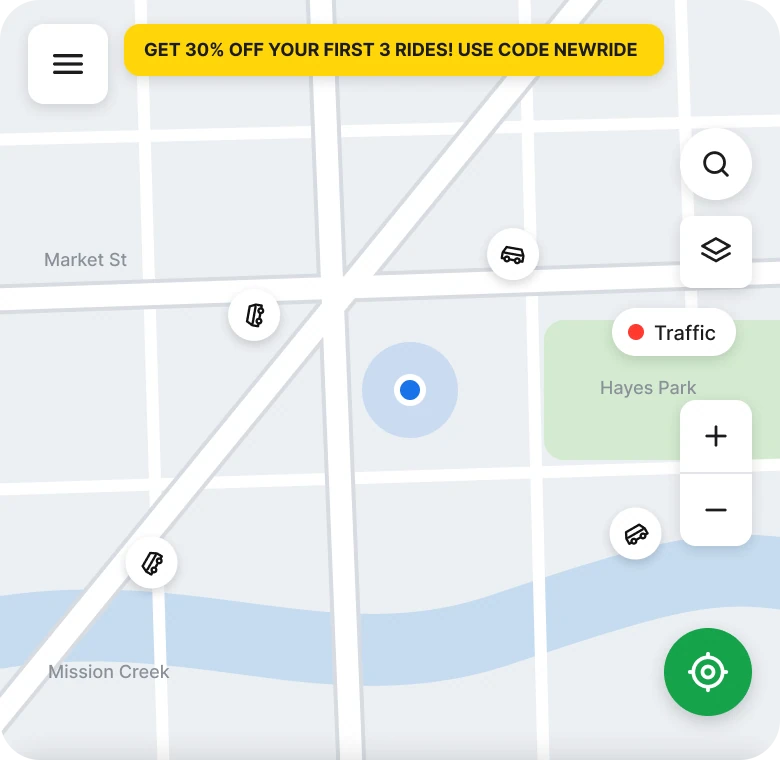
Six controls in four shapes and a banner, against a menu and a locate button.
The draft puts a menu square, a search circle, a layers square, a Traffic pill, a zoom stack and a green locate circle on top of the streets, and a promo banner in capitals across the top. All of them are things a rider could want. None of them is the thing a rider came to do, and together they cover the map the person is trying to read.
The fix keeps two 44 px buttons: the menu and your location. The search circle was a second way into the same search the sheet already has. The banner moved down into the sheet as one row.
Layers, Traffic and the zoom stack are not on this screen, and this redesign does not draw where they live, so a real app needs a home for them. Pinch zoom on a map does not need two buttons.
The rule to reuse: put on the map only the controls that change what you see right now, and give the rest a different home.
Fix 2: one question instead of two fields
Before
After
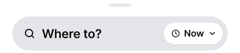
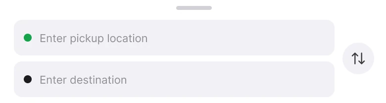
Two address fields and a swap button, against one field that asks Where to.
The draft opens a form: a pickup field with a green dot, a destination field with a black dot and a swap arrow. The map above already has a blue dot on it that shows where the rider is, so the first field asks for something the screen already says.
The fix asks "Where to?" in a 52 px field. On the right sits a Now chip, which is where the time lives: a person who wants a ride later changes it, and everyone else never reads it. The swap button went away along with the pickup field.
The rule to reuse: ask the one thing you do not know, and make the thing you can guess a chip that can be changed.
Fix 3: four services in one style
Before

After

Six services on six colors, against four on one gray with one green.
When every service has its own color, color stops meaning anything. The draft's six tiles are green, orange, blue, purple, pink and cyan, and each icon repeats its tile's color, at 9 to 12 px text. Nothing on the row says which one a rider usually wants.
The fix draws four services, Ride, Package, Reserve and Rental, as large tiles on one soft gray with icons in the brand green, #16A34A. They are wide enough to tap and read at once. Moto and XL are not on this home screen, which is a trade this redesign does not hide, because it does not draw where they go.
The rule to reuse: let one brand color mean "this is the app", and let shape and icon tell the choices apart.
Fix 4: saved places as rows, with the address
Before
After
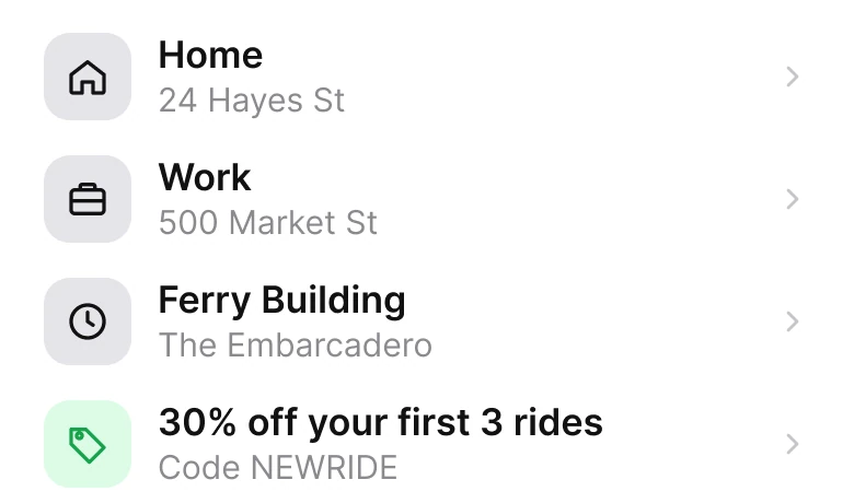
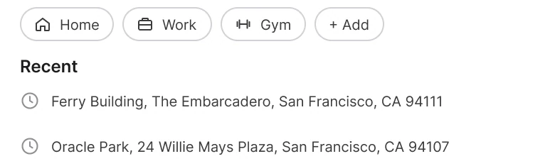
Chips with no addresses and two long recent lines, against rows with a name, an address and a tap target.
A chip that says "Home" tells the rider where they are going only if they trust it. The draft's chips do not show an address, and the recents below them are long lines like "Ferry Building, The Embarcadero, San Francisco, CA 94111", written to the postcode in 12 px.
The fix makes each of them a row: an icon, the name in bold and a short address below it, "Home, 24 Hayes St". Ferry Building is a recent place, with "The Embarcadero" under it, and the city and postcode are gone because the rider is already in that city. The 30% off became the fourth row, with a green tag and "Code NEWRIDE" under it, in the same size as the places.
The offer is still there. It no longer shouts across the map.
The rule to reuse: a shortcut should show where it goes, and a promo can be a row.
The smaller fixes
- One left edge. The draft's sheet used 14 px on the left and 12 px on the right. The fix uses 20 px on both sides.
- One accent. The draft used yellow for the banner, green for the locate button and six tints for services. The fix uses the brand green for the active tab, the service icons and the offer tag, and gray for the rest.
- A real type scale. Text went from 9 to 12 px to iOS sizes of 13 to 17 pt.
- Four tabs, not five. Home, Rides, Wallet, Offers and Account became Home, Activity, Wallet and Account. Offers is gone, because the offer is now a row on Home.
- A shorter map. The map went from 380 px to 270 px tall, so the question sits higher.
Audit your own ride app
| Question | Why it matters |
|---|---|
| How many controls sit on the map? | Each one covers a street |
| Do you ask the rider for something the screen already knows? | A pickup field repeats the blue dot |
| Does each service color mean something? | If it does not, use one color |
| Does each shortcut show its address? | A chip that hides where it goes is a guess |
| Is the promo a row or a banner? | A banner covers the map |
| Is the time a chip? | Most rides are now |
Get the Figma file
The free file has both screens as components, every fix as a before and after pair, the color variables and the iOS text styles.
Free Figma file
Ride app home screen, before and after
Both screens and every fixed part as Figma components. Free, view only, duplicate it to your drafts.
FAQ
What should a ride hailing app home screen show?
A map with two buttons, a single "Where to?" field and a few shortcuts underneath. Services, saved places and offers belong in the sheet, not on the map.
How many controls should a map screen have?
Two is enough on the home screen: the menu and your location. Layers, traffic and zoom can live elsewhere, since maps zoom with a pinch.
How do you design the "Where to" search field?
Make it one large field with the question inside it and a Now chip at the right for the time. Do not ask for pickup first when the map already shows where the person is.
How should a ride app show services like Ride, XL and Package?
In one style, as large tiles, with icons in the brand color. Four fit on the home screen; the rest need a place of their own.
How do you show promo codes in a ride app?
As one row in the same style as the places, with a short title and the code under it. A banner on the map covers the thing riders came to read.
What font size should a ride app use?
The platform text scale. The fixed screen uses iOS sizes from 13 to 17 pt, with 44 px map buttons.
Sources
- Both screens are our own, designed and measured in Figma. The map is our own vector drawing of streets, a park and a creek. Ferry Building and Oracle Park are public San Francisco landmarks; the home and work addresses are made up. No photos.
- Apple Human Interface Guidelines: Typography, for the iOS text sizes used in the fixed screen.
- Apple Human Interface Guidelines: Accessibility, for the 44 pt touch target size.
- First published as a carousel on App Brainy.
Want this for your own app? Our team redesigns app screens like this one, from the first audit to the finished components.
Get StartedGet new papers by email
New Brainy papers in your inbox. Confirm once, unsubscribe anytime.