Dark Mode Color Palettes: 12 Palettes With Hex Codes for Night
Twelve dark mode color palettes with exact hex codes: accents that glow at night, accents that sink, one accent for two themes, and off-white text that does not glare.

A dark mode palette is not the light one turned upside down. The accent behaves differently on a dark page, the text needs to be softer, and some colors simply stop working. Here are twelve dark palettes with every hex code, built to show what changes at night.
Dark mode flips your accent
The accents that struggle on white are the ones that glow on a dark surface. The accents that look solid on white can lose their edge. That means a dark theme cannot borrow the light theme's accent without checking.
Each palette below is a light ink, an accent and a dark surface. The tiles show the accent on the dark page and on white. For the system behind a dark theme, see our paper on dark mode color systems.
Lime
Electric Lime #C6F432 on Graphite #17181C: glows
Same accent on white: faint
Chalk #F2F3EE on Graphite
Electric Lime is nearly invisible on white and glows on Graphite. The colors that struggle on white are the ones that shine at night.
Pink
Hot Pink #FF4F9A on Night Plum #1A1218: glows
Same accent on white: weaker
Blush White #F6EEF2 on Night Plum
Hot Pink is weaker on white and much stronger on Night Plum.
Amber
Amber #FFB020 on Coffee Black #1B1610: glows
Same accent on white: faint
Warm White #F5F0E6 on Coffee Black
Amber is a weak accent on white and a warm, strong one on Coffee Black.
Royal
Royal #3B4CCA on Midnight #121426: sinks
Same accent on white: strong
Frost #EEF0FA on Midnight
Royal is the textbook light-mode blue. On Midnight it sinks under what a button needs to be seen as a shape, same hex, different page.
Same hex, different page. Royal is the one to watch: a button that works on white can sink at night.
One accent, two themes
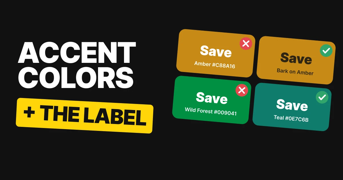
A button has to stand out from the page it sits on. Waikiki does it on its light page and on its dark one. So does Very Berry. One hex, both themes.
Lime Punch and Gentian Blue do not. Each looks great in one theme and disappears in the other.
Waikiki
Waikiki
On Silver Bird #FBF8F1: passes
On Midnight Oil #10141F: passes
A mid-tone teal that stands out on both pages. One hex, both themes.
Very Berry
Very Berry
On French Porcelain #F7F4FB: passes
On Twilight Zone #0F1C16: passes
Another mid-tone that works on its light page and its dark one.
Lime Punch
Lime Punch
On Ceramic #FBFAF5: fails
On Infinite Night #171538: passes
Too light for light mode: on its day surface the button almost disappears. On Infinite Night it glows.
Gentian Blue
Gentian Blue
On Open Book #F6EFE5: passes
On Balsamico #1C1612: fails
Too dark for dark mode. It is strong on Open Book and vanishes on Balsamico.
If you want one accent for both themes, pick a mid-tone and check it twice. If not, give each theme its own shade. Our guide to dark mode design covers how to ship that second theme.
Off-white beats pure white
Pure white on a near-black surface is the strongest contrast you can get, and that is the problem: it glares. The off-whites in these palettes are still far easier to read than body text needs to be.
Material Design's dark theme sets its main text at 87% white for the same reason. Give the off-white a little warmth or a little cool, and let the accent do the talking.
Smoked Salmon
Distant Cloud #E7ECEC on Dark Moon #0B1B1F
Pure white #FFFFFF on Dark Moon: it glares
Smoked Salmon #FF887A on Dark Moon
A cool off-white with a warm coral accent. The accent stands out clearly without any help.
Minted Elegance
Vanilla Sugar #F1EBDF on Violet Void #1C1022
Pure white #FFFFFF on Violet Void: it glares
Minted Elegance #4FCB9C on Violet Void
Vanilla Sugar has a little warmth, and the mint accent has plenty of room on Violet Void.
Malibu
Milk and Cookies #EFE7E7 on Asphalt #1C140F
Pure white #FFFFFF on Asphalt: it glares
Malibu #57BAF0 on Asphalt
A warm off-white on a warm near-black, with a sky blue that cuts through it.
Dream Vapour
Star Magnolia #EAEFE4 on Black Stallion #0E1A16
Pure white #FFFFFF on Black Stallion: it glares
Dream Vapour #BB9DF0 on Black Stallion
Star Magnolia leans slightly green, which sits well with a soft lilac accent.
Every accent in these four stands out clearly on its night surface, so the text can stay quiet.
All twelve palettes in one table
| Palette | Colors | What it shows |
|---|---|---|
| Lime | Chalk #F2F3EE, Electric Lime #C6F432, Graphite #17181C | Glows on dark |
| Pink | Blush White #F6EEF2, Hot Pink #FF4F9A, Night Plum #1A1218 | Stronger on dark |
| Amber | Warm White #F5F0E6, Amber #FFB020, Coffee Black #1B1610 | Glows on dark |
| Royal | Frost #EEF0FA, Royal #3B4CCA, Midnight #121426 | Sinks on dark |
| Waikiki | Midnight Oil #10141F, Waikiki #0098A4, Silver Bird #FBF8F1 | Works in both themes |
| Very Berry | Twilight Zone #0F1C16, Very Berry #CE4390, French Porcelain #F7F4FB | Works in both themes |
| Lime Punch | Infinite Night #171538, Lime Punch #B7DD31, Ceramic #FBFAF5 | Only works on dark |
| Gentian Blue | Balsamico #1C1612, Gentian Blue #292BAE, Open Book #F6EFE5 | Only works on light |
| Smoked Salmon | Distant Cloud #E7ECEC, Smoked Salmon #FF887A, Dark Moon #0B1B1F | Off-white text |
| Minted Elegance | Vanilla Sugar #F1EBDF, Minted Elegance #4FCB9C, Violet Void #1C1022 | Off-white text |
| Malibu | Milk and Cookies #EFE7E7, Malibu #57BAF0, Asphalt #1C140F | Off-white text |
| Dream Vapour | Star Magnolia #EAEFE4, Dream Vapour #BB9DF0, Black Stallion #0E1A16 | Off-white text |
The numbers, for the person defending the choice
Every pairing was measured with the WCAG 2 contrast formula against the surface it sits on. This is the only table in the paper with ratios.
| Palette | Test | Ratio | Result |
|---|---|---|---|
| Lime | Accent on the dark surface / on white | 13.84:1 / 1.28:1 | Glows, faint |
| Pink | Accent on the dark surface / on white | 5.98:1 / 3.07:1 | Stronger on dark |
| Amber | Accent on the dark surface / on white | 9.82:1 / 1.83:1 | Glows, faint |
| Royal | Accent on the dark surface / on white | 2.66:1 / 6.83:1 | Sinks on dark |
| Waikiki | Button on light / on dark | 3.2:1 / 5.2:1 | Passes both |
| Very Berry | Toggle on light / on dark | 3.9:1 / 4.0:1 | Passes both |
| Lime Punch | Button on light / on dark | 1.4:1 / 11.1:1 | Fails, passes |
| Gentian Blue | Play button on light / on dark | 8.9:1 / 1.7:1 | Passes, fails |
| Smoked Salmon | Off-white text / pure white / accent | 14.7:1 / 17.6:1 / 7.6:1 | Passes, glares, passes |
| Minted Elegance | Off-white text / pure white / accent | 15.4:1 / 18.3:1 / 9.0:1 | Passes, glares, passes |
| Malibu | Off-white text / pure white / accent | 14.9:1 / 18.1:1 / 8.3:1 | Passes, glares, passes |
| Dream Vapour | Off-white text / pure white / accent | 15.2:1 / 17.8:1 / 7.8:1 | Passes, glares, passes |
How to build your dark palette
- Pick the dark surface first. A near-black like Graphite #17181C or Violet Void #1C1022 is softer than pure black.
- Set text in an off-white. Add a little warmth or a little cool, as in Vanilla Sugar #F1EBDF.
- Test the accent on the dark surface. Do not reuse the light theme's accent without checking it.
- Decide one accent or two. If one accent has to serve both themes, pick a mid-tone and check it on both pages. Otherwise give each theme its own shade.
- Check the button as a shape. It has to stand out from the page, not just read as a label.
Get the files for each set
Each set is a free color set on Forge, with tap-to-copy codes, swatch files for Figma and Adobe (ASE), CSS variables and design tokens.
Free color set
Dark mode flips your accent: Lime, Pink, Amber, Royal
Every hex, plus ASE swatches, CSS variables and design tokens.
Free color set
One accent, two themes: Waikiki, Very Berry, Lime Punch, Gentian Blue
Every hex, plus ASE swatches, CSS variables and design tokens.
Free color set
Off-white for dark mode: Smoked Salmon, Minted Elegance, Malibu, Dream Vapour
Every hex, plus ASE swatches, CSS variables and design tokens.
FAQ
What colors work best in a dark mode color palette?
A near-black surface, an off-white for text, and an accent that stands out on the dark. Smoked Salmon #FF887A on Dark Moon #0B1B1F with Distant Cloud #E7ECEC for text is a good example.
Should dark mode use pure white text?
No. Pure white on a near-black surface glares. An off-white like Vanilla Sugar #F1EBDF is still far easier to read than body text needs, and it is softer.
Can I use the same accent color in light and dark mode?
Only if it is a mid-tone. Waikiki #0098A4 stands out on both pages. Lime Punch #B7DD31 vanishes on light and Gentian Blue #292BAE vanishes on dark.
Why does my blue button disappear in dark mode?
A blue that is strong on white can be too dark for a dark surface. Royal #3B4CCA sinks on Midnight #121426. Use a lighter blue for the dark theme.
What color should dark mode buttons be?
Whatever stands out from the dark surface. Electric Lime #C6F432, Hot Pink #FF4F9A and Amber #FFB020 all do, because bright colors glow at night.
What is the best dark mode background color?
A near-black such as Graphite #17181C or Coffee Black #1B1610, rather than pure black. It is softer next to an off-white and still lets the accent glow.
Sources
- Color names and hex codes from the UX Brainy color sets on Forge, vol 05, 09 and 10. Contrast was computed with the WCAG 2 formula against the surface each color sits on.
- Text and shape thresholds follow W3C WCAG 2.2: Contrast (Minimum) and Non-text Contrast.
- Material Design's dark theme sets main text at 87% white: Material Design, Dark theme.
- First published as three carousels on UX Brainy: The accent that works on white can disappear in dark mode, One accent for light and dark mode only works in the middle and Dark mode doesn't need pure white text.
Want a dark theme designed and tested for your own product, not borrowed from the light one? Our team designs interfaces that hold up in both themes.
Get StartedGet new papers by email
New Brainy papers in your inbox. Confirm once, unsubscribe anytime.