Brand Blue Is Not #0000FF: How Intel, LinkedIn, IBM and Dell Use Blue
Pure blue prints grayer, looks like a link and is hard to see on black. The famous blue logos all use a calmer blue instead. Their exact codes, why Facebook and Visa blues shift in print, and how to pick yours.
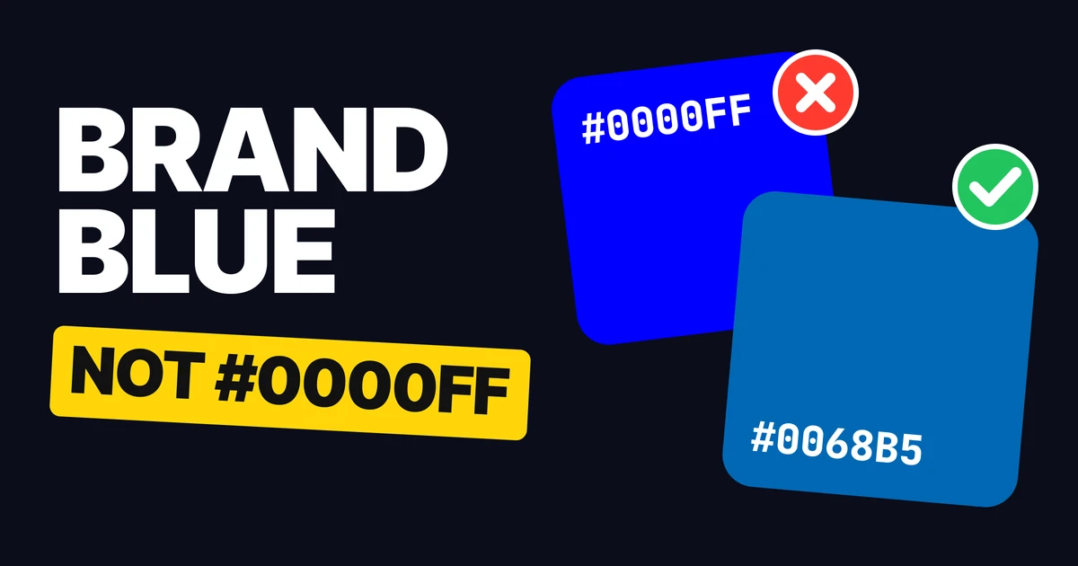
A good brand blue is never #0000FF. Pure blue is the deepest blue a screen can make, which sounds strong until the logo goes to print and comes back grayer, or ends up on a web page where every blue thing looks like a link. The famous blue logos all solve this the same way, and the pattern is easy to copy for your own.
Why pure blue is hard
Pure blue is the corner of the screen's color space: the blue light at full power and nothing else. Printing ink cannot reach that corner.
On screen
In print, on coated paper
Converted for a standard coated press, #0000FF becomes CMYK 93/75/0/0 and proofs as about #2C4A9A: grayer and flatter. The difference is large enough that a trained eye calls it a different color, so the blue on your business card will not match the blue on your website.
Pure blue has a second problem on black. It is the darkest of the bright colors, so blue text or a blue mark on a dark background nearly disappears.
On white
On black
It also looks like a link
Default browser link
Pure blue
Browsers paint unvisited links #0000EE, from the HTML Standard's suggested stylesheet. That is one step from #0000FF, so a logo or a button in pure blue reads as something to click, or as something left unstyled.
How the famous blues do it
Intel: #0068B5

A clear mid blue, about 34 degrees toward cyan from pure blue. It proofs in print within a Delta E of 0.8 of its screen color, which is too small to see. The Intel logo is used reversed to white on this blue, and white on it is easy to read.
LinkedIn: #0A66C2

A friendly blue with a touch more purple than Intel's. It shifts the most of the four in print, at a Delta E of 2.0, and that is still right at the edge of what the eye can notice. The wordmark and the box go white and the "in" is cut out in blue.
IBM: #1F70C1

A steady, slightly softer blue with a little gray in it. The striped letters are thin, so the color has to stay light enough for white lines to read against it: white on this blue clears the accessibility minimum for text with room to spare. It prints with a Delta E of 1.3.
Dell: #007DB8

The lightest and most cyan of the four, from Dell's 2016 refresh. It is the cleanest blue here, 41 degrees from pure blue, and it prints within 0.9 Delta E. It is also the one with the least room for white text: it passes the contrast check, but only just.
The three things they all do
They lean toward cyan. Pure blue sits at 240 degrees on the color wheel, and so does the default link color. Dell sits at 199, Intel at 206, LinkedIn and IBM at 210. Moving 30 to 40 degrees away from 240 is what makes a blue calm and stops it looking like a hyperlink.
They work on white and on black. Pure blue is strong on white and sinks on black. These four sit in the middle of the lightness range, so white text passes on all of them and each stays visible as a color on a dark ground.
They print true. Every one proofs within a Delta E of 2.0.
| Brand | Blue | Hue | White text on it | As a color on black | Print shift |
|---|---|---|---|---|---|
| Pure blue | #0000FF | 240° | Passes, 8.6 to 1 | Fails, 2.4 to 1 | Large, 16.6 |
| Intel | #0068B5 | 206° | Passes, 5.8 to 1 | Passes, 3.6 to 1 | Invisible, 0.8 |
| #0A66C2 | 210° | Passes, 5.7 to 1 | Passes, 3.7 to 1 | Small, 2.0 | |
| IBM | #1F70C1 | 210° | Passes, 5.1 to 1 | Passes, 4.1 to 1 | Small, 1.3 |
| Dell | #007DB8 | 199° | Passes, 4.5 to 1 | Passes, 4.6 to 1 | Invisible, 0.9 |
A print shift under about 2 is hard to see. Above about 5, the printed color reads as a different blue.
Blues that do shift in print
Passing the screen checks is not enough, because print is its own test. Measured the same way, three other famous blues move a lot on a coated press.
| Brand | Blue | Hue | White text on it | Print shift |
|---|---|---|---|---|
| #0866FF | 217° | Passes, 4.8 to 1 | Large, 9.7 | |
| Visa | #1434CB | 230° | Passes, 8.8 to 1 | Large, 9.2 |
| Samsung (cited) | #1428A0 | 231° | Passes, 11.4 to 1 | Noticeable, 6.0 |
Facebook's blue is the interesting one. It sits in the cyan-leaning range and passes the white text check, and it still proofs as a noticeably different blue.
Brighter, more saturated blues land outside what four-color ink can print. These brands have their own reasons and mostly live on screens, so this is a measurement and not a mistake. The lesson for your logo is to run the print proof, not to guess from the hue.
How to choose a blue for your logo
- Start 30 to 40 degrees from pure blue. Pull #0000FF toward cyan until it sits between about 199 and 210 degrees, the range the four famous blues use.
- Test it three ways. White text on it should read easily at body size. The color itself should still show up on black. And it should not look like a link next to #0000EE.
- Proof it in print. Soft-proof it in your design tool with a coated paper profile, or ask your printer for a proof. If the printed blue looks like a different color, move it until screen and print agree.
Steal these 4 blues
The four blues, as each brand draws them.
Use them to study and to test your own blue next to them. Copying a famous brand's exact blue for a new logo in a related business is how you end up looking like a knockoff: use the pattern, not the codes.
FAQ
What is the Intel blue hex code?
Intel blue is #0068B5, as drawn in the Intel logo file.
What is the LinkedIn blue hex code?
LinkedIn blue is #0A66C2, as drawn in the 2021 LinkedIn logo file.
What is the IBM blue hex code?
IBM blue is #1F70C1, as drawn in the IBM logo file.
What is the Dell blue hex code?
Dell blue is #007DB8, as drawn in the Dell logo from the 2016 refresh.
Why is #0000FF bad for a logo?
It prints noticeably grayer than it looks on screen, it is almost the same blue as a default browser link, and it nearly disappears on black. A calmer blue that leans toward cyan fixes all three.
What color is a default link in a browser?
Unvisited links are #0000EE in the HTML Standard's suggested stylesheet, which is one step from pure blue.
What is a good blue for a logo?
A mid blue between about 199 and 210 degrees of hue, like the blues of Intel, LinkedIn, IBM and Dell, that passes white text, stays visible on black and proofs within a Delta E of about 2 in print.
Sources
- Colors read from each brand's logo file on Wikimedia Commons: Intel logo (2020), LinkedIn (2021), IBM, Dell (2016).
- Default link color: the HTML Standard, rendering, where
:linkis#0000EE. - Print shift: a soft proof on the Coated FOGRA39 press profile, measured as Delta E 2000. #0000FF proofs as #2C4A9A, a difference of 16.6. The four famous blues shift between 0.8 and 2.0. Facebook's #0866FF, Visa's #1434CB and Samsung's cited #1428A0 shift 9.7, 9.2 and 6.0.
- Hue angles computed from the hex codes with the HSL model. White-on-color and color-on-black ratios computed with the WCAG 2 contrast formula.
- Each logo is shown reversed to white on its own blue, the version these brands use on their color. Recolored only, never redrawn, and the trademarks belong to their owners.
- First published as a carousel on Logo Brainy.
Choosing colors for a new logo? Our team designs brand identities with colors that work on screen, in print and next to each other.
Get StartedGet new papers by email
New Brainy papers in your inbox. Confirm once, unsubscribe anytime.