Accent Color Palettes: 16 Accents and the Label Each One Needs
Sixteen accent color palettes with exact hex codes, each tested for the one thing an accent has to do: carry a readable label on a button. See which accents take white, which take dark, and which take neither.
An accent color is the one color in your interface that means "tap here." It only works if the words on top of it can be read, so the label decides which accent is a good accent. Here are sixteen accents in four tests, with every hex code and the label each one takes.
What an accent has to survive
An accent is judged by what happens when you put a word on it. The label has to be readable, and the button has to stand out from the page behind it.
That gives four tests. Does it take a white or a dark label, or land in the middle where neither works? Can it carry small tag text? Is it too pale to be a button, like Butterscotch Gold #F7C873?
Each palette below is an ink, an accent and a surface, and the last tile shows the test.
Which label does the accent take
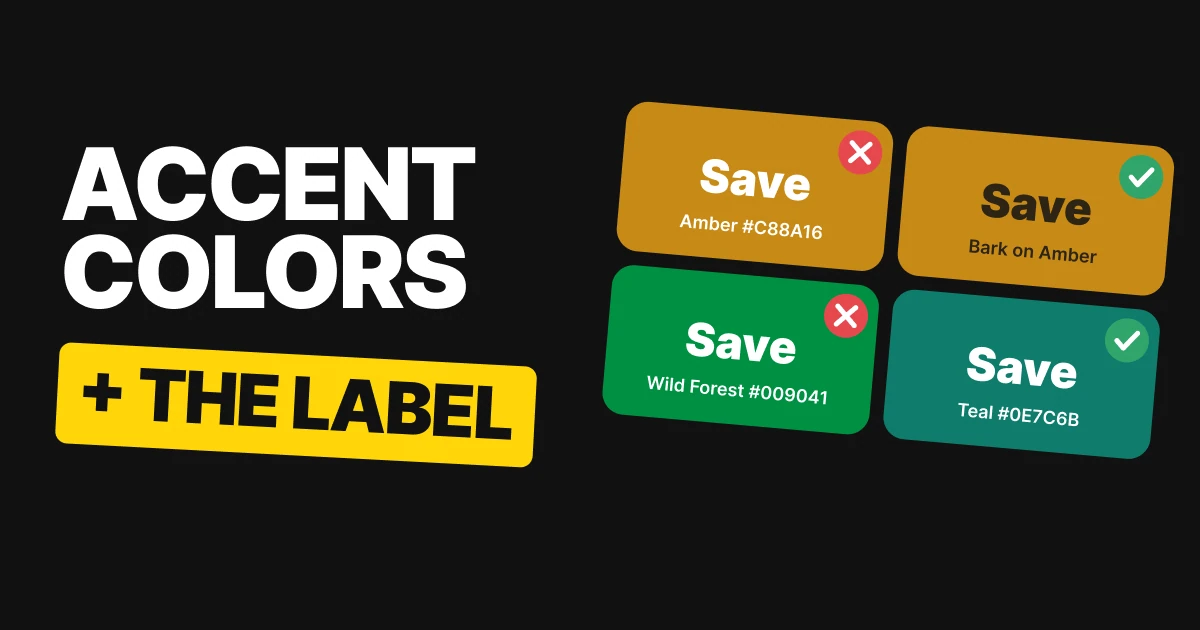
Teal, Cobalt and Rose are dark enough that a white label reads from across the room. Amber #C88A16 is not.
Teal
Deep Sea
Teal
Chalk
White on Teal
A deep teal that carries a white label with room to spare.
Cobalt
Navy Ink
Cobalt
Mist
White on Cobalt
The strongest of the four. White on Cobalt reads from across the room.
Rose
Plum Ink
Rose
Shell
White on Rose
Rose is the lightest of the three white-label accents, so it has the least room. Do not lighten it any further.
Amber
Bark
Amber
Oat
Bark on Amber
Amber is the honest one. White on it fails, and the answer is not a darker amber: set the label in Bark and keep the color exactly as it is.
That is the whole job of an accent: it has to survive the words you put on top of it. Amber shows the fix is rarely a different color. Change the label, keep the brand.
The mid-tone dead zone
Some accents sit in the middle of the lightness scale: too light for white text, too dark for dark text. Two of these four escape in opposite directions, and two are stuck.
French Winery
French Winery
White on French Winery: passes
Midnight Express #1D2433 on French Winery: fails
Magnolia Petal
Dark enough that white text works. French Winery leaves the dead zone by going darker.
Wild Forest
Wild Forest
White on Wild Forest: fails
Nightwalker #2B1A35 on Wild Forest: fails
Vintage Porcelain
A fresh green that sits right in the middle. White fails on it and so does dark. One shade darker and white passes, so nudge the green before you design a single button.
Glowing Lantern
Glowing Lantern
White on Glowing Lantern: fails
Aztec #153023 on Glowing Lantern: passes
Silent Snowfall
Light enough that dark text works. Glowing Lantern leaves the dead zone the other way, by going lighter, so its label is Aztec, never white.
Pink Orchid
Pink Orchid
White on Pink Orchid: fails
Royal Neptune #0F2E30 on Pink Orchid: fails
Snowflake
A mid-tone pink with the same problem as Wild Forest. One shade darker and white passes.
Large type has a lower bar than small print, so a big headline can look fine on these colors while the button label fails. Check the smallest text you will put on the accent. If your brand accent lands in the middle, nudge it before you build the button set.
A button is not a badge
A badge is usually the accent at about 15% for the background, with the full accent as the text. That tint lifts the background, so the text on it loses contrast. An accent can carry a white button label and still fail inside its own badge. The third tile is the accent at 15% over the surface.
Peacock Pride
Peacock Pride
White button label: passes
Peacock Pride on tint #D5E1D2: passes
Wood Bark #2A2320 on tint: passes
A deep teal-green that survives both jobs on Cosmic Latte #FBF7E6.
Furnace
Furnace
White button label: passes
Furnace on tint #EAD9D1: fails
Elite Teal #13302A on tint: passes
A strong red-orange button that turns weak as a tag. On White Glove #EEF4F0, set the tag text in the ink and the badge reads fine.
Purple Heart
Purple Heart
White button label: passes
Purple Heart on tint #E6D3DF: passes
Black Velvet #1B2838 on tint: passes
Dark enough that the tint behind it, on Vanilla Blush #FDF1EC, makes no difference.
French Blue
French Blue
White button label: passes
French Blue on tint #D9E3E3: fails
Nightly Voyager #2A1630 on tint: passes
The same story as Furnace: a button that works and a badge that does not. On Powdered #FFF6E8, the ink rescues the badge text.
If your accent is a mid-tone, set badge and tag text in your ink. Furnace's tags and French Blue's badges both become easy to read the moment the text switches to the ink.
The bright one is not the button
A button has to stand out clearly from the page it sits on. A pale, bright accent on a cream page does not, even though it is the prettiest color in the palette.
So swap the jobs. The dark color becomes the button, and the bright one becomes the tag, the badge and the selected state. Two of these palettes do that, and the other two have an accent dark enough to tap.
Butterscotch
Storm Graphite #434343 button, Butter Canvas #FAEBCD label: passes
Butterscotch Gold #F7C873 tag: passes
Butterscotch Gold on page: barely there
Butterscotch Gold looks lovely and disappears as a button on Butter Canvas. Swap the jobs: Storm Graphite taps, the gold becomes the tag.
Ocean Breeze
Midnight Navy #0C2C55 button, Vanilla Linen #EDEDCE label: passes
Ocean Breeze #629FAD tag: passes
Ocean Breeze on page: barely there
A soft teal-blue on a pale linen. Same fix: Midnight Navy is the button, Ocean Breeze is the tag and the selected state.
Silent Grove
Silent Grove #215E61 button: passes
Link on Morning Paper #F5FBE6: passes
Blue Monolith #233D4D
This one can do everything. A dark teal is both the button and the link on Morning Paper, with a white label that reads easily.
Wild Berry
Wild Berry #CF4173 button: passes
Wild Berry link on Peach Cashmere #F6D8BD: fails
Deep Berry Plum #5D3140 link: passes
Wild Berry only just makes it as a button with a white label. As text on Peach Cashmere it falls short, so its links go in Deep Berry Plum.
A link is words, so it has to clear the text bar, not just the button bar. When the accent only just passes as a button, set links in the ink.
All sixteen accents in one table
| Palette | Accent | Label that works | Watch out for |
|---|---|---|---|
| Teal | Teal #0E7C6B | White | None of the four jobs |
| Cobalt | Cobalt #2F4BD6 | White | None of the four jobs |
| Rose | Rose #C2445F | White | Least room of the three, do not lighten |
| Amber | Amber #C88A16 | Bark #2C2415 | White fails |
| French Winery | French Winery #9A0A2C | White | Dark text fails |
| Wild Forest | Wild Forest #009041 | None, until one shade darker | Both labels fail |
| Glowing Lantern | Glowing Lantern #FFBB40 | Aztec #153023 | White fails |
| Pink Orchid | Pink Orchid #C157AD | None, until one shade darker | Both labels fail |
| Peacock Pride | Peacock Pride #006262 | White | None of the four jobs |
| Furnace | Furnace #D23D20 | White | Badge text, use Elite Teal #13302A |
| Purple Heart | Purple Heart #652A97 | White | None of the four jobs |
| French Blue | French Blue #0075C9 | White | Badge text, use Nightly Voyager #2A1630 |
| Butterscotch | Butterscotch Gold #F7C873 | Dark text, as a tag | Too pale to be the button |
| Ocean Breeze | Ocean Breeze #629FAD | Dark text, as a tag | Too pale to be the button |
| Silent Grove | Silent Grove #215E61 | White | None of the four jobs |
| Wild Berry | Wild Berry #CF4173 | White | Links, use Deep Berry Plum #5D3140 |
The numbers, for the person defending the choice
Every pairing above was measured with the WCAG 2 contrast formula. This is the only table in the paper with ratios.
| Palette | Test | Ratio | Result |
|---|---|---|---|
| Teal | White label on the accent | 5.10:1 | Passes |
| Cobalt | White label on the accent | 6.78:1 | Passes |
| Rose | White label on the accent | 4.90:1 | Passes |
| Amber | White label on the accent | 2.96:1 | Fails |
| French Winery | White label | 8.5:1 | Passes |
| French Winery | Dark label | 1.8:1 | Fails |
| Wild Forest | White label | 4.1:1 | Fails |
| Wild Forest | Dark label | 3.8:1 | Fails |
| Wild Forest | White label, one shade darker | 4.6:1 | Passes |
| Glowing Lantern | Dark label | 8.4:1 | Passes |
| Glowing Lantern | White label | 1.6:1 | Fails |
| Pink Orchid | White label | 4.0:1 | Fails |
| Pink Orchid | Dark label | 3.6:1 | Fails |
| Pink Orchid | White label, one shade darker | 4.6:1 | Passes |
| Peacock Pride | Button label / badge text | 7.1:1 / 5.3:1 | Passes both |
| Furnace | Button label / badge text / badge text in ink | 4.7:1 / 3.4:1 / 10.3:1 | Passes, fails, passes |
| Purple Heart | Button label / badge text | 9.0:1 / 6.3:1 | Passes both |
| French Blue | Button label / badge text / badge text in ink | 4.7:1 / 3.6:1 / 12.7:1 | Passes, fails, passes |
| Butterscotch | Gold on the page / dark text on the gold tag | 1.32:1 / 6.34:1 | Fails, passes |
| Ocean Breeze | Accent on the page / dark text on the accent tag | 2.49:1 / 4.7:1 | Fails, passes |
| Silent Grove | White label on the accent | 7.4:1 | Passes |
| Wild Berry | White label on the accent | 4.51:1 | Just passes |
How to test your own accent
- Try white first. If white passes on the accent, as it does on Cobalt #2F4BD6, your label is settled.
- Try your darkest ink next. If white fails and the ink passes, set every label in the ink, like Amber and Glowing Lantern.
- If both fail, move the accent. One shade darker or lighter takes you out of the middle.
- Test the tag separately. Make the 15% tint and check the accent as text on it. If it fails, set tags in the ink.
- Check the button against the page. A pale accent is a tag, not a button. Our papers on accessible color contrast and UI color mistakes cover the thresholds.
Get the files for each set
Each set is a free color set on Forge, with tap-to-copy codes, swatch files for Figma and Adobe (ASE), CSS variables and design tokens.
Free color set
Ink, surface, one thing to tap: Teal, Cobalt, Rose, Amber
Every hex, plus ASE swatches, CSS variables and design tokens.
Free color set
The dead zone: French Winery, Wild Forest, Glowing Lantern, Pink Orchid
Every hex, plus ASE swatches, CSS variables and design tokens.
Free color set
A button is not a badge: Peacock Pride, Furnace, Purple Heart, French Blue
Every hex, plus ASE swatches, CSS variables and design tokens.
Free color set
The bright one is not the button: Butterscotch, Ocean Breeze, Silent Grove, Wild Berry
Every hex, plus ASE swatches, CSS variables and design tokens.
FAQ
What color text goes on an accent color button?
White if the accent is dark enough, dark ink if it is light. Teal #0E7C6B takes white. Amber #C88A16 takes Bark #2C2415. If neither works, the accent is in the middle and needs to move a shade.
Why does white text fail on some colored buttons?
Because the button is too light. Amber, Glowing Lantern #FFBB40 and Butterscotch Gold #F7C873 are bright, so white text on them is faint. Mid-tones like Wild Forest #009041 fail with both white and dark text.
How do I pick an accent color for a UI palette?
Choose the label first. Decide whether the accent will carry white or dark text, then pick a color clearly on one side of the middle. Check it as a button, as badge text and against the page.
Why does my accent color look fine as a button but bad as a badge?
A badge puts the accent as text on a light tint of itself, which lowers the contrast. Furnace #D23D20 and French Blue #0075C9 carry a white button label easily and fail as badge text. Set badge text in your ink.
Can a light accent color be a button?
Rarely. It has to stand out from the page behind it, and a pale accent on a cream page barely does. Make a dark color the button and use the pale accent as the tag or selected state.
Sources
- Color names and hex codes from the UX Brainy color sets on Forge, vol 02, 06, 07 and 11. Contrast was computed with the WCAG 2 formula against the surface each color sits on.
- The contrast thresholds for text and for shapes follow W3C WCAG 2.2: Contrast (Minimum) and Non-text Contrast.
- The tint hex in each badge tile is the accent at 15% over the surface, derived from the palette.
- First published as four carousels on UX Brainy: Your accent decides what color the label on it has to be, The dead zone, A button is not a badge and The bright one is not the button.
Want an accent and a full UI palette built for your product and tested on your real screens? Our team designs interfaces that hold up in every state.
Get StartedGet new papers by email
New Brainy papers in your inbox. Confirm once, unsubscribe anytime.