UI Color Palettes: What Each Color Can and Cannot Do
Twelve UI color palettes with exact hex codes, tested role by role. Which accents work as both button and link, which gray text fails on a tinted card, and why a pale accent fills but never writes.
A UI color palette is not a set of nice colors. It is a set of roles, and each color can do some jobs and not others. Here are twelve palettes, each tested on one role that usually goes wrong, with every hex code.
The three roles in a UI palette
The ink writes. It is the color of every line of text, so it has to be dark enough on the surface, like Ink Navy #141238 on Indigo Mist #EEF0FB. You also use it for links when the accent cannot.
The surface holds. It is the page or the card behind everything else. It does not have to be white, and the tint you choose changes how every other color behaves.
The accent taps. It is the one color that says "this does something." That sounds like one job, and the next section shows it is two.
An accent has two jobs
On a button, the label has to read on the accent, and the button has to stand out from the page. In a sentence, the same accent is a link, and a link is text, so it has to be readable on that same page. Both jobs use the same pair of colors, but the second one has a higher bar.
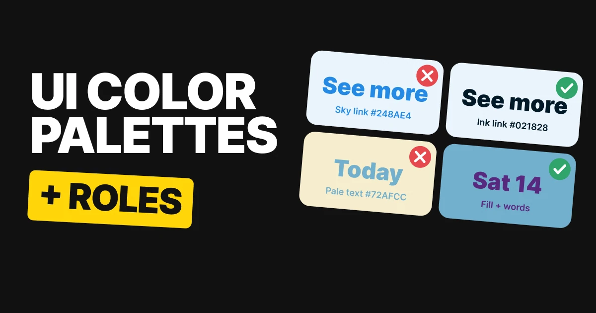
That means an accent can be a good button and a bad link. Sky and Coral sit in exactly that gap. Indigo and Berry pass both.
Indigo
Indigo #4338CA, white label: passes
Indigo as a link on Indigo Mist #EEF0FB: passes
Ink Navy #141238 as the link: passes
Indigo works as the button and as the link. One color, both jobs, nothing to fix.
Berry
Berry #A61E4D, white label: passes
Berry as a link on Berry Milk #FBEAF0: passes
Deep Berry #2A0A18 as the link: passes
Berry does the same: a white label on the button, a readable link on its pale pink surface.
Sky
Sky #248AE4, Harbor Ink label: passes
Sky as a link on Sky Wash #EAF4FC: fails
Harbor Ink #021828 as the link: passes
Sky is a good button and a hard link. Keep it for buttons and set links in Harbor Ink, underlined.
Coral
Coral #E85446, Burnt Clay label: passes
Coral as a link on Coral Milk #FDEEEB: fails
Burnt Clay #290E0A as the link: passes
Coral has the same split. A button people can see, and a link that disappears into Coral Milk.
Keep the accent for buttons
The fix is cheap. Keep Sky and Coral for buttons and set links in the ink, underlined. Here is the same sentence both ways.
Password
Forgot your password?
✕ Sky as the link: hard to read
Password
Forgot your password?
✓ Harbor Ink as the link: easy to read
Gray text on tinted cards
Secondary text is usually your ink at about 65%. On white it is easy to read in all four palettes, and on a pale surface it barely changes. On a real tint it can slip under the line.
So test it on the surface it sits on, not on white. On a strong tint, push the gray to 70% and it recovers.
Red Panda
Sombre Night
Red Panda
#636772 on Sugar Milk #FAF7F0: passes
Same 65% mix #656A77 on white: passes
Sugar Milk is almost white, so the gray barely changes. It passes on the card and on white.
Warm Purple
English Walnut
Warm Purple
#606146 on Oh Pistachio #BCDBA4: fails
At 70%, #59573F: passes
Oh Pistachio is a real tint. The same gray that passes on white slips under the line here, and 70% brings it back.
Mango
Jedi Night
Mango
#5E6C68 on Heart of Ice #F2F5FA: passes
Same 65% mix #626F6A on white: passes
Heart of Ice is a pale cool tint, so the gray holds up.
Viridian
Midnight Dreams
Viridian
#535D71 on Digital Lavender #D3CAEE: fails
At 70%, #495467: passes
Digital Lavender is a strong enough tint to fail the same gray. Push it to 70% and the card reads again.
A pale accent fills, it never writes
A pale accent is a lovely fill and a hopeless text color. On its own page, none of these four can be read as text. Turn the same color into a fill and it works, as long as you choose the right words for it.
Purple Estate
Blue Horizon #72AFCC as text on Sunwashed Paper #F5EDCE: fails
Purple Estate #58287F on Blue Horizon: big type only
Purple Estate on Sunwashed Paper: passes
The pale blue fails as text on the paper. As a fill it takes Purple Estate, which is fine for a big date and not for small type.
Blue Horizon
Blue Horizon #2FA4D7 as text on Desert Cream #F5E9D8: fails
Cocoa Noir #3E2C23 on Blue Horizon: passes
Cocoa Noir on Desert Cream: passes
The brighter blue also fails as text on Desert Cream. As a fill it carries Cocoa Noir easily.
Herb Garden
Herb Garden #BCD9A2 as text on Sun Linen #FEFFD3: fails
Red Monarch #A82323 on Herb Garden: passes
Red Monarch on Sun Linen: passes
The faintest of the four on its page. Put Red Monarch on the green and the number reads clearly.
Nordic Sky
Nordic Sky #7288AE as text on Manor Cream #EAE0CF: fails
White #FFFFFF on Nordic Sky: big type only
Velvet Indigo #4B5694 on Manor Cream: passes
Nordic Sky only takes white, and only for big type, so numbers yes and small print no. The page text is set in Velvet Indigo.
So check the fill and the words on it, not just the page. If the words on the fill only reach big-type contrast, keep them big.
All twelve palettes in one table
| Palette | Colors | The role it tests |
|---|---|---|
| Indigo | Ink Navy #141238, Indigo #4338CA, Indigo Mist #EEF0FB | Button and link both pass |
| Berry | Deep Berry #2A0A18, Berry #A61E4D, Berry Milk #FBEAF0 | Button and link both pass |
| Sky | Harbor Ink #021828, Sky #248AE4, Sky Wash #EAF4FC | Button passes, link fails |
| Coral | Burnt Clay #290E0A, Coral #E85446, Coral Milk #FDEEEB | Button passes, link fails |
| Red Panda | Sombre Night #121A2E, Red Panda #B54302, Sugar Milk #FAF7F0 | Gray passes on the card |
| Warm Purple | English Walnut #2E1F14, Warm Purple #812E7D, Oh Pistachio #BCDBA4 | Gray fails on the card |
| Mango | Jedi Night #0E2219, Mango #FAA828, Heart of Ice #F2F5FA | Gray passes on the card |
| Viridian | Midnight Dreams #0E222D, Viridian #007F5B, Digital Lavender #D3CAEE | Gray fails on the card |
| Purple Estate | Sunwashed Paper #F5EDCE, Blue Horizon #72AFCC, Purple Estate #58287F | Pale blue fills, big type only |
| Blue Horizon | Blue Horizon #2FA4D7, Desert Cream #F5E9D8, Cocoa Noir #3E2C23 | Fill passes with Cocoa Noir |
| Herb Garden | Red Monarch #A82323, Sun Linen #FEFFD3, Herb Garden #BCD9A2 | Fill passes with Red Monarch |
| Nordic Sky | Velvet Indigo #4B5694, Nordic Sky #7288AE, Manor Cream #EAE0CF | Fill takes white, big type only |
The numbers, for the person defending the choice
Every pairing was measured with the WCAG 2 contrast formula against the surface it sits on. This is the only table in the paper with ratios.
| Palette | Test | Ratio | Result |
|---|---|---|---|
| Indigo | White label / button on page / link on page | 7.90:1 / 6.96:1 / 6.96:1 | Passes all |
| Berry | White label / button on page / link on page | 7.21:1 / 6.22:1 / 6.22:1 | Passes all |
| Sky | Ink label / button on page / link on page | 5.01:1 / 3.23:1 / 3.23:1 | Passes, passes, fails |
| Coral | Ink label / button on page / link on page | 4.98:1 / 3.21:1 / 3.21:1 | Passes, passes, fails |
| Red Panda | 65% gray on the card / on white | 5.2:1 / 5.4:1 | Passes both |
| Warm Purple | 65% gray on the card / on white / at 70% | 4.1:1 / 5.0:1 / 4.8:1 | Fails, passes, passes |
| Mango | 65% gray on the card / on white | 5.0:1 / 5.2:1 | Passes both |
| Viridian | 65% gray on the card / on white / at 70% | 4.2:1 / 5.1:1 / 4.8:1 | Fails, passes, passes |
| Purple Estate | Pale accent as text / best text on it / ink on page | 2.05:1 / 4.31:1 / 8.83:1 | Fails, big type, passes |
| Blue Horizon | Pale accent as text / best text on it / ink on page | 2.36:1 / 4.66:1 / 11.03:1 | Fails, passes, passes |
| Herb Garden | Pale accent as text / best text on it / ink on page | 1.51:1 / 4.64:1 / 6.98:1 | Fails, passes, passes |
| Nordic Sky | Pale accent as text / white on it / ink on page | 2.75:1 / 3.59:1 / 5.25:1 | Fails, big type, passes |
How to build your own UI palette
- Start with ink and surface. Pick a dark ink and a surface, tinted or white, and check the ink on the surface. Harbor Ink #021828 on Sky Wash #EAF4FC is the easy case.
- Pick the accent for the label. Decide whether white or dark text goes on it, and check the label on the accent.
- Test the accent as a link. Put it on your surface as text. If it fails, keep it for buttons and set links in the ink.
- Test secondary text on every surface. Mix the ink at 65% over each card color. Push to 70% where it slips.
- Keep pale colors for fills. Pick the words that go on them before you commit. Our papers on UI color mistakes and accessible color contrast go deeper on the thresholds.
Get the files for each set
Each set is a free color set on Forge, with tap-to-copy codes, swatch files for Figma and Adobe (ASE), CSS variables and design tokens.
Free color set
An accent has two jobs: Indigo, Berry, Sky, Coral
Every hex, plus ASE swatches, CSS variables and design tokens.
Free color set
Gray text on tinted cards: Red Panda, Warm Purple, Mango, Viridian
Every hex, plus ASE swatches, CSS variables and design tokens.
Free color set
A pale accent fills, it never writes: Purple Estate, Blue Horizon, Herb Garden, Nordic Sky
Every hex, plus ASE swatches, CSS variables and design tokens.
FAQ
What colors should a UI color palette have?
At least three roles: an ink for text, an accent for buttons and links, and a surface for the page. Indigo #4338CA with Ink Navy #141238 and Indigo Mist #EEF0FB is a complete example.
What color should links be in a UI?
The accent only if it passes as text on your surface. Indigo does. Sky #248AE4 does not, so its links go in Harbor Ink #021828, underlined.
What color should secondary text be?
Your ink at about 65%, checked on the surface it sits on. On a strong tint like Oh Pistachio #BCDBA4 it can fail, and pushing it to 70% fixes it.
Why is gray text hard to read on a colored card?
A tinted card is darker than white, so the gap between the gray and the card shrinks. White hides the problem, which is why you test on the real surface.
Can I use a pastel as an accent color?
As a fill, yes. As text, no. Herb Garden #BCD9A2 fails as text on Sun Linen #FEFFD3 and works as a fill with Red Monarch #A82323 on it.
Does a button color have to work as a link color?
It has to if you use it for both. A button needs to stand out from the page and carry its label. A link is text, so it needs a higher bar on the same page.
Sources
- Color names and hex codes from the UX Brainy color sets on Forge, vol 04, 08 and 12. Contrast was computed with the WCAG 2 formula against the surface each color sits on.
- Text and shape thresholds follow W3C WCAG 2.2: Contrast (Minimum) and Non-text Contrast.
- The gray in each tile is the palette ink mixed with the surface at 65%, or 70% where noted, so that hex is derived from the palette.
- First published as three carousels on UX Brainy: An accent color has two jobs, The same gray can pass on white and fail on your tinted card and Your pale accent can fill a shape.
Want a UI palette built for your product, with every role tested on your real screens? Our team designs interfaces that hold up in every state.
Get StartedGet new papers by email
New Brainy papers in your inbox. Confirm once, unsubscribe anytime.