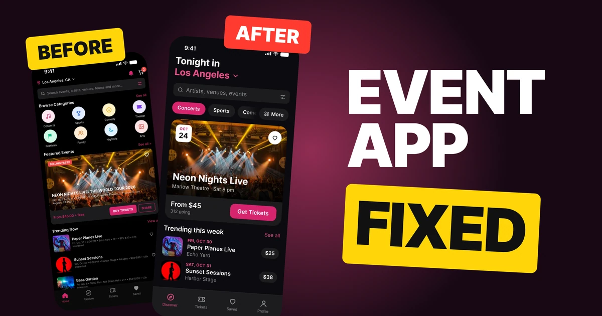
Recipe App Design: A Home Screen Redesign, Before and After
A junior recipe app home screen with a search box that lists four things, six category colors, white capitals on a photo and three icons on every row, and the same screen fixed. Every change side by side and the free Figma file.
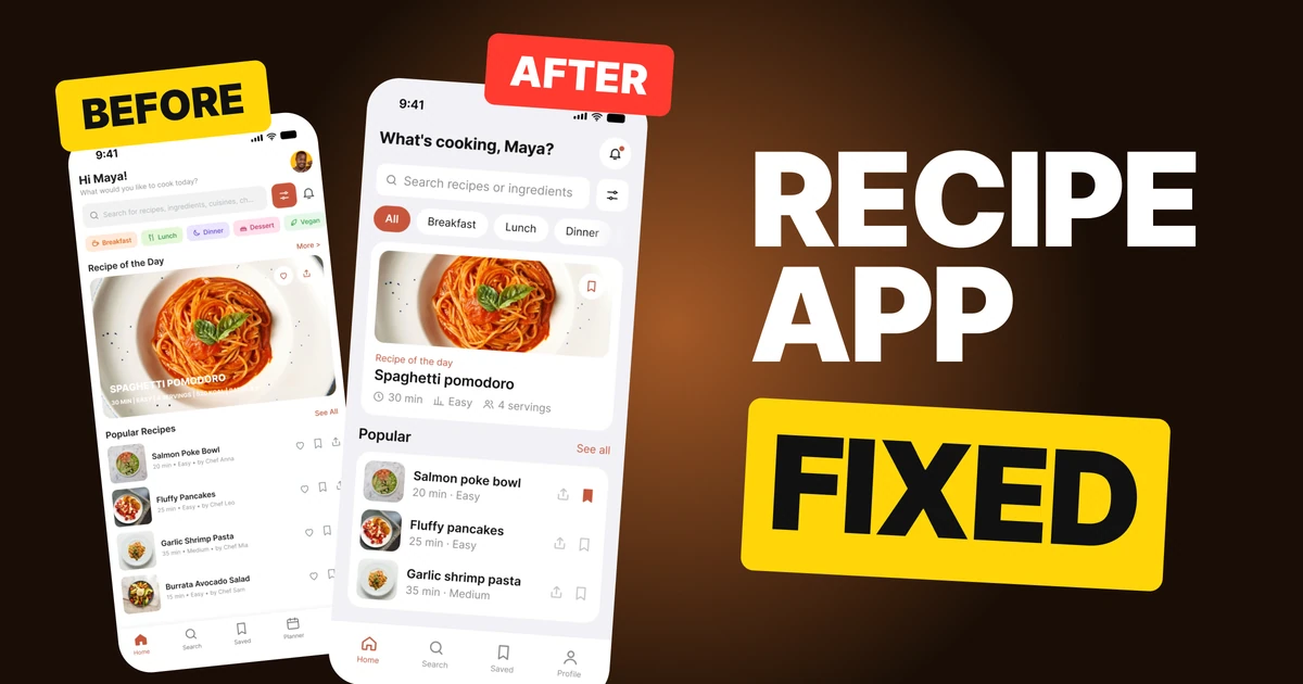
A recipe app starts with the best asset a screen can have: food that looks good. The first draft below has real recipes and good photos, then crowds them with a search box that lists four things, a rainbow of categories, small capitals on the main photo and three icons on every row. The fix keeps all the content and gives the food the room.
The whole screen, before and after
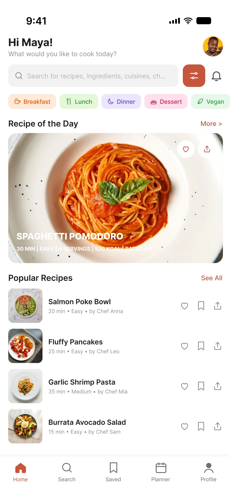
Junior draft
Fixed
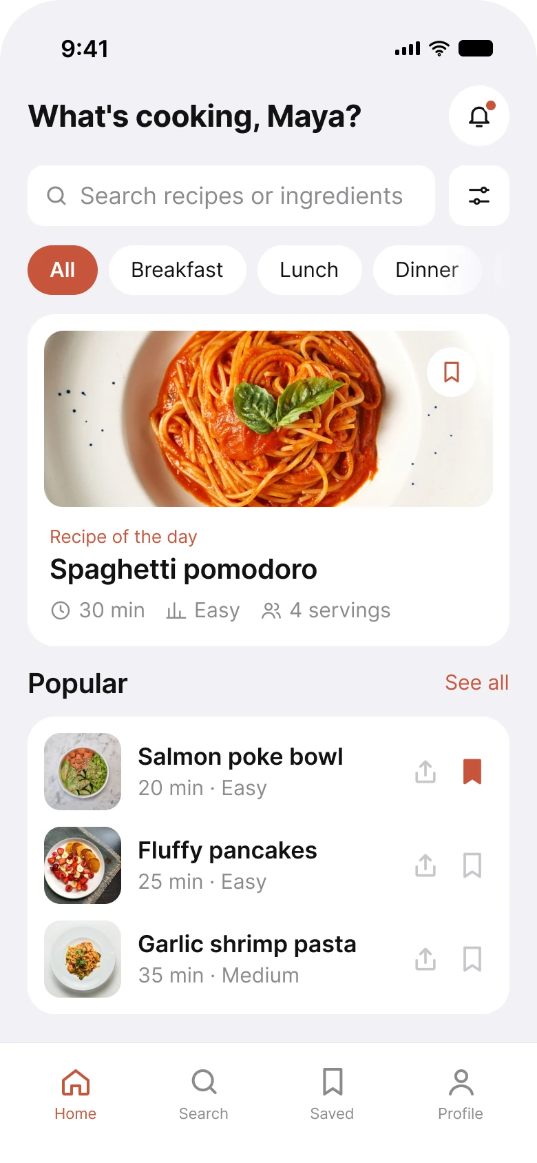
The left screen has a lot to offer and tells you all of it at once. On the right, the same recipes arrive in the order a cook looks for them: find, filter, pick, then browse.
Count what a person has to read before choosing dinner. In the draft: a greeting with a sub line, a search box, a filter button, a bell, category chips in six colors, a title on a photo, a line of five facts in capitals, two buttons on the photo, and then three icons on each of four rows. The fixed screen asks for less at each step, and the numbers show it.
| Junior draft | Fixed | |
|---|---|---|
| Category colors | 6 | 1, on the selected chip |
| Things the search placeholder lists | 4 | 2 |
| Icons on each list row | 3 | 2 |
| Icons on the main photo | 2 | 1 |
| Text on top of the main photo | title and 5 facts | none |
| Tabs | 5 | 4 |
| Side margin | 14 px left, 12 px right | 20 px on both sides |
| Text sizes | 8 to 18 px | 11 to 22 pt |
Fix 1: let search say what it finds
Before

After

A placeholder that lists four things and runs out of room, against two things and one filter.
The draft's placeholder is "Search for recipes, ingredients, cuisines, ch...", and it is cut off in the middle of the fourth word. A placeholder is the one sentence a search box gets to say, so it should say what the box does, and it should fit. The draft's list does not fit, and a cut-off hint reads as a mistake.
The fix names the two things people actually type: recipes or ingredients. Everything else, such as cuisine or diet, is what the filter button next to it is for.
The filter button also changed from a filled terracotta square to a white one. A filled button is the loudest thing on the row, and it was the filter, not the search. The bell left this row and moved up to the greeting, so the row is a search and one button.
Fix 2: one style for every category
Before

After

Five categories in five colors with an icon each, against one style and one filled chip.
When every category has its own color, the colors stop meaning anything. Breakfast is peach, lunch is green, dinner is purple. None of that tells a cook which one is on, and the draft has no selected state at all.
In the fix every chip is white and plain, and the selected one, "All", is filled in the brand terracotta. Color now carries one fact: what is on.
The chips are also larger, so each is an easier tap, and the row fades out at the right edge where it scrolls. In the draft the row is simply cut off at the screen edge, with "Vegan" sliced in half. A fade says "there is more, swipe". A hard cut says nothing.
Fix 3: the facts go under the photo
Before
After
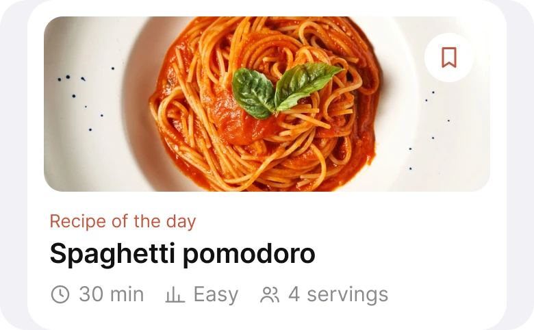
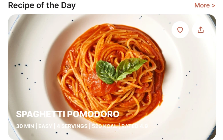
A title and five facts in capitals on a light plate, against a title and three facts with icons on the card under it.
The draft sets a 15 px title and a line of 9 px white capitals on a light plate and a light table. The plate is the photo's whole point, and the text sits on top of it in the one color that disappears against it. The line carries the facts a cook needs to decide: time, difficulty and servings. They are the hardest part of the photo to read.
The fix moves the text down to a card under the photo, in dark type. The three facts that decide whether to cook tonight keep their place, each with an icon: a clock for 30 min, a bar chart for Easy and two people for 4 servings. A person learns the icons once and then reads the row at a glance. The fixed card drops the calories and the rating, which can sit on the recipe page.
The photo's buttons went from two, a heart and a share, to one save. That is the action a cook wants from a recipe card, because saving is how a recipe gets cooked later.
Fix 4: a row is a recipe, a time and a level
Before
After
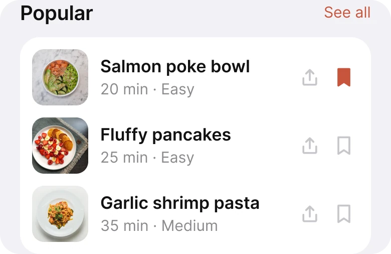
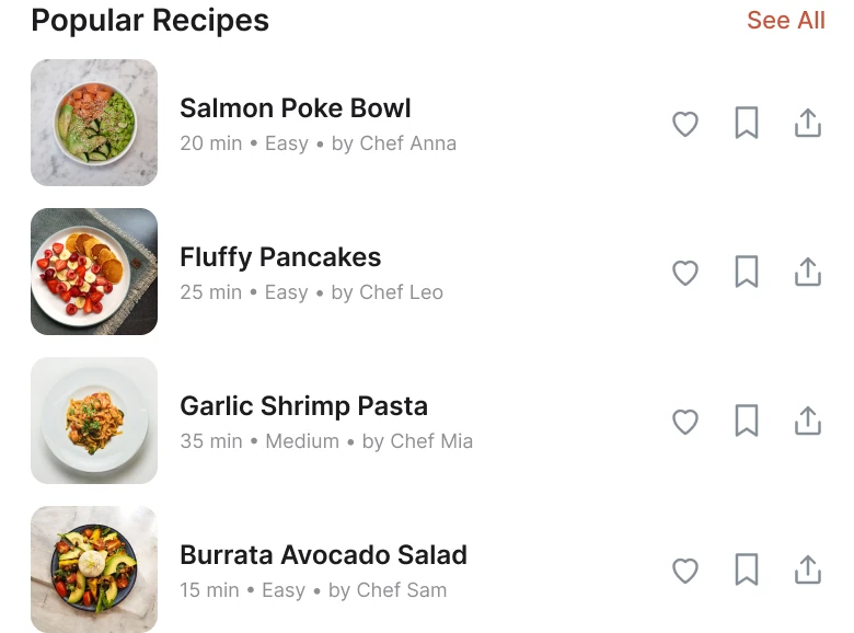
Four rows with a chef's credit and three icons each, against three rows with time, level and two quiet icons.
Each draft row carries a thumbnail, a name, a line of time, difficulty and "by Chef Anna", and three icons: a heart, a bookmark and a share. A heart and a bookmark are two ways of saying "I like this", and a list of four rows prints that choice twelve times.
In the fix every row has a larger photo, the name, and one line of time and difficulty. On the right there are two icons, share and save, in a light grey that stays out of the way until you want them. The first recipe shows what a saved state looks like: the bookmark fills in the brand terracotta, the same color as the selected category. The "Popular Recipes" title shortens to "Popular", because the app is already about recipes.
The fixed list shows three recipes instead of four, so the card has room above the tab bar.
The smaller fixes
- Four tabs, not five. Home, Search, Saved and Profile replace Home, Search, Saved, Planner and Profile.
- One margin. The draft used 14 px on the left and 12 px on the right. The fix uses 20 px on both sides and 14 px between blocks.
- A shorter greeting. "Hi Maya! What would you like to cook today?" became "What's cooking, Maya?".
- One brand color. The terracotta,
#C8553D, marks the selected chip, the saved bookmark, the active tab and the small labels. Nothing else is colored. - A real type scale. Text went from 8 to 18 px to the iOS sizes of 11 to 22 pt.
Audit your own recipe app
| Question | Why it matters |
|---|---|
| Does the search placeholder fit and say what it finds? | A cut-off hint reads as a bug |
| Does every category have a different color? | Color should show state, not variety |
| Is any text sitting on a food photo? | Food photos are bright, and white text vanishes |
| Are time, difficulty and servings in one row with icons? | They decide whether tonight is the night |
| Does every list row carry more than two actions? | Repeated icons are noise |
| Is a selected item filled and an unselected one plain? | The user should see what is on |
Get the Figma file
The free file has both screens as components, every fix as a before and after pair, the color variables and the iOS text styles.
Free Figma file
Recipe app home screen, before and after
Both screens and every fixed part as Figma components. Free, view only, duplicate it to your drafts.
FAQ
What should a recipe app home screen show?
A search box that says what it finds, a row of categories, one featured recipe with its time, difficulty and servings, and a short list of popular recipes. Calories, ratings and chef credits can live on the recipe page.
What should a recipe search bar say?
Say what the box finds, in as few words as fit: "Search recipes or ingredients". A long list of everything it could find gets cut off, and the extras belong in a filter.
How should category chips look in a recipe app?
One style for all of them, with the selected chip filled in the brand color. Let the row scroll and fade at the edge so people see there is more.
Where should a recipe's time and difficulty go?
Under the photo, in a row with a small icon each: a clock for time, a level for difficulty and people for servings. Text on a food photo is hard to read and hides the dish.
How many icons should a recipe list row have?
Two or fewer. Save and share are enough, and a quiet grey keeps them from competing with the dish.
Sources
- Both screens are our own, designed and measured in Figma. The user, the chefs and the recipe list are made up for the exercise.
- Photos via Pexels by Tamra Creatives Agency, Willians Huerta, Kei Scampa, Ana Palade, adrian vieriu and Surendra Shrestha.
- Apple Human Interface Guidelines: Typography, for the iOS text sizes used in the fixed screen.
- W3C: Web Content Accessibility Guidelines 2.2, Contrast (Minimum), for text on images and backgrounds.
- First published as a carousel on App Brainy.
Want this for your own app? Our team redesigns app screens like this one, from the first audit to the finished components.
Get StartedGet new papers by email
New Brainy papers in your inbox. Confirm once, unsubscribe anytime.