Logo Inspiration Sites: 6 Places to Study Famous Logos
Six sites that show famous logos with the story behind them: Logo Design Love, Brand New, Fonts In Use, Logobook, Wikimedia Commons and Standards Manual. What each one is for, what it costs and what to look for.
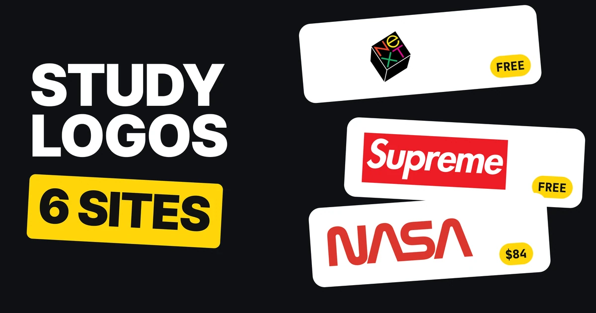
Before you brief a designer or sketch a logo yourself, look at how the famous ones were made. A famous logo shows you what a finished, working mark looks like, and the best sites around it also tell you who drew it, when and why. Here are six, with what each is good for and which parts cost money.
| Site | Best for | Cost |
|---|---|---|
| Logo Design Love | The story behind a famous logo | Free |
| Brand New | Big rebrands, old next to new | Before and after free, full reviews paid |
| Fonts In Use | Naming the font inside a logo | Free |
| Logobook | Classic logos, filed by shape | Free |
| Wikimedia Commons | The real logo files, old versions included | Free |
| Standards Manual | A full brand book in print | Book from $84 |
Logo Design Love: the story behind the mark
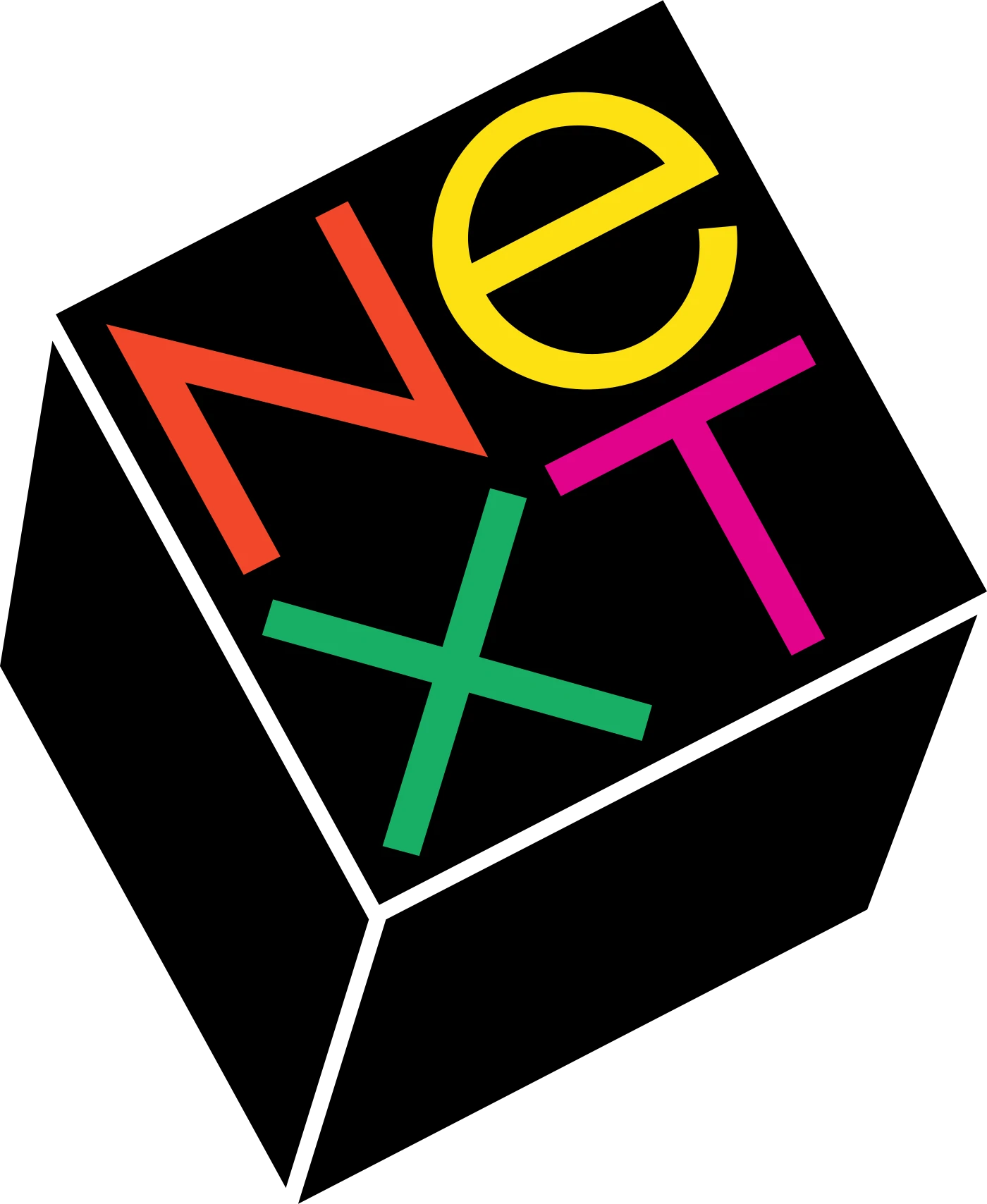
Logo Design Love is the place to read how a famous logo came to exist. Its page on the NeXT logo quotes the facts directly: in 1986 Steve Jobs paid designer Paul Rand $100,000 to create a logo and visual identity for his computer company, and Rand wrote a 100-page proposal book to go with it.
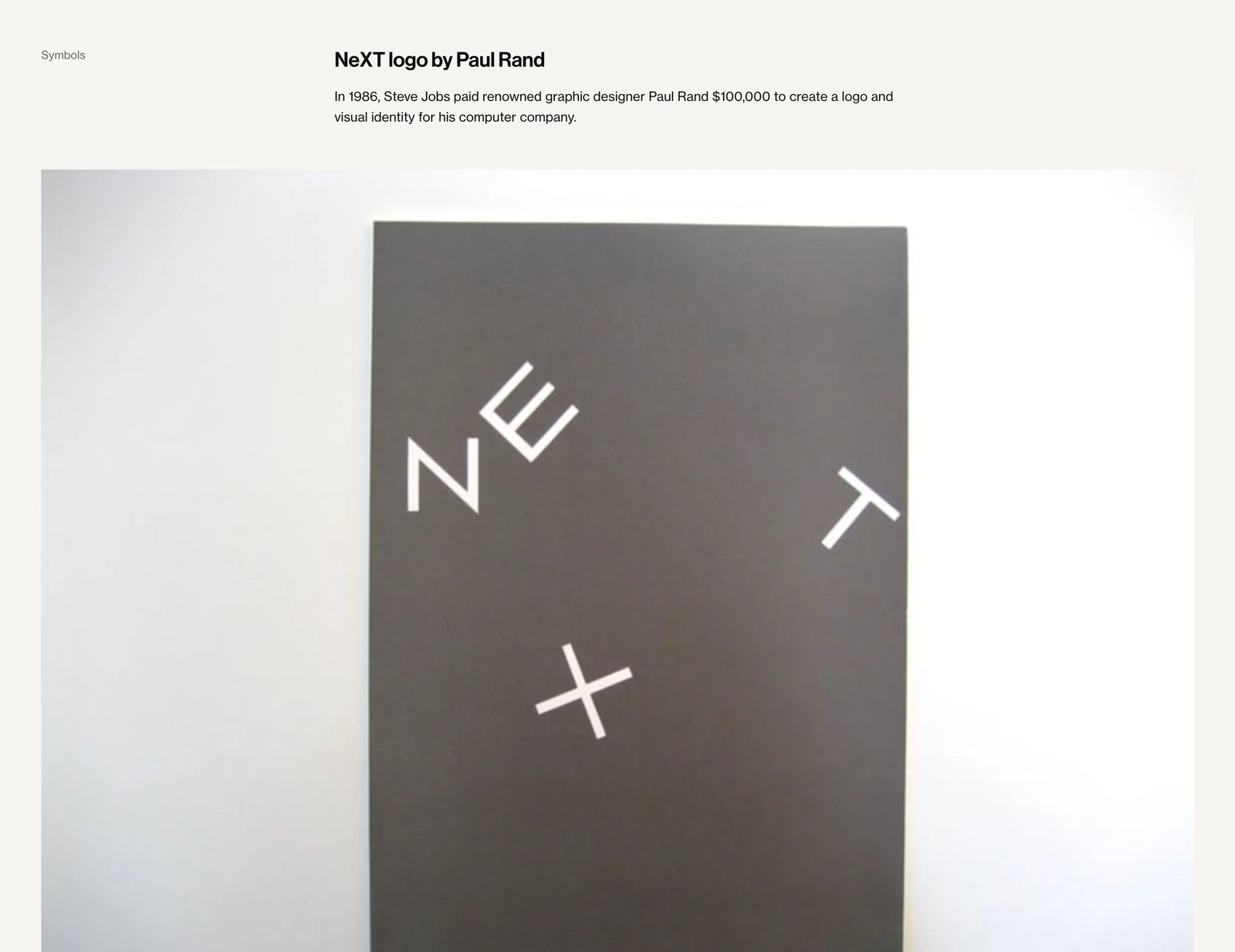
What to look for: the reasoning, not the shape. A story like this one shows you what a client was asked to decide and why one option won. Free to read.
Brand New: old next to new
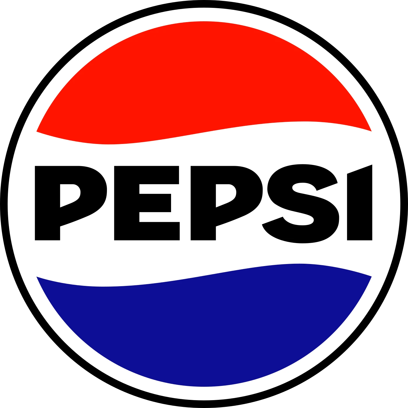
Brand New, from UnderConsideration, reviews big rebrands with the old logo and the new one side by side. Its page on Pepsi's in-house redesign was reviewed on 29 March 2023. The before and after is visible to everyone.
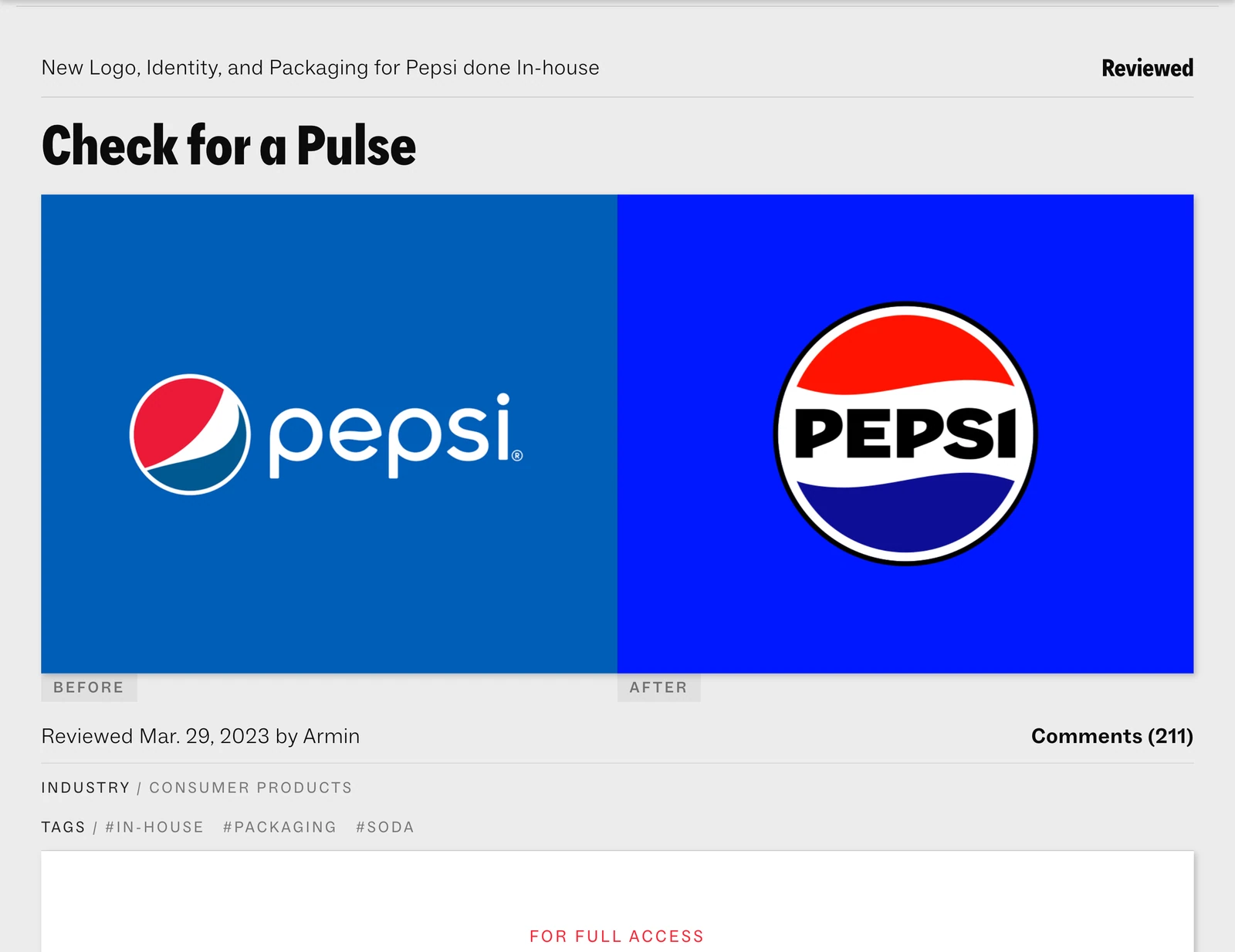
What to look for: what changed and what stayed. When a company redraws a famous logo, the parts it keeps are the parts people already know. The full review asks for a subscription, shown on the page as $2.50 a month or $25 a year. That is the only part of this list that charges for words.
Fonts In Use: the typeface inside a logo
Fonts In Use is an archive of typography in real work. Its Supreme entry lists the typeface as Futura and notes that the logo is "a direct imitation of a typographic style established by Barbara Kruger in her artwork."
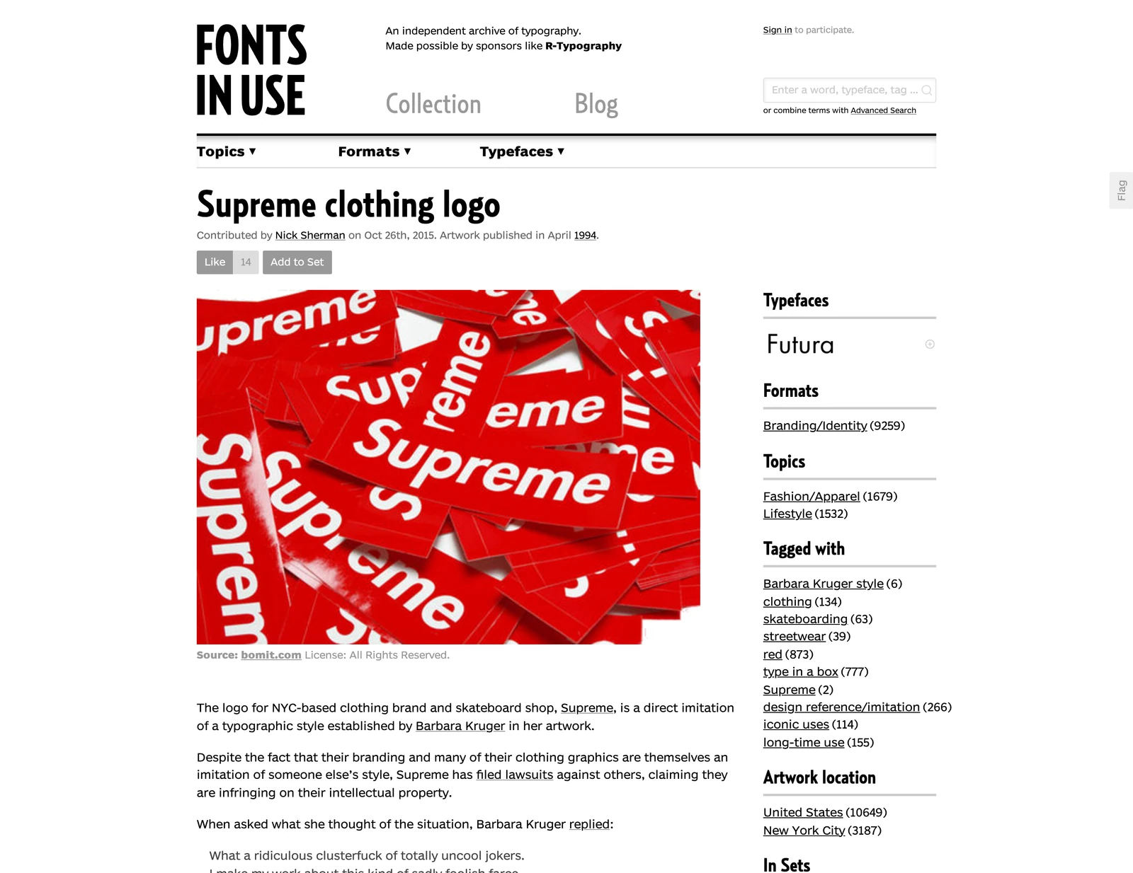
What to look for: how plain the font can be. A logo that looks like a rule-breaking statement is often a standard typeface set with confidence. Our paper on famous logo fonts goes deeper on this. Free to browse.
Logobook: the classics, filed by shape

Logobook keeps classic logos and files them by shape: letters and numbers, shape, object, nature and business. Its entry for The Chase Manhattan Bank lists Chermayeff & Geismar and the year 1960. Other sources give 1961 for the rollout, so treat 1960 as the design date.
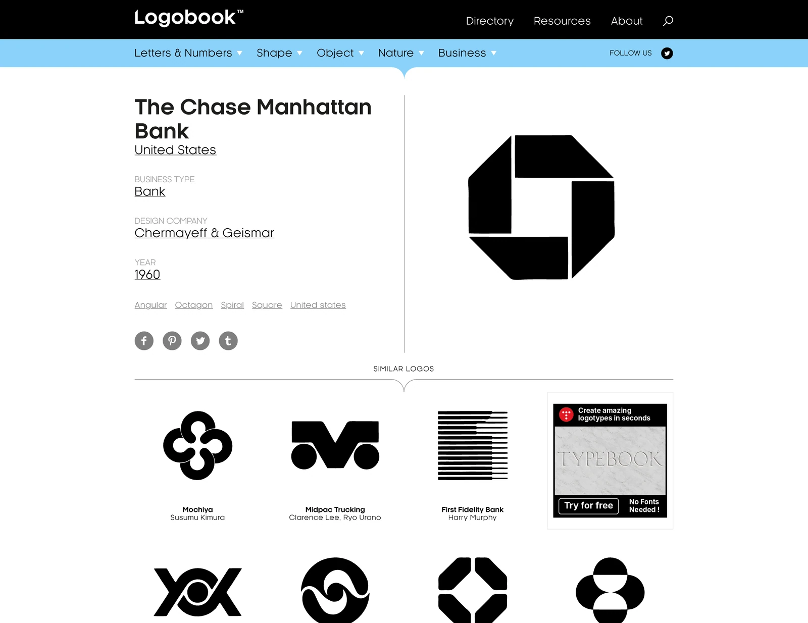
What to look for: every logo in your own category. If you are drawing a letter, open the letters. If you are drawing a symbol, open the shapes and see what already exists. Free to browse.
Wikimedia Commons: the real files
Wikimedia Commons holds the actual logo files, old versions included. Its Coca-Cola category lists the current logo and the historic ones in one place. The logos stay trademarks of their owners, so use them to study and never as your own.
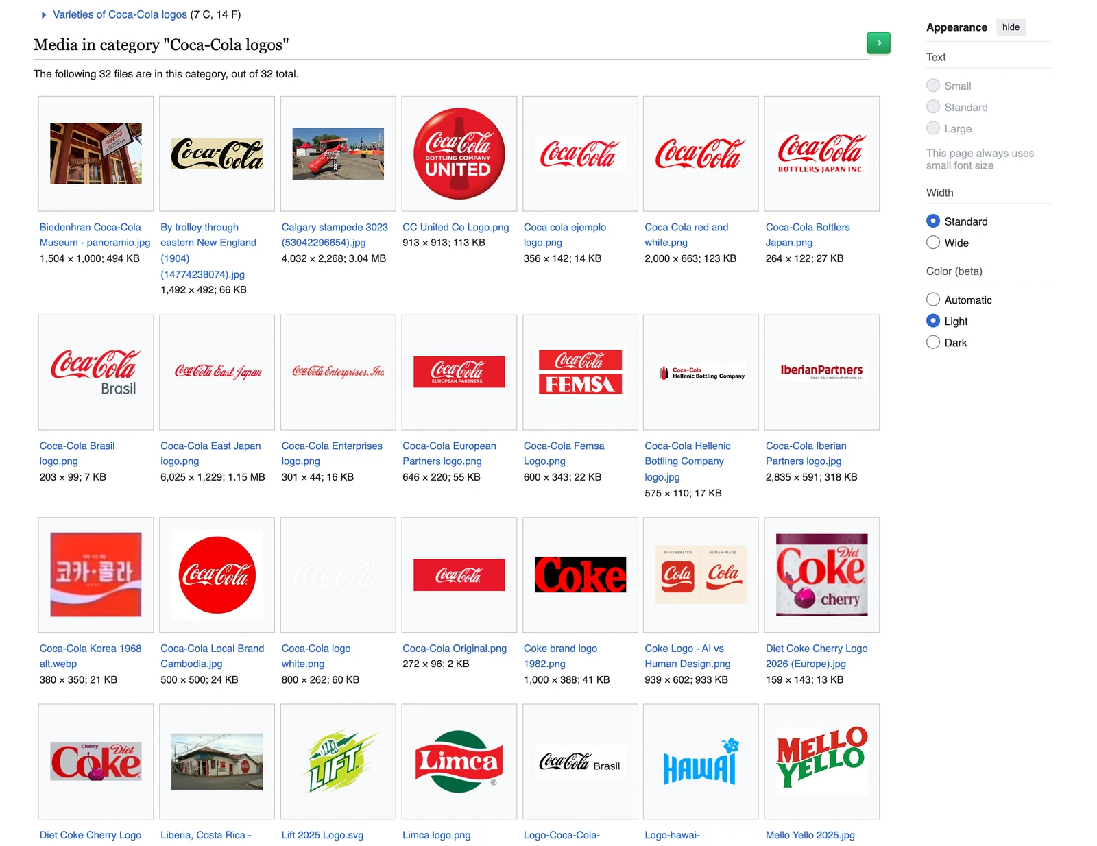
What to look for: the vector file itself. Zoom in on an SVG and you see how the curves are built, which no screenshot shows. Our guide to logo file formats explains why. Free to browse.
Standards Manual: the whole brand book
Standards Manual reissues classic brand manuals. Its best-known title is the 1975 NASA Graphics Standards Manual by Richard Danne and Bruce Blackburn, reprinted from scans of Danne's own copy, with the worm logo throughout. It was listed at $84.00 when we checked.
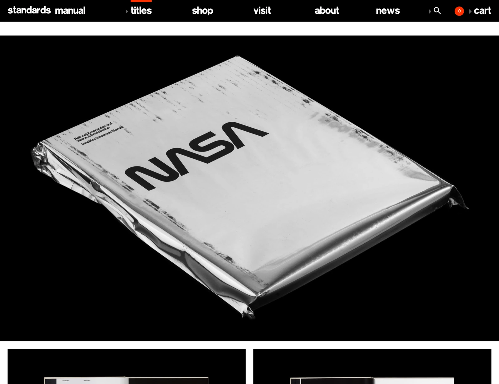
What to look for: the rules around the logo, not the logo. Spacing, sizes, color and use on everything from rockets to stationery are what make a mark a system. It is the only paid item here you buy for the object. See our brand identity guidelines paper for how to write your own.
How to use the six together
- Start with the story. Read one Logo Design Love entry for a logo in your field.
- Check the before and after. Find the same brand, or a rival, on Brand New.
- Name the type. Look up the typeface on Fonts In Use.
- Scan your category. Browse the matching shape on Logobook.
- Open the file. Pull the vector from Wikimedia Commons and look at how it is built.
- Read the rules. If you are building a brand, read how NASA wrote them.
Then write your brief from what you noticed. A designer can do a lot more with "simple like the Chase octagon, bold like Supreme" than with "make it modern". The same research feeds a proper logo design process, and the Apple logo history shows what studying one famous mark looks like in full.
Site
Logo Design Love
The stories behind famous logos. Free to read.
Site
Brand New
Big rebrands, old next to new. Full reviews are paid.
Site
Fonts In Use
Name the typeface inside a logo. Free to browse.
Site
Logobook
Classic logos filed by shape. Free to browse.
Site
Wikimedia Commons, Logos
The real logo files, old versions included. Free to browse.
Site
Standards Manual
Reissued brand books, including the 1975 NASA manual. Books are paid.
FAQ
What are the best sites to study famous logos?
Logo Design Love, Brand New, Fonts In Use, Logobook, Wikimedia Commons and Standards Manual. Each one answers a different question: the story, the rebrand, the font, the category, the file and the rules.
Where can I find the real files of famous logos?
Wikimedia Commons holds the actual logo files, including old versions, such as its category of Coca-Cola logos. The logos remain trademarks of their owners, so they are for study.
How do I find which font a famous logo uses?
Search Fonts In Use. Its Supreme clothing logo entry lists Futura as the typeface.
Are these logo inspiration sites free?
Four are free. Brand New shows before and after images for free but charges for its full reviews, and the NASA Graphics Standards Manual at Standards Manual was listed at $84.00.
Where can I see old logos next to new ones?
Brand New. It reviews major rebrands with the previous logo and the new one together, such as Pepsi's in-house redesign reviewed in March 2023.
How should I use inspiration sites before hiring a designer?
Pick two or three famous logos you admire, note what each does well in one sentence, and put those sentences in your brief. Specific references save a designer rounds of guessing.
Sources
- Logo Design Love, the NeXT logo by Paul Rand: the 1986 $100,000 commission and the 100-page proposal book.
- Brand New, the Pepsi in-house redesign: reviewed 29 March 2023, subscription pricing as shown on the page.
- Fonts In Use, Supreme clothing logo: Futura and the Barbara Kruger reference.
- Logobook, The Chase Manhattan Bank: Chermayeff & Geismar, 1960.
- Wikimedia Commons, Coca-Cola logos, and the logo files shown here, never redrawn: NeXT logo, Pepsi 2023, Supreme Logo, Chase logo 2007, Coca-Cola logo and NASA Worm logo. Trademarks of their owners.
- Standards Manual, NASA Graphics Standards Manual: Danne & Blackburn, 1975, listed at $84.00 on 25 October 2026.
- First published as a carousel on Logo Brainy.
Studied the greats and still stuck on your own? Our team turns a clear brief into a logo that holds up at every size.
Get StartedGet new papers by email
New Brainy papers in your inbox. Confirm once, unsubscribe anytime.