The Fonts Behind 6 Famous Logos: Futura, Segoe, FF Mark and More
Supreme and Louis Vuitton are Futura. Microsoft is Segoe. Mastercard is FF Mark. Wikipedia is Linux Libertine. Coca-Cola is no font at all. The source for each, and the free look-alikes.
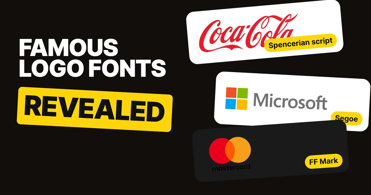
Most famous wordmarks did not start as hand-drawn lettering. Six of the best known started as a font someone chose well, and one of them started as 1880s handwriting. Here is which font sits behind each logo, who says so, and which free fonts come closest if you want the same feel.
| Logo | Font | Free to use? |
|---|---|---|
| Supreme | Futura Heavy Oblique | No. Free look-alike: Jost |
| Louis Vuitton | Futura | No. Free look-alike: Jost |
| Microsoft | Segoe | No. Free look-alike: Selawik |
| Mastercard | FF Mark | No, a paid font |
| Wikipedia | Linux Libertine | Yes, it is free itself |
| Coca-Cola | None, Spencerian script | Not a font |
Supreme: Futura Heavy Oblique
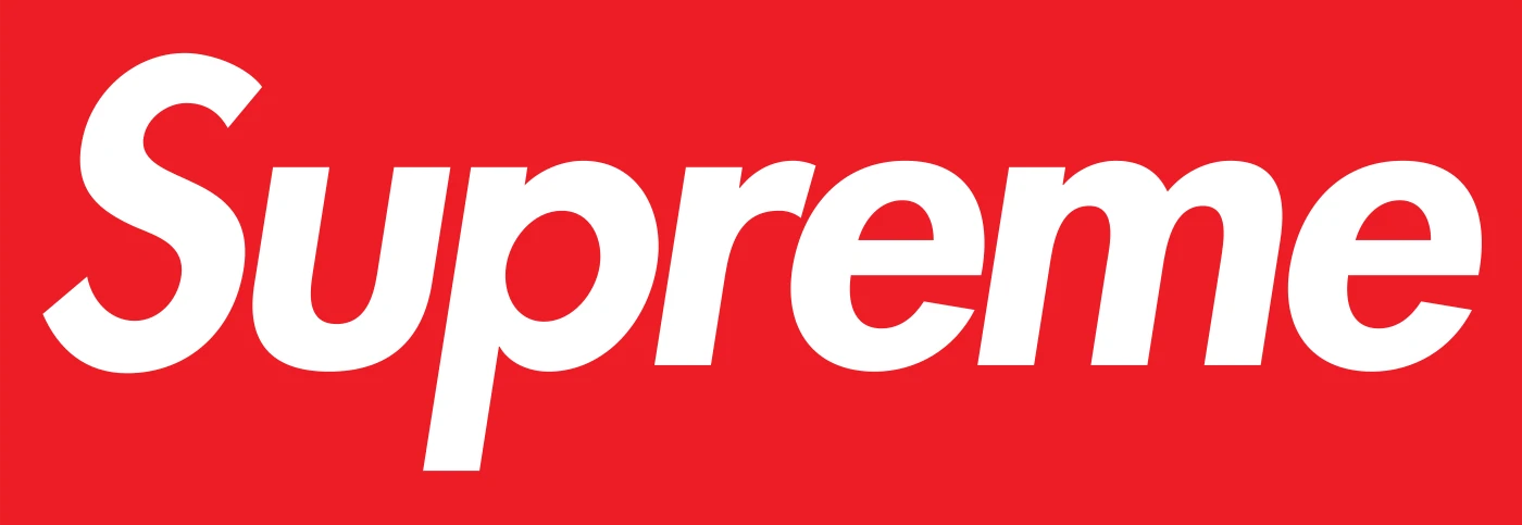
The Supreme box logo is Futura, in the Heavy Oblique cut: heavy, slanted, set in white on a red box. The look is borrowed on purpose. It follows the typographic style of the artist Barbara Kruger, who made it famous with white Futura on red.
The font is common. The box, the red and thirty years of putting it on everything are what make it Supreme.
Louis Vuitton: the same Futura, spaced wide
Monotype, which sells the font, writes that Futura is used for the Louis Vuitton wordmark and text. Some sources call it a slightly modified Futura. Either way, it is the same typeface family as Supreme.
What differs is the setting. Supreme is heavy, slanted and tight in a box. Louis Vuitton is light, upright, black and spaced wide, and it reads as luxury. One font, two opposite signals, and the difference is weight, slant and spacing.
Microsoft: Segoe, the font of its own products
When Microsoft unveiled its new logo in 2012, it said the logotype is set in Segoe, "the same font we use in our products as well as our marketing communications." The wordmark and the software speak in the same letters.
Segoe is not free. Microsoft publishes Selawik, an open-source font under the SIL Open Font License, as a replacement for Segoe UI, so it is the closest free match.
Mastercard: FF Mark, for its round letters
Pentagram's 2016 lowercase Mastercard wordmark is set in FF Mark, a typeface by Hannes von Döhren and Christoph Koeberlin from 2013. It was chosen for its circular forms, which echo the two circles above it.
FF Mark is a paid font, so there is no free swap to offer. The lesson is the reasoning: the letters were picked to rhyme with the symbol.
Wikipedia: Linux Libertine, with one custom W

In 2010 Wikipedia moved its wordmark from Hoefler Text to Linux Libertine, an open-source font, so the name could be set in hundreds of languages. A crossed W was added as an OpenType variant of the same font.
This is the only logo on the list you can use exactly as it is, because Linux Libertine is free. The crossed W is the small custom touch that turns a stock font into a recognisable mark.
Coca-Cola: no font at all
Coca-Cola is the exception. In 1886 Frank M. Robinson, bookkeeper to the drink's inventor John Pemberton, wrote the name in an adaptation of Spencerian script, the formal handwriting of the day. No font was involved, and nobody can buy it.
What the six have in common
Four of the six started from a typeface anyone could license or download. They became famous because of what happened next: Supreme repeated one setting for decades, Louis Vuitton kept its spacing, Mastercard tied its letters to its circles, and Wikipedia added a custom W. The font is the starting point. How long and how well you use it is what makes it yours.
Steal these fonts
The free fonts closest to the famous ones, for your own tests and mock-ups.
Free font
Jost
A free Futura-style geometric sans with italics, under the SIL Open Font License.
Free font
Selawik
Microsoft's open-source replacement for Segoe UI, under the SIL Open Font License.
For Wikipedia's look, download Linux Libertine itself. For Coca-Cola and Mastercard, there is no free font that does the same job, so take the idea instead of the letters.
FAQ
What font is the Supreme logo?
The Supreme box logo is set in Futura Heavy Oblique, white on a red box. A free look-alike is Jost.
What font does Louis Vuitton use?
Louis Vuitton uses Futura for its wordmark and text, spaced wide and set in black. Some sources describe it as slightly modified.
What font is the Microsoft logo?
The 2012 Microsoft logo is set in Segoe, the same font used in its products. Selawik is the free, open-source replacement for Segoe UI.
What font is the Mastercard logo?
The 2016 Mastercard wordmark is FF Mark, chosen by Pentagram for its round letters. FF Mark is a paid font.
What font is the Wikipedia logo?
Wikipedia's wordmark is Linux Libertine, a free font, with a custom crossed W. It replaced Hoefler Text in 2010.
What font is the Coca-Cola logo?
None. Coca-Cola's logo is Spencerian script, a style of formal handwriting, written by bookkeeper Frank M. Robinson in 1886.
Sources
- Supreme: Fonts In Use, Supreme clothing logo and Fonts Plugin, Supreme logo font. Jost as a look-alike: Font Alternatives.
- Louis Vuitton: Monotype, fonts and luxury brands.
- Microsoft: Microsoft blog, 23 August 2012 and Microsoft Learn, Selawik.
- Mastercard: Fonts In Use, Mastercard identity 2016 and Creative Review.
- Wikipedia: Wikipedia logo.
- Coca-Cola: The Coca-Cola Company, history.
- Logo files from Wikimedia Commons, shown for commentary and never redrawn: Supreme, Louis Vuitton, Microsoft, Mastercard, Wikipedia, Coca-Cola. Trademarks of their owners.
- Our own Instagram post on this topic: The fonts behind 6 famous logos.
Want a wordmark that starts from the right font and becomes yours? Our team sets type for logos and builds the identity around it.
Get StartedGet new papers by email
New Brainy papers in your inbox. Confirm once, unsubscribe anytime.