Print Design Principles Every Designer Should Steal
Print designers solved hierarchy, grid, rhythm, and restraint decades ago. Here is the canonical guide to what digital designers should steal in 2026.
Print designers figured out almost everything you are wrestling with on screen. They figured it out before you were born, on smaller budgets, with worse tools, and with the unforgiving discipline of a deadline that rolled off a press at three in the morning.
Every wave of digital design rediscovers their work slowly and badly. We invent a new grid system every five years. We rename hierarchy as "visual weight" and pretend it is fresh. We argue about white space like it is a startup pitch.
The field already solved most of this. The work is sitting in a bound copy of Wired from 1995 or a Penguin paperback from 1947, waiting for you to actually look. Print is not a museum. It is a working library you are allowed to walk in, take what you need, and walk out of.
Why print solved this first and we keep forgetting
Print had constraints digital still pretends it is exempt from. A page is a fixed canvas. A magazine spread costs real money to print and ship.
Every decision had a cost, and that cost forced editorial restraint. Print designers also had to fight for a reader's attention against the next spread, not against TikTok. The competition was honest. The tools were limited to type, image, color, paper, and the grid.
With those five things, Massimo Vignelli built the Unimark identity for American Airlines. Paula Scher built Pentagram's most iconic posters. Wim Crouwel built the visual language of the Stedelijk Museum. Five tools, decades of canon.
Digital designers have a thousand tools and most of us still cannot make a landing page that respects its reader. The constraint is not the tools. The constraint is that nobody made us study the canon.
The seven principles print figured out
Strip away the romance and you get seven principles that print nailed and digital keeps stumbling on.
-
Hierarchy. One thing is the lead. Everything else is in service of the lead.
-
Grid. A grid is a contract with the reader, not a cage for the designer.
-
Rhythm. Page after page should feel like a piece of music, not a slot machine.
-
Scale. Big things are big because they earn it, small things are small because they earned that too.
-
Contrast. Type weight, color, density, scale. Contrast is how the eye moves.
-
Restraint. Most decisions are decisions to remove, not to add.
-
Respect for the reader. The reader's time, attention, and intelligence are the budget you spend.
These seven sit underneath every great print object. They show up in a Tschichold-era Penguin paperback and in a Bloomberg Businessweek cover under Richard Turley. They show up the same way in a Vignelli subway map and a New York Times Magazine feature opener. The names change, the principles do not.

Hierarchy and grid: pick a lead, anchor it to a contract
Open any issue of Bloomberg Businessweek from the Richard Turley era, roughly 2010 to 2014. Every spread has one lead. The lead is enormous, the supporting type is small, the image either screams or whispers, and there is no confusion about where to start.
Compare that to a typical SaaS marketing page in 2026. The hero headline, the eyebrow, the subhead, the three feature bullets, the testimonial, and the gradient blob all want to be the lead. None of them are. The reader bounces.
The print fix is brutal. Look at your screen, ask which single element is the lead, and then make every other element visibly smaller, lighter, or quieter. If two elements are competing, you do not have hierarchy. You have noise wearing a hierarchy costume.
The lead has to land somewhere. That somewhere is the grid. Jan Tschichold rebuilt the Penguin paperback line in the late 1940s using a grid so disciplined that the books still feel modern.
Wim Crouwel did the same for Dutch civic design. Massimo Vignelli put the Unigrid system on every National Park Service brochure in the United States, and those brochures are still in print, still legible, still beautiful, fifty years on.
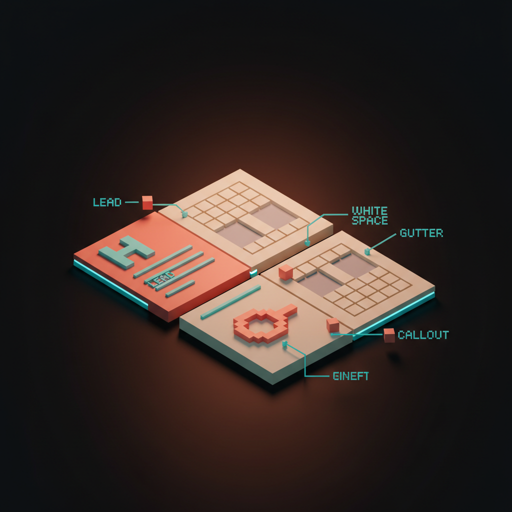
A grid is not the twelve-column thing your front-end framework ships with. A grid is a promise that headlines start in the same place, that captions sit in a known column, that gutters do not move, that the eye can trust the page. The reader does not see the grid. The reader feels it.
Most digital products do not have a grid. They have a layout that survived the last design review. That is not the same thing.
Rhythm and scale: design the second page, earn the size
A print designer thinks in spreads, not in pages. A magazine art director plans how a feature opens, breathes, accelerates, and lands, the same way a film editor cuts a scene. Wired in the Carson and Plunkett era was famous for this. Each feature was a song, not a single note.
Digital design overwhelmingly thinks in single screens. The hero gets a hundred hours of attention, the second scroll gets fifteen minutes, the third gets none. Then we wonder why our marketing pages collapse below the fold.
Steal the move. Sketch the entire page as a sequence of beats. If you cannot describe the rhythm out loud, the page does not have one.
Scale is rhythm's loud cousin. Paula Scher's Public Theater posters are an education in scale. Type fills the poster, cropped at the edges, a single weight doing all the work.
The size is the message. You read the type because the type is the room.
Digital design tends to use big type as a vibe instead of as a statement. Forty-eight pixel headlines that say "Welcome to the platform that empowers your team" are not big because they earned it. They are big because the design system shipped a display-xl token and somebody used it.
The print rule is simple. If a piece of type is large, the words inside it have to be worth that real estate. Either the words deserve the size or the size comes down. There is no third option.
The five digital sins print principles fix

Most bad digital design is one of five repeating mistakes. Each has a print principle that fixes it on contact.
| Print principle | Common digital sin | The fix |
|---|---|---|
| Hierarchy | Everything is the same size, nothing leads | Pick the single lead, shrink the rest visibly |
| Grid | Decorative layout, no underlying structure | Set a real grid, align every element to it, no exceptions |
| Restraint | Too many fonts, too much chrome | Cap fonts at two, kill borders, shadows, gradients that do no work |
| Scale | Big type with weak words | Make the words deserve the size, or shrink the type |
| Contrast | Flat gray-on-gray UI with no anchor | Add real weight contrast, real color anchor, real density change |
Read the table once and then read your own product. You will find at least three of these sins on the screen you shipped this month. That is fine, almost everyone has them. The point is to name them so you can kill them.
Restraint and respect: the two principles that hurt to learn
Vignelli's life work was a war on decoration. He used five typefaces, total, for the rest of his career after a certain point. He believed most design problems were caused by adding something that should have been removed. He was right about almost every one of them.
Restraint is the hardest principle to internalize because the visible work in design is what you add. Nobody applauds the gradient you removed, the icon you cut, the third font you refused to load. The reader applauds, silently, by actually finishing the page.
A useful private rule. Before you ship a screen, remove three elements and see if the design still works. If it does, keep the elements removed.
Respect for the reader is the principle restraint serves. The print canon treats the reader as an adult. Penguin assumed you could read a four hundred page novel set in eleven point Garamond with no scroll indicators, no progress bar, no estimated reading time.
Digital has spent fifteen years quietly insulting its readers. Reading time chips, progress bars, "TLDR" sections inside articles that are themselves summaries. The assumption is that the reader cannot handle text without a chaperone.
Throw that assumption out. Your reader is an adult. They will reward you by reading.
How to read a great editorial spread
Pick up an old issue of the New York Times Magazine, or pull a Bloomberg Businessweek from the Turley years, or grab any Pentagram annual report. Open to a feature spread. Now actually look.
Note the lead. There is exactly one. It is either the headline, the image, or a pulled quote.
Note where the lead sits, almost always at a grid intersection, never centered for the sake of centering. Note the supporting type, smaller, often lighter, never fighting the lead.
Note the white space, more than you expect, shaped, not accidental. Note the captions, tiny, anchored to a fixed column. Note the folios, which live in a known place and do not move.
That is a grid working. That is hierarchy working. That is rhythm working.
Every one of those decisions was made on purpose, by a person, in service of the reader.
Typography lessons that translate cleanly
Print typography is decades ahead of screen typography in three specific ways.
First, scale ratio. Print designers pick a typographic scale and stick to it. Major third, perfect fourth, golden ratio, whatever.
The screen designer picks "well, the design system has eight sizes, and I will use most of them." That is not a scale. That is a buffet.
Second, line length and leading. The print canon settled on around sixty-six characters per line for body type, with leading roughly one hundred and forty percent of font size. Web design routinely ships paragraphs that run a hundred and twenty characters wide with stingy leading because the design system token said so.
Third, type pairing. The print rule is two families, max, and they have to do different jobs. Display and text, or serif and sans.
The digital rule somehow became "use Inter and then add four other fonts because the marketing team likes them." Cap your fonts at two and your hierarchy gets sharper overnight.
White space and cover design lessons
White space is not the negative of design. It is design. The Swiss school taught this in the nineteen fifties and we have somehow lost it twice since.
Look at a Müller-Brockmann poster. The white space is doing structural work. It frames the type, it carries the eye, it gives the loud elements somewhere to land.
White space is not the absence of content. It is the part of the page that makes the content readable. Digital products are terrified of white space because empty pixels feel like wasted real estate. They are not.
They are the breathing room that lets the reader stay. A landing page with twice as much white space converts better than the same page with twice as much copy. Test it on your own product. Notice what happens.
A magazine cover has two seconds to do its job on a newsstand. It has to signal the brand, sell the lead story, and look beautiful at thumbnail size. Editorial designers have been solving that problem for a hundred years.
Your homepage hero, your onboarding screen, your app icon, your social share image. These are all covers. Same two-second rule.
Steal the playbook. One dominant idea, one typographic anchor, one image that does not blink. If your hero needs three lines of copy to explain itself, it is not a hero.
What does not translate from print to digital
Print did not solve everything. Be honest about what the canon cannot give you.
Print did not solve interactivity. A page does not respond to a tap. The canon teaches you nothing about state, feedback, error handling, or the moment the user does something you did not predict.
Print did not solve motion. Editorial designers think in stillness. Motion is a craft you learn from animation, film, and games, not from a magazine spread.
Print did not solve responsive layout. The print grid teaches you discipline, but the responsive grid is a problem you solve on top of that.
The principle survives, the implementation does not. Take the principles, leave the assumptions. That is how you steal correctly.

Building a print-influenced design system
You can put all of this into a design system without anyone calling you precious. The trick is to encode the principles as constraints, not as decorations.
Cap your typefaces at two. Cap your type sizes at six, on a real scale. Cap your color tokens at a working set, with a single accent that earns its loudness.
Cap your spacing tokens to a rhythm that holds across breakpoints. Cap your shadow and border tokens at the smallest set that does the job.
Then write the rules of use. The lead in any view is the largest element. The grid is sacred and alignment is non-negotiable. White space is a token, not a leftover.
Decoration is added only when it does structural work. These rules sit inside the design system documentation, right next to the components, and they are reviewed in design crit the same way code is reviewed in pull requests.
A design system without principles is a sticker pack. A design system with print principles baked in is a publication.
The Bauhaus understood this in the nineteen twenties. Tschichold codified it in The New Typography in 1928. The Swiss school operationalized it in the fifties.
Pentagram has been shipping it commercially for sixty years. The principles are stable, the medium is what keeps changing.
A short workshop you can run on your own product
Pick one screen from your current product. The homepage hero, the dashboard, the settings page, whatever. Sit down with a print object you respect, a magazine spread, an annual report page, a paperback opener, anything by Pentagram or Vignelli or Scher. Put them side by side.
Ask five questions. What is the lead on each? Where does the eye go first, second, third? How many fonts and sizes are in use, and how much white space is shaped versus accidental?
Then make the cuts. Remove three elements, shrink the eyebrow, cap the fonts at two. Move the lead to a real grid intersection. Add white space until the page breathes.
Run the new version past the same five questions. The improvement will be obvious.
Do this once a week for a month. Your eye will recalibrate. Your screens will get quieter and stronger. Your team will start to notice.
That is what a print education does, and you can give yourself one in an afternoon.
The canon is a working library, treat it that way
The names in this paper are not history. Vignelli, Tschichold, Crouwel, Scher, Müller-Brockmann, Carson, Turley, Pentagram, Penguin, Bloomberg Businessweek, the New York Times Magazine. They are a working library you can pull from this week.
Their books are still in print. Their spreads are still online. Their principles still hold.
Buy one monograph. Subscribe to one print magazine. Keep one design annual on the desk where you actually work. Open them when you are stuck.
The canon will outwork your Pinterest board every single time. The field already solved most of what you are wrestling with. The work is sitting there waiting for you to look. Look.
If your product screens feel noisy and flat, hire Brainy to rebuild them with editorial discipline.
Get StartedNot ready to hire? Run the free Business Genome, an 11-dimension diagnostic for your venture.
Get your free GenomeGet new papers by email
New Brainy papers in your inbox. Confirm once, unsubscribe anytime.