Bold Color Palettes: 16 Loud Brand Palettes and the Colors That Hold Them
Sixteen bold three-color palettes for brands and logos, each with exact hex codes. Every loud color comes with a deep partner and a soft one, and here is why that is the whole trick.
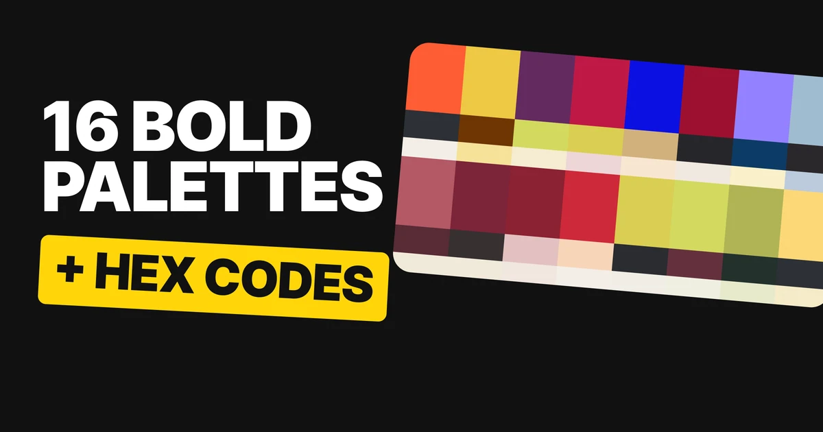
A bold color palette is not a set of loud colors. It is one loud color and two quiet ones that let it be loud without taking over. Here are sixteen of them, in four families, with every hex code and the rule that makes each one work for a logo.
The rule behind all sixteen
Loud colors are easy to find. Using one for a brand is harder, because a color that bright has to sit next to text, packaging, a website and a logo, every day. Left alone it shouts at all of them.
So every palette here has three jobs filled.
The loud color is the one people remember. The deep color, usually a near-black or a dark version of a hue, is what a wordmark is set in. The soft color, a cream, a pale tint or an off-white, is the ground the other two sit on. In a few of them, Barberry, Rio Red and Tomato among them, the loud color is dark enough to carry the type itself, so it does two jobs.
The fourth tile under each palette shows the pairing a logo would use. Each one is built from the palette itself, with no white or black added.
Loud on purpose
Four hero colors that would take over a room if you let them. Each gets two colors to keep it honest: one deep enough to set a mark in, one soft enough to breathe around it.
Persimmon
Vulcan
Persimmon
Sugar Swizzle
Persimmon on Vulcan
A hot orange with a cool dark. Vulcan is a blue-gray, not a black, so the orange looks warmer next to it.
Maize
Cold Press Coffee
Maize
Lemon Meringue
Cold Press Coffee on Maize
A bright yellow needs a real dark. Maize comes with Cold Press Coffee and not with white, because a wordmark set on a yellow this light disappears unless the ink is properly deep.
Charisma
Charisma
Limeade
Winter White
Limeade on Charisma
Here the deep color is the hue. Charisma is a dark plum that can carry type on its own, and Limeade is the loud note on top of it.
Barberry
Barberry
Green Sheen
Mauve Morn
Mauve Morn on Barberry
Two loud colors in one palette, held apart by a pale mauve. Use Barberry for the mark and keep Green Sheen small: a foil, a sticker, a detail.
One loud color, two quiet ones
The same rule, pushed further. Each of these has one very saturated color held between two near-neutrals.
Ultrasonic
Ultrasonic Blue
Soft Fawn
Antique White
Antique White on Ultrasonic Blue
Ultrasonic Blue is about as saturated as a screen blue gets. On its own it looks like a warning light. Between Antique White and Soft Fawn, it looks like a brand.
Jester Red
Black Beauty
Jester Red
Gardenia
Gardenia on Jester Red
A deep red between two near-neutrals. Black Beauty is softer than pure black, which keeps the red from looking harsh, and there is still plenty of contrast for text.
Periwinkle
Regal Navy
Soft Periwinkle
Lemon Chiffon
Soft Periwinkle on Regal Navy
Soft Periwinkle is loud but light, so it needs Regal Navy to sit on. Lemon Chiffon warms the whole set up.
Dream Blue
Black Onyx
Dream Blue
Winter Scene
Black Onyx on Dream Blue
The quiet one out: two soft blues and a near-black. Here the near-black does all the work, and every mark goes in Black Onyx.
None of the darks in these palettes is pure black. A near-black reads just as clearly and looks less severe next to a loud color.
Four reds, four moods
Red is four colors, not one. Windsor Wine leans cool, Tomato leans warm, and Rumba Red and Rio Red sit in between, which is where most brand reds live. The mood comes from the partner as much as from the red: wine gets a cream, tomato gets a peach.
Windsor Wine
Windsor Wine
Slate Rose
Vanilla Ice
Vanilla Ice on Windsor Wine
A cool wine red with a dusty rose. Quiet enough for a restaurant or a wine label, with Vanilla Ice for the type.
Rumba Red
Espresso
Rumba Red
Vanilla Ice
Vanilla Ice on Rumba Red
Espresso and Rumba Red are almost the same lightness. That makes a lovely tone-on-tone pattern, and it means you never set one as text on the other. Text goes in Vanilla Ice.
Rio Red
Rio Red
Lotus
Sea Salt
Sea Salt on Rio Red
A classic deep brand red, softened by a pale pink and a warm off-white. The red does the talking, the pinks keep it friendly.
Tomato
Tomato
Tender Peach
Sugar Swizzle
Sugar Swizzle on Tomato
The warmest and brightest red here. Tomato on its pale partners only just reads for small text, so use it for big marks and headlines, and set body text in a darker color.
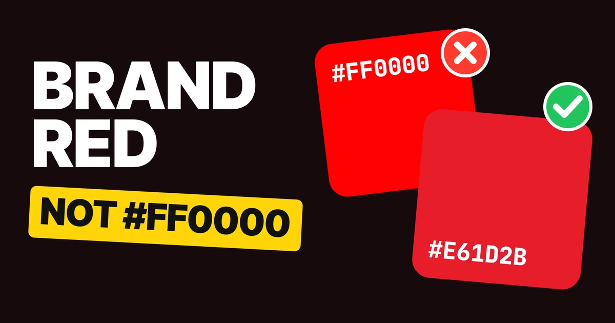
For how famous brands tune their reds for screen and print, see our paper on brand red.
Acid colors need a dark
Four bright yellow-greens. They make great logos as long as nobody asks them to work alone, because they are loud and light at the same time.
Lemon Drop on Lemon Icing
Lemon Drop on Vulcan
That is the rule for a mark in a bright color: bright on dark, or dark on bright. Never bright on light.
Green Sheen
Stretch Limo
Green Sheen
Coconut Milk
Green Sheen on Stretch Limo
A yellow-green on a cool near-black. Coconut Milk is the ground for everything that is not the logo.
Limeade
Burgundy
Limeade
Cannoli Cream
Limeade on Burgundy
Limeade on Burgundy instead of black. A dark warm red behind an acid green is louder and friendlier than a black would be.
Green Oasis
Scarab
Green Oasis
Sylvan Green
Green Oasis on Scarab
The calmest of the four. Green Oasis is an olive, and Scarab is a deep green-black, so the whole set stays in one family.
Lemon Drop
Vulcan
Lemon Drop
Lemon Icing
Lemon Drop on Vulcan
The lightest yellow here, and the one that most needs its dark. On Lemon Icing it vanishes; on Vulcan it glows.
All sixteen palettes in one table
| Palette | The loud color | Its partners |
|---|---|---|
| Persimmon | Persimmon #FF5C34 | Vulcan #2D3036, Sugar Swizzle #F3EEE7 |
| Maize | Maize #EEC843 | Cold Press Coffee #6F3503, Lemon Meringue #F6E199 |
| Charisma | Charisma #632A60 | Limeade #D3D95F, Winter White #F5ECD2 |
| Barberry | Barberry #BF1945 | Green Sheen #D9CE52, Mauve Morn #ECD6D6 |
| Ultrasonic | Ultrasonic Blue #0C10E3 | Soft Fawn #D1B17C, Antique White #F8E6D2 |
| Jester Red | Jester Red #9E1030 | Black Beauty #26262A, Gardenia #F1E8DF |
| Periwinkle | Soft Periwinkle #9381FF | Regal Navy #0D3B66, Lemon Chiffon #FAF0CA |
| Dream Blue | Dream Blue #A0BCD0 | Black Onyx #2B272B, Winter Scene #BBCBDC |
| Windsor Wine | Slate Rose #B45865 | Windsor Wine #582B36, Vanilla Ice #F0EADA |
| Rumba Red | Rumba Red #7C2439 | Espresso #363031, Vanilla Ice #F0EADA |
| Rio Red | Rio Red #8A2232 | Lotus #E2C1C0, Sea Salt #F1E6DE |
| Tomato | Tomato #CE2939 | Tender Peach #F8D5B8, Sugar Swizzle #F3EEE7 |
| Green Sheen | Green Sheen #D9CE52 | Stretch Limo #2B2C30, Coconut Milk #F0EDE5 |
| Limeade | Limeade #D3D95F | Burgundy #64313E, Cannoli Cream #F0EFE2 |
| Green Oasis | Green Oasis #B0B454 | Scarab #23312D, Sylvan Green #E7EACB |
| Lemon Drop | Lemon Drop #FDD878 | Vulcan #2D3036, Lemon Icing #F6EBC8 |
How to use a bold palette for your brand
- Give the loud color one job. The logo, the packaging hero, the one button. Everywhere else it appears small.
- Set the wordmark in the deep color on light grounds, or in the loud color on the deep one.
- Use the soft color as the page. Most of what people see of your brand is background, and a cream or a pale tint is calmer than pure white.
- Test it in one color first. If the logo only works in the loud color, it will fail on a fax, a stamp or a dark photo. Our brand color palette paper covers the full system.
Get the files for each family
Each family is a free color set on Forge, with tap-to-copy codes, swatch files for Figma and Adobe (ASE), CSS variables and design tokens.
Free color set
Loud on purpose: Persimmon, Maize, Charisma, Barberry
Every hex, plus ASE swatches, CSS variables and design tokens.
Free color set
One loud color: Ultrasonic, Jester Red, Periwinkle, Dream Blue
Every hex, plus ASE swatches, CSS variables and design tokens.
Free color set
Four reds: Windsor Wine, Rumba Red, Rio Red, Tomato
Every hex, plus ASE swatches, CSS variables and design tokens.
Free color set
Acid colors: Green Sheen, Limeade, Green Oasis, Lemon Drop
Every hex, plus ASE swatches, CSS variables and design tokens.
FAQ
What is a bold color palette?
A bold color palette is built around one saturated, attention-grabbing color, such as a hot orange, a deep red or an acid green. The palettes that work for brands pair that color with a deep color for text and a soft one for backgrounds.
What colors go well with a bright brand color?
A near-black or a dark version of a hue for text and marks, and a cream or pale tint for backgrounds. Persimmon #FF5C34 with Vulcan #2D3036 and Sugar Swizzle #F3EEE7 is a good example.
Can I use a bright yellow or green in a logo?
Yes, but put it on a dark background or set the mark in a dark color on top of it. A bright yellow or acid green on white or cream almost disappears.
What is a good red color palette for a brand?
Pick the red by mood, then pick its partners. A cool wine like Windsor Wine #582B36 suits a quiet, premium brand. A warm Tomato #CE2939 suits a loud, friendly one. Both need a pale partner for type.
Are these color palettes free to use?
Yes. The hex codes are free to use in any project, and each family is a free download on Forge with swatch files and CSS.
Sources
- Color names and hex codes from the palette cards on our team's color board, checked against the published Forge color sets.
- Readability of each pairing checked with the WCAG 2 contrast formula. Tomato on Sugar Swizzle scores 4.5 to 1, the minimum for body text. Espresso on Rumba Red scores 1.3 to 1, which is why the two are never used as text on each other.
- First published as four carousels on Logo Brainy: Loud on purpose, One loud colour, Four reds and Acid colours.
Want a palette built for your own brand, tested on your logo, your packaging and your screens? Our team designs brand identities that hold up everywhere.
Get StartedGet new papers by email
New Brainy papers in your inbox. Confirm once, unsubscribe anytime.