Brand Red Is Not #FF0000: How Coca-Cola, LEGO, Levi's and Netflix Use Red
Pure red prints duller and fails white text. The famous red logos all use a tuned red instead. Their exact codes, why YouTube moved off pure red, and how to pick a red for your logo.
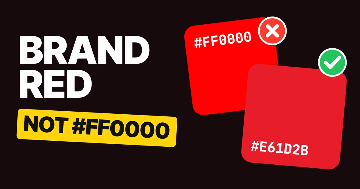
A good brand red is never #FF0000. Pure red is the brightest red a screen can show, which sounds like an advantage until the logo goes to print, comes back duller, and turns out to be too light to carry white text. Every famous red you know is a tuned red instead.
Why pure red fails
Pure red is the corner of the screen's color space: the red light at full power and nothing else. Printing ink cannot reach it.
On screen
In print, on coated paper
Converted for a standard coated press, #FF0000 proofs as about #E51F20: duller and slightly orange. The difference is large enough that a trained eye calls it a different color, so the red on your business card will not match the red on your website.
The second problem is white text. White on #FF0000 scores 4.0 to 1, under the 4.5 to 1 the accessibility guidelines ask for normal text. A red that is meant to carry the brand name in white has to be a little darker than the brightest red there is.
Even YouTube moved off it
YouTube until 2017
YouTube since 2024
YouTube's red was pure red in the RGB system. Google's design team wrote that it rendered orange on some screens, caused burn-in on TVs and felt too loud, so the brand moved to a slightly cooler red. Read from the logo files, that is #FF0000 to #FF0033.
YouTube tuned its red for screens, which is where YouTube lives. #FF0033 still shifts a lot in print, so it is a lesson rather than a red to copy for a logo that will be printed.
How the famous reds do it
Coca-Cola: #E61D2B

The most famous red in the world sits just below pure red and leans a hair toward blue. It prints almost exactly as it looks on screen, and white script on it passes the contrast check, which is how Coca-Cola uses it on cans and trucks.
LEGO: #E3000B
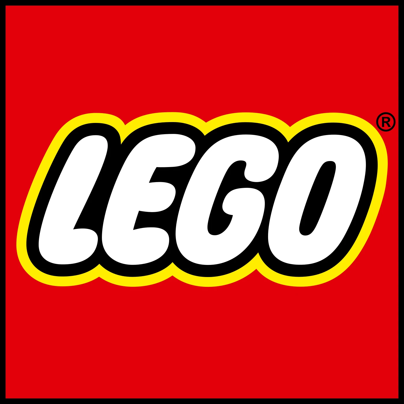
A deep, fully saturated red that keeps its punch on toy boxes. LEGO's square already carries its own outline, so the red can stay bright and still read as a solid block on a shelf.
Levi's: #C41230
The darkest of the four, closer to crimson. It is the red on the tab sewn into the jeans, which is why it is shown here on white: Levi's red is built to sit on fabric and paper, and its darkness keeps the white lettering crisp.
Netflix: #E50914

The red that greets you on a black screen. Netflix's red mostly lives on black, and the N uses a darker shade, #B1060F, for its folds, so the letter looks folded like a ribbon.
The two things they all do
Every famous red is a touch cooler and darker than pure red. Pure red sits at 0 degrees on the color wheel. Coca-Cola, LEGO and Netflix sit at 356 to 357, Levi's at 350: all lean slightly toward blue. All four are also a little darker than pure red, which is exactly what white text needs.
Every famous red can carry white text. White on pure red fails the contrast check. White on each of the four passes.
| Brand | Red | Hue | White text on it | Print shift |
|---|---|---|---|---|
| Pure red | #FF0000 | 0° | Fails, 4.0 to 1 | Large, 6.0 |
| YouTube (2024) | #FF0033 | 348° | Fails, 4.0 to 1 | Large, 5.5 |
| Coca-Cola | #E61D2B | 356° | Passes, 4.6 to 1 | Invisible, 0.7 |
| Netflix | #E50914 | 357° | Passes, 4.8 to 1 | Small, 1.1 |
| LEGO | #E3000B | 357° | Passes, 4.9 to 1 | Small, 1.3 |
| Levi's | #C41230 | 350° | Passes, 6.0 to 1 | Invisible, 0.6 |
A print shift under about 2 is hard to see. Above about 5, the printed color reads as a different red.
How to choose a red for your logo
- Start just below pure red. Pull #FF0000 a few degrees toward blue and a little darker. The four famous reds sit between 350 and 357 degrees.
- Test white on it. If the brand name will ever be white on red, check the contrast reaches 4.5 to 1. Darken until it does.
- Proof it in print. Soft-proof it in your design tool with a coated paper profile, or ask your printer for a proof. Move it until the printed red and the screen red agree.
Steal these 4 reds
The four reds, as each brand draws them.
Use them to study and to test your own red next to them. Copying a famous brand's exact red for a new logo in a related business is how you end up looking like a knockoff: use the pattern, not the code.
FAQ
What is the Coca-Cola red hex code?
Coca-Cola red is #E61D2B, as drawn in the Coca-Cola logo file.
What is the Netflix red hex code?
Netflix red is #E50914. The folds of the N logo use a darker #B1060F.
What is the LEGO red hex code?
LEGO red is #E3000B.
What is the YouTube red hex code?
YouTube used pure red, #FF0000, until it moved to a slightly cooler red. The current logo file draws #FF0033.
Why is #FF0000 bad for a logo?
It prints noticeably duller than it looks on screen, and white text on it fails the contrast check. A slightly darker, cooler red fixes both.
Sources
- Colors read from each brand's logo file on Wikimedia Commons: Coca-Cola, LEGO, Levi's (2011), Netflix N (2016), YouTube icon 2017 and 2024.
- Google Design, YouTube's New Hue, on why YouTube left pure red.
- Print shift: a soft proof on the Coated FOGRA39 press profile, measured as Delta E 2000. #FF0000 proofs as #E51F20, a difference of 6.0.
- Hue angles and contrast computed from the hex codes with the HSL model and the WCAG 2 contrast formula.
Choosing colors for a new logo? Our team designs brand identities with colors that work on screen, in print and next to each other.
Get StartedGet new papers by email
New Brainy papers in your inbox. Confirm once, unsubscribe anytime.