
Color Harmony: How to Build Schemes That Actually Work
What color harmony really is, the color wheel relationships behind every scheme, complementary vs analogous vs triadic, real brand palettes, and how to build one.
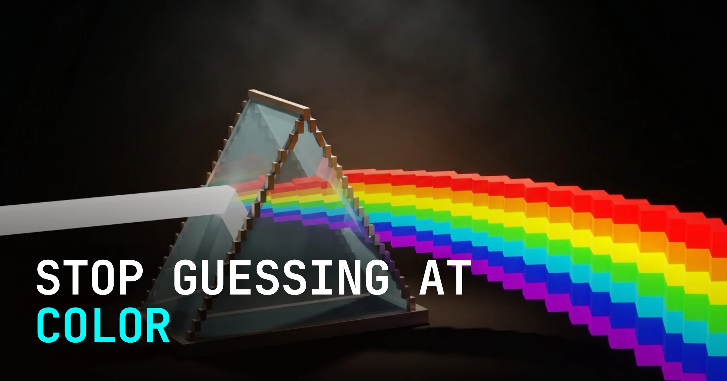
Color harmony is not taste. It is geometry. Every palette that feels right is a fixed relationship on the color wheel, and you can reproduce it on purpose.
That is the whole secret most "color theory" articles bury under a swatch gallery. The colors in a good scheme are not friends who happen to get along. They are points placed at deliberate angles around a wheel, and the angle is the reason they work.
Once you see the geometry, picking colors stops being a vibe you chase and becomes a decision you make. This is a system, not a mood board.
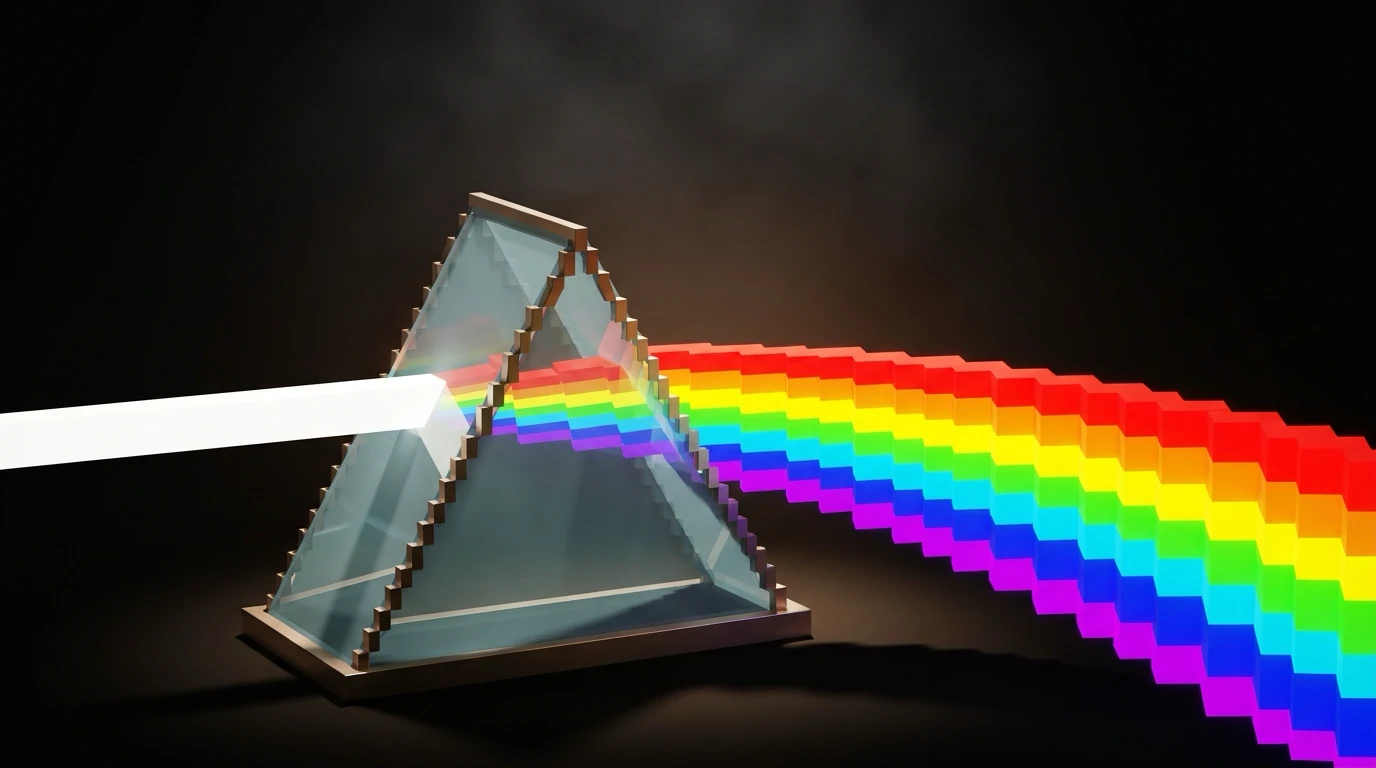
What color harmony actually means
Color harmony is the arrangement of colors in a way the eye reads as ordered rather than random. Harmony is what happens when the relationships between your colors are consistent, not when the colors are individually pretty.
Why bother? Because the judgment is fast and unforgiving. According to the Interaction Design Foundation, citing research from the University of Basel and Google, people judge a design's appeal in roughly 17 to 50 milliseconds, and that snap judgment runs largely on color and composition. You do not get a second first impression.
Harmony also carries meaning. As Joann and Arielle Eckstut put it, "Colors can symbolize emotions that align with a brand's persona," quoted by the Interaction Design Foundation. The relationship sets the feeling before a single word is read. If you want the deeper layer of what each hue communicates, we break down what each color actually signals separately.
The color wheel is the whole game
The color wheel is a map of where every hue sits relative to every other hue. Harmony schemes are just shapes you drop onto that map. Rotate the shape, get a new palette, keep the same balance.
This is not folklore. As Sensational Color explains, the classic harmonies "are combinations of colors that balance the spectrum," and you can "see using geometric shapes to help you visualize the relationship of the hues on the color wheel." The shape is the recipe. The wheel is the kitchen.
Three relationships do most of the heavy lifting:
- Opposite hues sit across the wheel and create contrast.
- Neighboring hues sit side by side and create cohesion.
- Evenly spaced hues split the wheel into equal slices and create balance.
Master those three and you have covered the schemes that 90% of brands actually ship.

The six schemes that matter
There are six classic harmonies worth knowing. Each one is a geometric shape rotated around the wheel, per Sensational Color, and each produces a predictable feeling.
| Scheme | Wheel geometry | What it produces |
|---|---|---|
| Monochromatic | One hue, many tints and shades | Calm, unified, minimal risk |
| Analogous | 3 to 4 neighbors, side by side | Cohesive, smooth, low contrast |
| Complementary | 2 hues directly opposite | Maximum contrast, high energy |
| Split-complementary | 1 hue plus the two beside its opposite | Contrast with less tension |
| Triadic | 3 hues at equal thirds of the wheel | Balanced, vivid, lively |
| Tetradic | 2 complementary pairs (a rectangle) | Rich, complex, hard to manage |
You do not need all six on day one. Most working designers live in three of them: complementary, analogous, and triadic. The other three are variations you reach for when the base scheme runs out of room. Here is when each of the three core schemes earns its place.

Complementary: maximum contrast, minimum effort
Complementary means two hues sitting directly opposite on the wheel, like blue and orange, red and green, or purple and yellow. The opposition is the point.
Why does it work perceptually? Opposite hues share almost no wavelength neighbors, so the eye reads maximum separation. That separation is contrast, and contrast is attention. This is why a complementary accent on a neutral field is the most reliable "look here" tool in design.
FedEx is the textbook case: a purple and orange wordmark, two hues that sit opposite on the wheel. The contrast is so clean it survives at any size, even hidden in the negative-space arrow.

The catch: complementary at full saturation, side by side, in equal amounts, will vibrate. Two opposites screaming at the same volume fight for the same attention and exhaust the eye. The fix is proportion, which we get to below.
Analogous: calm, cohesive, low-risk
Analogous means three to four hues sitting next to each other on the wheel. Think yellow into yellow-green into green. They are neighbors, so they blend.
The reason this feels smooth is wavelength proximity. Neighboring hues share most of their spectral range, so the transitions between them are gentle and the eye reads them as one family. There is no fight because there is no opposition.
Stripe's brand is the cleanest example in tech. Its signature hero gradient flows through neighboring blues, purples, and teals, hues that sit beside one another on the wheel. The effect is premium and calm because nothing in the gradient is arguing.
Analogous is the lowest-risk scheme you can pick, which is exactly why it can read as flat. With no opposition, you have to manufacture contrast through value (light versus dark) instead of hue. Get the values right and analogous looks expensive. Skip them and it looks like a fog.

Triadic: balanced energy without chaos
Triadic means three hues spaced evenly around the wheel, one third apart. Drop an equilateral triangle on the wheel and read off the three points.
The even spacing is what makes it work. Each hue is equally far from the other two, so no single color dominates by position. You get the liveliness of multiple distinct colors without the head-on collision of a complementary pair. It is energy with a referee.

The trap is that three vivid hues at equal strength turns into a circus fast. Triadic only stays balanced when one hue leads and the other two support. The geometry gives you balance of position, not balance of proportion. Proportion is still your job.
That is the through-line for every scheme: the wheel hands you the relationship, you decide how much of each color to pour in.
How real brands pick their scheme
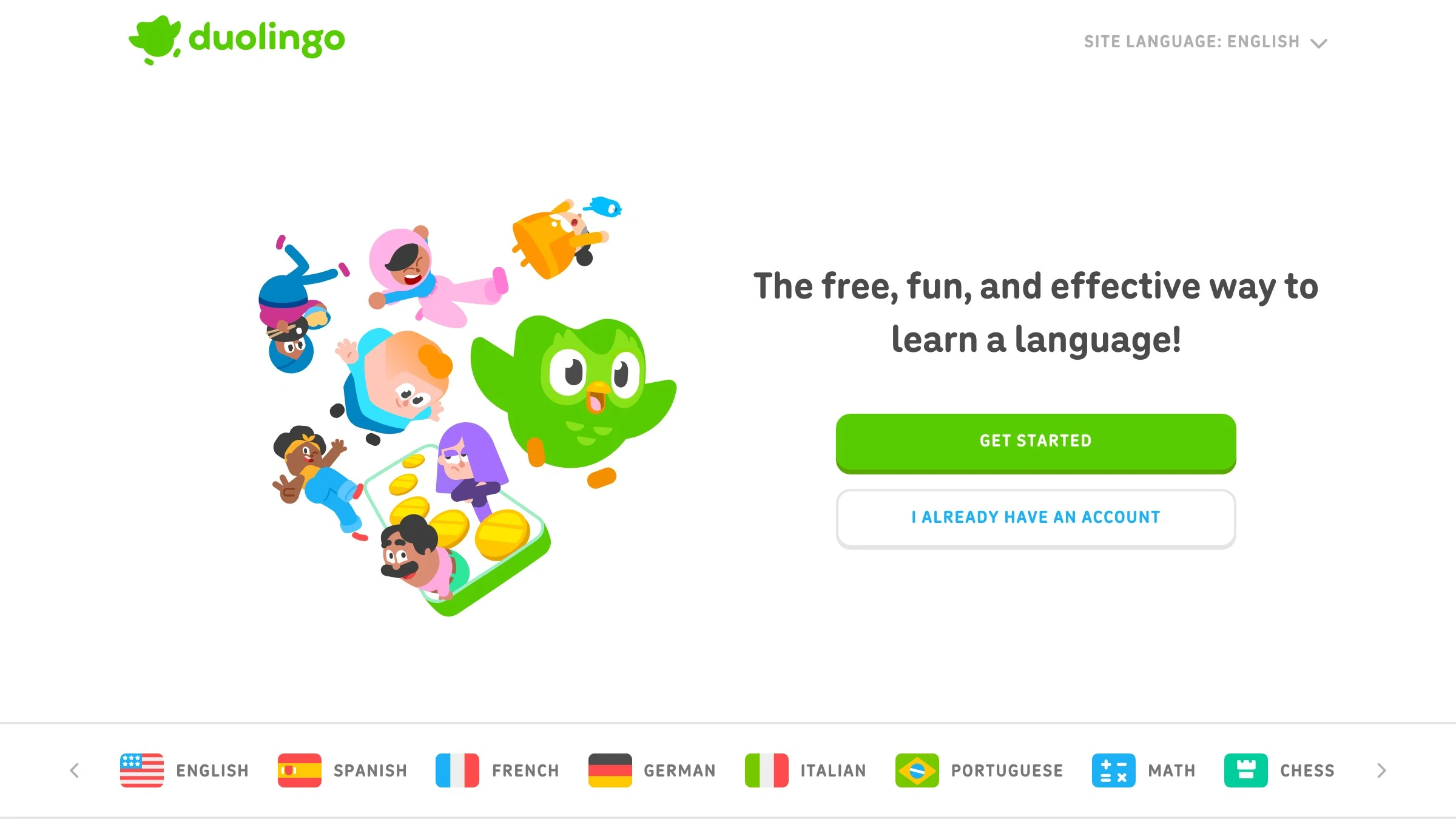
Brands do not pick schemes for fun. They pick the scheme that produces the feeling the brand needs, then apply it with discipline. Here are four that map cleanly to the geometry.
| Brand | Scheme | The relationship |
|---|---|---|
| FedEx | Complementary | Purple and orange, opposite on the wheel |
| Stripe | Analogous | Blues, purples, teals flowing as neighbors |
| Spotify | Monochromatic | One green, carried across tints and shades |
| Duolingo | Dominant + accents | One green leading a small harmonized set |
Spotify is the discipline case. The identity rides on a single green, varied through tints and shades rather than new hues. That is monochromatic done right: depth from value, not from adding colors. One hue, total recall.
Duolingo runs the same logic as a live product. The interface leads with a dominant green and pulls in a small set of harmonized accents for states and rewards. It is colorful without being chaotic because the accents serve the green instead of competing with it.
Notice none of these brands use more colors than they need. The restraint is the brand.
Need a palette that holds up across a whole brand, not just one screen? Brainy builds color systems. Have Brainy build your brand palette.
The mistakes that wreck a harmony
Most broken palettes fail for the same handful of reasons. None of them are about picking "ugly" colors. They are about ignoring the relationship.
- Equal proportions. Giving every color the same amount of space removes hierarchy and the eye has nowhere to rest.
- Full saturation everywhere. When every hue is at max intensity, nothing leads and the whole thing buzzes.
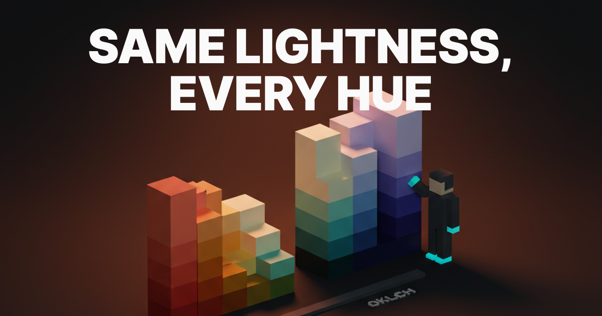
- No value contrast. Colors that are the same lightness, especially in analogous schemes, turn into mud the moment they sit together.
- Too many hues. Past four hues, holding harmony by hand gets very hard, which is why tetradic schemes wreck more palettes than they save.
- Ignoring context. A palette that sang on your monitor can die on a phone in sunlight. The relationship has to survive the real screen.
The deepest fix is unity, and there is an old painter's trick for it. As artist Mallery Jane describes it, "One way to create color harmony is to use a technique called Mother Color, take a little of one color (mother color) and add it into all of your mixtures." Everything ends up sharing a common undertone, so the palette reads as one family instead of a committee.
A workflow to build a palette from one color
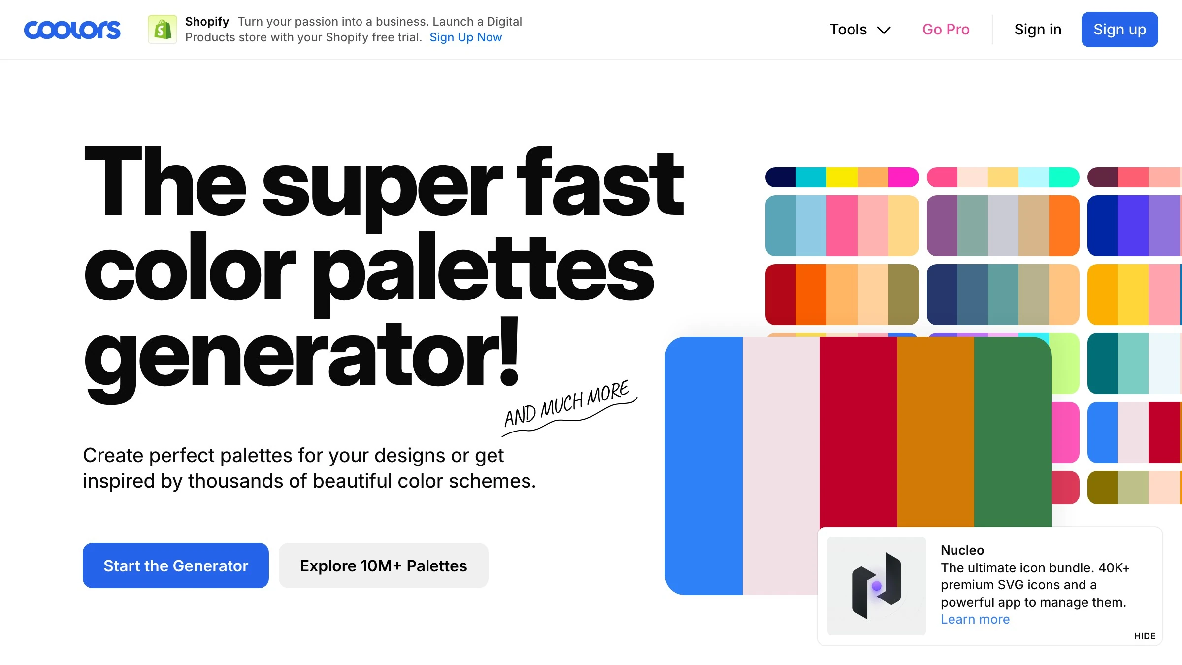
Generate palettes at coolors.co
You do not need inspiration. You need a process. The Interaction Design Foundation lays out a repeatable one that working designers actually use: find inspiration, select a dominant color, consult the color wheel for relationships, use generators, define hierarchy with proportion, ensure contrast, prototype, test with users, and iterate on feedback.
Here is that process compressed into a workflow you can run from a single base color.
- Pick one base color. Start from the brand, the product feeling, or the one color you cannot give up. This is your anchor.
- Choose a relationship, not a color. Decide the feeling first, then let the geometry hand you the other hues. Calm means analogous. Punch means complementary. Lively means triadic.
- Read the other hues off the wheel. Drop the matching shape and take the points. Do not eyeball it. The wheel is more accurate than your gut.
- Get values right before adding hues. A strong move, echoed by artist Chou (@hong_chou_), is to "start with a fairly monochromatic color palette and focus on getting the contrast and values right first," then "introduce some other hues into the brightest areas... without losing harmony." Value is the skeleton. Hue is the skin.
- Unify with a mother color. Mix a trace of your base into every other color so they share an undertone.
- Assign proportions. Use the 60-30-10 rule so one color leads, one supports, and one accents. More on that next.
- Test in context, then iterate. Check it on real screens, at real sizes, against real content. Adjust. Ship.
Match the mood to the scheme
Pick the feeling first and this is the table you reach for.
| You want it to feel | Reach for | Why |
|---|---|---|
| Calm, premium, cohesive | Analogous | Neighbors blend, low contrast |
| Bold, attention-grabbing | Complementary | Opposites create maximum contrast |
| Lively but balanced | Triadic | Even spacing shares the energy |
| Minimal, unified, safe | Monochromatic | One hue, depth through value |
| Rich and complex | Tetradic | Two pairs, only if you can manage it |
About proportion: the reason step six matters is that relationship alone does not create hierarchy. The 60-30-10 rule fixes that. As House Beautiful describes it, you run "one dominant color for 60 percent, a secondary color for 30 percent, and an accent shade for the remaining 10 percent." We cover that split in full in its own piece, so treat this as the reminder, not the lesson: the dominant color is usually your calm foundation, and the accent is where a complementary hue earns its keep.
The tools that do the wheel math for you
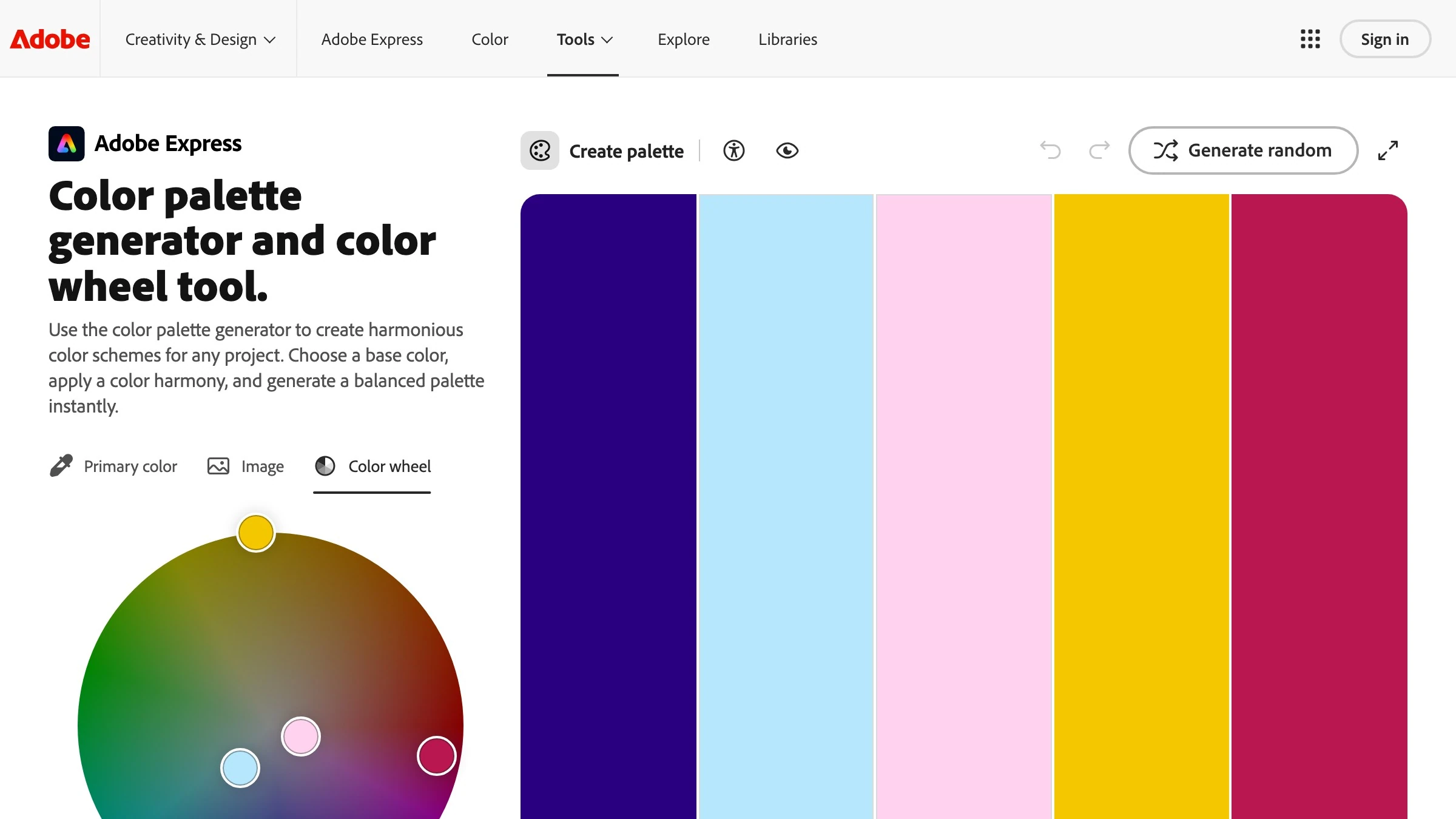
You do not have to calculate angles by hand. A handful of free tools run the geometry and hand you the hex codes.
| Tool | What it does best |
|---|---|
| Adobe Color | Pick a scheme type, rotate the wheel, export the harmony |
| Coolors | Spacebar-fast palette generation and locking |
| Paletton | Deep control over each scheme's tints and shades |
| Khroma | Trains on colors you like, then suggests pairs |
A warning: tools make it easy to skip the thinking. A generator hands you a mathematically valid relationship, but it does not know your brand, your contrast needs, or whether your accent passes an accessibility check on white. The tool does the wheel math, you still do the judgment. We keep more color and design breakdowns in one place.
FAQ
What is the difference between a color scheme and color harmony?
A color scheme is the specific set of colors you chose. Color harmony is the relationship that makes those colors read as ordered instead of random. Every good scheme is built on a harmony, but you can assemble a scheme with no harmony and end up with noise.
How many colors should a palette have?
For most brands, three to five does everything. One dominant, one or two secondary, one or two accents, applied with the 60-30-10 proportion House Beautiful describes. Past four distinct hues, harmony gets hard to hold by hand, which is why disciplined brands like Spotify ride a single hue across many tints instead.
Which color scheme is best for beginners?
Analogous or monochromatic. Both are forgiving because they avoid head-on contrast. Monochromatic is nearly impossible to break since you are working inside one hue, and analogous only asks that you manage value contrast between neighbors.
How do I make complementary colors that do not clash or vibrate?
Do not use them at equal amounts or equal saturation. Let one hue dominate the space and keep the opposite as a small, often more saturated accent. The 60-30-10 split exists exactly to stop two opposites from fighting at the same volume.
Does color harmony actually affect how users respond?
It affects the first impression measurably. The Interaction Design Foundation, citing University of Basel and Google research, notes that people judge design appeal in 17 to 50 milliseconds, largely on color and composition. Harmony is what that snap judgment is reading.
Can I just use a palette generator and skip the theory?
You can generate a valid relationship in seconds, yes. What a generator cannot do is set proportion, fix value contrast, check accessibility, or know your brand's meaning. The theory is what turns a valid palette into a working one.
Stop guessing at color
Color harmony is a system you can run, not a gift you either have or do not. The wheel encodes the relationships, the six schemes are shapes you drop onto it, and proportion plus value turn a relationship into a palette that holds up.
Pick one base color, choose a feeling, and read the other hues off the geometry. Get values right, unify with a mother color, split it 60-30-10, and test it where it actually lives. That is the entire method, and it beats instinct every time.
A palette that feels right is never an accident. It is a relationship on the wheel you can name and reuse.
Need a palette that holds up across a whole brand, not just one screen? Brainy builds color systems. Have Brainy build your brand palette.
Need a palette that holds up across a whole brand, not just one screen? Brainy builds color systems.
Get StartedGet new papers by email
New Brainy papers in your inbox. Confirm once, unsubscribe anytime.