
Color Psychology in Design: The 2026 Field Manual
How color shapes trust, urgency, and price perception in 2026 brands, with teardowns of Tiffany, Liquid Death, Olipop, Atlassian, and Duolingo.
Color Psychology in Design: The 2026 Field Manual
Color is the first word a brand says, and most brands say something they did not mean.
Before the headline loads, the color is already working, setting expectations about price, trust, and personality. Designers who treat color as decoration cede the most powerful communication tool in the stack to instinct.
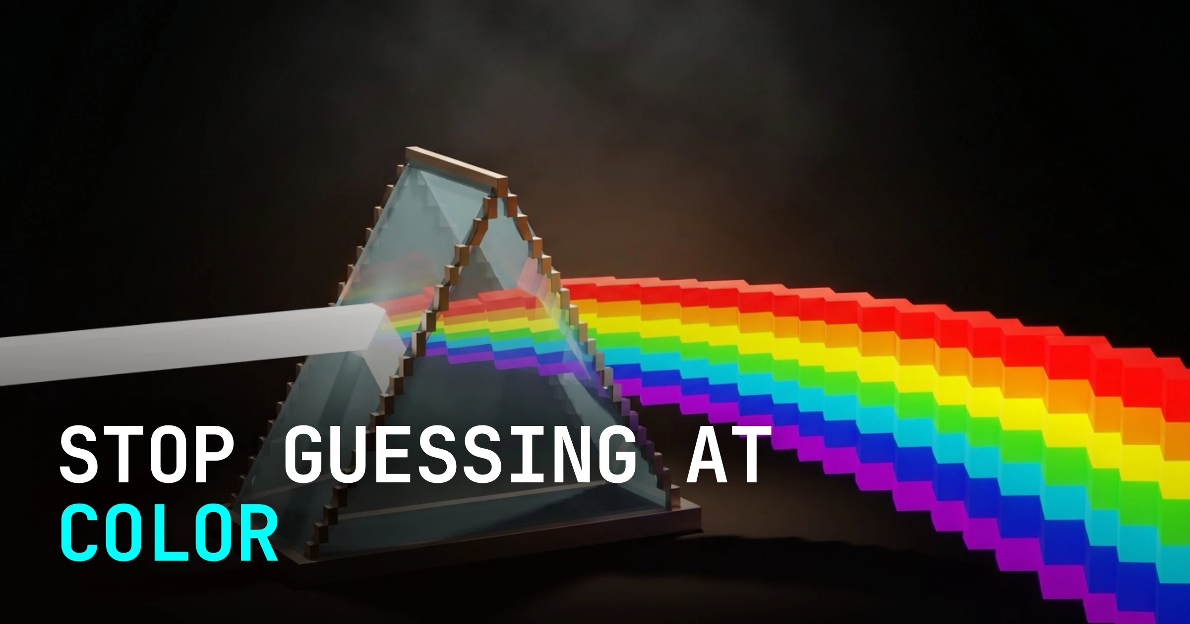
Color carries meaning before language does
The eye processes color in roughly 100 milliseconds. In physical retail, color influences purchase decisions in the first 90 seconds of product exposure. That is not trivia.
It means color is not a finishing touch applied after the real design work is done. It is the design work.
The speed matters because the mechanism is biological. Warm colors (red, orange, yellow) activate the part of the nervous system associated with urgency and appetite. Cool colors (blue, green, violet) suppress it.
This is not learned behavior. It holds across most cultural contexts. Meaningful overlays still exist. Work with those overlays consciously, not by accident.
The five jobs color does in a brand
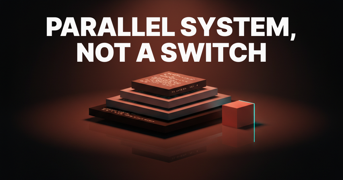
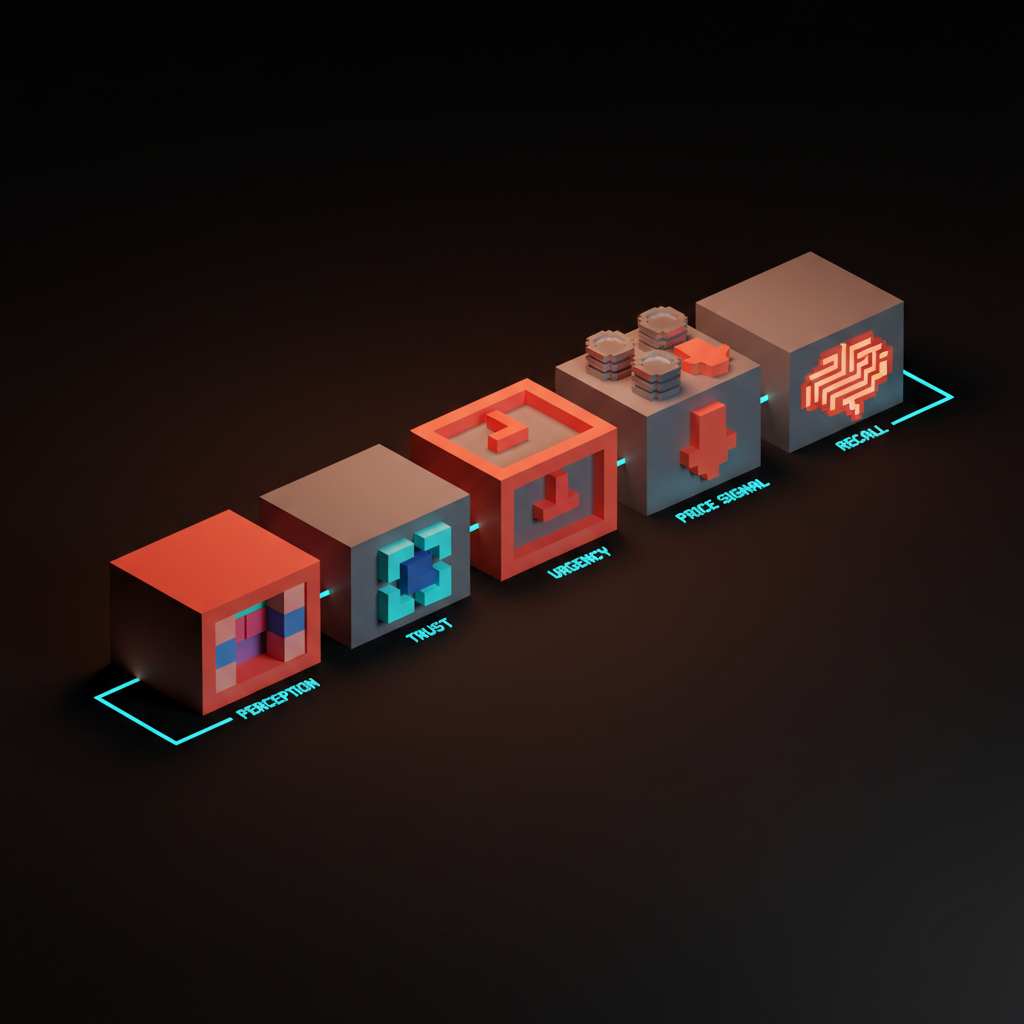
Color is not one thing doing one job. A disciplined brand runs five distinct functions in parallel.
| Job | What it does | Goes wrong when |
|---|---|---|
| Perception | Shapes how quality, category, and personality land before a word is read | Color contradicts the product tier or category |
| Trust | Signals stability and credibility, especially in finance, health, and B2B | Too many competing colors read as chaotic |
| Urgency | Drives action on CTAs, promotions, and limited offers | Red is overused until it means nothing |
| Price signal | Communicates premium or accessible without a price tag | High saturation on a luxury brand reads as mass-market |
| Recall | Makes the brand recognizable without the logo | Color is inconsistent across touchpoints |
Most brands run one or two of these jobs well. The best brands run all five, from a single documented color system, not a collection of hex codes scattered across Figma files.
Five teardowns at a glance
| Brand | Category convention | Color move | Strategic job |
|---|---|---|---|
| Tiffany | Generic luxury packaging | Robin's-egg blue, registered as Pantone 1837 | Own a color until the market cannot separate it from the brand |
| Liquid Death | Pale blues and glaciers | Black, silver, heavy metal iconography | Invert category color to attract a buyer the category ignores |
| Olipop | Coke red, Sprite green, shelf-pop saturation | Cream, earth tones, retro warmth | Signal a category reset before a word of copy lands |
| Atlassian | Enterprise navy and gray | Warmer blue (#0052CC) governed by written constraints | Trust without sterility, scaled by a documented system |
| Duolingo | Edtech blues and pastels | Pantone 360 C green tied to Duo the owl | Anchor a color to a character so every decision has a reason |
Each row gets a full teardown below. Read for the mechanics, not the trivia.
Tiffany Blue: when a color becomes the brand
Tiffany registered its specific shade of robin's-egg blue as Pantone 1837. That number is the year the company was founded. This is not a coincidence, it is an assertion that the color is the brand in the same way the name is the brand.
Most designers take away the exclusivity angle: the color is powerful because you cannot buy it anywhere else. That is true, but it misses the more useful lesson.
Tiffany earned that ownership through absolute consistency over 189 years. Every box, every bag, every piece of print. The color was never diluted by seasonal palettes or trend-chasing campaigns.
The path to that kind of equity starts with one decision: pick a primary color and protect it like a trademark before it legally is one. The brands that do own visual real estate no competitor can buy. See how to build a brand color palette for the tactical side.
Liquid Death's black: subverting a category by inverting its color
Water brands live in a specific visual language: pale blues, clean whites, mountains, glaciers. The entire category signals purity through lightness. Liquid Death (founded 2019, $1.4B valuation by 2024) looked at that palette and chose black.
The choice was not random. The product is still water. The color signal is deliberately wrong for the category, and that mismatch is the brand.
It targets a consumer who is allergic to wellness marketing aesthetics and positions the product as something closer to a craft beer or a hard seltzer. The name helps. The black tallboy can closes the deal.
The lesson is not "go dark for edginess." It is that category color conventions are a signal system, and intentionally violating them is a legitimate positioning move when the violation maps to a real audience insight. Liquid Death did not pick black because it looked cool on a mood board. They picked it because their audience had no water brand that spoke to them.
Olipop's warm retro: signaling that the category has changed
Soda is red and blue (Coke, Pepsi) or green and silver (Sprite, 7-Up). Saturated, high contrast, built for shelf pop at scale. Olipop (launched 2018, $500M valuation by 2023) ignored all of it.
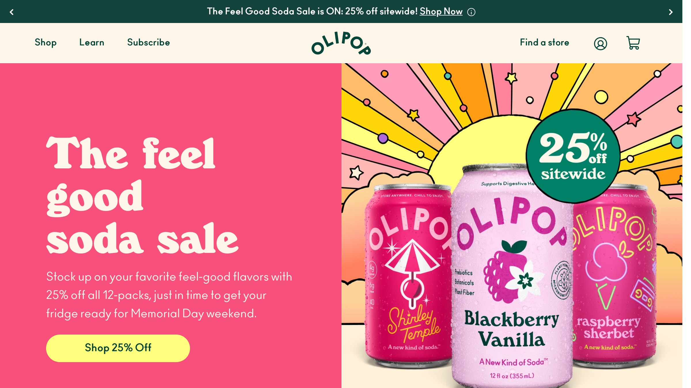
Their palette is warm, desaturated, and deliberately retro. Cream backgrounds, earthy oranges, muted pinks. The visual language reads more like a 1970s health-food store than a beverage aisle.
That is the point. Olipop is a prebiotic soda, a product that belongs in neither the soda section nor the supplement section. The warm retro palette signals "this is something different" without a word of copy to say so.
When a product genuinely changes the rules of a category, the visual language should signal the change before the customer reads a word. Color does that work faster than any headline.
Atlassian's blue: trust without sterility
Most enterprise software defaults to navy and gray. Safe, invisible, nothing to object to and nothing to remember.
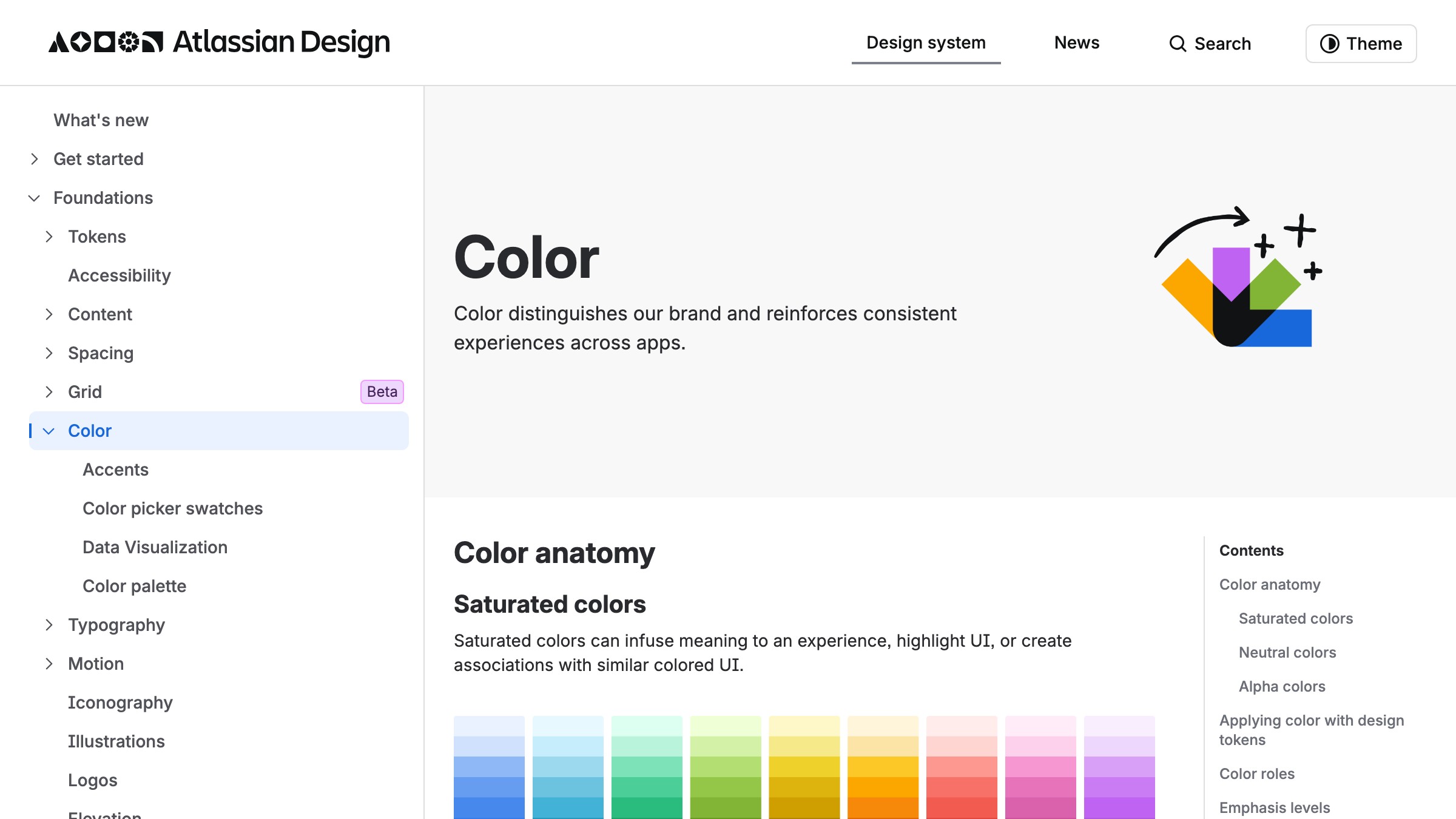
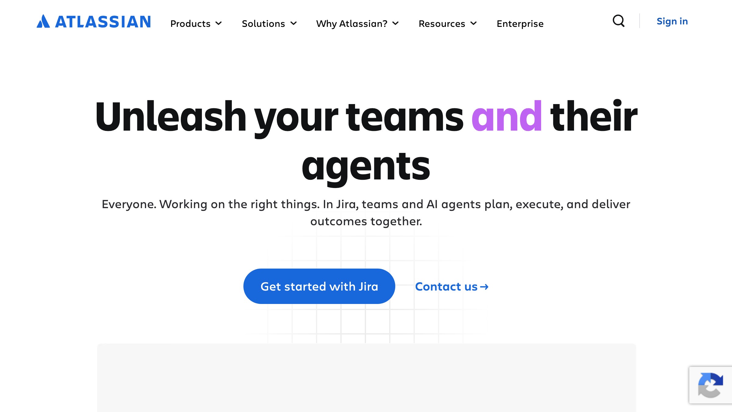
Atlassian runs a different blue (#0052CC), one that is warmer and slightly more saturated than the standard corporate palette. The distinction is subtle on any single screen. Over thousands of daily touchpoints (loading states, empty states, modals, nav bars) it accumulates into a personality.
Atlassian documented this reasoning in their public design system at atlassian.design. They describe their use of color as "bold without being loud" and "approachable without being casual." Those are real constraints, not marketing copy.
When a design system documents color with constraints like that, the team can make decisions consistently without running every edge case back to a brand committee.
Enterprise does not require beige. A documented constraint is more useful than a hex code alone. See the underlying color theory for the mechanics of saturation and temperature at the system level.
Duolingo's green: documenting why the color exists
Duolingo's brand color is Pantone 360 C. What makes the brand worth studying is the fact that the reasoning lives inside their public design system at design.duolingo.com. The green is documented as optimistic and energetic, tied explicitly to Duo the owl. The color exists in service of a character, not as an abstract brand decision.
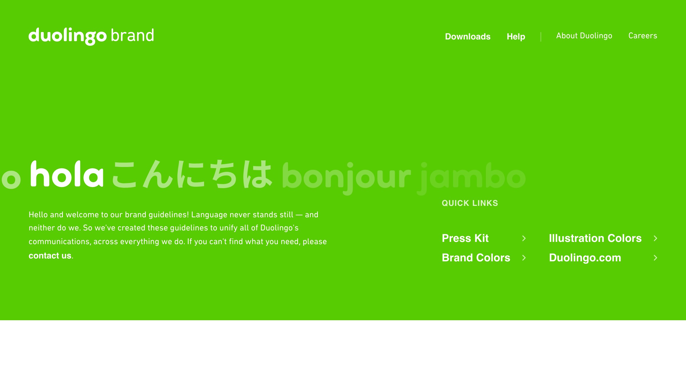
This matters because it gives every designer at Duolingo a reason to protect the color beyond "the brand guide says so." When you know the color represents encouragement and the joy of learning, every decision about when to use it and when to pull back becomes defensible without escalation.
The practical output: write a one-paragraph rationale for your brand color before you finalize it. Not "we chose green because it feels fresh." Write the specific thing this brand is doing with this shade so a designer two years from now can defend it without escalation.
Need a brand color system that survives every channel, not another mood board? Brainy ships brand identity.
How to pick a brand color this week
Work through these in order. Do not open a color picker until you have answered all six.
| # | Question | Rule |
|---|---|---|
| 1 | What color does your category already own? | Start from the convention. Decide consciously whether to join it or break it. |
| 2 | What is the one emotional job this color must do first? | Pick from: trust, urgency, warmth, premium, energy, calm. One job, not five. |
| 3 | Who specifically should this color attract? | Name a real person you know. If they would wear this color, it is probably right. |
| 4 | Where will this color live at its smallest? | Favicon, app icon, mobile nav. If it does not hold at 16x16, it will not hold the system. |
| 5 | What is the one constraint this color must never violate? | Write it as Atlassian did: "bold without being loud," "warm without being childish." |
| 6 | Is a competitor already owning this color in the category? | If yes, go further in the same direction or go perpendicular. Never split the difference. |
This is a set of constraints that narrow the space until one or two colors emerge as the only defensible choice. For layout-side ratios, see the 60/30/10 rule. For contrast ratios that actually pass, use a token system, not a guess.
FAQ
Does color psychology work across all cultures?
The core signal map (warm equals urgency, cool equals calm) holds broadly across Western and East Asian markets. A few overlays are worth checking before you launch:
- White signals mourning in parts of East Asia and South Asia.
- Green carries religious weight in some Middle Eastern markets.
- Red reads as celebration in China and as warning in most Western contexts.
If you are building a global brand, validate your primary color against your top two or three markets before locking it.
Can a small brand afford to own a color?
Yes. Ownership is about consistency, not scale. A brand with 500 customers that uses one color with perfect consistency across every touchpoint earns more recognition per impression than a brand with 5 million customers running six shades.
Scale accelerates ownership. It does not create it.
How often should a brand update its color palette?
Rarely, and never without a clear reason. The brands that age best (Hermes orange, Tiffany blue, UPS brown) treat their color as infrastructure, not aesthetic. Refresh sub-colors and seasonal palettes if the work demands it. Leave the primary alone unless the brand's position in the market has fundamentally changed.
What is the difference between brand color and product color?
Brand color is the color the company owns. Product color is how color communicates function inside the product (green for success, red for error, yellow for warning). Design these systems independently and then reconcile them. Using your brand primary as your product's interactive state creates ambiguity and limits flexibility.
How do I defend a color choice to a CEO who just has a preference?
Bring the six-question framework to the meeting. A preference with no framework attached loses to a CEO's preference every time. A color choice that answers all six questions and names the emotional job, the constraint, and the competitive positioning is a business argument, not an aesthetic one. Business arguments win.
Stop picking colors by mood board
Color is the fastest communication channel a brand has. It works before language, before layout, before the logo resolves. Treating it as decoration is the same as treating copy as decoration.
Pick your color with the six questions. Write the rationale in a sentence. Protect it like you already trademarked it. The equity compounds.
Have Brainy build your brand color system.
Need a brand color system that survives every channel, not another mood board? Brainy ships brand identity.
Get StartedGet new papers by email
New Brainy papers in your inbox. Confirm once, unsubscribe anytime.