Brand Yellow Is Not #FFFF00: How McDonald's, IKEA, DHL and Nikon Use Yellow
Pure yellow vanishes on white and prints duller. The famous yellow logos all do two things instead: a warmer yellow, and a dark partner color. Here are their exact codes and how to pick yours.
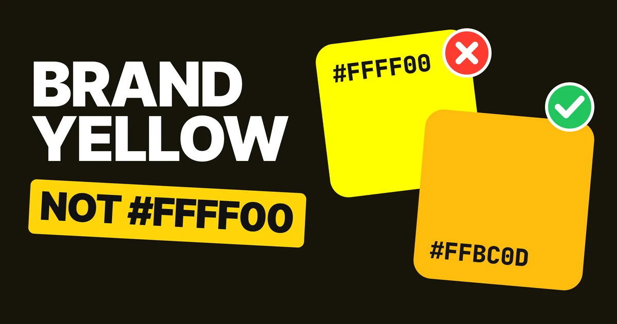
A good brand yellow is never #FFFF00. Pure yellow almost disappears on a white background, and in print it comes back darker and duller than it looked on screen. The famous yellow logos solve this the same way, and the pattern is easy to copy for your own logo.
Why yellow is the hardest brand color
Every other bright color has some darkness in it. Pure red is about as light as a mid gray, and pure blue is darker still. Pure yellow is almost as light as white, so on a white page there is nearly nothing separating the two.
On white
On black
Same color, opposite results. Whether a yellow logo can be seen is decided by what sits behind it, and most logos spend their life on white: letterheads, invoices, website headers, app stores, sponsor walls.
Then it changes color in print
On screen
In print, on coated paper
A screen makes yellow by adding light. A printer makes it with ink on paper, and paper cannot glow. Converted for a standard coated press, #FFFF00 proofs as about #F4E600: darker, greener, flatter. The shift is big enough that a trained eye calls it a different color.
The famous yellows below stay close to themselves in print. All four shift far less than pure yellow does.
How the famous yellows do it
McDonald's: #FFBC0D on red #DB0007

A deep golden yellow that almost always sits on red. The red does the hard work: on its own on a white page, red is easy to see, so the yellow only has to be recognized, not read.
IKEA: #FBD914 on blue #0058AB
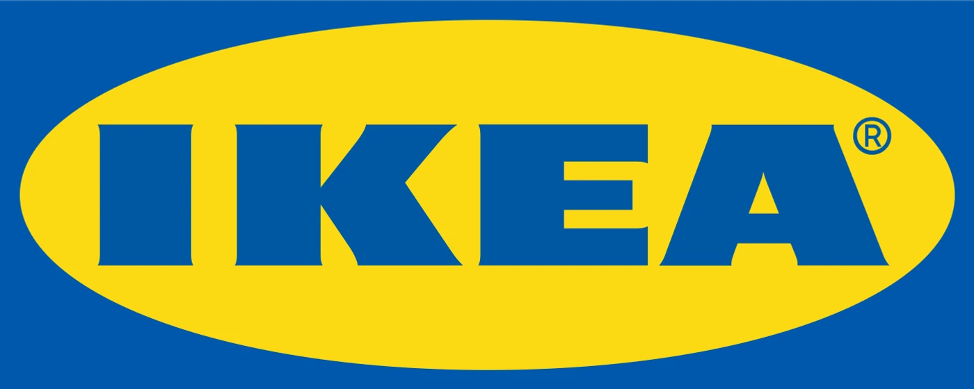
The yellow oval sits on a blue field and the name is written in the same blue, so the yellow never has to touch white. Blue and yellow are also the colors of the Swedish flag, which carries the brand's origin with it.
DHL: #FFCC00 with red #D2002E
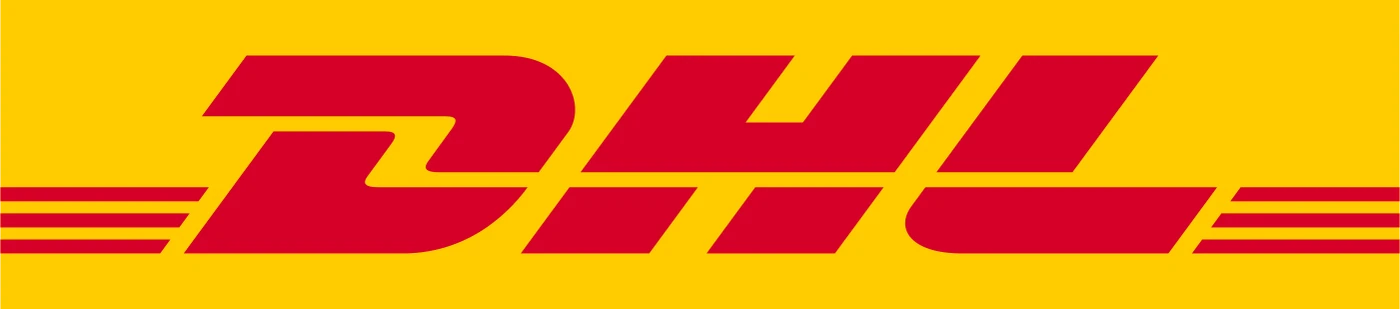
Here the yellow is the background, a whole field of it, and the name is red on top. DHL's vans and envelopes work the same way: a yellow surface you notice from across the street, with red to read.
Nikon: #FFE100 with near-black #150301
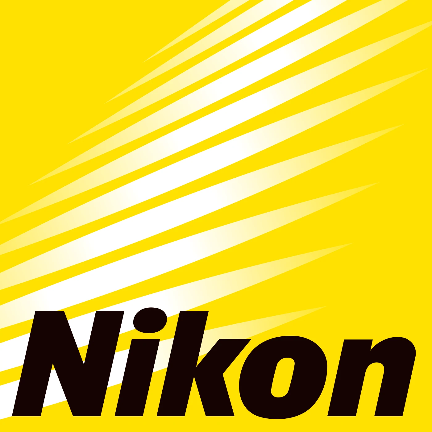
The most extreme pairing of the four: a clean, slightly warm yellow behind black type, about as much contrast as two colors can have. The yellow is the memory, the black is what you read.
The two things they all do
Every famous yellow is warmer than pure yellow. On the color wheel, pure yellow sits at 60 degrees. McDonald's is at 43, DHL at 48, IKEA at 51 and Nikon at 53. All four lean toward orange, which makes yellow look richer and more golden, and less like a highlighter.
The partner color carries the legibility. None of the four yellows is readable as text on white. Every one of the partners is.
| Brand | Yellow | Hue | Readable on white? | Partner | Partner readable on white? |
|---|---|---|---|---|---|
| Pure yellow | #FFFF00 | 60° | No | none | n/a |
| McDonald's | #FFBC0D | 43° | No | Red #DB0007 | Yes |
| DHL | #FFCC00 | 48° | No | Red #D2002E | Yes |
| IKEA | #FBD914 | 51° | No | Blue #0058AB | Yes |
| Nikon | #FFE100 | 53° | No | Black #150301 | Yes |
So the yellow is not trying to be read. The name, the small text and the website buttons all go to the partner. That is why "just use a darker yellow" is the wrong fix: a yellow dark enough to read on white is no longer the yellow anyone wanted.
How to choose a yellow for your logo
- Pick the partner first. Decide which dark color your name will be written in: a red like McDonald's, a blue like IKEA, a near-black like Nikon. It has to work alone on every white page.
- Warm the yellow. Start from #FFFF00 and pull it toward orange until it sits between 43 and 53 degrees, the range the famous four use.
- Proof it in print before you commit. Ask your printer for a proof, or soft-proof it in your design tool with a coated paper profile. If the printed yellow looks like a different color, move it until screen and print agree.
Steal these 4 pairs
The four pairs, as each brand draws them.
Use them to study and to test ideas next to your own colors. Copying a famous brand's exact pair for a new logo in a related business is how you end up looking like a knockoff: use the pattern, not the codes.
FAQ
What is the McDonald's yellow hex code?
The golden arches in McDonald's 2020 square logo are #FFBC0D, on red #DB0007.
What is the IKEA yellow hex code?
IKEA's yellow is #FBD914, used on IKEA blue #0058AB.
What is the DHL yellow hex code?
DHL yellow is #FFCC00 (Pantone 116 C), paired with DHL red #D2002E (Pantone 199 C).
Why does yellow look bad on white?
Pure yellow is almost as light as white, so the two barely contrast. #FFFF00 on white scores about 1.07 to 1, where body text needs 4.5 to 1. Put yellow on a dark color, or set your text in a dark partner color.
What is a good yellow for a logo?
A warm yellow between about 43 and 53 degrees of hue, like the golden yellows of McDonald's, DHL, IKEA and Nikon, paired with a dark color that carries the name.
Sources
- Colors read from each brand's logo file on Wikimedia Commons: McDonald's square logo (2020), IKEA logo, DHL Express logo (Pantone 116 C and 199 C), Nikon logo.
- Print shift: a soft proof on the Coated FOGRA39 press profile. #FFFF00 proofs as #F4E600, a color difference (Delta E 2000) of 5.6; above about 2 reads as a different color. The four brand yellows shift between 0.2 and 0.7.
- Hue angles and the "readable on white" columns computed from the hex codes with the HSL model and the WCAG 2 contrast formula. The yellows score 1.3 to 1.7 to 1 on white; the partners 5.0 to 20 to 1.
- First published as a carousel on Logo Brainy.
Choosing colors for a new logo? Our team designs brand identities with colors that work on screen, in print and next to each other.
Get StartedGet new papers by email
New Brainy papers in your inbox. Confirm once, unsubscribe anytime.