Button Labels: Why "OK" Is the Wrong Button Text and What to Write Instead
A button should say what happens when you tap it. Why OK, Yes, No and Submit fail, the verb-first rule behind Apple's own guidelines, six swaps to copy and a five-second test for any dialog.
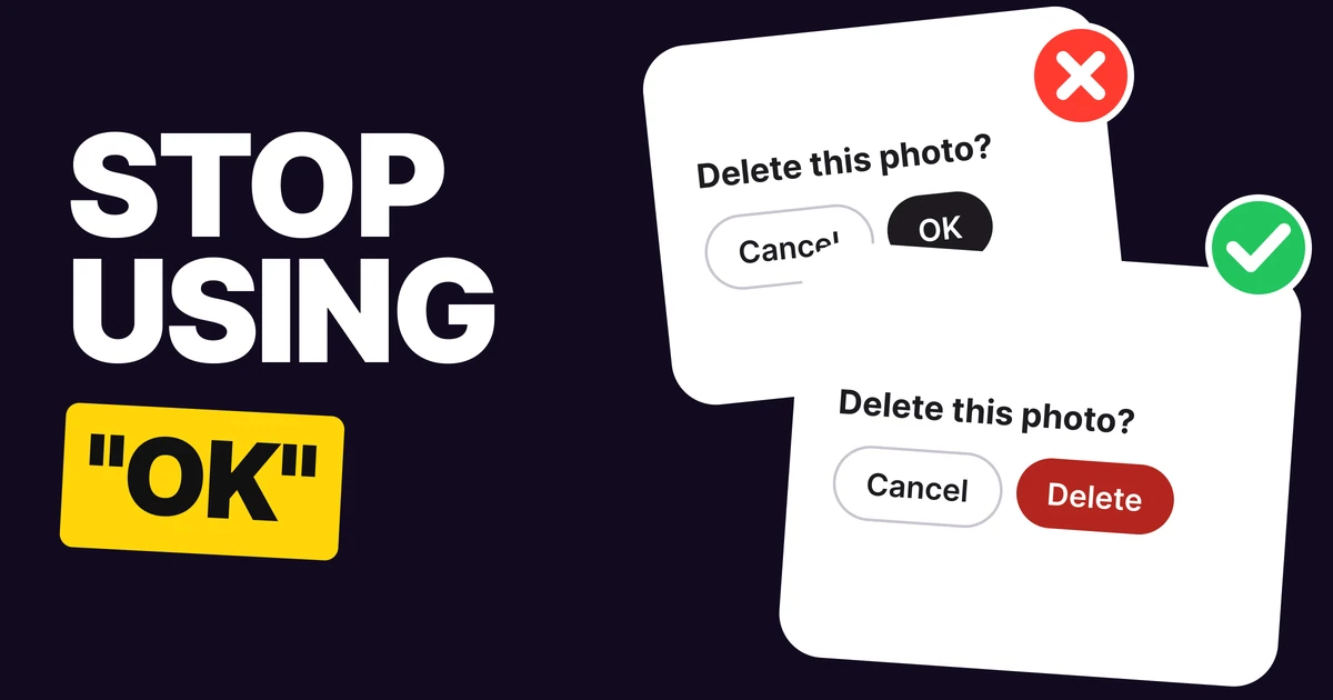
A button that says OK makes people reread the question to find out what OK means. "OK, delete it?" or "OK, never mind?" A button label should name what happens when it is tapped, so nobody has to look anywhere else. Here are the four rules, each one rebuilt side by side, and six swaps you can copy.
Why OK fails
OK answers the question in the head of the person who wrote it. The reader has to hold the title in memory, rebuild the sentence with OK on the end and decide whether that is what they want. On a destructive dialog that is a gamble, because the two buttons look alike and the dangerous one does not say it is dangerous.
The same goes for Yes, No, Submit, Continue and Confirm. They are all answers to a question or a generic step in a form, not the thing that will happen. When the label does not carry the action, the title and the body copy have to, and people tap before they read.
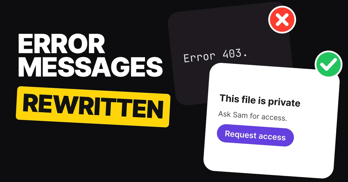
Apple says so in its Human Interface Guidelines for alerts: use a one or two word title that describes the result of selecting the button, and prefer verbs and verb phrases that relate directly to the alert text. Our paper on error message examples covers the words around the button. This one is about the button itself.
Fix 1: say what it does
OK
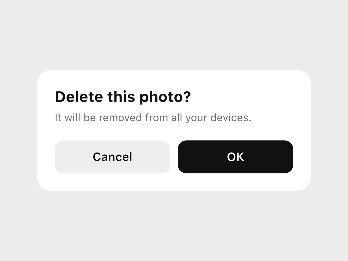
Delete
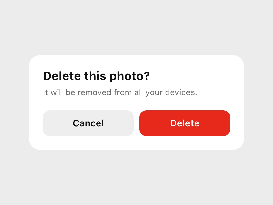
Copy the verb straight from the title. "Delete this photo?" gets Delete, and "Block this account?" gets Block.
If the verb will not fit, the title is probably too vague, so fix the title.
Fix 2: drop Yes and No, keep Cancel
No / Yes
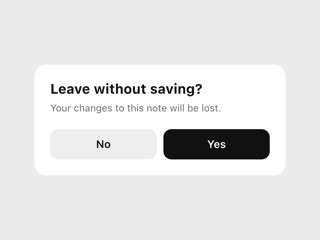
Cancel / Leave
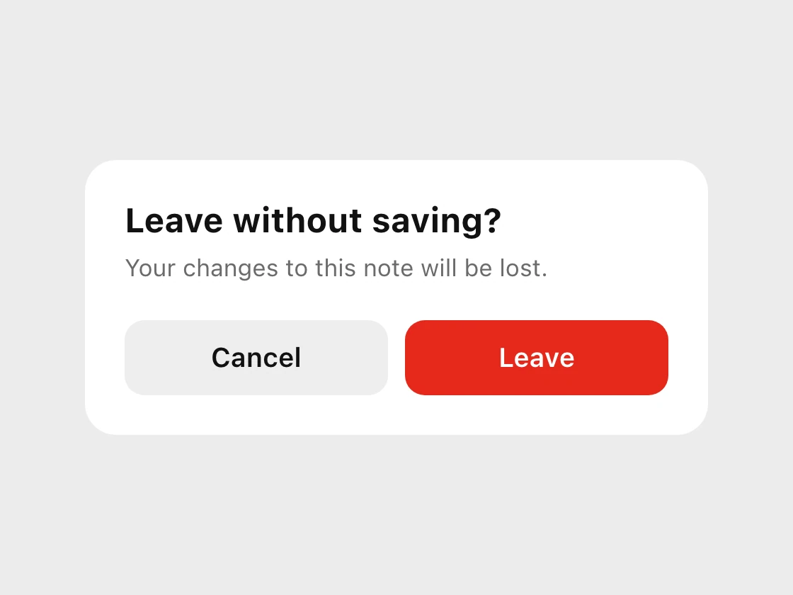
Yes and No force the reader to map their answer onto the sentence. Cancel is the one generic word worth keeping, because its meaning never changes: back out, nothing happens. Apple's guidance is the same: avoid Yes and No, and always use Cancel for the button that cancels the action.
Fix 3: name the result
Submit
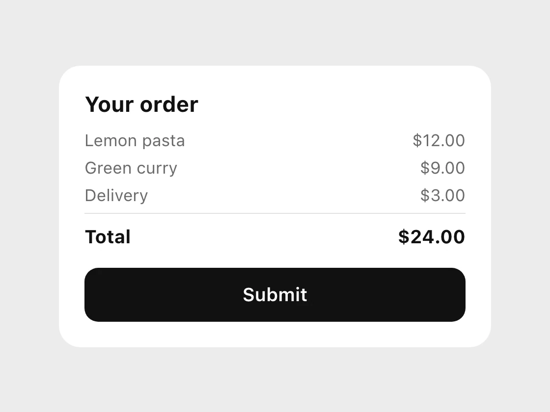
Pay $24.00
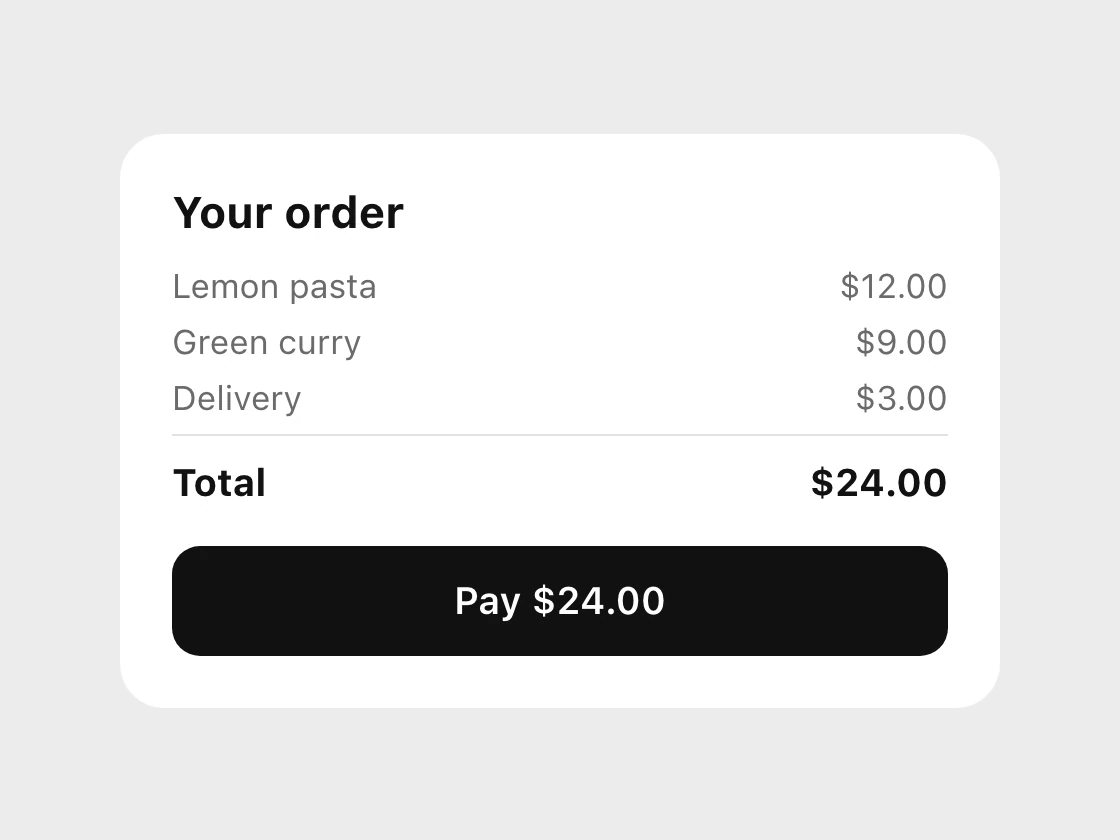
The best label often carries the object or the amount: Send $50, Create Account, View Invoice, Save Draft. This matters most at the moments that cost something, such as paying, sending or deleting, because the button is the last thing read before the commitment.
Fix 4: one or two words
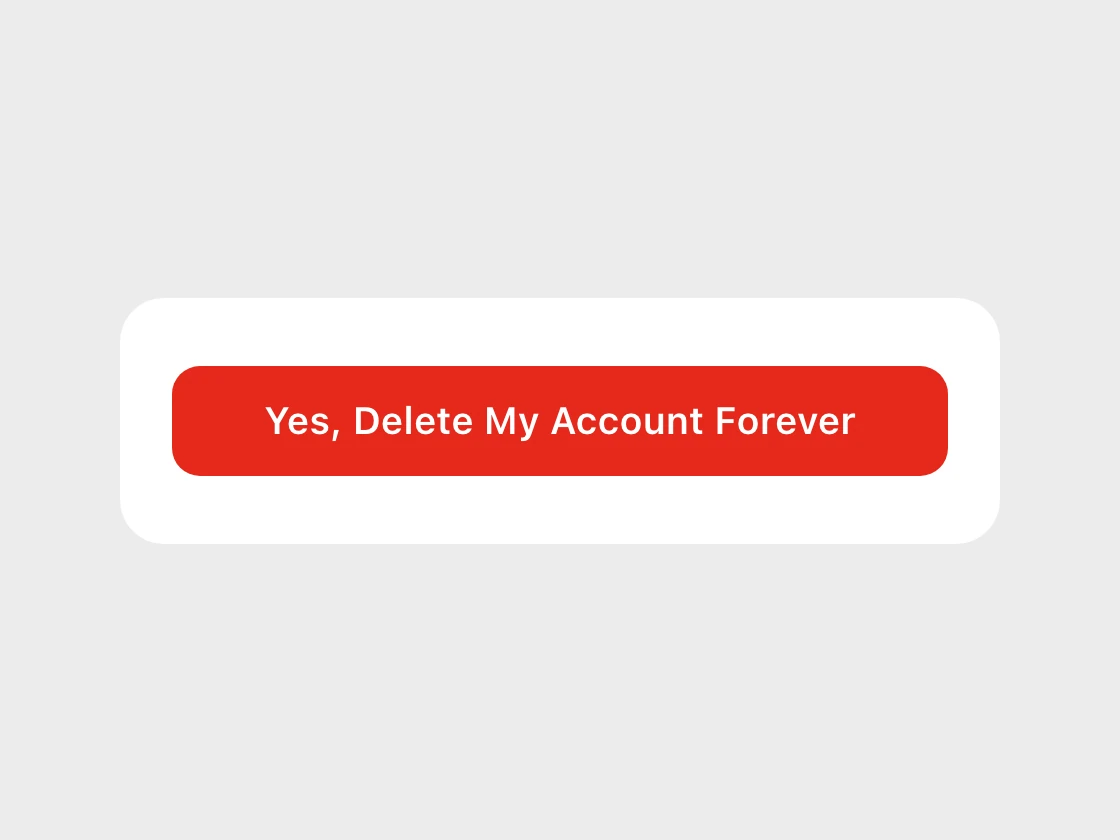
Five words
Two words
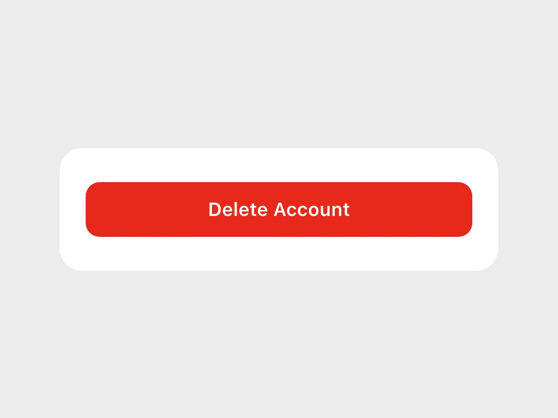
Short labels also survive translation and small screens. A five word button in English becomes a longer one in German or Russian and starts to wrap or truncate. Two words leave room to grow.
The six swaps
| Instead of | Say | When |
|---|---|---|
| OK | Delete | After "Delete this photo?" |
| Yes | Leave | After "Leave without saving?" |
| Submit | Pay $24.00 | On a checkout summary |
| Click Here | View Invoice | On a link or button that opens something |
| Continue | Create Account | At the end of a sign-up form |
| Confirm | Send $50 | After a transfer summary |
When OK is correct
Apple allows exactly one use: informational alerts, where there is nothing to decide and the only job of the button is to dismiss the message. "Your session has ended" with an OK button is fine. Anything with a choice in it should get a verb. Even in an informational alert, a more specific word such as Got It or Sign In Again can be better when it describes the next step.
The five-second test
Cover the title and the body and read only the buttons. If a person can still tell what each one will do, the labels are right. If they cannot, the label is leaning on the question to mean something.
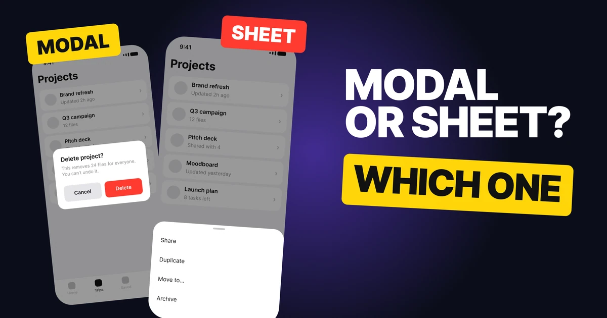
Run it on every dialog in your product, on the toasts, and on the one button in each form. It takes minutes, and it is the cheapest copy change a team can make. For the choice between a dialog and a sheet in the first place, see modal vs bottom sheet.
FAQ
What should a button say instead of OK?
The verb from the question. A dialog that asks "Delete this photo?" should have a button that says Delete. OK only fits an alert that informs and asks for no decision.
Is it bad to use Yes and No on buttons?
Usually, yes. They make people map the answer back onto the sentence and misread it, as in "Leave without saving?" Use a verb for the action and Cancel for backing out. Apple's guidelines say to avoid Yes and No in alerts.
Should I use Cancel or No?
Cancel. It always means back out and nothing happens. No can mean different things depending on how the question is worded.
How many words should button text have?
One or two. Name the result, such as Delete Account or Pay $24.00, and put any explanation in the body copy above.
Why is Submit a bad button label?
Submit says what the form does, not what the person gets or spends. A label such as Pay $24.00, Send Message or Create Account names the outcome and, where it matters, the amount.
What does Apple say about OK buttons?
Apple's Human Interface Guidelines say to avoid OK as the default button title unless the alert is purely informational, and to prefer verbs that describe the result of tapping.
Sources
- Apple Human Interface Guidelines, Alerts: a one or two word title that describes the result of selecting the button, verbs and verb phrases that relate directly to the alert text, OK only in informational alerts, avoiding Yes and No, and Cancel to title a button that cancels the alert's action. It also says to avoid OK as the default button title unless the alert is purely informational.
- The dialogs and the order summary above are our own examples. The word counts, including the five word "Yes, Delete My Account Forever", are counted from the labels shown.
- First published as a carousel on UX Brainy.
Want every button, dialog and error in your product to say exactly what it does? Our team designs app UI and writes the words inside it.
Get StartedGet new papers by email
New Brainy papers in your inbox. Confirm once, unsubscribe anytime.