
Variable Fonts: A Designer's Working Guide for 2026
What variable fonts actually do, why they replace font families, with teardowns of Inter, Recursive, Apple SF Pro, IBM Plex, and a picking framework.
Variable fonts replaced shipping six files with shipping one file that does six things, and most teams still have not made the swap. That is the whole argument. Everything below is the proof.
Loading four static font files for a brand typeface in 2026 means paying a performance tax and leaving design range on the table. This guide covers the mechanics, four production teardowns, a real performance number, and a six-question framework you can use to pick and ship a variable font by Monday.
What a variable font actually is
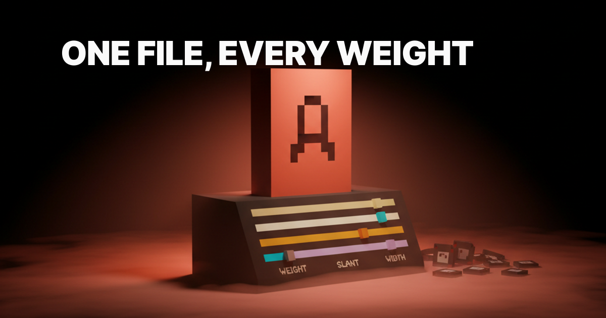
A variable font is a single font file that encodes a continuous design space across one or more axes. Weight is the most familiar axis: instead of shipping a Regular file plus a Bold file, you ship one file that can render any weight from 100 to 900. Type designers can also define custom axes beyond the standard set, which is where things get interesting.
The OpenType variable font spec (OT 1.8, released 2016) made this possible. The font file stores a default master and delta values for each axis endpoint. The rendering engine interpolates. The designer, or the CSS, dials in the exact value at runtime.
The five standard registered axes:
- Weight (
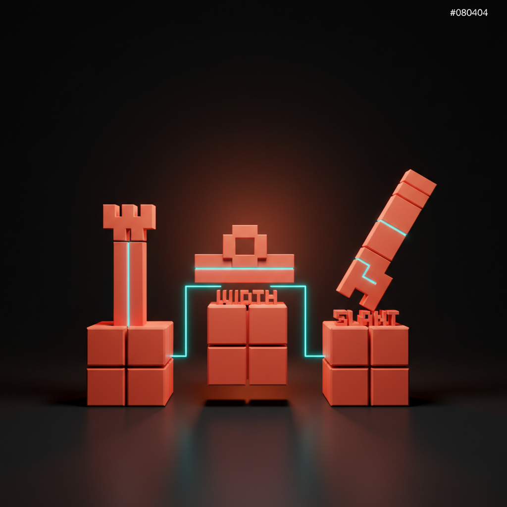
wght): thin to black, the most familiar axis - Width (
wdth): compressed to expanded - Slant (
slnt): controls oblique angle - Optical size (
opsz): adjusts letterforms for caption versus display sizes - Italic (
ital): roman to italic as a continuous value
Custom axes use four-letter uppercase codes and let type designers build expressive ranges no static font can offer.
The four teardowns at a glance
Four production variable fonts, four different reasons to ship them.
| Font | Designer | Custom Axes | Primary Use Case | File (~variable) |
|---|---|---|---|---|
| Inter | Rasmus Andersson | None | Product UI, SaaS, dashboards | ~310 KB |
| Recursive | Stephen Nixon (Arrow Type) | Mono, Casual, Expression | Code + marketing from one file | ~580 KB |
| Apple SF Pro | Apple | Optical size | OS-level, every Apple platform | Bundled |
| IBM Plex | Bold Monday + IBM | None | Corporate design system across product and marketing | ~200 KB per style |
Each font solves a different version of the same problem: ship one file, cover every context.
Inter: the variable font designers actually ship
Inter is Rasmus Andersson's typeface for screens, and it is probably the most-shipped variable font in production right now. The variable version at rsms.me/inter includes weight from 100 to 900 and italic, all in one file.
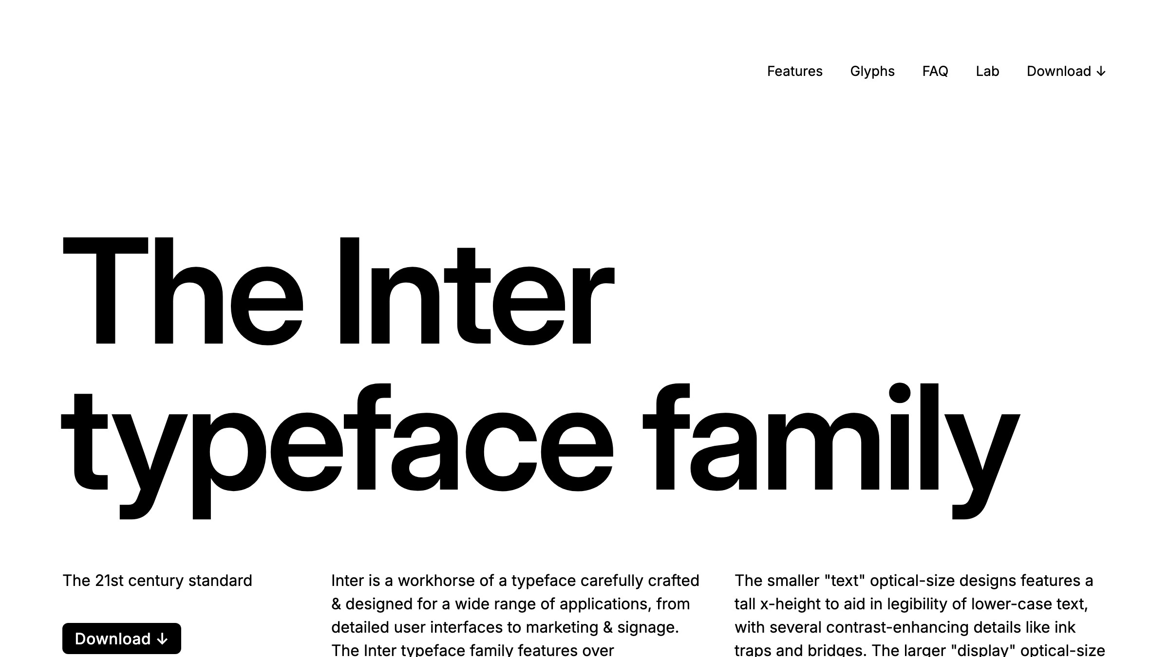
The honest case for Inter is mundane and correct. It has tight metrics, deep Latin and Cyrillic coverage, and it was designed from day one for small sizes on low-DPI screens.
It is not a personality typeface. It is infrastructure. When the job is readable body copy, readable labels, readable data tables, Inter does not get in the way.
Teams running Notion, Linear, and dozens of other SaaS products use Inter or a derivative. Picking it does not make your UI generic; it makes your type choice a non-issue so you can spend creative budget on spacing, sizing, and hierarchy instead.
Recursive: when axes design the typeface, not just the weight
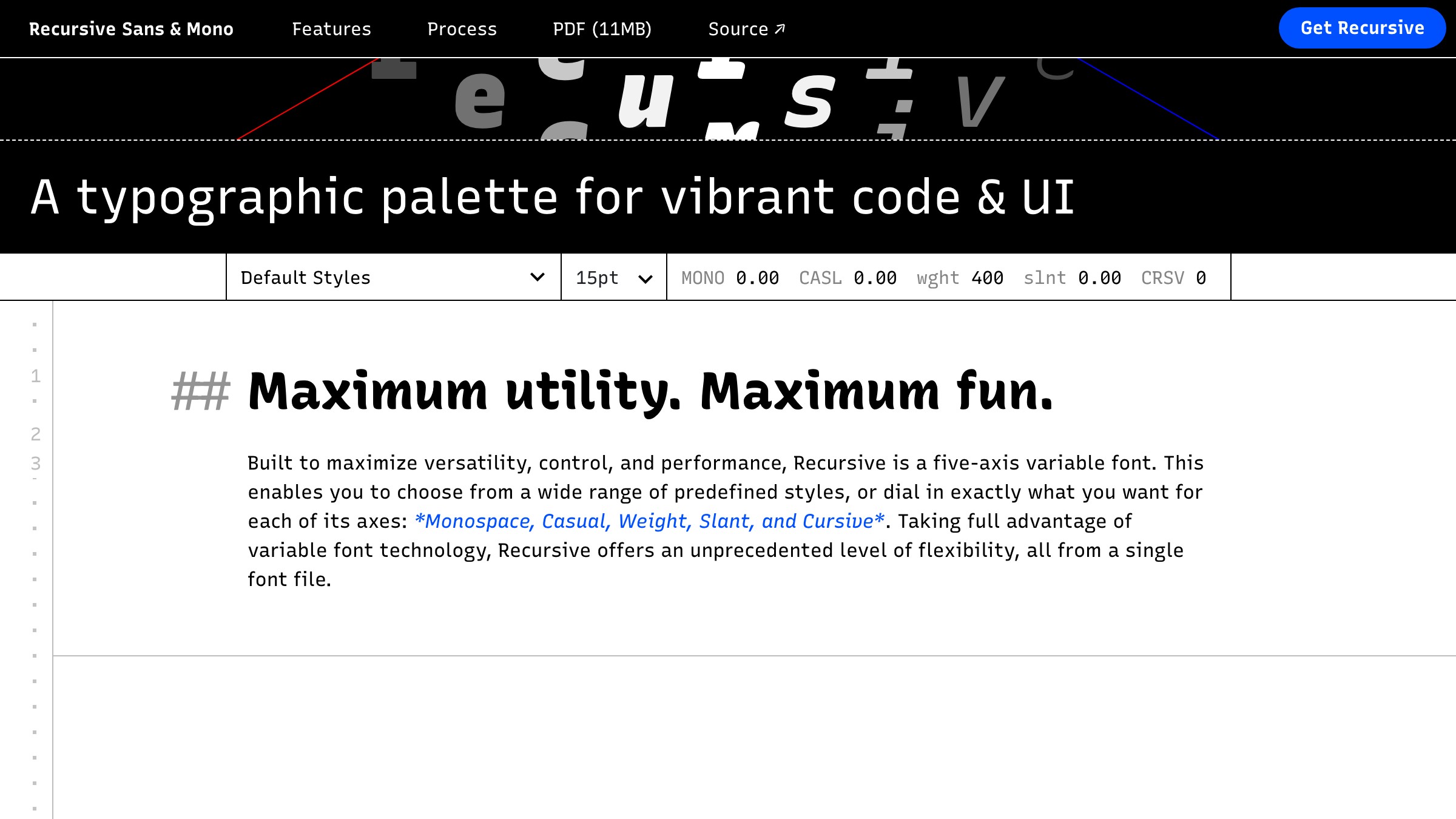
Recursive by Stephen Nixon at Arrow Type is the canonical example of a custom axis that changes what a typeface is, not just how heavy it feels. The key axis is Monospace (MONO), which shifts the font continuously from proportional to monospaced. A second axis, Casual (CASL), moves from a formal linear construction to an expressive, informal stroke.
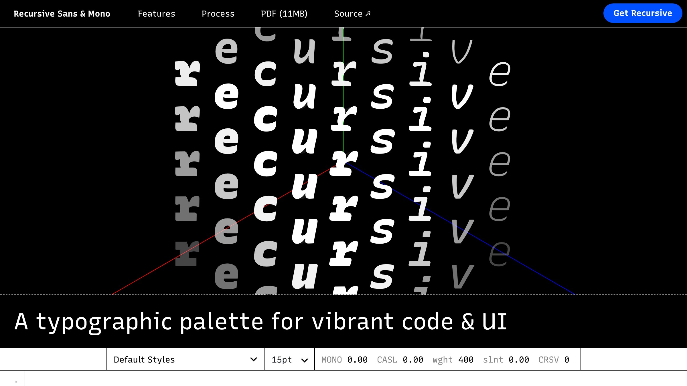
That means one Recursive file can serve your marketing headline, your body copy, and your code blocks. Different values on MONO and CASL, same file. The savings are not just in file count; they are in brand coherence. Code samples visually rhyme with prose because they share a skeleton.
The performance tradeoff is real: Recursive's variable file runs around 580 KB because it is carrying a wider design space. For a product that actually uses the full axis range, that is one request for everything. For a product that only needs one stop on each axis, a targeted static subset is leaner. Know what you are buying before you commit.
Apple SF Pro: variable as the OS-level standard
Apple ships SF Pro and SF Compact as variable fonts inside every modern Apple OS. The optical size axis (opsz) is the primary lever: the font automatically adjusts its letterform construction for caption sizes versus display sizes, tightening spacing and adjusting stroke weight without designer intervention.
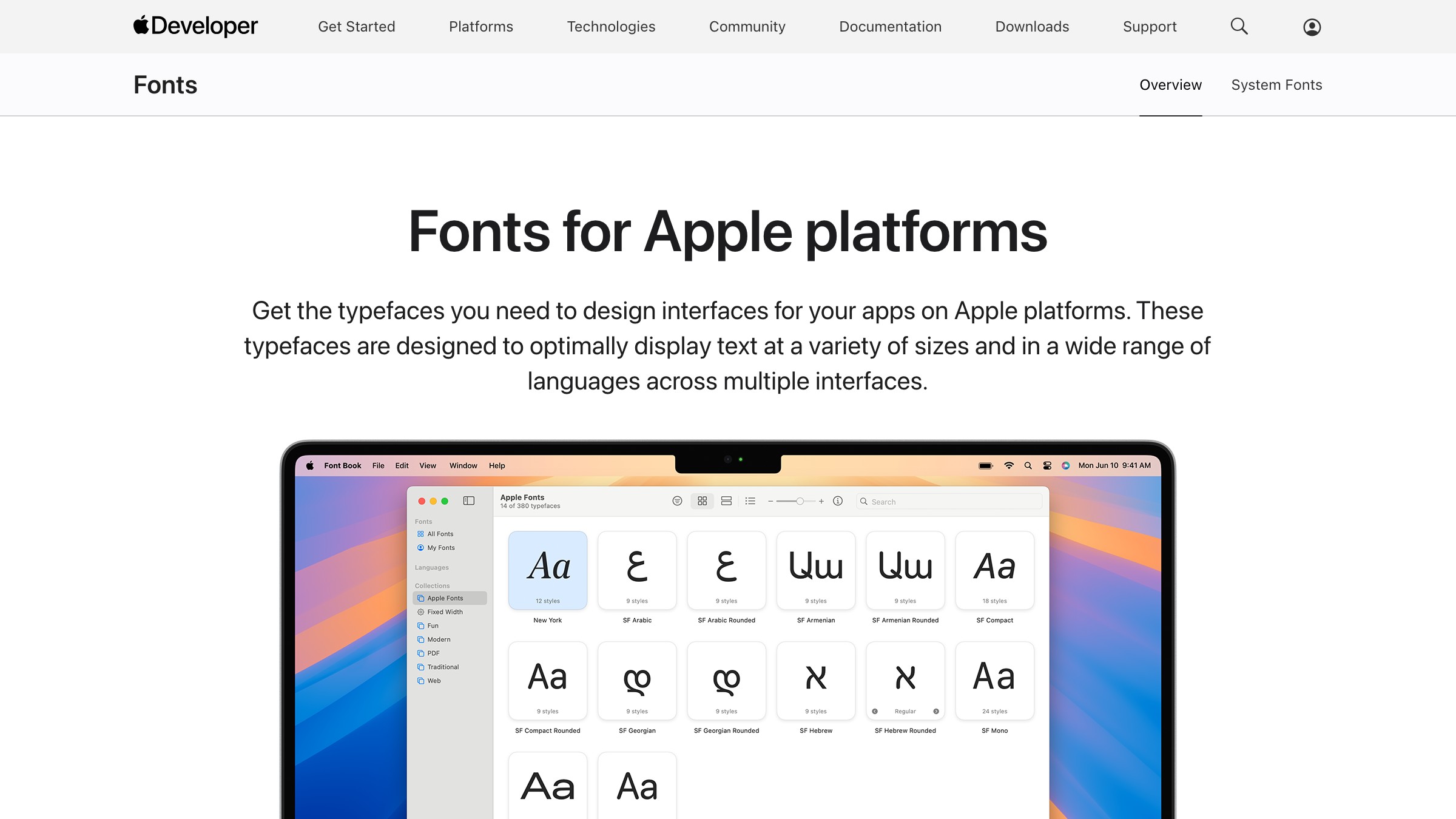
This is the upstream argument for variable fonts as a platform standard. Apple and Google both treat variable as the default; the static file is the legacy format. When the OS, the browser, and the rendering stack are all built around the variable format, shipping static files starts to look like shipping GIF instead of WebP.
Designers working inside Apple's HIG cannot load SF Pro on the web directly (licensing). But the optical size axis pattern is fully reproducible with any variable font that supports opsz, and it is a concrete argument for why axes matter beyond weight.
IBM Plex: variable inside a corporate design system
IBM Plex is Bold Monday's typeface commissioned for IBM, and it is the clearest example of a variable font anchoring a corporate design system at scale. Plex covers Serif, Sans, Mono, and Math, with variable versions available for Sans and Serif.
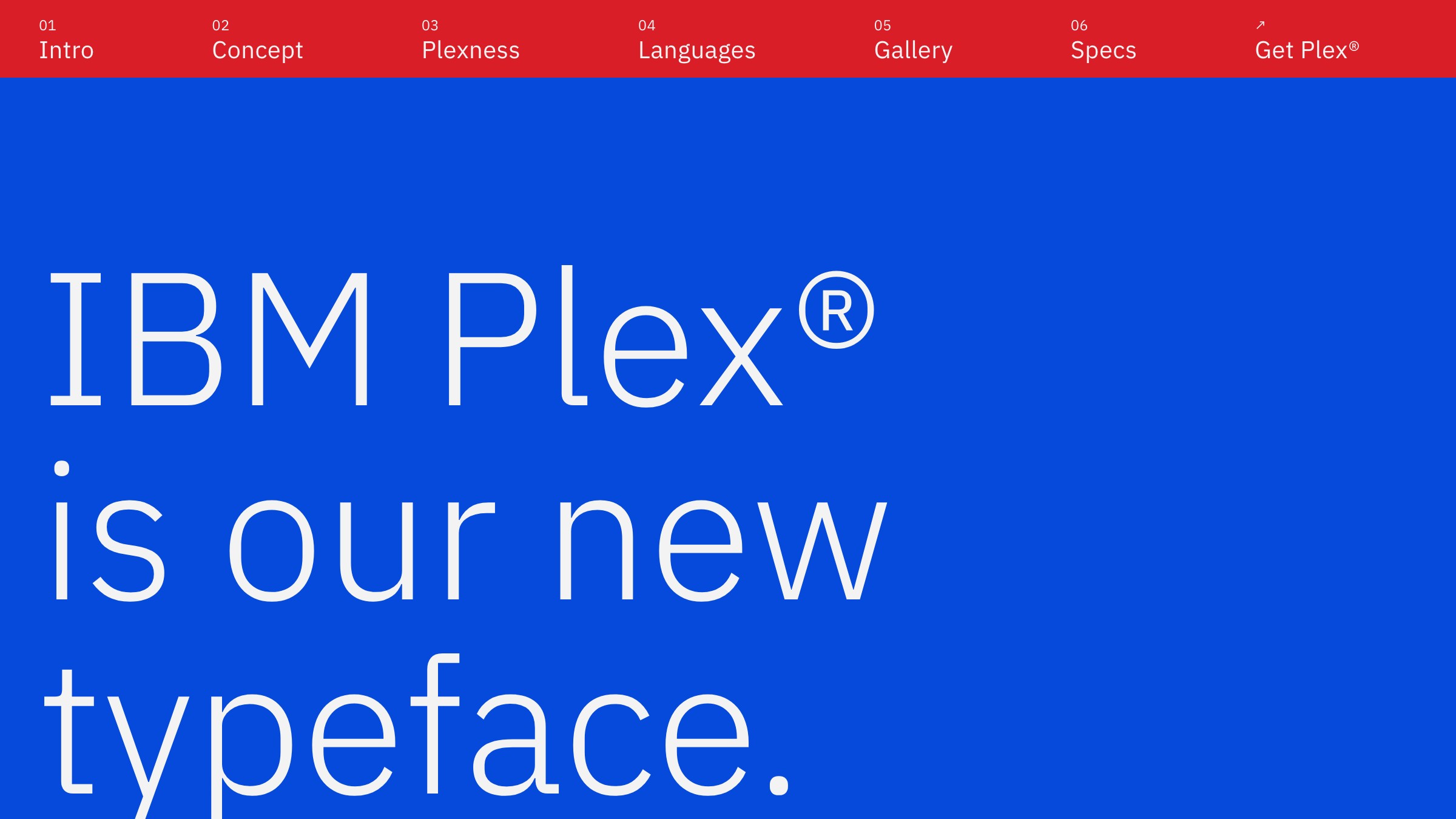
The business argument IBM made: one type family, one set of files, every product surface, every language. Plex ships across IBM's cloud products, marketing, developer documentation, and print. The variable Sans carries the same brand signal whether it is rendering at 11px in a data table or 72px in a billboard. That consistency is not accidental; it is what commissioning a type system with a coherent variable backbone buys.
Brands with multiple product surfaces and a long shelf life are where Plex proves its value. It is the teardown to put in front of anyone questioning the investment in a proper type system.
Need a type system that survives every channel and ships in one file, not six? Brainy ships brand identity.
The performance argument in one number
Inter variable is roughly 310 KB as a single file. Shipping Inter Regular and Inter Bold as static files adds up to about 280 KB combined. That sounds like static wins. It does not.
| Static fonts | Variable font | |
|---|---|---|
| HTTP requests | 2 | 1 |
| Weight range | Fixed stops (400 and 700) | 100 to 900, continuous |
| Axis variation | None | All registered axes |
| Design range | Limited to shipped weights | Any value the axis supports |
For a UI that uses three or four weights, the variable file pays for itself in request count alone. A marketing site that dials display weight precisely gets design control that static fonts cannot offer at any file size.
Subsetting sharpens the math. Tools like Fonttools and Google Fonts' subsetting API let you trim a variable font to just the axes and glyphs you need. A properly subsetted variable Inter for Latin characters with weight and italic only runs well under 100 KB.
How to pick a variable font this week
Six questions, designed for 2026 production budgets. Answer them in order. The last answer you give that has a clear outcome is your pick.
| # | Question | Rule |
|---|---|---|
| 1 | Is the brand typeface already variable? | If yes, use it. No switch needed. |
| 2 | Is this primarily a UI or SaaS product? | Start with Inter. It is boring in the right way. |
| 3 | Do you need code blocks to visually match prose? | Look at Recursive. The MONO axis is built for this. |
| 4 | Do you need more than weight and italic variation? | Check the axis list before committing. Most fonts only offer wght. |
| 5 | Is file size a hard constraint (aggressive performance budget)? | Subset to the axis ranges and glyphs you actually use. |
| 6 | Is this a long-lived design system, not a one-off project? | Commission or license a typeface with variable from the start. Do not retrofit. |
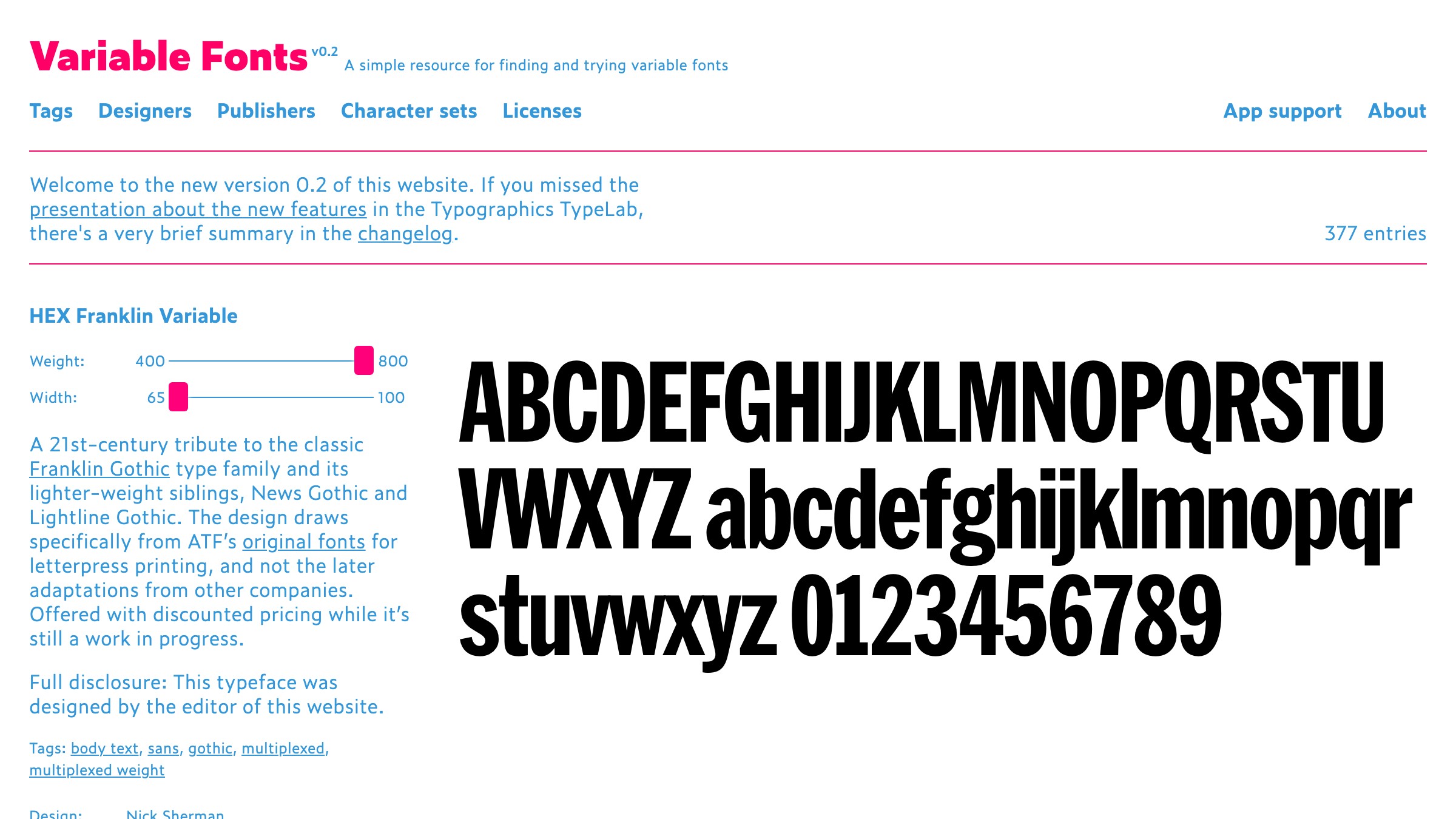
The catalog to check before committing to any pick is v-fonts.com. It is the most comprehensive variable font index available and lets you test axes live before you download a thing.
For pairing variable fonts with secondaries, see our font pairing guide. For how this fits the broader typography stack, that breakdown covers hierarchy, scale, and spacing.
FAQ
Do variable fonts work in all browsers?
Yes, as of 2026. Variable fonts have had broad support since Safari 11, Chrome 66, Firefox 62, and Edge 17.
The only concern is very old Android WebView instances. If your analytics show significant traffic from Android 4-era browsers, test. For everyone else, ship with confidence.
Are variable fonts harder to implement in CSS?
No harder than static fonts once you understand the font-variation-settings property. You declare axis values the same way you declare font-weight. Weight variation is often handled entirely through the existing font-weight property because browsers map it to the wght axis automatically. Custom axes use four-letter tags directly in font-variation-settings.
Can I use a variable font from Google Fonts?
Yes. Google Fonts serves variable versions of many typefaces, including Inter, Recursive, and Roboto Flex. Append :ital,wght@0,100..900;1,100..900 (or the appropriate axis range) to the Google Fonts URL to request the variable file instead of individual weights. The syntax is documented on the Google Fonts developer page.
Is a variable font always smaller than multiple static files?
Not always. A variable font encodes the full design space, which can make the raw file larger than a single static weight. The case for variable is one request plus axis range, not raw file size. Subsetting closes the gap fast for most production use cases.
When should I stick with static fonts?
When you only ever use one weight of a typeface and have no plans to expand. A subsetted static Regular is genuinely leaner than a variable font you are using at a single stop. The variable advantage compounds with axis usage. If you use one weight and one style, static is fine.
Stop shipping six font files when you need one
The argument for variable fonts is not speculative. Apple ships SF Pro as variable across every platform. IBM Plex anchors a system covering cloud products, developer docs, and print.
Rasmus Andersson's Inter is the default typeface of half the SaaS interfaces you use daily. The format is not experimental; it is the current standard that most project-level design work has not caught up to yet.
Pick one font from the teardowns above, run it through the six-question framework, pull the variable file from v-fonts.com or Google Fonts, and ship it this week.
The performance argument is real. The design range argument is real. The "we need to audit our font loading strategy first" argument is a reason to start Monday, not to wait. For more typography breakdowns, the full library is there.
Need a type system that survives every channel and ships in one file, not six? Brainy ships brand identity.
Get StartedGet new papers by email
New Brainy papers in your inbox. Confirm once, unsubscribe anytime.