Apple Logo History: From Newton's Drawing to One Bitten Shape
Apple fixed its logo twice. The 1976 Newton drawing, the 1977 rainbow apple with a bite and the one-color apple that followed, with who made each and what it teaches.
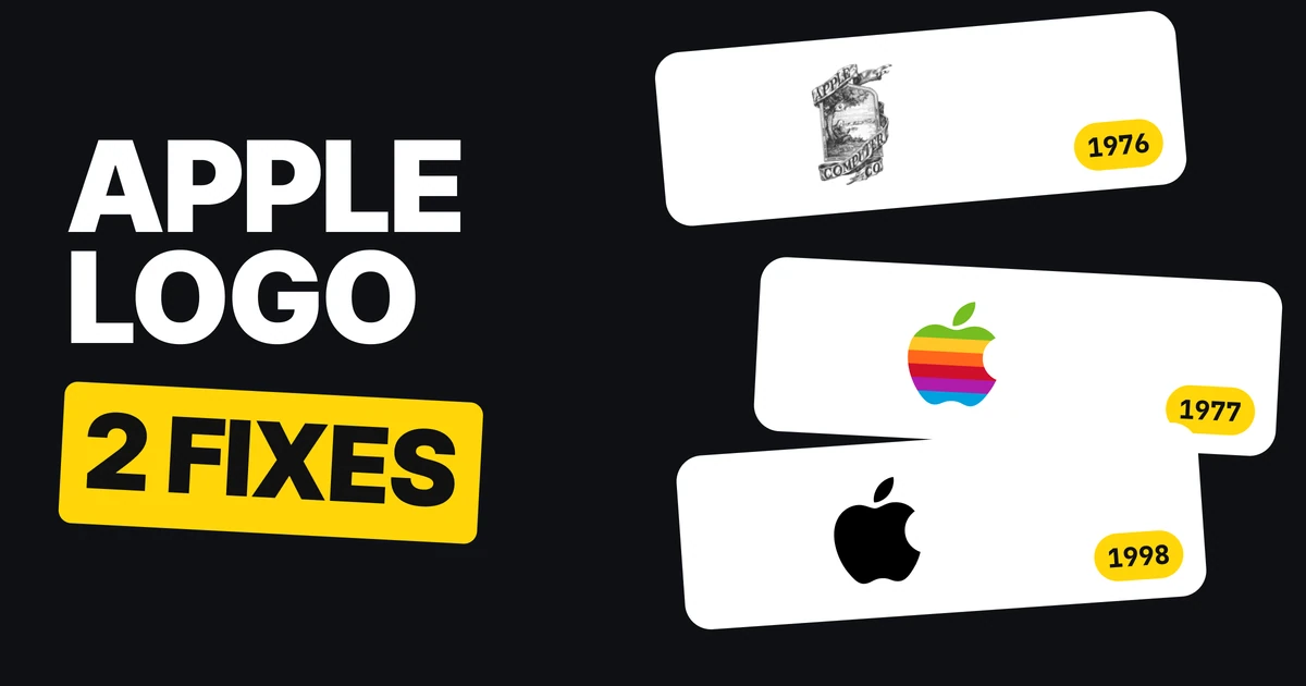
Apple's first logo was a detailed pen drawing of Isaac Newton under a tree. The one on every iPhone today is a single black shape with a bite taken out of it. Two fixes sit between them, and both made the logo simpler. Here is each version, who made it and what it teaches if you are drawing a logo of your own.
| Year | Logo | The fix |
|---|---|---|
| 1976 | Newton under an apple tree, with a poem on the border | Starting point |
| 1977 | One rainbow apple with a bite | A scene became a shape |
| 1998 | The same apple in one color | A color set became one color |
1976: a drawing, not a logo
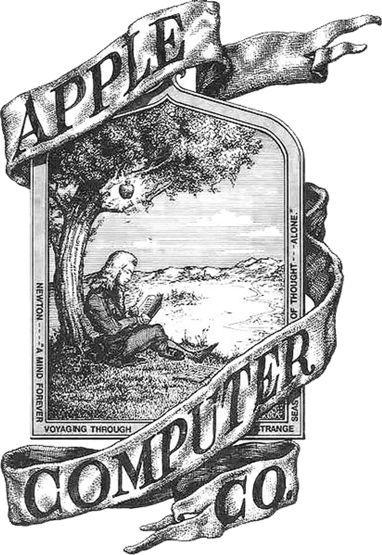
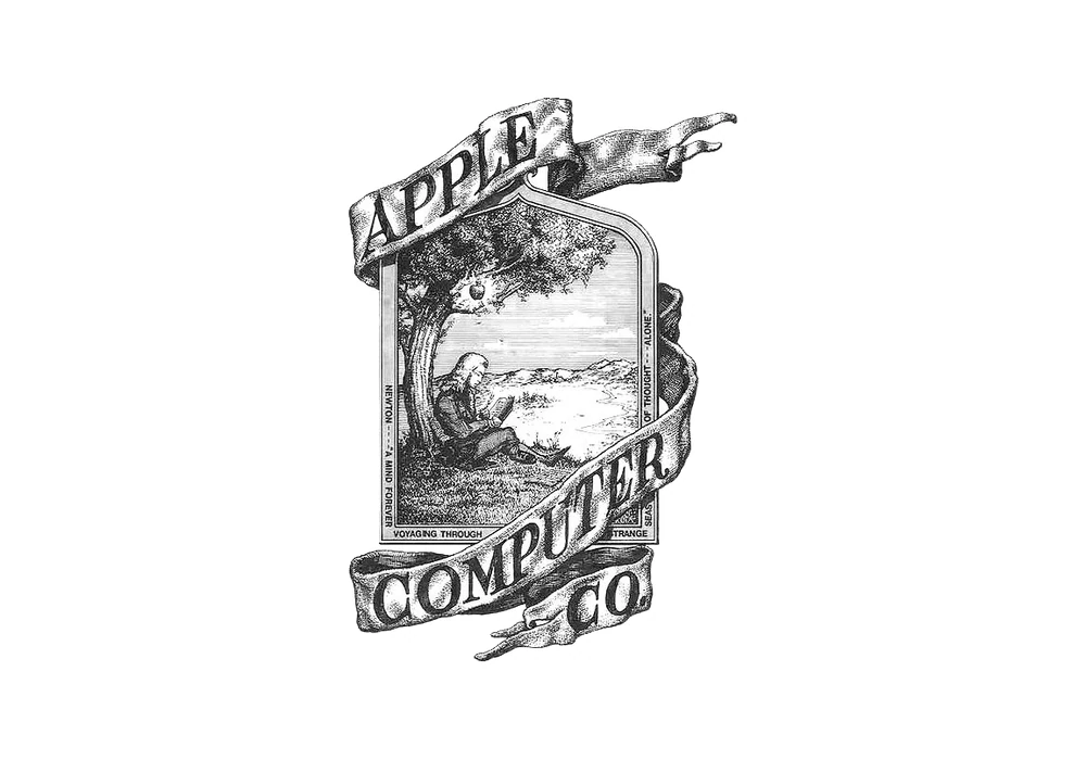
The first Apple logo was drawn by Ronald Wayne, Apple's third co-founder. Rob Janoff, who made the next one, describes it as "a pen and ink drawing" of Sir Isaac Newton under an apple tree "with a poem all around the border." As an illustration it is lovely. As a logo it has a problem.
Shrink it and it turns to mush
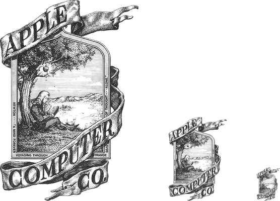
This is the same file at 400, 167 and 67 pixels tall. At the first size you can read the banner and the tree. At the last it is a gray smudge. A logo has to work at the size of a browser tab, an app icon and a receipt, and a scene full of fine lines cannot.
What it teaches: draw a shape, not a scene. If the details disappear when the logo gets small, the logo disappears with them.
1977: one shape, with a bite
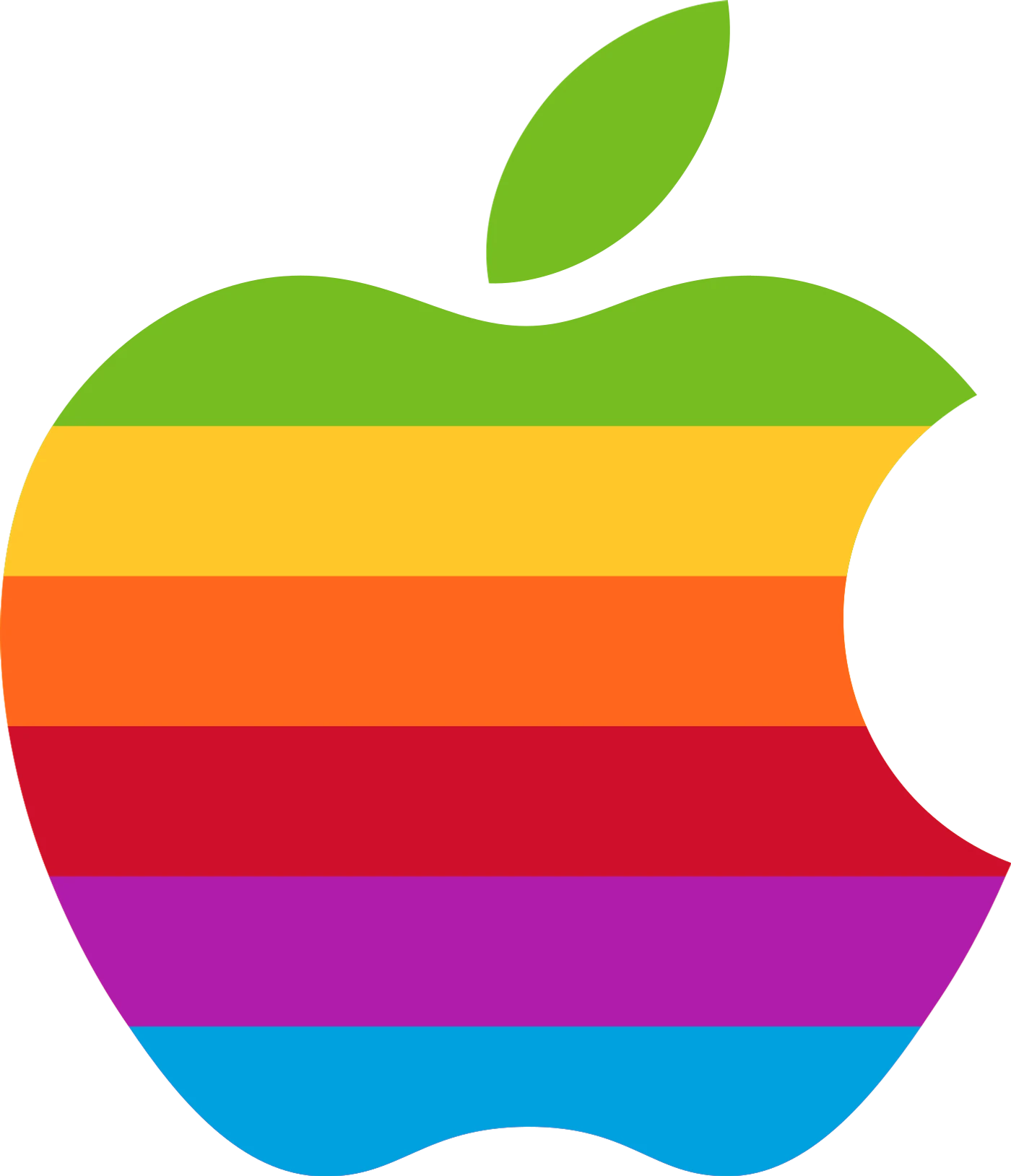
Rob Janoff, working at the agency Regis McKenna, designed the rainbow apple in 1977. Steve Jobs's only direction, in Janoff's words, was "don't make it cute." Two choices in the drawing are worth knowing.
- The bite. "I designed it with a bite for scale, so people get that it was an apple not a cherry." One small cut makes a plain silhouette say apple.
- The stripes. The Apple II was "the first home or personal computer that could reproduce images on the monitor in color," so the colors told that story.
What it teaches: one detail can explain the whole mark. The bite does the work that a whole illustration was doing before.
1998: one color
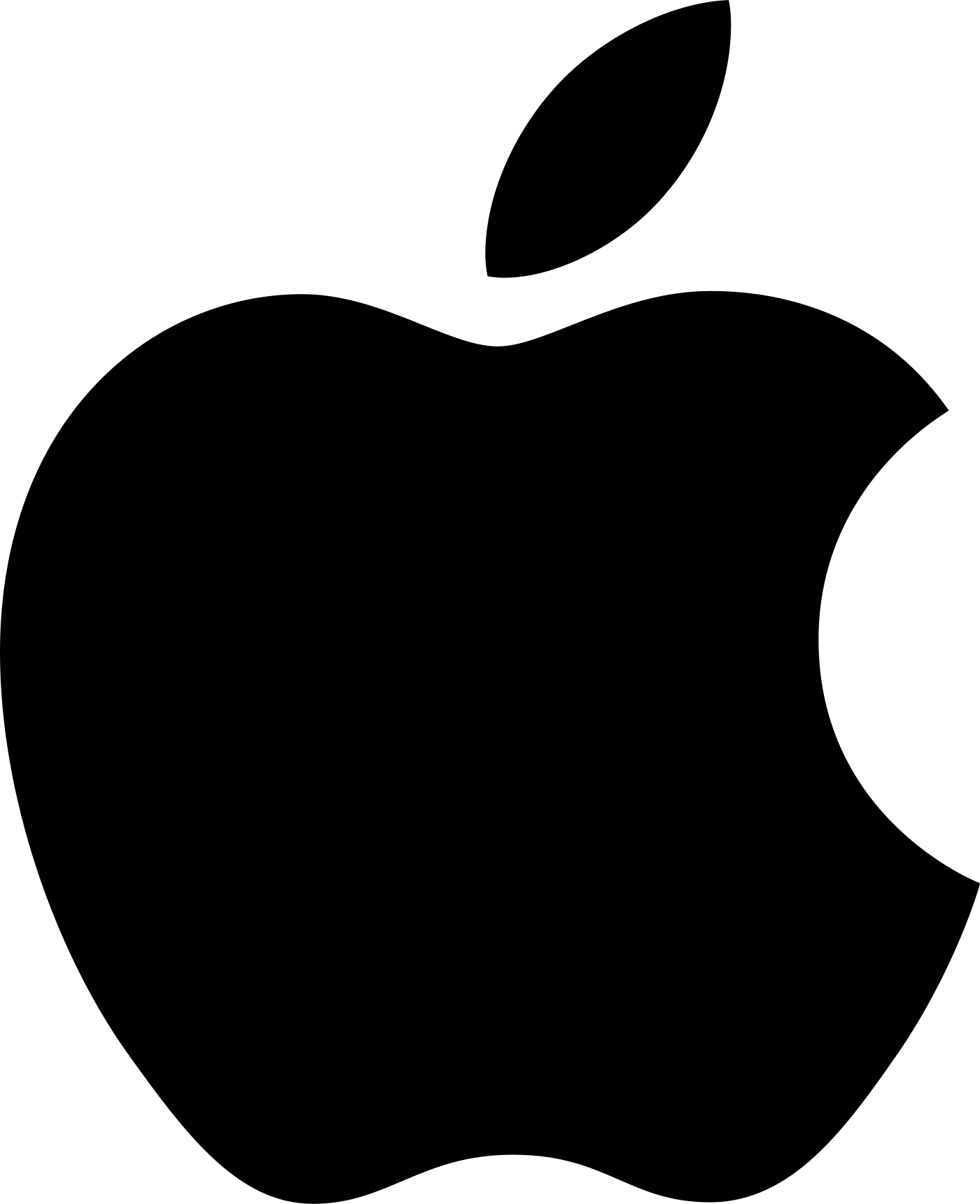
The rainbow went and one color took over. Most logo histories tie the switch to the 1998 iMac, while Wikipedia and Cult of Mac date the formal swap to 27 August 1999, so treat 1998 as the start of the change. The result is a logo that can be black on white, white on black, stamped in metal, etched in glass or printed on paper.
Janoff saw the problem early. When he presented the logo in 1977 he showed a striped version, a solid color version and a metallic version, and said the stripes "really didn't work as a greyscale halftone." The one-color apple is the version that was always going to travel furthest.
Later versions, glossy, chrome and flat, only changed the finish of the same one-color apple. They are not new fixes, which is why the count stays at two.
What it teaches: get a one-color version. If a logo needs its colors to be understood, it fails anywhere color is not available.
First against last
1976
Today
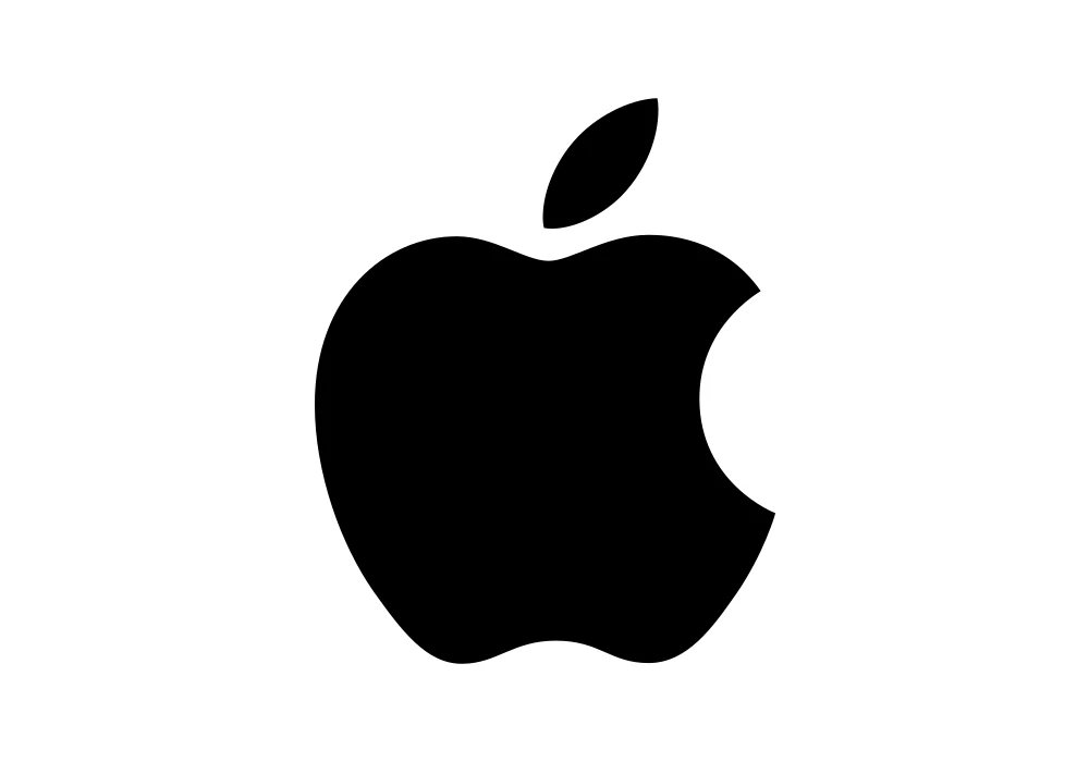
The 1976 logo holds a person, a tree, a banner, a poem and a name. Today's holds one shape. You can draw the second from memory in three seconds, and almost nobody can draw the first at all. That is the test a logo has to pass.
What this means for your logo
- Draw a shape, not a scene. If your logo needs the whole story to make sense, people will not remember it. Pick the single shape that stands for the business.
- Let one detail explain it. Apple's bite says apple. Find the one small cut, notch or turn that does the same for you. Our one-letter logos paper shows the same idea in lettermarks.
- Make a one-color version. Test the logo in solid black on white before you fall for any color. A compact, flat version also belongs in a proper logo variants system.
If the logo you have is closer to the 1976 end, the safe way to change it is in the logo redesign process. For another famous logo that got simpler over time, read the Google logo history.
FAQ
What was the first Apple logo?
A pen and ink drawing of Sir Isaac Newton sitting under an apple tree, with a poem around the border, drawn by Apple's third co-founder, Ronald Wayne, in 1976.
Who designed the Apple logo?
Rob Janoff designed the apple with a bite in 1977 while working at the agency Regis McKenna. Steve Jobs's only direction was "don't make it cute."
Why does the Apple logo have a bite?
Janoff says he added it for scale, "so people get that it was an apple not a cherry."
Why did the Apple logo have rainbow stripes?
The Apple II was the first home computer that could show images on the monitor in color, and the stripes said so.
When did Apple change to a one-color logo?
Most logo histories tie it to the 1998 iMac. Wikipedia and Cult of Mac date the formal swap to 27 August 1999.
How many times did Apple change its logo?
Twice in design terms: 1977, from a drawing to one shape with a bite, and 1998, from the rainbow to one color. Later versions only changed the finish of the same apple.
Sources
- Rob Janoff, interview with Creative Bits, creativebits.org: the 1976 drawing, "don't make it cute", the bite, the stripes and the three versions shown in 1977.
- Wikipedia, Apple Inc., Branding section, and Cult of Mac: the date of the one-color swap.
- Logo files from Wikimedia Commons, shown for commentary and never redrawn: the 1976 drawing, the rainbow apple, the one-color apple. Trademarks of Apple.
- The three-size demonstration is our render of the 1976 file at 400, 167 and 67 pixels tall.
- First published as a carousel on Logo Brainy.
Is your logo trying to tell the whole story? Our team turns it into one shape that works at every size.
Get StartedGet new papers by email
New Brainy papers in your inbox. Confirm once, unsubscribe anytime.