Logos That Dropped Their Name: Nike, Starbucks and Mastercard
Nike kept its name on the swoosh for 24 years, Starbucks for 40 and Mastercard for 50. See each logo before and after, why they could drop the name and when your logo can.
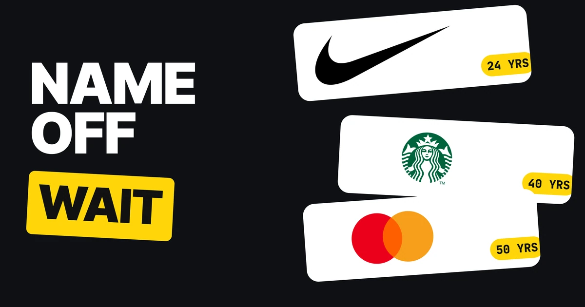
Nike's swoosh, the Starbucks siren and the two Mastercard circles all stand alone today. None of them started that way. Each one wore its name for decades first, and dropped it only once strangers knew the symbol without it. Here is each logo before and after, how long it waited and what that means for a logo you are building now.
| Brand | Name on the logo | Years | Dropped |
|---|---|---|---|
| Nike | 1971 to 1995 | 24 | 1995 |
| Starbucks | 1971 to 2011 | 40 | 2011 |
| Mastercard | 1969 to 2019 | 50 | 2019 |
Nike: 24 years with NIKE on the swoosh
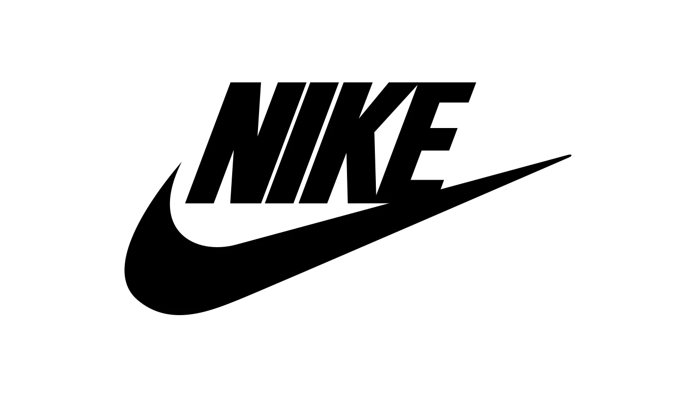
Carolyn Davidson, a graphic design student at Portland State University, drew the swoosh in 1971. Until 1995 the official Nike logo carried the name: the word NIKE in Futura Bold capitals, cradled within the swoosh. From 1971 to 1978 the word was a lowercase script, and the bold version above ran from 1978 to 1995.
In 1995 the word came off. By then the swoosh had been on shoes, ads and athletes for 24 years, and nobody needed to be told what it was.
Starbucks: 40 years of a name around the ring
Starbucks opened in 1971 with its name running around the siren, and kept it there for 40 years. On 5 January 2011 it announced a new logo that dropped the words "Starbucks Coffee" and let the siren step out of the ring. It reached stores from March 2011, for the company's 40th anniversary.
The new mark also gave Starbucks room to sell more than coffee. A ring that says COFFEE is a promise about one product, and a bare siren is not.
Mastercard: 50 years, then a check
A name first sat on the circles in 1969, as "Master Charge: The Interbank Card". On 7 January 2019 Mastercard announced it was dropping its name from the mark in select contexts, and it gave the reason in numbers: more than 80 percent of people spontaneously recognized the symbol without the word.
Mastercard is the only one of the three that tested first. Nike and Starbucks had the same evidence in the world around them, but Mastercard measured it.
Before and after, side by side
Nike, name on
Nike, since 1995
The mark itself did not change. The word left, and the swoosh got more room, a cleaner outline and the freedom to sit on a sleeve, a cap or a sole with nothing beside it.
Why they could drop the name
All three had the same three things in place before they let go.
- Years of use. Between 24 and 50 years of the symbol and the name appearing together, so the name taught the symbol what it stood for.
- Reach. Shoes on feet, cups in hands, cards in wallets. The symbol was seen everywhere, daily.
- Proof, or close to it. Mastercard measured recognition at more than 80 percent. The other two could see it in how people talked about the logo.
The name was never the problem. It was a teacher. Once the lesson stuck, it could go.
What this means for your logo
If you want a logo like the swoosh, start the way Nike did. Keep the symbol and the name together, for years, and let the symbol earn the right to stand alone.
- Ship the pair. Draw the symbol and the name as one lockup, and a wordmark or a lettermark version for when space is tight.
- Plan the solo version now. Build a symbol that works on its own at small sizes, as in responsive logo systems, so the day you drop the name nothing needs redrawing.
- Wait for a signal. Ask strangers to name the brand from the symbol alone. If most cannot, the name stays.
- Drop it in steps. Mastercard removed the name in select contexts first. When you do change it, the logo redesign process shows how to roll it out, and rebrand vs brand refresh tells you how big a change this really is.
FAQ
Why did Nike drop its name from the swoosh?
In 1995 Nike removed the word NIKE from its logo. The swoosh had been on its products for 24 years and no longer needed the name to be recognized.
How long did Nike keep its name on the logo?
24 years, from 1971 to 1995. The word was a lowercase script until 1978 and bold Futura capitals after that.
When did Starbucks remove its name from the logo?
Starbucks announced the change on 5 January 2011. The words "Starbucks Coffee" came off and the siren left the ring, for the company's 40th anniversary.
When did Mastercard drop its name from the logo?
On 7 January 2019. It said more than 80 percent of people recognized the symbol without the word.
Can a small business use a logo with no name?
Not at the start. Strangers cannot name a symbol they have never seen. Keep the name beside it until they can.
How do I know my logo can stand alone?
Show the symbol alone to people who do not know you and ask what brand it is. Mastercard dropped its name only after more than 80 percent of people got it right.
Sources
- Wikipedia, Swoosh: created in 1971 by Carolyn Davidson, a graphic design student at Portland State University, and the name in Futura Bold in the logo until 1995.
- CNN Money, Starbucks unveils new logo, 5 January 2011, and The Washington Times, Starbucks gives logo new look, 6 January 2011.
- Mastercard, Mastercard evolves its brand mark by dropping its name, 7 January 2019, and Wikipedia, Mastercard, Branding section, for the 1969 Master Charge logo.
- Logo files shown for commentary and never redrawn, from Wikimedia Commons and English Wikipedia: Nike logo 1978, the Nike swoosh, Starbucks Coffee Logo (1992 to 2011), Starbucks Corporation Logo 2011, Mastercard logo (2016 to 2019), Mastercard 2019 logo. Trademarks of Nike, Starbucks and Mastercard.
- First published as a carousel on Logo Brainy.
Is your symbol ready to stand alone, or does it still need the name? Our team builds the pair that earns it.
Get StartedGet new papers by email
New Brainy papers in your inbox. Confirm once, unsubscribe anytime.