Divider Color in UI: Why Dividers Are Not #000000
A pure black line between list rows is louder than the words it separates. Use #C6C6C8 on light, #38383A on dark, 1 px, inset to the text, and try space before you draw a line at all.
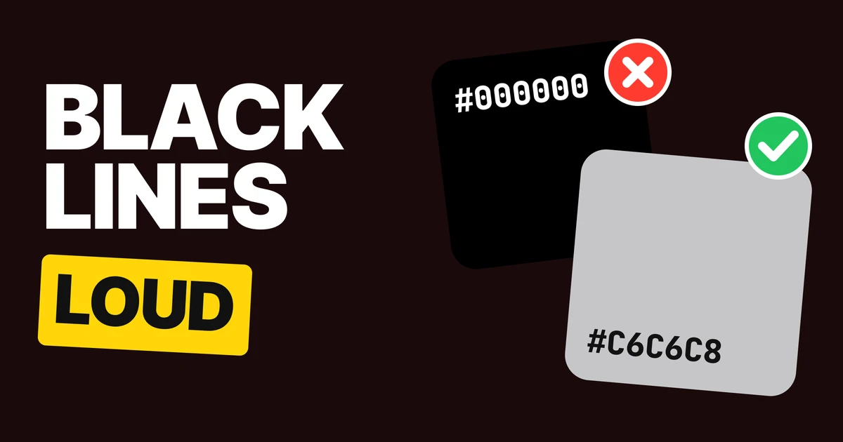
The right divider color is a soft light gray such as #C6C6C8, drawn 1 px thick and inset to the text, not a pure black line. A divider exists to separate rows, and a black one becomes the loudest thing in the list. Here are the four fixes, with the values for light and dark screens.
Why black dividers shout
Nobody picks a black divider on purpose. A line drawn without thinking comes out #000000, and it stays that way until someone changes it.
The problem is contrast. Pure black on white is the strongest pairing a screen can show, and your row text is usually a little softer than that. So the line outranks the words. The eye reads the lines first, then goes looking for the content between them.
A divider is a hint, not a feature. Its job is to be found by the eye when needed and ignored the rest of the time.
Fix 1: lighten the lines
#000000 lines
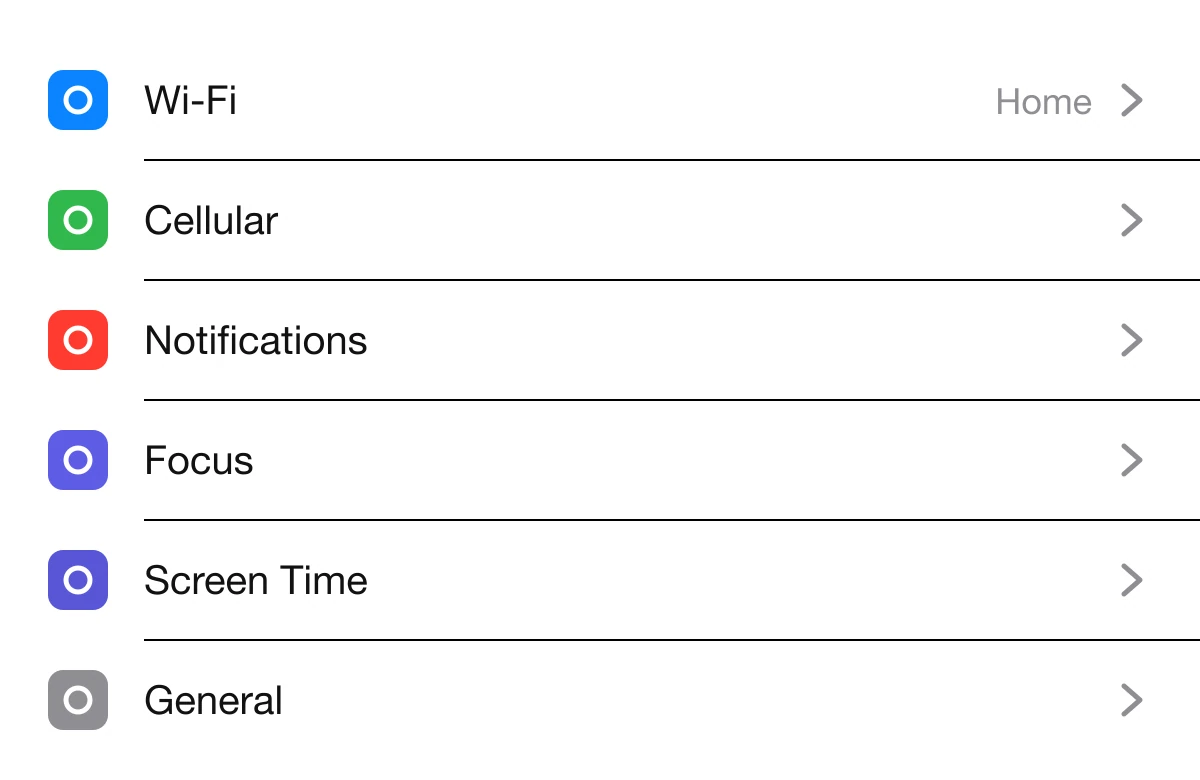
#C6C6C8 lines
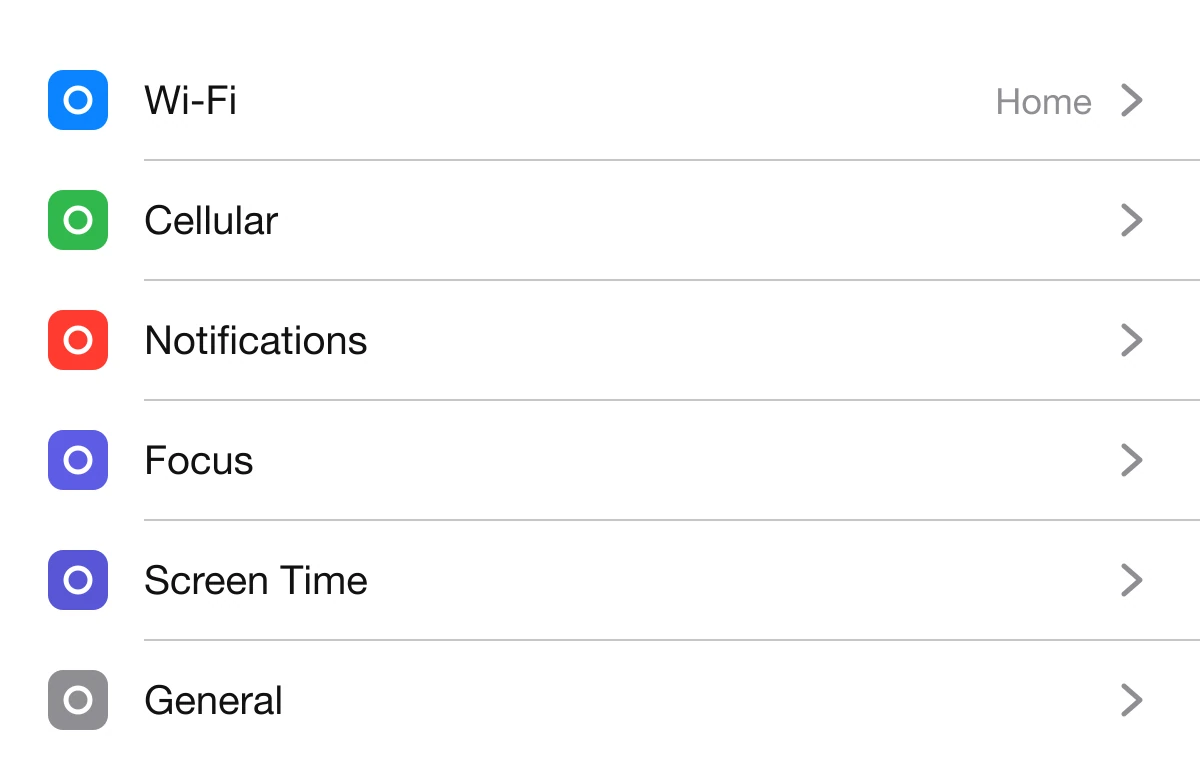
iOS draws its list separators in #C6C6C8 on white, which is the semi-transparent system separator color settled onto a white background. Material 3 lands in the same place with #CAC4D0, its outline variant token, at 1 dp.
Black line
iOS separator
Material 3 divider
12% black on white
If your background is not plain white, use an alpha value instead of a fixed gray. Material's guidelines describe dividers as 12% black in light themes and 12% white in dark themes. #000000 at 12% over white renders #E0E0E0, and over a tinted surface it stays tinted, so the line never looks pasted on.
The same fix applies outside lists: table row rules, card footers, the line under a header and the rule between menu groups.
Fix 2: inset them to the text
Full width
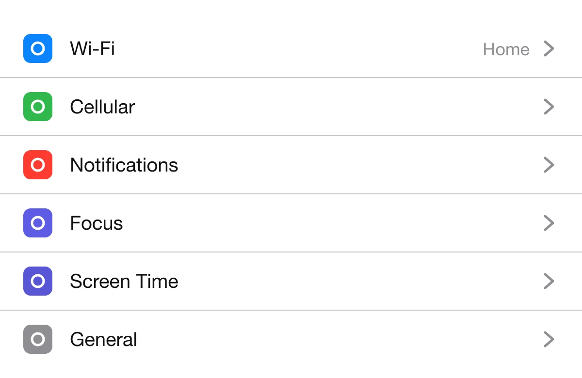
Starts at the text
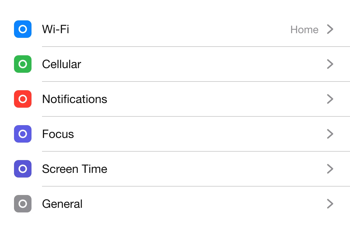
Open Settings on an iPhone and look at it. The line starts at the label, not under the icon. Material says the same thing: inset dividers separate related content, and they pair with anchoring elements such as avatars.
That inset is what ties an icon to its row. A full-width line under the icon cuts it loose, and the list reads as stripes instead of rows.
Since iOS 16, SwiftUI lists align each separator to the leading edge of the row's text by default, not to its icon. If your rows have no icon or avatar, there is nothing to inset around, and a full-width line is fine.
Fix 3: try space first
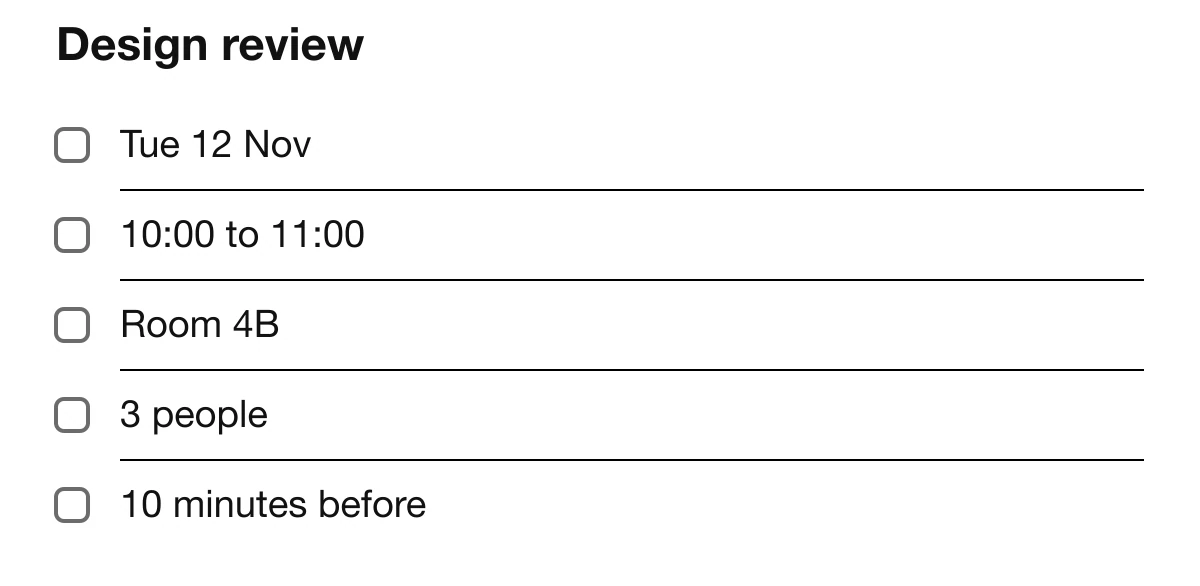
A line every row
Space does it

Before you reach for a line, ask what the line is for. Often it is grouping, and grouping can be done with distance. Material lists alternatives to full-bleed dividers: white space, subheaders and inset dividers, and warns that overusing full-bleed ones creates visual noise. Refactoring UI makes the same argument under "use fewer borders": separate things with space, a background color or a shadow.
A quick test is to delete every line in your list. If you can still see the groups, the lines were decoration.
Fix 4: dim them on dark too
#FFFFFF on #1C1C1E
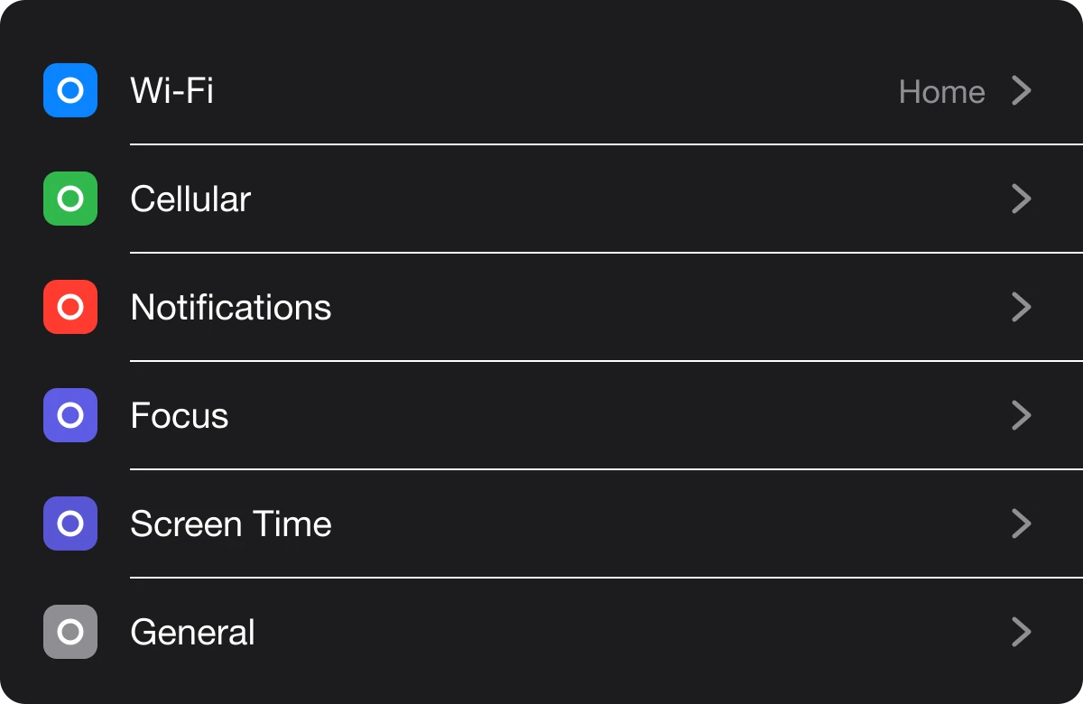
#38383A on #1C1C1E
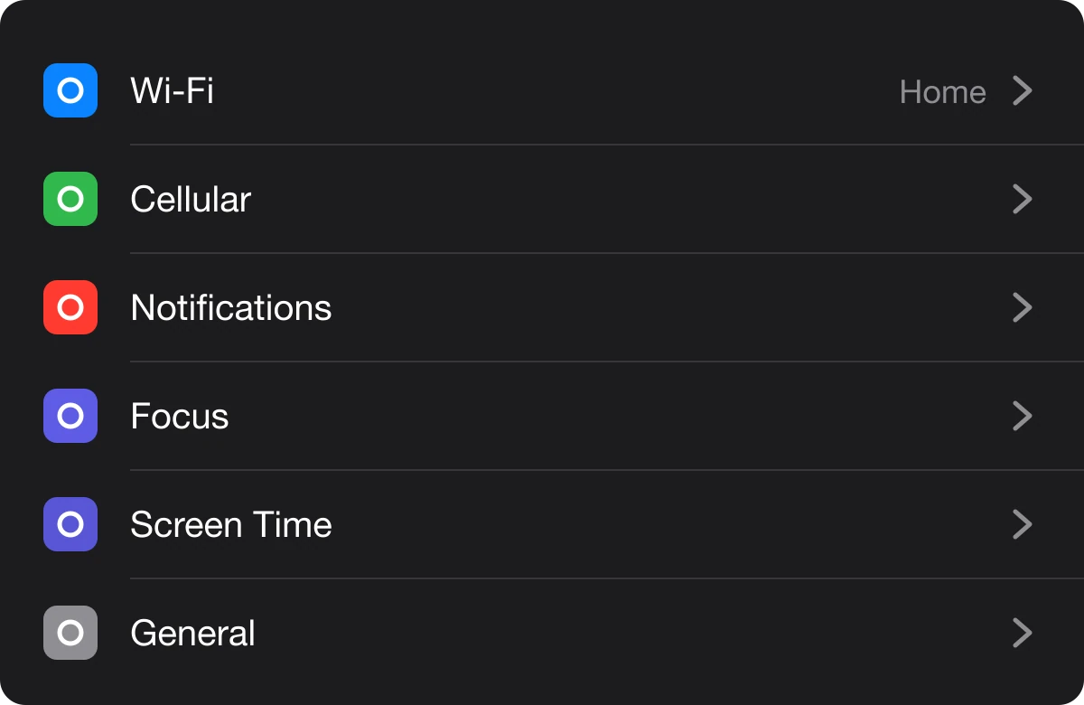
The rule does not change in dark mode, it flips. On a light screen the line is a bit darker than the surface, and on a dark screen it is a bit lighter.
iOS uses #38383A on its dark list background. Material 3 uses #49454F, its dark outline variant, on a #141218 surface.
Pure white lines have the same problem as pure black ones: they are the brightest marks in the list, so they beat the text.
The divider spec
Tap any chip to copy its code.
| Property | Value | Why |
|---|---|---|
| Color, light | #C6C6C8 | Visible when you look, quiet when you read |
| Alpha option | #000000 at 12% | Adapts to any surface, renders #E0E0E0 on white |
| Weight | 1 px (1 dp) | Thicker lines become shapes |
| Inset | Start at the text | Keeps icons and avatars attached to their rows |
| Color, dark | #38383A | A little lighter than the surface, never white |
| Space | Try it first | Grouping without drawing anything |
Hand this to your developer
:root {
  --divider: #C6C6C8;
}

@media (prefers-color-scheme: dark) {
  :root {
    --divider: #38383A;
  }
}

.row + .row {
  border-top: 1px solid var(--divider);
  margin-left: 56px; /* icon width plus gap, so the line starts at the text */
}

.group + .group {
  margin-top: 24px; /* try this before adding a line */
}
The margin-left on the border is the inset: the line begins where the label begins. If you use the alpha approach, replace the variable with rgba(0, 0, 0, 0.12) on light and rgba(255, 255, 255, 0.12) on dark.
FAQ
What color should dividers be?
A soft light gray on light screens, such as iOS's #C6C6C8 or Material 3's #CAC4D0. On dark screens use a slightly lighter dark gray such as #38383A.
Should dividers be black?
No. A pure black line is the highest-contrast mark in the list, so the eye reads it before the content. Use a light gray or black at about 12% opacity.
How thick should a divider be?
1 px, which is 1 dp in Material. Thicker lines turn into shapes and compete with the rows.
What is an inset divider?
A divider that starts at the row's text instead of the screen edge, so it does not cut under an icon or avatar. iOS Settings uses it for every list.
Do I need dividers between every row?
Not always. A bigger gap between groups often separates content with nothing drawn, and Material warns that overusing full-width dividers creates visual noise.
What divider color works in dark mode?
#38383A on iOS's dark list background and #49454F on Material 3's dark surface. Avoid white, because bright lines glare on dark screens.
Sources
- Material Design 2, Dividers: dividers are 1 dp thick with 12% black in light themes or 12% white in dark themes; inset dividers separate related content and work with anchoring elements such as avatars; alternatives to full-bleed dividers include white space, subheaders and inset dividers; overuse of full-bleed dividers creates visual noise.
- Material 3 tokens: the divider uses the outline variant color at 1.0 dp thickness; the baseline value is #CAC4D0 in the light scheme and #49454F in the dark scheme. #141218 is the baseline dark surface.
- Apple, listRowSeparatorLeading and Adjust List Row Separator Insets: since iOS 16 lists align each separator to the leading edge of the row's text by default.
- iOS separator colors: light rgba(60, 60, 67, 0.29), which sits on white as #C6C6C8, and #38383A on dark. The Settings app on iPhone shows the inset.
- #000000 at 12% over #FFFFFF renders #E0E0E0, computed by alpha blending.
- Refactoring UI, "Use fewer borders" (Adam Wathan and Steve Schoger).
- WCAG 2.2, 1.4.11 Non-text Contrast: a divider between list rows is decoration, not needed to understand the content, so no minimum contrast applies to it.
- The Settings rows and the "Design review" event details are invented for this page.
- First published as a carousel on UX Brainy.
Want lists, forms and every other surface designed as one quiet system? Our team designs and builds product UI that holds up in light and dark.
Get StartedGet new papers by email
New Brainy papers in your inbox. Confirm once, unsubscribe anytime.