Notes App Design: A Home Screen Redesign, Before and After
A notes app home screen with twelve colored sticky notes, eight colored tags and a storage warning, and the same screen fixed: folder chips, two pinned tiles and a plain list. Every change side by side, with the free Figma file.
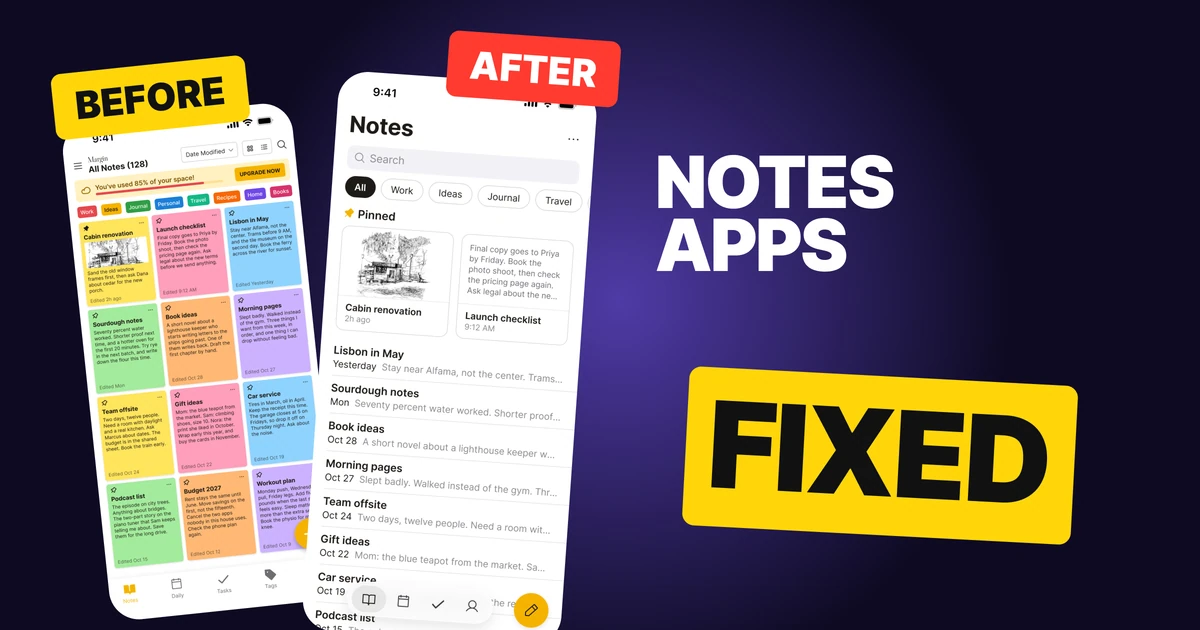
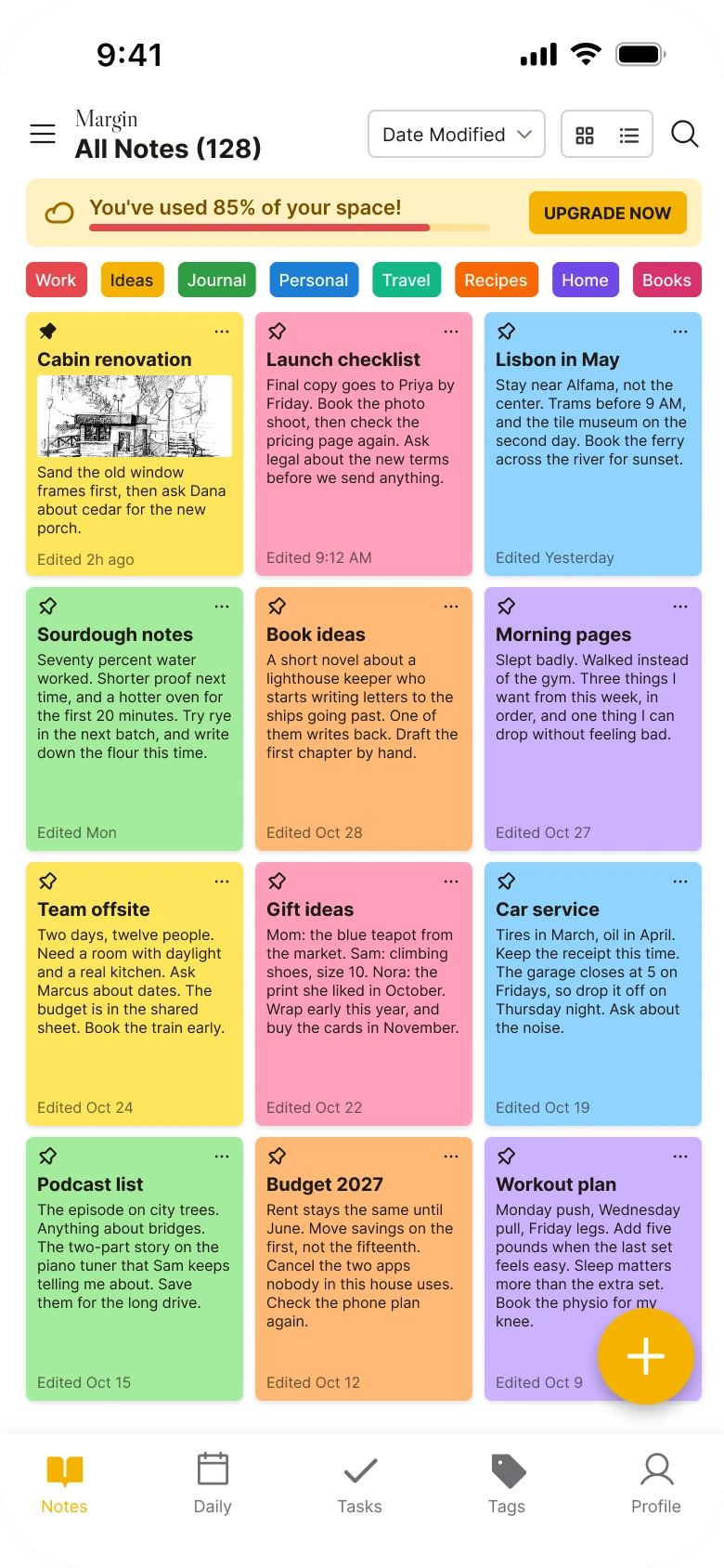
A notes app has one job on its home screen: get you to the note you want. The first draft below has everything you need to find a note, but it paints twelve sticky notes in six colors with 8 px text, adds eight tags in eight more colors, warns you about storage before you read a word, and parks a floating plus on top of a note.
The fix keeps every function and removes the chrome around the notes. The colored tags become hairline folder chips, the notes you pin become two white tiles, every other note becomes a plain row, and search is one grey field under a plain title.
The whole screen, before and after
Junior draft
Fixed
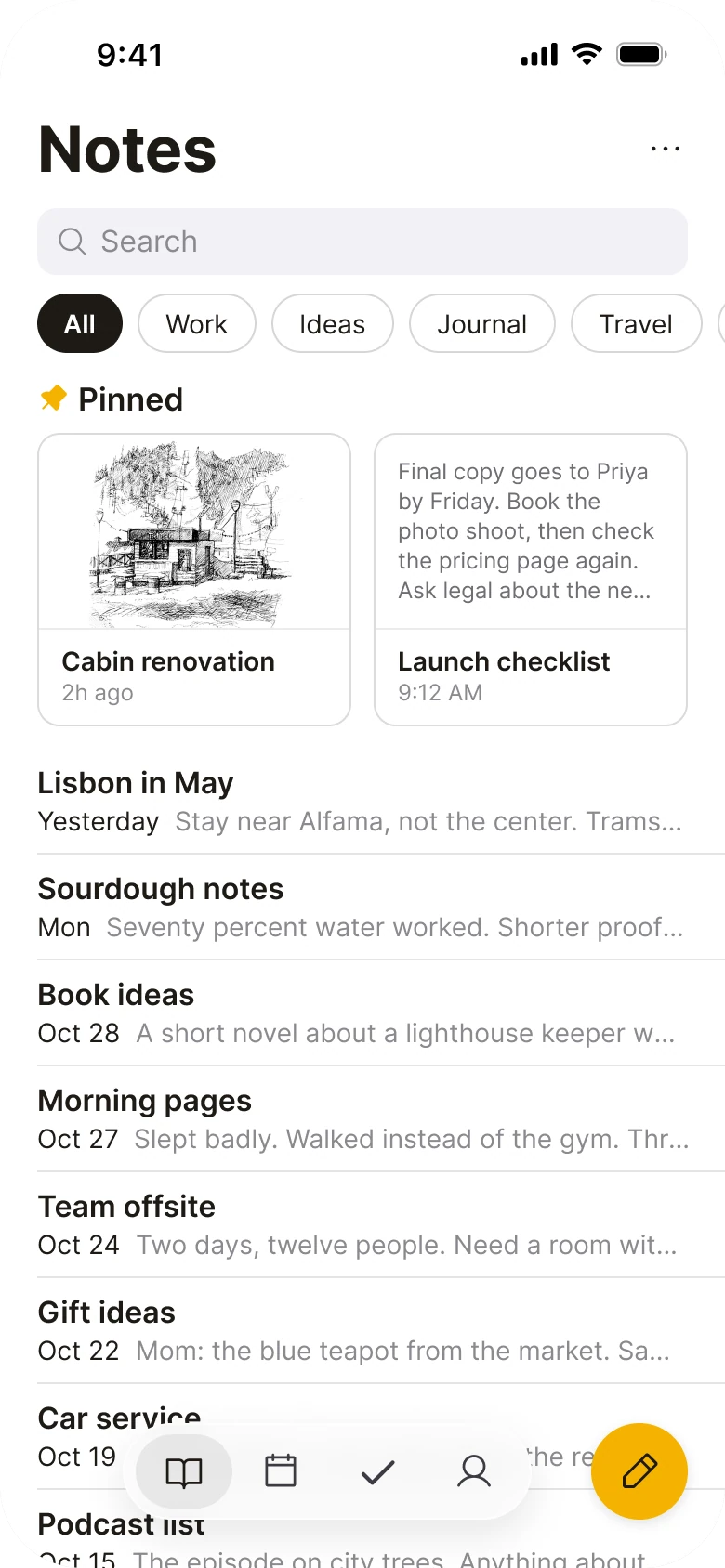
On the left, everything shouts at the same volume. Six sticky colors, eight tag colors, a yellow banner and a yellow plus all compete, and the notes themselves are the smallest thing on the screen.
On the right, the screen reads in the order a person thinks: what is this, can I search it, which folder, what did I pin, what else is there. The only colors are the ones inside the notes.
What changed, measured
| Junior draft | Fixed | |
|---|---|---|
| Title | A wordmark plus "All Notes (128)" | Notes at 34 px bold |
| Notes | Twelve 117 x 142 px stickies in six colors | Two 169 px pinned tiles, then plain rows |
| Note text | 8 px body text | 16 px titles over 14 px previews |
| Tags | Eight 9 px chips in eight colors | 32 px hairline folder chips |
| Search | An icon in the corner | A 36 px field in grey #F2F2F7 |
| Alerts | A storage banner above the notes | Moved to the Profile tab |
| Margins | 14 px left, 12 px right | 20 px on both sides |
| Tabs | Five, mixed filled and outline icons | Four, icons only, in a floating capsule |
Fix 1: a plain title and one search field
Before
After
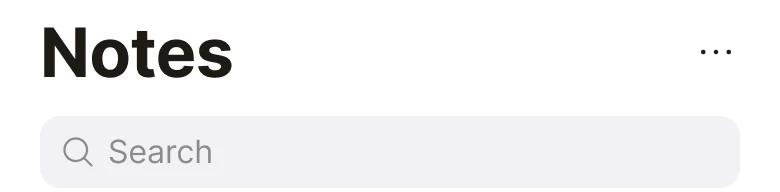
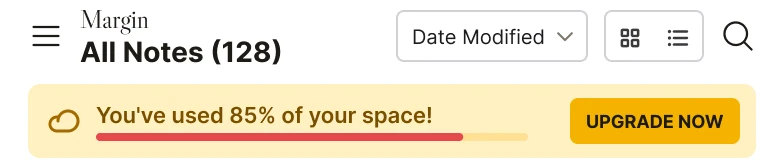
A tiny serif wordmark over All Notes (128), a Date Modified dropdown, two view toggles and a search icon, with a yellow storage banner and an UPGRADE NOW button underneath. Against a big Notes title, a three dot menu and a grey search field with the word Search in it.
The draft header holds seven controls before you see a single note: a menu, a wordmark, a count, a sort, two view toggles and a search icon. Then a banner tells you that you have used 85% of your space, with a button to pay.
The fix gives the screen a name and a way in. Notes is 34 px bold. Search is a full-width field with a 10 px radius in a light grey (#F2F2F7), so it looks like a field and nobody has to guess that an icon is a search.
Sort and view still exist, behind the three dots. The storage warning and Upgrade moved to Profile, where a person goes to manage their account.
Rule to reuse: the top of a screen should name it and offer the main way in. Everything else goes behind a menu.
Fix 2: folder chips instead of colored tags
Before

After

Eight tiny filled tags, Work in red, Ideas in amber, Journal in green, Personal in blue, Travel in teal, Recipes in orange, Home in purple and Books in pink, all squeezed onto one line. Against hairline pill chips reading All, Work, Ideas, Journal and Travel, with All filled black and the rest running off the right edge.
Eight tags in eight colors cannot be told apart by color for long, and at 9 px they are hard to tap. They also fill the line exactly, so the row looks finished and gives no hint that there is more.
The fix uses 32 px pills with a hairline outline. The selected one, All, is filled black. The rest are plain, and the folders after Travel swipe in from the right edge. A chip that is cut off by the edge of the screen tells the thumb it can scroll, and nobody needs an arrow.
Rule to reuse: show which item is selected with fill, not with a different color per item.
Fix 3: pin the notes you use as two white tiles
Before
After
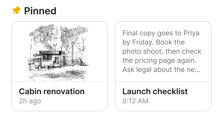
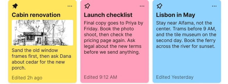
Three colored sticky notes in a row, yellow, pink and blue, each with a tiny pin and a more icon in the top corners and 8 px text. Against a Pinned heading with an amber pin and two white tiles: a pencil sketch of a cabin with the title Cabin renovation and 2h ago, and a text preview of the launch checklist with its title and 9:12 AM.
In the draft, a pinned note looks exactly like every other note, apart from an 11 px pin icon. The first two stickies are the same notes that are pinned in the fixed version. The pin does not change how they are treated, so it changes nothing about how easily you find them.
The fix gives pinned notes their own section and their own shape. Two 169 px white tiles with a 12 px radius and a hairline sit under a Pinned heading. The cabin note shows its sketch, the launch checklist shows a text preview, and each has a 14 pt semibold title and a 12 pt date under it. Pinning now changes what you see, and that is the reason to pin.
Rule to reuse: if a state matters, give it a place on the screen. A small icon on an identical card is not a place.
Fix 4: every other note is a plain row
Before
After
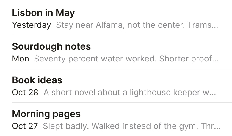
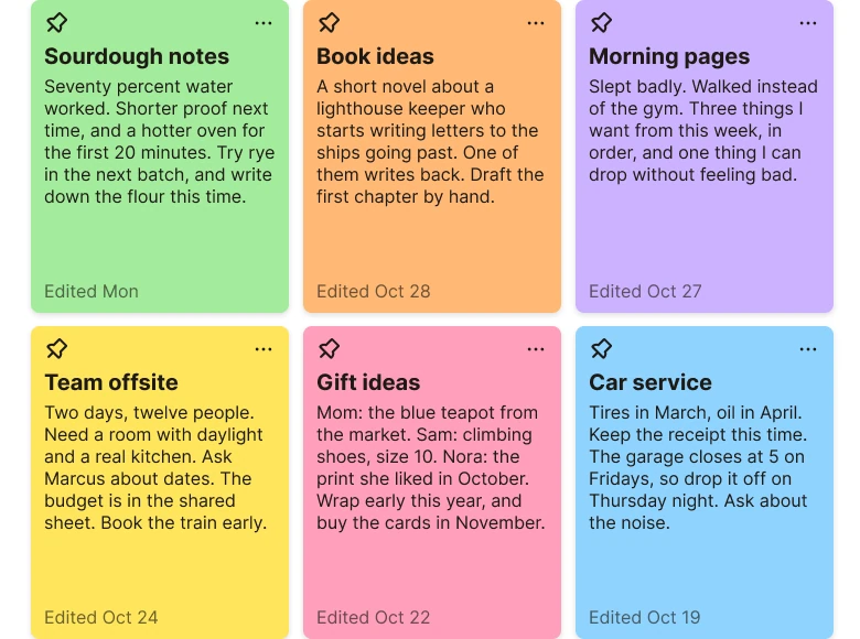
Two rows of colored stickies, green, orange, purple, yellow, pink and blue, each filled with tiny body text and an Edited date at the bottom. Against four plain rows on white: Lisbon in May, Sourdough notes, Book ideas and Morning pages, each a 16 pt title with a date and one line of its text under it, separated by hairlines.
A sticky shows a note in full, so a few lines of 8 px text is what you get. You cannot read it and you cannot scan it, and you fill a whole screen with twelve of them. The six colors mean nothing, so nothing is learned from them.
The fix is a list. Each note is a title at 16 pt, a date, and one line of its text at 14 pt that ends in an ellipsis. The rows are 57 px tall with hairlines between them, so about eight fit under the pinned tiles. You can read all the titles in one glance and open the right note by its first line.
Rule to reuse: a list is for finding things, a card is for looking at one thing. Pick the one that matches the job.
Fix 5: the tab bar and the compose button
Before
After
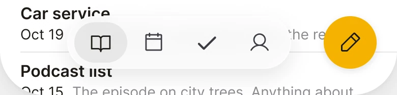
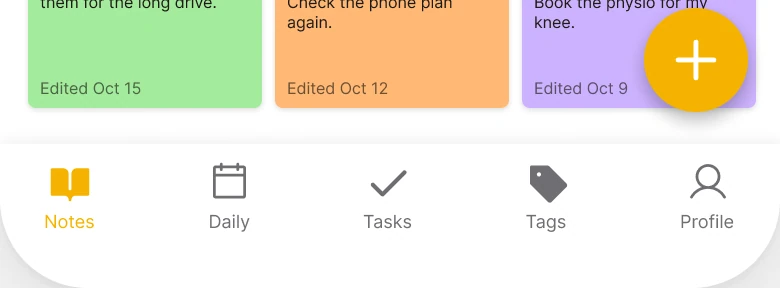
The bottom of the draft: a yellow round plus button sitting on top of the last note, over a flat tab bar with five labeled tabs, Notes, Daily, Tasks, Tags and Profile, with mixed filled and outline icons. Against a floating capsule with four icons, one selected, with the notes running under it, and a separate round amber compose button with a pencil beside it.
The draft puts a floating plus on top of the last note, so it hides text. Its tab bar has five tabs with labels, and the Notes icon is filled while the rest are outlines.
The fix makes two controls with two jobs. A 52 px icon-only capsule holds four tabs, in one icon style, and a 52 px amber compose button with a pencil sits beside it. The notes continue underneath both, so the screen feels like one long list instead of a list with a bar cutting it off. The Tags tab is gone because the folder chips do its job.
Rule to reuse: put the "make a new thing" button where the thumb is, and give it its own shape and color so it can't be mistaken for navigation.
The smaller fixes
- Every function stays. Search is the field under the title. Date Modified sort and the grid and list toggles sit behind the dots. All Notes (128) became the All folder. The more button is inside each note. The storage warning moved to Profile.
- One margin. The draft has 14 px on the left and 12 px on the right. The fixed screen uses 20 on both sides, with 10 px between blocks.
- One accent. Amber (#F5B301) is used only on the pin and the compose button. Everything else is black, grey and white.
- A type scale you can read. The draft runs from 8 to 14 px. The fixed screen starts at 12 px for dates and goes to 34 px for the title.
- Real content. The sketch tile shows an actual drawing instead of a colored box, so the pinned section shows what the note is about before you open it.
- No wordmark. The draft has a serif wordmark, Margin, in the header. The fixed screen has none, because the screen title is the header in Apple Notes.
Audit your own notes screen
| Question | Why it matters |
|---|---|
| Can you read every note title without opening the note? | A list is for finding, so titles must be readable |
| Does the screen use more than one accent color? | Each extra color needs a meaning, or it is noise |
| Do pinned notes look different from the rest? | A pin that changes nothing is not worth tapping |
| Is a warning or an upsell above the first note? | Sell after the job is done, not before |
| Does the compose button cover any text? | A control that hides content is in the wrong place |
| Can the folder row tell you it scrolls? | An item cut by the edge says "swipe" without a label |
Get the Figma file
The free file has the junior draft, the fixed screen and every part as a component.
Free Figma file
Notes app redesign, before and after
Both screens and every part as a Figma component. Free, view only, duplicate it to your drafts.
FAQ
How should a notes app home screen be designed?
Lead with a plain title and one search field, then folder chips, a short Pinned section and a list of notes with a title and one line each. Keep warnings and upsells out of the way so the notes are the loudest thing on the screen.
Should a notes app use a grid or a list?
A list for finding notes, because titles and one line of text are readable at a glance. A grid of full cards only works if each card is large enough to read, and at 117 px wide the text drops to 8 px.
How many colors should a notes app use?
One accent. Apple Notes uses a single amber for its pin and its compose button, and keeps everything else neutral, so the notes carry the color.
Where should the storage warning go in a notes app?
On the Profile or settings screen, or as a small notice only when the user is close to the limit. A banner above the first note makes every visit start with a sales message.
How should pinned notes look in a notes app?
As their own section under a Pinned heading, shown as two tiles with a preview, a title and a date. A pin icon on an identical card does not make a note easier to find.
Sources
- Both screens are our own, designed and measured in Figma. The app, Margin, and all its data are made up. The notes agree on both screens: the two pinned tiles are the draft's first two stickies, and the rows are the next stickies with the same titles, dates and opening lines.
- Pattern studied: Apple Notes on iPhone.
- Photo: a pencil sketch by Sofya Borboris on Pexels, straightened, cropped to the drawing and set on white. No AI.
- Icons are from Phosphor (MIT). The status bar is drawn from a measured iPhone screenshot. The draft's wordmark is Libre Caslon Display Regular.
- First published as a carousel on App Brainy.
Want this for your own app? Our team redesigns app screens like this one, from the first audit to the finished components.
Get StartedGet new papers by email
New Brainy papers in your inbox. Confirm once, unsubscribe anytime.