UI Design Inspiration Sites: 6 Places to Find Real Interfaces
Six sites that show real interfaces instead of mockups: Mobbin, Refero, Page Flows, Landingfolio, Dark Mode Design and SaaSFrame. What each one is best for, what it costs to open and how to use them in a brief.
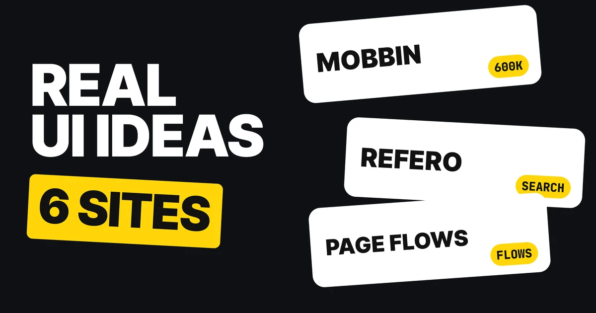
A blank frame is the hardest place to start a design. Real interfaces make it easy: you see what a settings page, a paywall or a hero already looks like when a team shipped it. Here are six sites that collect real screens, what each one is best for, and which ones ask you to sign up first.
| Site | Best for | Open without paying |
|---|---|---|
| Mobbin | Real app screens, over 600,000 | Free account, limited access |
| Refero | Searching screens, flows and patterns | Search the library on the site |
| Page Flows | Whole flows with screen recordings | 3 day trial |
| Landingfolio | Landing pages, heroes, components | Browse the gallery |
| Dark Mode Design | Dark website designs | Browse the grid |
| SaaSFrame | SaaS websites and product screens | Browse by category |
1. Mobbin: real app screens
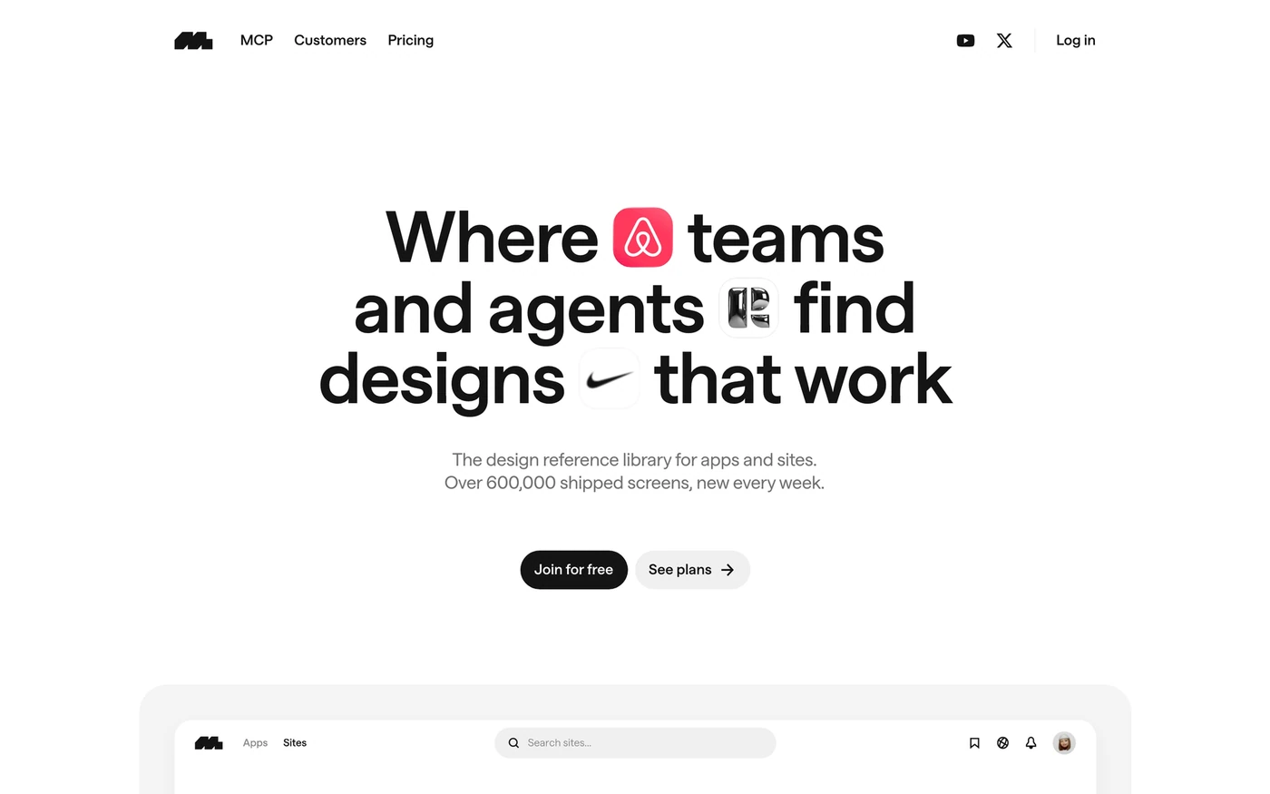
Mobbin calls itself "the design reference library for apps and sites" and lists over 600,000 shipped screens, with new ones every week. Its library is split into apps, sites, screens, flows, animations and UI elements. You can join for free, but a free account has limited access and the full library sits behind paid plans.
What to look for: how several apps solve the same screen. Pick one screen type, like onboarding or a paywall, and compare five of them in a row before you draw yours.
2. Refero: references you can search
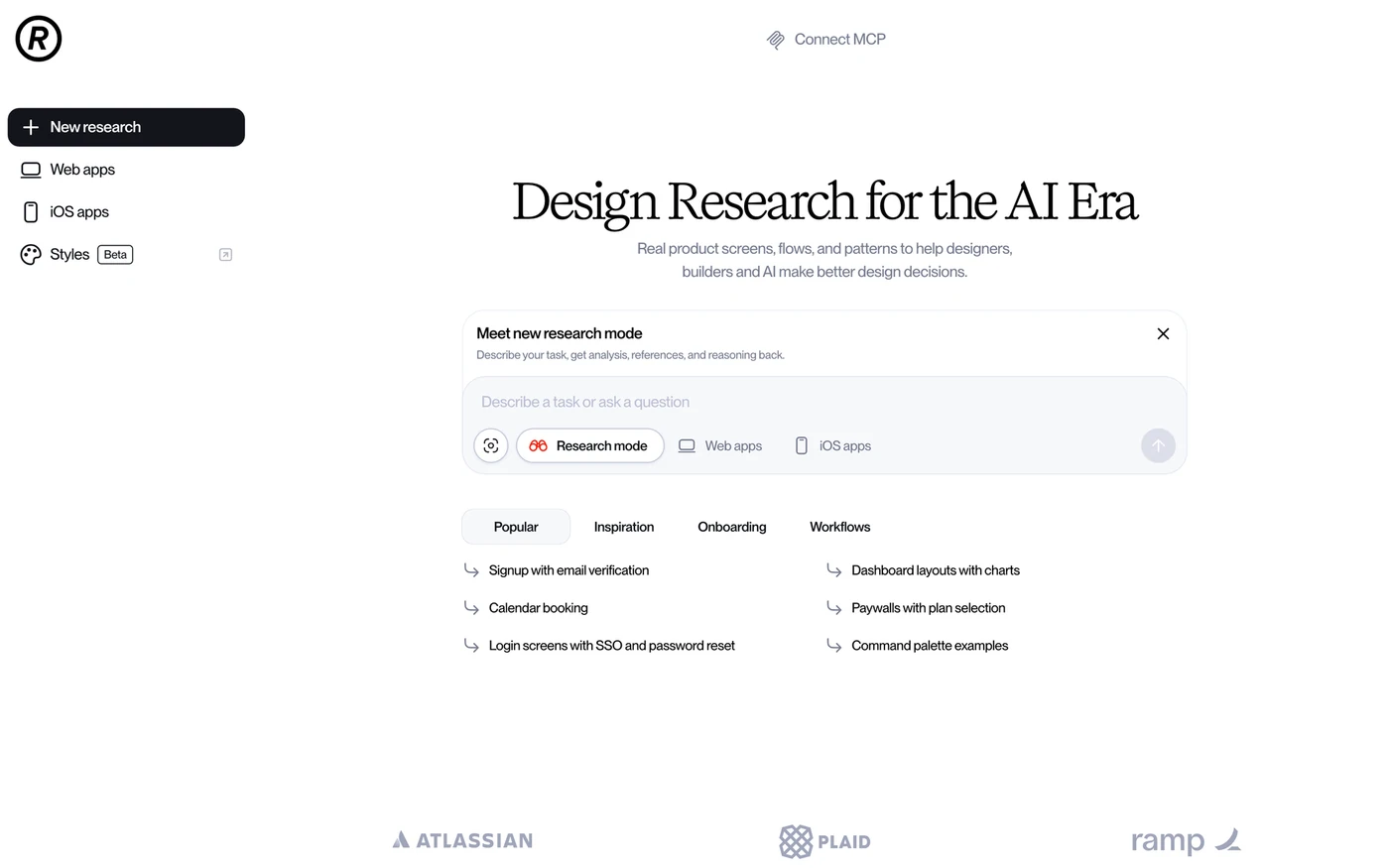
Refero describes itself as "real product screens, flows, and patterns". It is built around search. Its page offers prompts such as signup with email verification, dashboard layouts with charts and login screens with SSO and password reset, and it has separate tabs for web apps and iOS apps.
What to look for: a specific question, typed as a search. "Calendar booking" returns working answers faster than scrolling a gallery.
3. Page Flows: the whole journey
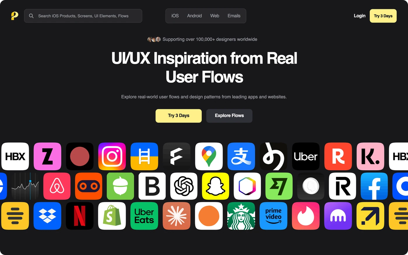
Most inspiration sites show single screens. Page Flows shows the path between them. Its tagline is "UI/UX Inspiration from Real User Flows", and it pairs flows with screen recordings and step by step annotations.
You can filter by iOS, Android, web and emails, and it offers a 3 day trial.
What to look for: the steps between the screens. A good sign up flow is decided by what happens after the button, so watch the whole sequence, not the first frame.
4. Landingfolio: landing page and hero ideas
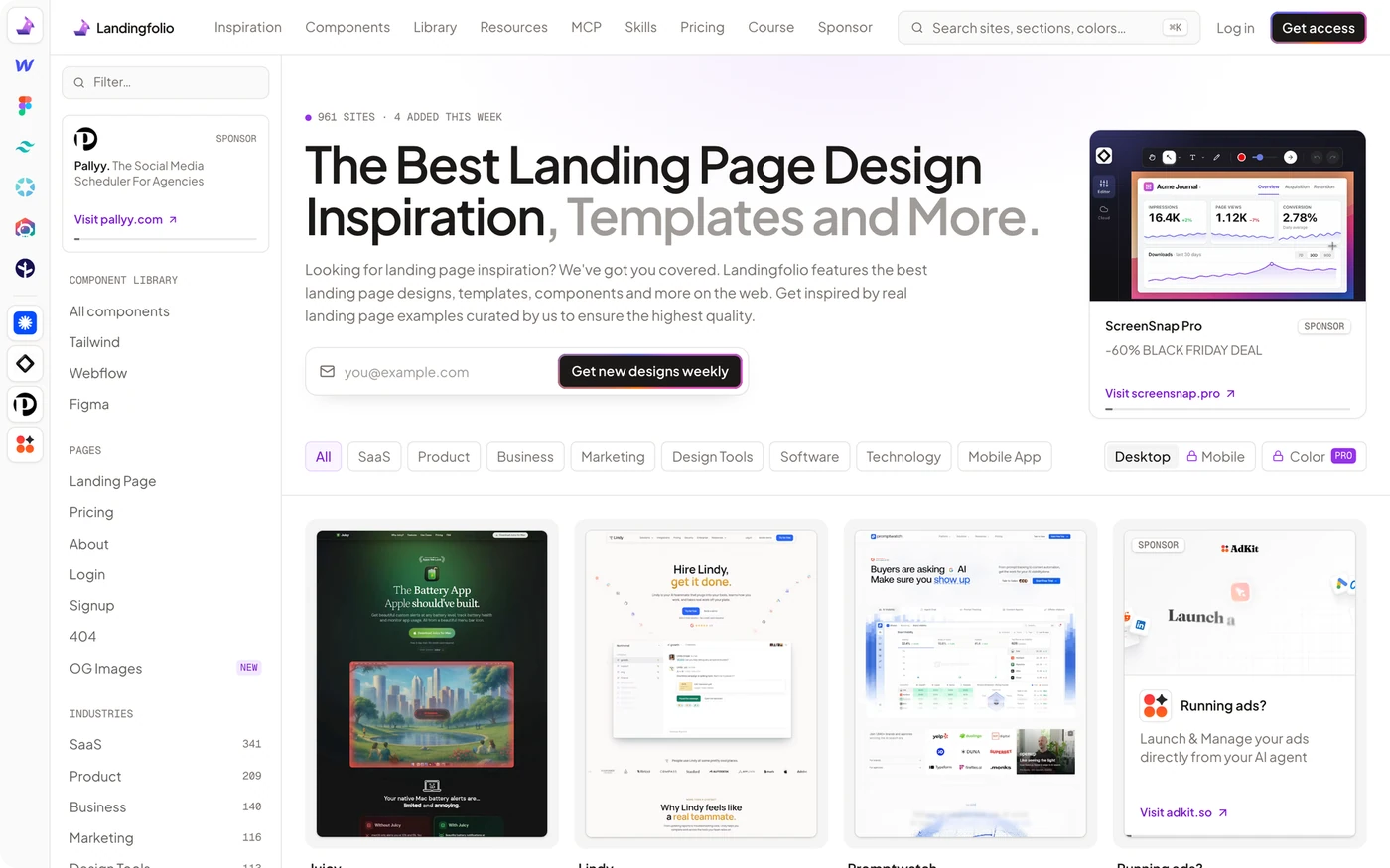
Landingfolio is a gallery of landing pages. When we checked, its header counted 961 sites and 4 added that week, filterable by industry, page type (landing, pricing, about, login, signup, 404) and color. It also lists components for Tailwind, Webflow and Figma.
What to look for: the first screen, the hero. Filter to your industry and compare how competitors say the one thing a visitor needs to know. Our guides to landing page design principles and SaaS landing page anatomy cover what to do with what you find.
5. Dark Mode Design: dark websites
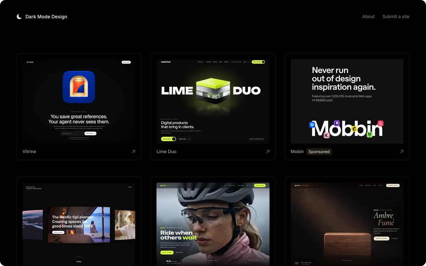
Dark Mode Design is a curated grid of dark websites, and anyone can submit a site. Each tile is a full dark design, so you see how others handle contrast, accent color and imagery on a black or near black ground. All screenshots belong to their owners.
What to look for: the second color. Note which colors each site adds on top of its accent, and where it uses them. Our paper on dark mode color systems explains how to build your own.
6. SaaSFrame: SaaS screens
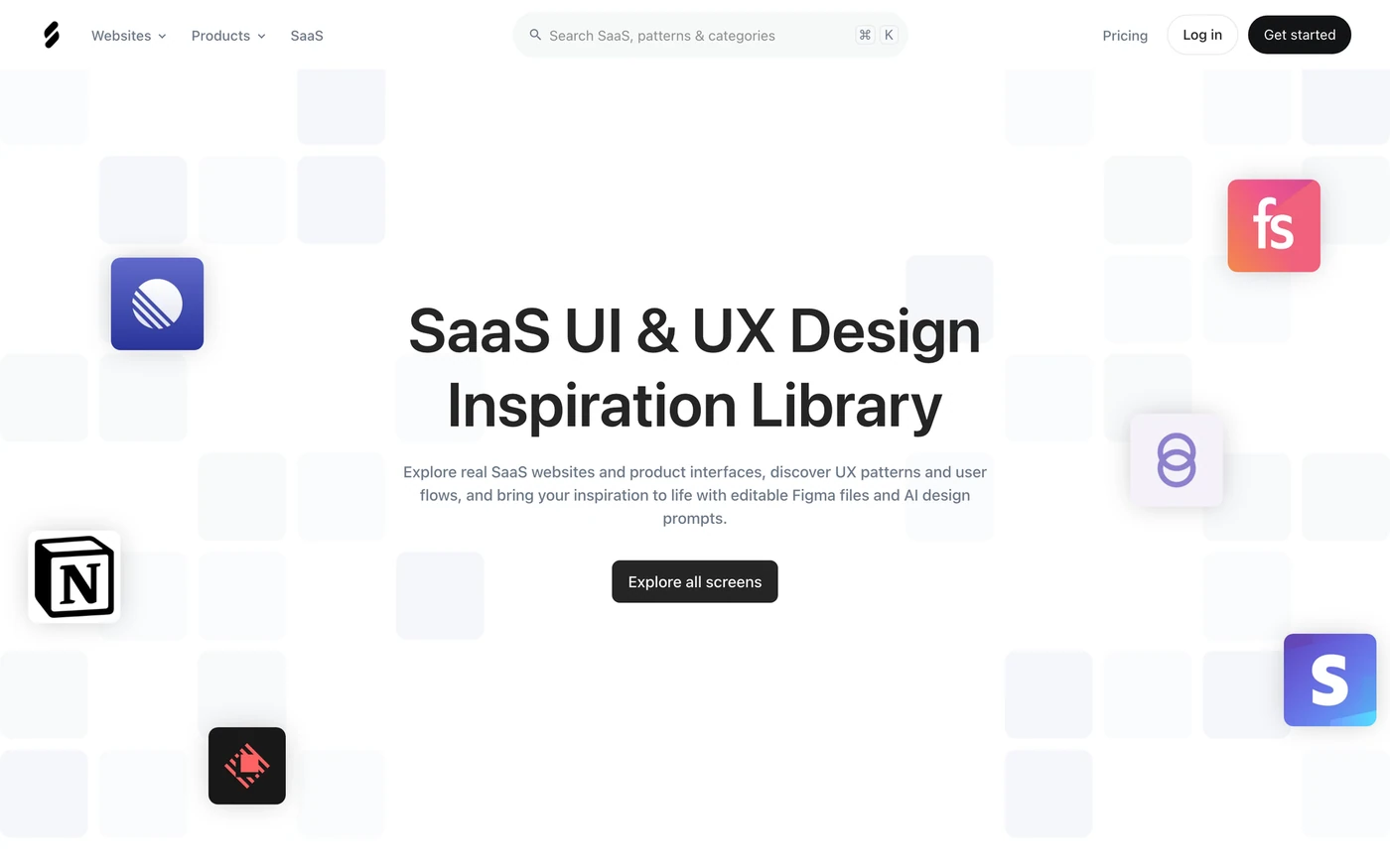
SaaSFrame is "a SaaS UI & UX design inspiration library" of real SaaS websites and product interfaces. Its categories show the size of the library: 296 landing page screens, 211 pricing pages, 191 dashboards, 424 add and edit screens and 571 account setup screens when we checked. It also lists patterns, such as sidebar navigation, onboarding checklists and AI generation states, and says it offers editable Figma files and AI design prompts.
What to look for: the boring screens. Pricing, settings and account setup decide whether a product feels finished, and they are the screens a blank frame makes hardest.
How to use the six together
- Name the screen. Write down the one screen or flow you are designing.
- Match the site. Whole app screens go to Mobbin, a question to Refero, a journey to Page Flows, a hero to Landingfolio, a dark theme to Dark Mode Design, and a SaaS product to SaaSFrame.
- Save three, not thirty. Pick the three that solve your screen best.
- Write one line each. "Clear price, one button" is a reference. A saved image with no note is a pile.
- Copy the decision, not the pixels. Take what the layout is doing and why. Our paper on screenshot-driven design shows how to turn references into a workflow.
A designer or a client can do a lot with "a pricing page as plain as this one, with a plan switch like that one". They can do very little with "make it modern".
Site
Mobbin
Real app screens. Free account with limited access, paid for the full library.
Site
Refero
Real product screens, flows and patterns you can search.
Site
Page Flows
Whole user flows from top apps, with screen recordings.
Site
Landingfolio
Landing page and hero inspiration.
Site
Dark Mode Design
A grid of dark website designs.
Site
SaaSFrame
A SaaS UI and UX design inspiration library.
Free Figma file
6 sites for UI ideas
All six links and what each site is good for, in one free file.
FAQ
What are the best websites for UI design inspiration?
Mobbin, Refero, Page Flows, Landingfolio, Dark Mode Design and SaaSFrame. They cover app screens, searchable references, whole user flows, landing pages, dark websites and SaaS interfaces.
Is Mobbin free?
Partly. Mobbin lets you join for free with limited access, and the full library of over 600,000 screens needs a paid plan.
Where can I find real user flow examples?
Page Flows. It shows flows from real apps and websites with screen recordings and step by step annotations, and it offers a 3 day trial.
Where can I find landing page design inspiration?
Landingfolio is a gallery of landing pages filterable by industry and page type. SaaSFrame also lists SaaS landing page screens.
Where can I find dark website inspiration?
Dark Mode Design collects dark websites in one grid, and anyone can submit a site.
How do I use inspiration without copying?
Save two or three references for the screen you are designing and write one line on what each does well. Use the decision, such as the clear price or the single button, and draw the layout yourself.
Sources
- Mobbin, mobbin.com: "The design reference library for apps and sites", over 600,000 shipped screens, join for free, plans. Checked 4 November 2026.
- Refero, refero.design: "Real product screens, flows, and patterns". Checked 4 November 2026.
- Page Flows, pageflows.com: "UI/UX Inspiration from Real User Flows", screen recordings and annotations, 3 day trial. Checked 4 November 2026.
- Landingfolio, landingfolio.com: "The Best Landing Page Design Inspiration", 961 sites on the day checked. Checked 4 November 2026.
- Dark Mode Design, darkmodedesign.com: a grid of dark websites, submit a site. Screenshots belong to their owners. Checked 4 November 2026.
- SaaSFrame, saasframe.io: "SaaS UI & UX Design Inspiration Library", screen counts as shown on the day checked. Checked 4 November 2026.
- First published as a carousel on UX Brainy.
Collected the references and still need the interface built? Our team turns a clear brief into product UI that holds up in every state.
Get StartedGet new papers by email
New Brainy papers in your inbox. Confirm once, unsubscribe anytime.