Success Message Color: Why #00FF00 Fails and the 8 Greens to Use Instead
Pure green is the first success color everyone picks and the wrong one for text. The four fixes, the eight light and dark success colors from IBM Carbon, and the code to hand your developer.
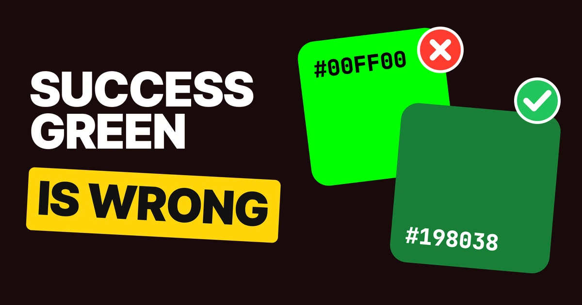
The right success color for text is a darker green, not #00FF00. Pure green looks fresh and still reads badly on white, and on a dark screen it glares. Here are the four fixes, the eight success colors to use in light and dark mode, and the code to hand your developer.
Why pure green fails
Nobody chooses #00FF00 for success text. It arrives. It is the green in the top row of every color picker, the lime of old CSS, the first green in a new design file. So it ends up on the line that tells someone their payment went through.
Pure green is bright and saturated, so it looks like "go". But brightness is the problem. It is one of the lightest colors a screen can make, and light text on a light page has nothing to hold on to. White text on #00FF00 and #00FF00 text on white both fail the WCAG minimum for small text by a wide margin.
The fix is not a different hue. It is the same green, pushed darker until the text has weight, and kept off the loudest surfaces.
The greens below come from the IBM Carbon design system, which publishes a full green ramp and uses specific steps for each job.
Fix 1: darken the green for text
New password
✓ Password is strong.
✕ #00FF00 on white: hard to read
New password
✓ Password is strong.
✓ #198038 on white: easy to read
Same field, same message, two greens. The right one is Carbon's green 60. It is still clearly green, and it is the one your eye reads, even though the left one is the "greener" green.
Use the darker green for every piece of success text: the line under a field, a label that turns green, an inline "Verified" tag, the check icon itself. Keep #00FF00 out of text entirely. If your brand green sits near pure green, keep it for illustrations and large display type, where size does the work that darkness does in small text.
Fix 2: tint the banner, then use dark text
✕ White on #00FF00: shouts, still hard to read
✓ #044317 on #A7F0BA: easy to read
A solid neon bar with white text is the loudest thing on the page and it is still hard to read, because white on #00FF00 has the same weak contrast as #00FF00 on white. The colors swapped places. The problem did not.
A soft green container with dark green text says "success" through its color and lets the words be read. Success is good news, so it should not scream. Shopify's Polaris system lands in the same place: its success surface #CDFED4 carries dark green text, #014B40.
Use the tinted container for banners, toasts and inline alert boxes. Reserve a solid green fill for one thing, the single button that confirms the action, and put a dark or white label on a green deep enough to carry it, such as #198038.
Fix 3: soften it on dark screens
Site status
✓ Deployment ready.
✕ #00FF00 on dark: glares
Site status
✓ Deployment ready.
✓ #42BE65 on dark: calm and clear
Dark mode flips the advice. Pure green on near-black passes the contrast minimum by a mile, so a checker will not flag it. It is still the wrong choice. A fully saturated green on dark gray glows and tires the eye, and a list of ten of them is hard to look at.
Carbon's dark theme uses a softer, lighter green, green 40, #42BE65. On #161616 it is easy to read without the glare. This is the general rule for dark themes: saturated colors that work on white get lighter and softer on dark. Our paper on dark mode color systems covers the rest of the palette, and the sibling rule for errors is in error message color.
Fix 4: never use color alone
Payment 1
✕ A dot only: which one went through?
Payment 1
✓ Succeeded
✓ Check and word: still obvious
Take a green dot for "Succeeded" and a red dot for "Failed". Convert them to grayscale with the usual luminance weights (0.299 red, 0.587 green, 0.114 blue) and they come out almost identical:
Green dot #198038 in gray
Red dot #DA1E28 in gray
That is what a status column looks like to someone with red-green color blindness, and roughly to anyone on a washed-out screen in sunlight. Every success state needs three things:
- A color: the darker green on light, the softer green on dark.
- A shape: a check mark in front of the message, visible without color.
- Words: what happened. "Payment received" beats a green dot.
This is WCAG 1.4.1, use of color: color can support a message, never be the only way it is given. Turn your screen to grayscale once before you ship a status list (System Settings, Accessibility, Display, Color Filters on a Mac; the same filter lives in the accessibility display settings on iOS and Android).
The 8 success colors, light and dark
Tap any chip to copy its code.
| Role | Light | Dark | Use it for |
|---|---|---|---|
| Success | #198038 | #42BE65 | Success text, check icons, success borders |
| On success | #FFFFFF | #161616 | Text on a solid success fill, like a Confirm button |
| Success container | #A7F0BA | #044317 | Banners, toasts and inline alert boxes |
| On success container | #044317 | #A7F0BA | Text and icons inside those containers |
The dark theme is not a new palette. It is the same four steps of the green ramp with the roles swapped: the container color becomes the text color and the other way around.
Hand this to your developer
The same eight colors as CSS custom properties, with the dark values switching on the system theme:
:root {
  --color-success: #198038;
  --color-on-success: #FFFFFF;
  --color-success-container: #A7F0BA;
  --color-on-success-container: #044317;
}

@media (prefers-color-scheme: dark) {
  :root {
    --color-success: #42BE65;
    --color-on-success: #161616;
    --color-success-container: #044317;
    --color-on-success-container: #A7F0BA;
  }
}

.field--valid { border-color: var(--color-success); }
.field__hint--valid { color: var(--color-success); }
.alert--success {
  background: var(--color-success-container);
  color: var(--color-on-success-container);
}
.alert--success::before { content: "✓ "; }
Carbon names these as green 60, green 40, green 20 and green 80 on its green ramp. Whatever system you use, the four role names are worth stealing: they stop the next person from reaching for #00FF00.
One related trap: iOS systemGreen, #34C759, is too light for text on white. Apple uses it for switches and fills, where the shape carries the meaning. Do not copy it into body text.
FAQ
What color should success messages be?
A dark green that is easy to read at small sizes, such as #198038 on a white background. Pair it with a check mark and a word that says what happened.
Is #00FF00 accessible for success text?
No. Pure green on white fails the WCAG contrast minimum for body text by a wide margin. Use a darker green such as #198038.
What is a good green for a success banner?
Tint the fill with a pale green such as #A7F0BA and put dark green text, #044317, on it. That pair is easy to read and does not shout.
What color should success be in dark mode?
A softer, lighter green such as #42BE65 on #161616. Pure green passes the contrast check on dark backgrounds but glares and tires the eye.
Can success be shown with color alone?
No. A green dot and a red dot look the same in grayscale, and WCAG 1.4.1 requires that color is never the only signal. Add a check mark and a word like Succeeded or Failed.
Sources
- IBM Carbon design system, color overview: green 60 #198038, green 40 #42BE65, green 20 #A7F0BA, green 80 #044317 and gray 100 #161616.
- WCAG 2.2, 1.4.3 Contrast (Minimum) and 1.4.1 Use of Color.
- Contrast checked with the WCAG relative luminance formula (white on #00FF00 and #00FF00 on white 1.37:1; #198038 on white 5.02:1; #044317 on #A7F0BA 8.69:1; #42BE65 on #161616 7.57:1; #00FF00 on #161616 13.19:1). The grayscale values use the 0.299, 0.587, 0.114 luminance weights.
- Shopify Polaris success surface #CDFED4 with text #014B40, from
@shopify/polaris-tokens9.4.2. - iOS systemGreen #34C759 measured against white (2.22:1); see Apple's Human Interface Guidelines on color.
- The password form, the receipt to mia@brainy.ink, the brainy-site deployment and the payments list are invented examples built for this page.
- First published as a carousel on UX Brainy.
Want success, error and every other state designed as one system? Our team designs and builds product UI that holds up in light and dark.
Get StartedGet new papers by email
New Brainy papers in your inbox. Confirm once, unsubscribe anytime.