Fashion Store App Design: A Clothing Shop Home Screen Redesign, Before and After
A fashion store app that shouts a sale in a red banner, and the same home screen fixed: a plain header, text tabs, a full-bleed denim photo and tiles with one price. Every change side by side, with the free Figma file.
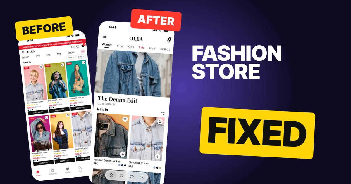
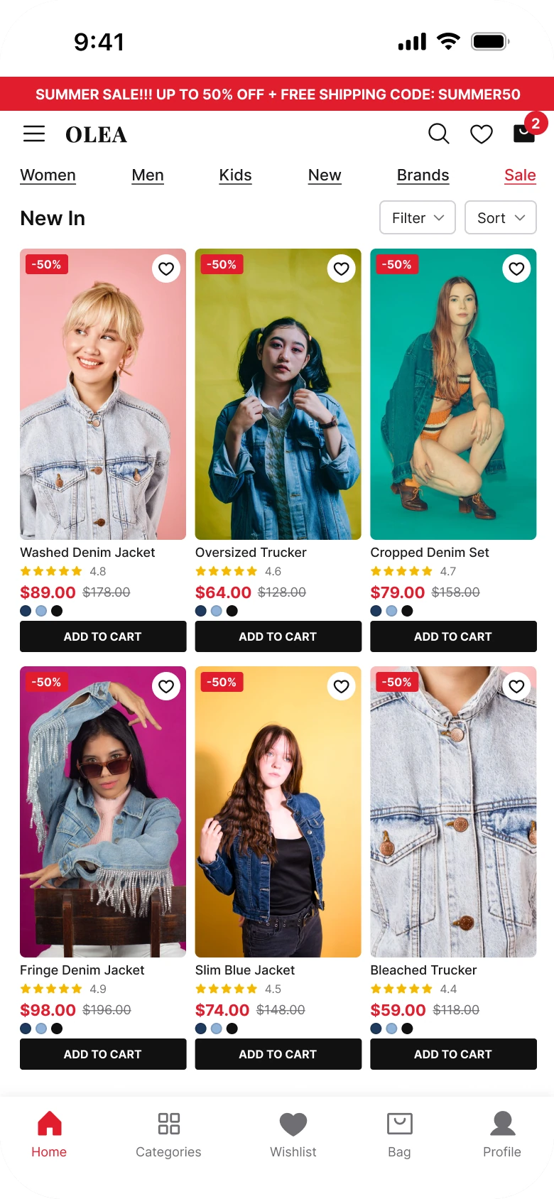
A fashion store app has one job on its home screen: make people want the clothes. The first draft below puts the discount first. A red marquee runs across the top, six underlined links sit under it, and every product tile stacks a tag, stars, two prices, color dots and a button under a small photo.
The fix keeps every function and lets the clothes carry the sale. The marquee becomes a full-bleed denim photo with the offer in two lines under it, the header goes plain, and each tile gets a big 3:4 photo with one price.
The whole screen, before and after
Junior draft
Fixed
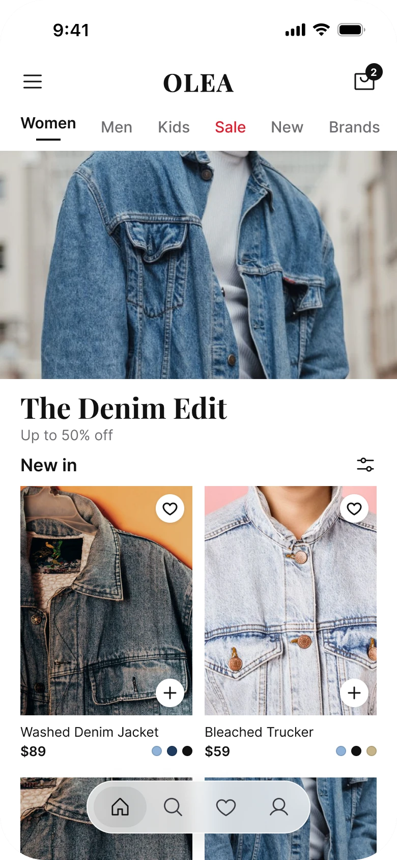
On the left, everything shouts at the same volume. The marquee is red, the tags are red, the prices are red and the buttons are black, so the eye has no place to start, and the clothes are the smallest thing on the screen.
On the right, the order is clear: the brand, where to go, the one offer, then the products. The photos are bigger, the text is smaller in number, and red is kept for one word, Sale.
What changed, measured
| Junior draft | Fixed | |
|---|---|---|
| Offer | A full-width red marquee at 10 px | A 390 x 224 photo, then a 28 px serif line and a 14 px line |
| Margins | 14 left, 12 right | 20 on both sides |
| Header | Menu, wordmark, search, heart and bag, left aligned | Menu, centered wordmark, bag |
| Categories | Six underlined links at 11 px | Six text tabs at 15 px, one underlined, Sale in red |
| Tiles | Three columns, 117 x 205 photos, 9 px names | Two columns, 169 x 225 photos (3:4), 13 px names |
| Under each photo | Stars, two prices, color dots and a caps button | One price and three swatches |
| Tabs | Five, mixed filled and outline icons | Four, icon only, in a small floating bar |
| Red | Marquee, tags, prices, bag badge, Sale, active tab | Sale only |
Fix 1: sell the clothes, not the discount
Before

After
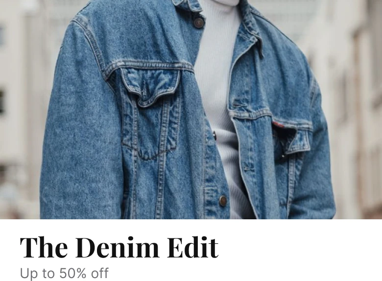
A thin full-width red bar with white capitals reading Summer sale, up to 50 percent off, plus free shipping, code SUMMER50, against a full-bleed photo of a worn denim jacket with The Denim Edit in a large serif and Up to 50% off in gray under it.
A marquee is a banner, and people have learned to skip banners. This one carries four messages at 10 px: a season, a discount, free shipping and a code. None of them shows a piece of clothing, so a shopper opening a fashion app sees a warning label first.
The fix gives the offer a picture. The photo is the product on a person, cropped from below the chin so the jacket fills the frame, with no radius and no gradient so it runs edge to edge. Under it, two lines of type do the job of the marquee: a 28 px name for the collection and a 14 px line for the discount. The code and the shipping promise moved to the page behind the hero, where someone who tapped is ready to read terms.
The price math stays honest. $178 less 50% is $89, the same price as the draft.
Rule to reuse: show what is for sale and name the offer in plain text under it. If the photo needs a banner to explain it, choose a better photo.
Fix 2: a plain header and tabs that show where you are
Before

After
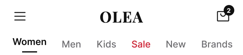
A left-aligned header with a menu icon, the OLEA wordmark, then search, heart and a bag with a red badge, above six underlined links, Women, Men, Kids, New, Brands and a red Sale, against a header with a menu icon at the left, a large centered OLEA wordmark and a bag with a small dark badge, above text tabs where Women is dark with an underline, Sale is red, and the rest are gray, running off the right edge.
In the draft, four icons and a wordmark fight for one 364 px row, and the six links under it are all underlined. An underline means "this is the current one," so six underlines mean nothing. There is no selected state at all.
The fix does two things. The wordmark moves to the center at a size people can read, and the header drops to two icons, because search and the heart already live in the tab bar. Then the categories lose their underlines, and the underline goes back to meaning one thing: Women is dark with a line, the others are gray, and Sale is red because it is the only category that is not a department. The row runs off the edge, which tells people it scrolls.
Rule to reuse: let an underline mean "you are here" and use color once, for the item that needs a flag.
Fix 3: one photo, one price
Before
After
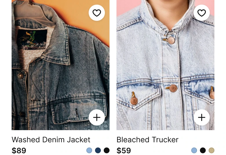
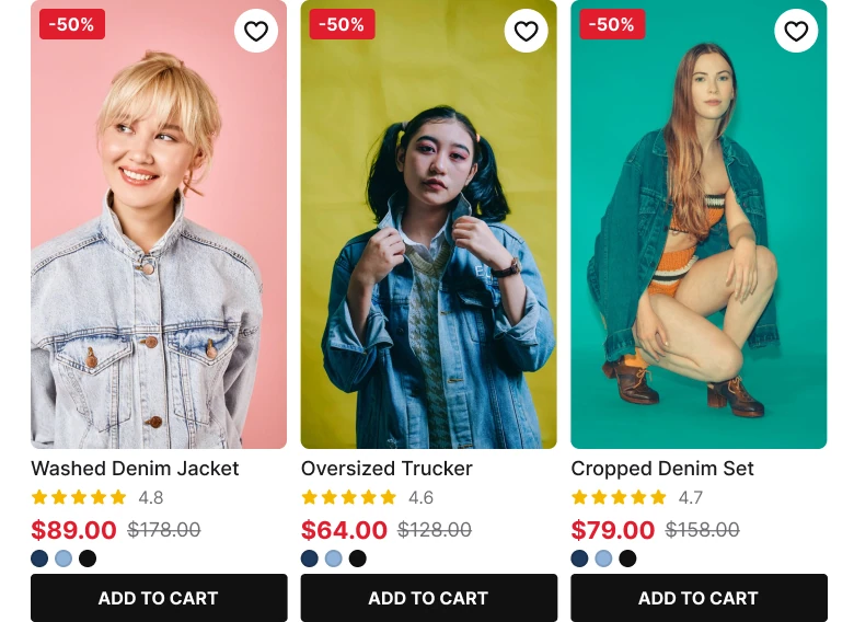
A row of three product tiles, each with a small portrait photo of a person in a denim jacket, a red minus 50 percent tag, a heart, a name at 9 px, five gold stars with a rating, a red price beside a struck-through price, three color dots and a black ADD TO CART button, against two larger tiles with a photo of the jacket itself, a heart and a plus on the photo, the name, one price and three color swatches.
A draft tile holds nine things: photo, tag, heart, name, stars, rating, two prices, dots and a button. At 117 px wide each one gets a few pixels, and the photo is the smallest part. Faces fill the frame, so the product barely shows.
The fix keeps four: photo, name, price and swatches.
The photo is 169 x 225, a true 3:4, with square corners, and each one is cropped to the garment, so the denim texture is the picture. The heart stays on the photo. Add to Cart becomes a plus on the photo's corner, so the function is one tap away without a black bar under every tile. Stars and the second price move to the product page, where the shopper has decided to look closer.
Two photos in a row instead of three also means each name fits on one line at 13 px, and the tab bar floats over the next row of tiles so the scroll never hits a wall.
Rule to reuse: a tile on a list page answers "do I like it and what does it cost." Everything else belongs one tap deeper.
The smaller fixes
- Every function stays reachable. Add to Cart is the plus on each photo, Filter and Sort sit behind the sliders icon, search is the second tab, the menu stays top left, Brands stays in the category row, and the other products are further down the scroll.
- Even margins. The draft has 14 px on the left and 12 on the right. The fix uses 20 on both sides and 10 between blocks.
- White ground, one ink. Black text on white is the only UI color. The photos supply the rest.
- Photos cropped to clothes. Each image is oversized and offset inside a clipping frame so the jacket fills it. People are in the photos, but the garment is the subject.
- A calmer tab bar. Four icons in a small floating bar replace five tabs with labels and mixed filled and outline icons.
- A real type scale. Text runs from 13 to 28 px, against the draft's 8 to 15 px.
Audit your own store screen
| Question | Why it matters |
|---|---|
| Does the first thing you see show a piece of clothing? | A fashion app is a picture book before it is a price list |
| Is the offer said once, in plain text? | A banner gets skipped, a headline gets read |
| Does an underline mean one thing? | Six underlined links hide the current one |
| Is red used for one thing? | If everything is red, nothing is a sale |
| Does each tile show only photo, name and price? | The rest belongs on the product page |
| Is the photo cropped to the garment, not the face? | The shopper is buying the clothes |
| Can you reach Add to Cart in one tap? | Removing the button must not remove the function |
Get the Figma file
The free file has the junior draft, the fixed screen and every part as a component.
Free Figma file
Fashion store home screen redesign, before and after
Both screens and every part as a Figma component. Free, view only, duplicate it to your drafts.
FAQ
How should a fashion store app home screen be designed?
Lead with a full-bleed photo of the product and put the offer in two lines of text under it. Follow with plain text categories, then two-column tiles with large 3:4 photos, one price and a few color swatches under each.
What size should product photos be in a clothing app?
A 3:4 portrait ratio is the standard for clothing. Here the tiles are 169 x 225 px on a 390 px screen, two per row, with square corners and the photo cropped to the garment.
Should a fashion app show a sale banner?
Avoid a banner that carries no product. A photo with a short offer line under it does the same job, and the red can stay on a Sale tab so the discount is easy to find without dominating the screen.
How many details should a product tile show?
Four are enough on a list page: photo, name, price and color swatches. Ratings, the old price and sizes belong on the product page, and Add to Cart can be a plus on the photo.
How should category navigation look in a shopping app?
Use text tabs with one underlined to show the current one, gray for the rest and a single accent color for Sale. Let the row run off the screen edge so people see it scrolls.
What should the tab bar of a store app contain?
Four icons are enough: shop, search, saved and profile. Bag stays in the header, where its count is visible.
Sources
- Both screens are our own, designed and measured in Figma. The app, OLEA, its products and its prices are made up. The prices are consistent on both screens: $178 less 50% is $89, and $118 less 50% is $59.
- Pattern studied: the fashion apps of Zara and SSENSE, with a white ground, a plain header, text tabs, a full-bleed hero and square-cornered 3:4 tiles.
- Photos from Pexels: the hero by Thomas Nguka, the jacket tile by Arturo A, and the Bleached Trucker by Kristina Polianskaia. Icons are from Phosphor (MIT).
- First published as a carousel on App Brainy.
Want this for your own app? Our team redesigns store screens like this one, from the first audit to the finished components.
Get StartedGet new papers by email
New Brainy papers in your inbox. Confirm once, unsubscribe anytime.