Video Editor App Design: An Editor Screen Redesign, Before and After
A video editor screen with the shot squeezed between black bars, fourteen tiny tools and unnamed tracks, and the same screen fixed: a full-width preview, one row of tools for the picked clip and a timeline you can read. Every change side by side, with the free Figma file.
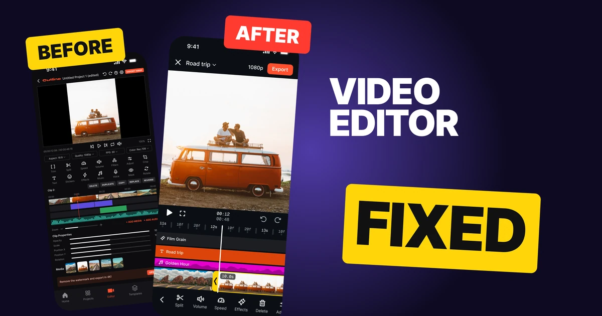
A video editor has one job: let someone shape a video while looking at it. The first draft below has every tool a creator could ask for, but the shot sits small between black bars, fourteen tiny tools fight for the thumb, the tracks carry no names and a tab bar takes space on a screen nobody is trying to leave.
The fix keeps every function and gives the room back to the video. It follows the editor in Instagram's Edits app, and each change below is one you can copy.
The whole screen, before and after
Junior draft
Fixed
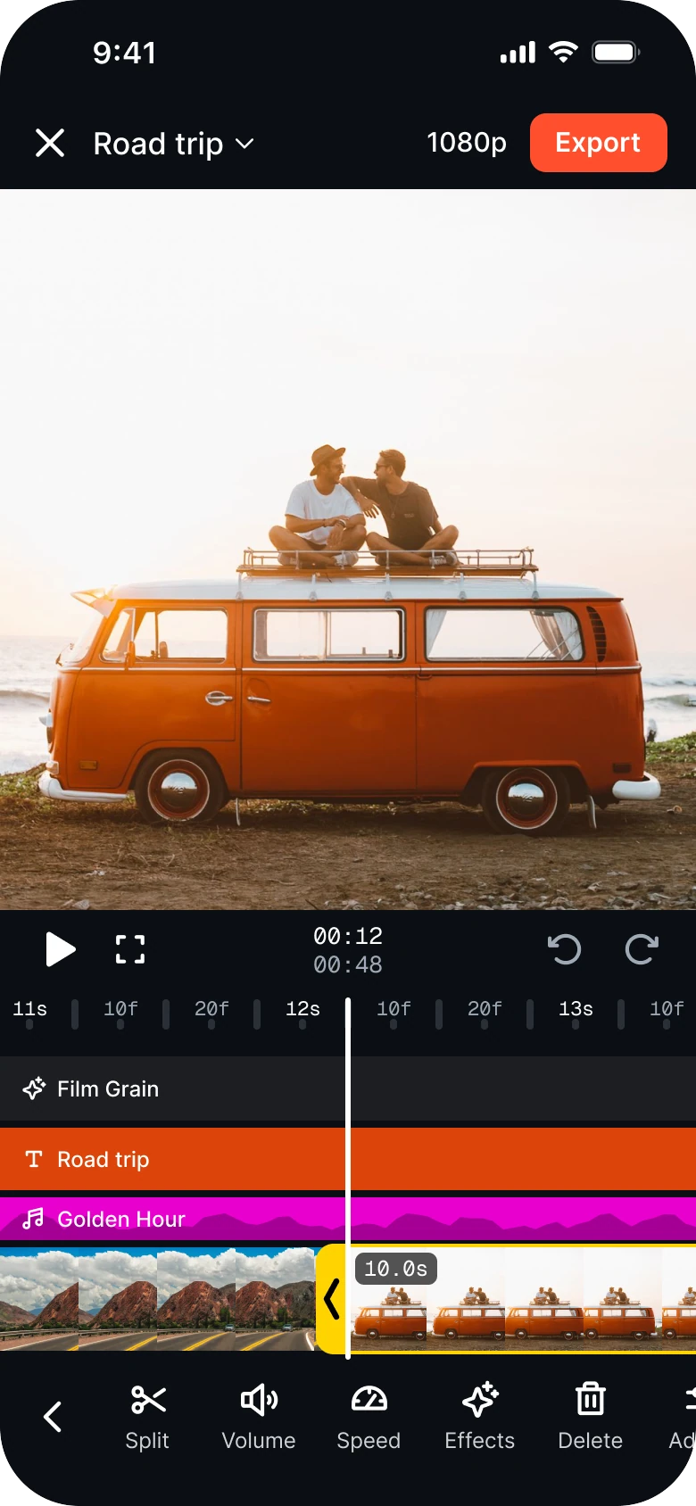
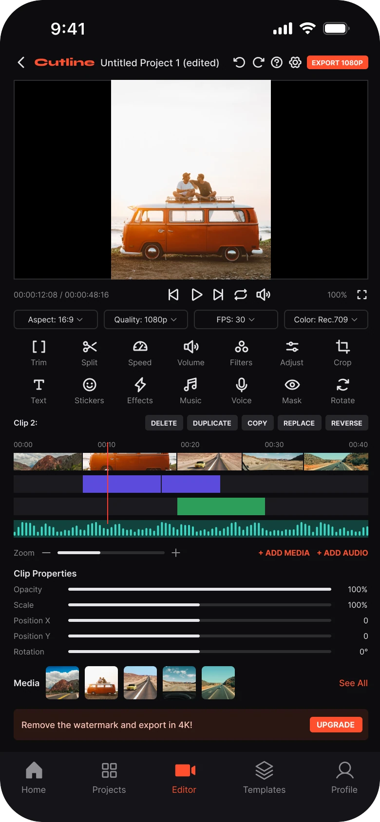
On the left, the video is the smallest thing on the screen. The shot is a 164 px wide strip between black bars, and almost everything else is a control: four dropdowns, fourteen tools, five buttons, five sliders, a media row and an upgrade banner.
On the right, the screen reads from top to bottom in the order a creator works: leave or export, look at the shot, move the playhead, pick a clip, act on it. The preview is 390 by 404, the text runs 11 to 17 px against the draft's 7 to 11 px, and there is no tab bar.
What changed, measured
| Junior draft | Fixed | |
|---|---|---|
| Top bar | Back, wordmark, name, undo, redo, help, settings, Export 1080P | Close, project name with a caret, 1080p, one coral Export |
| Preview | 364 by 205, the shot 164 wide between black bars | 390 by 404, no radius, nothing on it |
| Tools | Fourteen at 16 px, 8 px labels, both rows always on | One flat row at 22 px, 12 px labels, only the picked clip's tools |
| Timeline | Four unlabeled 18 px tracks, a 1 px playhead | Named lanes 24 to 36 tall, a film strip 58 tall, a 3 px white playhead |
| Tabs | Five, on an editor | None |
| Margins | 14 left, 12 right | Edge to edge, radius 0 |
Fix 1: cut the top bar to what you need
Before

After

A back arrow, the Cutline wordmark, the name Untitled Project 1 (edited), then undo, redo, help and settings icons and a small orange EXPORT 1080P button. Against a plain close icon, the name Road trip with a caret, 1080p and a larger coral Export button.
The draft's bar holds eight things in 26 px of height, and the project name gets squeezed by a wordmark nobody needs inside their own editor. Export is the most important button on the screen, and it is also one of the smallest, a tiny pill at the far corner.
The fixed bar keeps four things: close, the name, the quality and Export. Export is 33 px tall with one coral fill, so it is the only loud object at the top. The caret next to the name opens the project menu, where help, settings, loop and upgrade now live. Undo and redo moved down to sit by the playhead, where the hand already is.
Rule to reuse: the top bar answers "where am I and how do I finish". Everything else goes behind the name.
Fix 2: give the video the whole width
Before
After

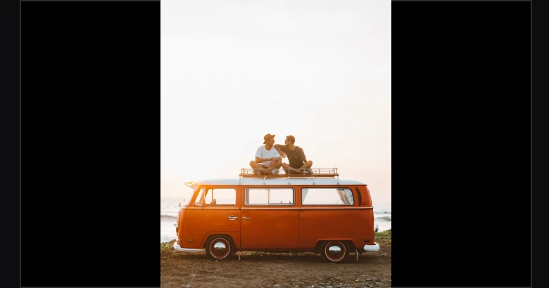
A short frame with black bars on both sides and a portrait shot of an orange van in the middle, 164 px wide. Against the same shot filling the full width, 390 px wide and 404 tall, with square corners and no controls on top of it.
A video editor that shows the video small has misread its own job. In the draft the frame is 16:9 and the shot is portrait, so black bars eat more than half the width. The frame also has a border, rounded corners and a watermark and timecode pill drawn on top of the picture.
The fix lets the preview fill the screen width with no corners, no border and nothing on it. You see the frame you are cutting, at a size where you can judge focus and framing. The timecode moved under the preview, and the watermark is gone from the editor.
Rule to reuse: whatever the user came to change should be the biggest thing on the screen, with nothing painted over it.
Fix 3: show the tools for the clip you picked
Before
After

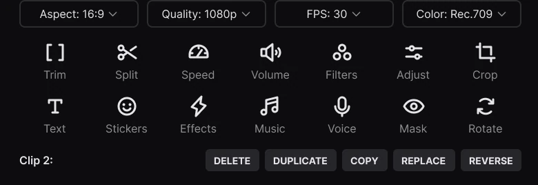
Four dropdowns for Aspect 16:9, Quality 1080p, FPS 30 and Color Rec.709, then fourteen small tools in two rows of seven with 8 px labels: Trim, Split, Speed, Volume, Filters, Adjust, Crop, Text, Stickers, Effects, Music, Voice, Mask and Rotate, and a Clip 2 label with Delete, Duplicate, Copy, Replace and Reverse. Against one flat row of five large tools, Split, Volume, Speed, Effects and Delete, with a back chevron on the left, running off the right edge.
The draft puts every tool on screen at once, whether it applies to what you picked or not. Fourteen icons at 16 px with 8 px labels are a lot to read and a smaller thing to hit, and the clip buttons sit on a separate line under them.
The fix has two states. With a clip picked, one flat row shows what you can do to that clip: Split, Volume, Speed, Effects, Delete and Adjust, with the row running off the edge so you know to swipe. The chevron on the left goes back to the main row with Text, Stickers, Music, Voice, Filters, Crop, Rotate and Mask. Icons grow to 22 px in the bold weight and labels to 12 px.
Nothing was cut. Trim is now the yellow handle on the clip itself, clip properties sit behind Adjust, and aspect, frame rate and color sit behind the quality button in the top bar.
Rule to reuse: show tools for the thing that is selected. A tool that cannot act on the selection is noise.
Fix 4: make the timeline readable
Before
After
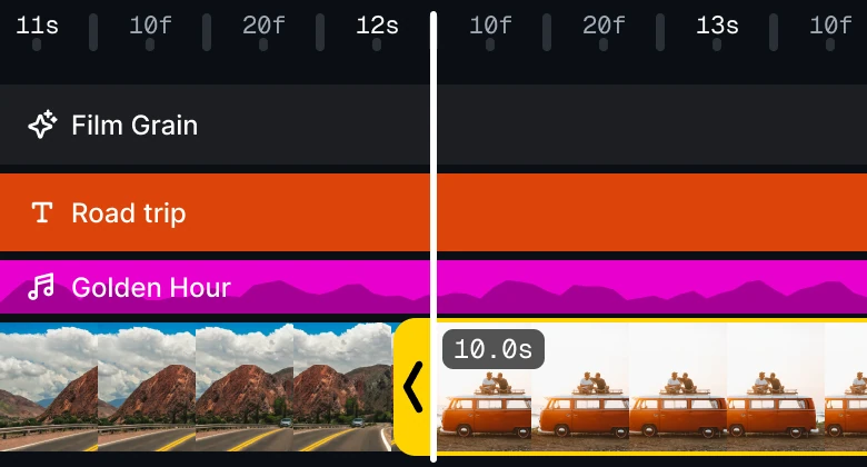
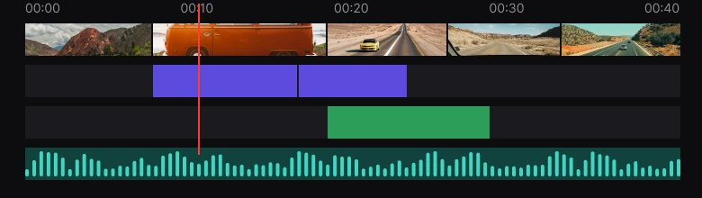
A ruler from 00:00 to 00:40, a small film strip of five stills, a purple track, a green track and a green waveform, none with a name, and a 1 px red playhead. Against a ruler at a finer zoom, a named Film Grain lane, a coral text lane called Road trip, a magenta music lane called Golden Hour with a waveform, a film strip that runs off both edges with a yellow handle and a 10.0s tag on the picked clip, and one 3 px white playhead across every lane.
This is where an editor lives, and the draft treats it as a decoration. The four tracks are 18 px tall with no labels, so you cannot tell which is text, which is music and which is an effect without tapping each. The playhead is 1 px wide, and the film strip has rounded thumbnails with gaps that make it look like a row of stickers.
The fixed timeline has named lanes: Film Grain, a text lane called Road trip and a music lane called Golden Hour. Each is 24 to 36 px tall and runs edge to edge with no rounded corners and 4 px between them.
The film strip is 58 px tall and reads as one piece of footage. The picked clip gets a yellow handle with a chevron and a duration tag, and one 3 px white playhead crosses everything.
The time is honest too. The zoom is 153 pt per second, so the playhead rests just past 12 seconds, and the two-line time reads 00:12 over 00:48.
Rule to reuse: a lane without a name is a mystery. Label every track and give the selection one loud color.
The smaller fixes
- No tab bar. An editor is a place you stay in, so Home, Projects, Editor, Templates and Profile gave up 72 px to a bar nobody taps while cutting.
- One accent per job. Coral marks Export and the text lane, yellow marks the picked clip. The draft spends orange, purple, green and red on tracks that do not say what they are.
- Plain controls. The circles behind play, undo and redo are gone. Plain icons read cleaner against a dark ground.
- Watermark and timecode pill off the preview. The time lives under the shot, and the watermark message moved to the project menu with the upgrade link.
- Zoom is a pinch. The zoom slider and its plus and minus took a full row, and a pinch on the timeline does the same job.
- Skip is a drag. The skip buttons are gone because dragging the timeline moves the playhead.
- Add media is a plus on the strip. It shows when no clip is picked.
- Type scale. Text runs 11 to 17 px in place of 7 to 11 px, and the timeline ruler is set in a monospace at 11 px so the numbers do not jump.
Audit your own editor
| Question | Why it matters |
|---|---|
| How much of the 390 px width does the preview use? | The video is what people came to change |
| Is anything drawn on top of the preview? | Overlays hide the frame being edited |
| Do the tools change with the selection? | Tools that cannot act on a clip are noise |
| Does every track have a name? | People should not tap to learn what a lane is |
| Can you see which clip is picked from across the room? | One loud color beats ten quiet ones |
| Is Export the biggest button at the top? | It is the end of every session |
| Does an editor screen need a tab bar? | Users are not trying to leave, and 72 px is a lot |
Get the Figma file
The free file has the junior draft, the fixed screen and every part as a component.
Free Figma file
Video editor screen redesign, before and after
Both screens and every part as a Figma component. Free, view only, duplicate it to your drafts.
FAQ
How should a mobile video editor screen be designed?
Give the preview the full screen width, keep the top bar to a close button, the project name, the quality and one Export button, and put the tools for the picked clip in one flat row. Add a timeline with named lanes and one playhead.
How big should the preview be in a video editing app?
As large as the screen allows, ideally the full width with no corners and nothing drawn on top. A shot that sits small between black bars makes it hard to judge framing and focus.
Should a video editor have a tab bar?
Usually not. People who are cutting a video are not trying to leave, so a tab bar spends about 72 px on navigation they do not use. Put Home, Projects and Templates behind the project name or the close button.
How do you show tools in a video editor without clutter?
Show only the tools that apply to what is selected. With a clip picked, a row of Split, Volume, Speed, Effects, Delete and Adjust is enough, and a chevron goes back to the main row of Text, Stickers, Music, Voice and Filters.
How should a video timeline UI look?
A ruler with time labels, named lanes for text, music and effects, a film strip that runs edge to edge, a handle on the picked clip and one wide playhead across every lane.
Sources
- Both screens are our own, designed and measured in Figma. The app, Cutline, the project and the tracks are made up. The timeline follows two real iPhone screenshots of the editor in Instagram's Edits app, at its own zoom of 153 pt per second.
- Icons are from Phosphor (MIT). The status bar is drawn from a measured real iPhone screenshot.
- Photos are from Pexels: Roman Odintsov, Hector Perez, Thang-Nhat Tran, Airam Dato-on and Sokil.
- First published as a carousel on App Brainy.
Want this for your own app? Our team redesigns app screens like this one, from the first audit to the finished components.
Get StartedGet new papers by email
New Brainy papers in your inbox. Confirm once, unsubscribe anytime.