Car Rental App Design: A Rental Home Screen Redesign, Before and After
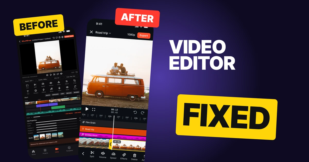
A car rental home screen that opens on a five-field form, a banner that points at nothing and 100 by 60 car photos, and the same screen fixed: one search field, an offer on a real car, one row of car types and full-width photos. Every change side by side, with the free Figma file.
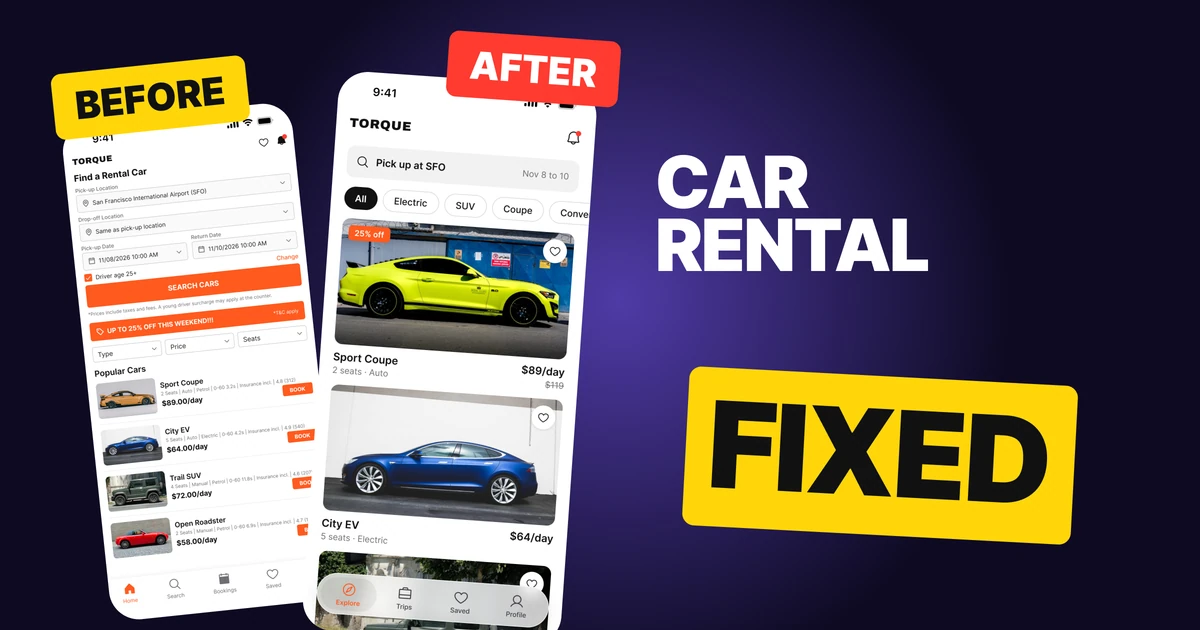
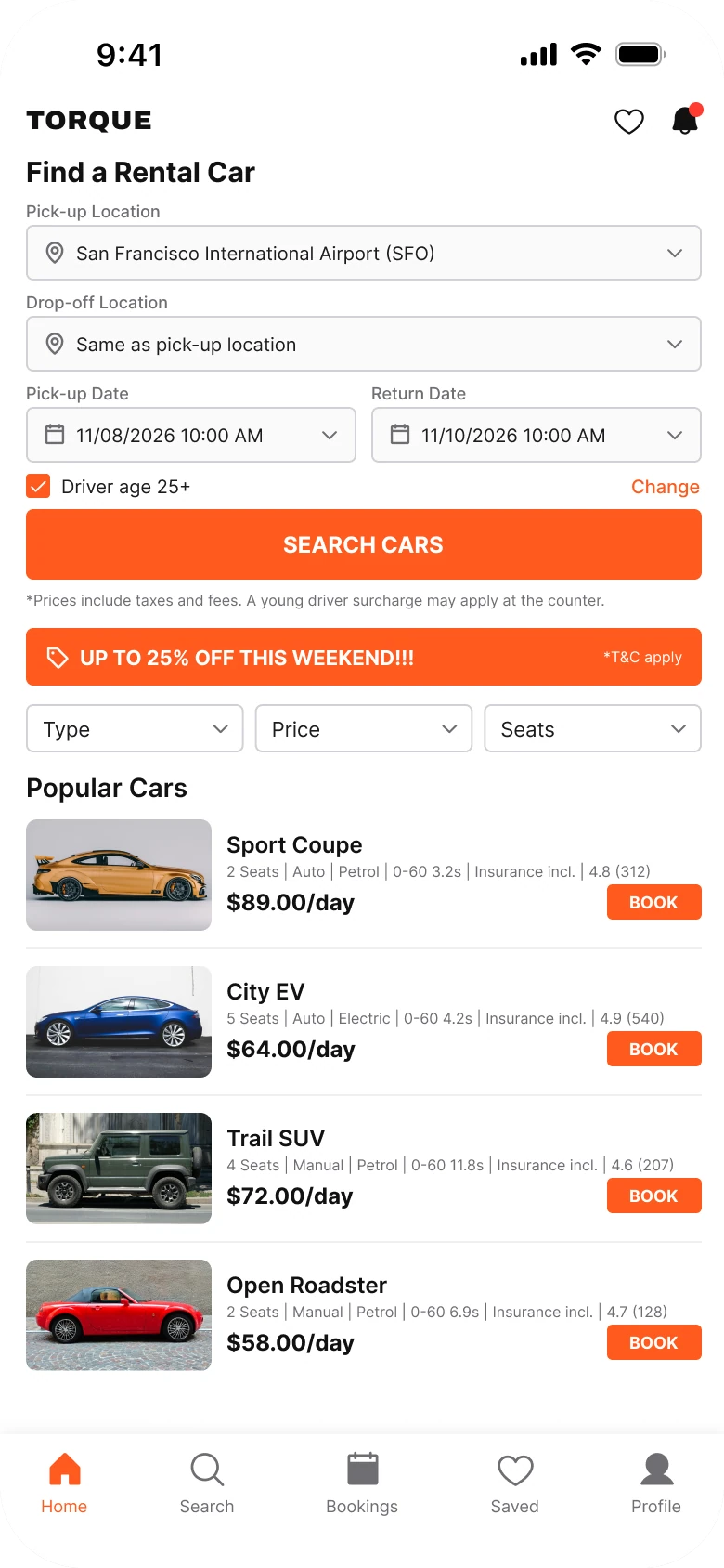
A rental app has one job on its home screen: get someone to a car they want. The first draft below has everything a driver needs, but it opens on a five-field form, shouts 25% off in a banner that points at nothing, and leaves the cars for last, at 100 by 60 pixels with their specs in 8 px text.
The fix keeps every function and puts the cars first. It follows Turo's layout, a white ground, one search field and full-width car cards with the price under the photo. Each change below is one you can copy.
The whole screen, before and after
Junior draft
Fixed
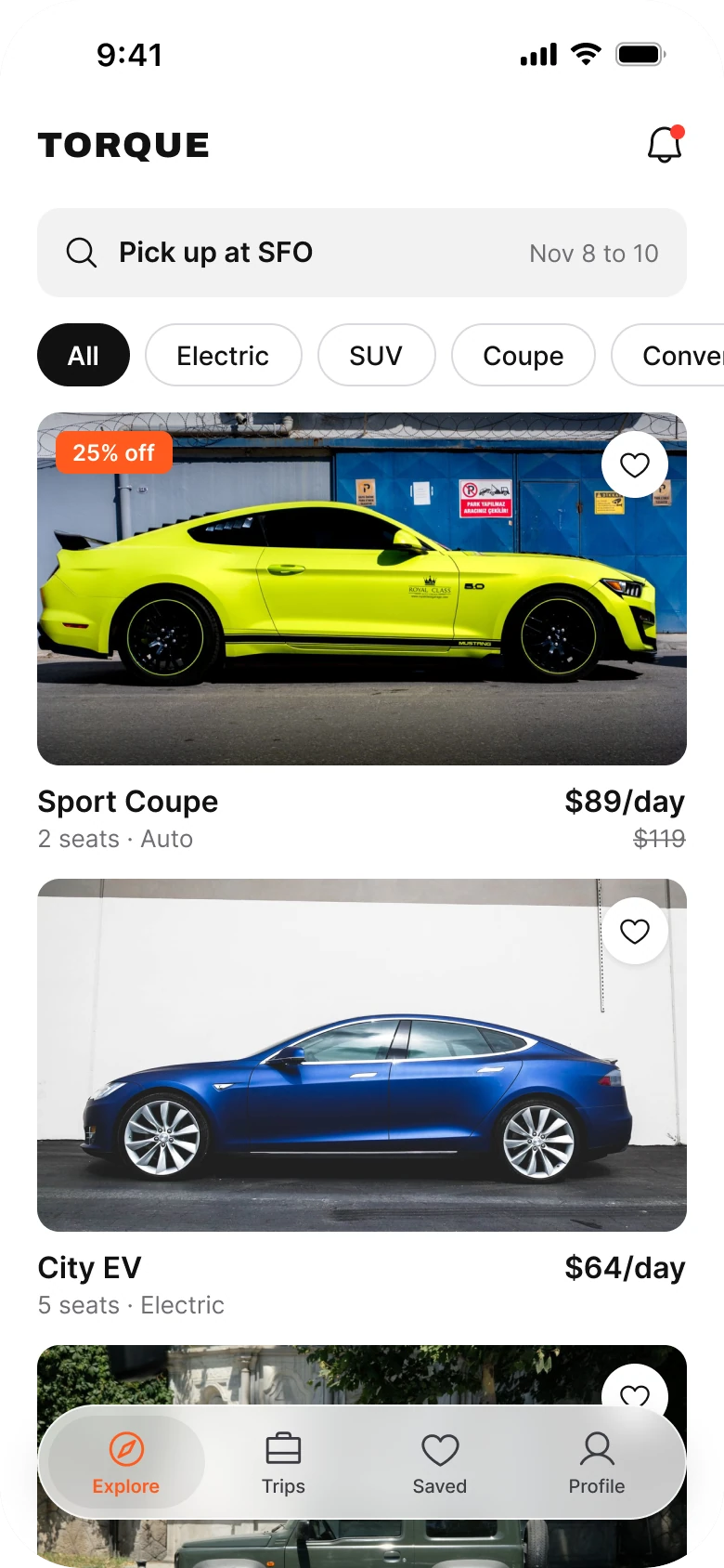
On the left, the cars are the smallest thing on the screen. Before a driver sees one, they pass five form fields, a checkbox, a button, a banner and three dropdowns. Each car is a 100 by 60 thumbnail with 8 px specs and a BOOK button.
On the right, the screen reads in the order a driver decides: where, which kind, which car. The search is one 48 px field, the car photos are 350 by 190, and the text runs 13 to 18 px against the draft's 8 to 15 px.
What changed, measured
| Junior draft | Fixed | |
|---|---|---|
| Search | Five fields (pick-up, drop-off, two dates, driver age) and a button | One 48 px field with the dates at its right edge |
| Offer | A full-width banner with "!!!" and "T&C apply" | A 25% off tag on the car, $89/day with $119 struck through |
| Filters | Three dropdowns: Type, Price, Seats | One row of 34 px chips that swipes off the edge |
| Cars | 100 by 60 photos, 8 px spec lines, caps BOOK buttons | 350 by 190 photos, name and price under them |
| Margins | 14 left, 12 right | 20 on both sides, 14 between blocks |
| Tabs | Five, mixed filled and outline icons | Four, in a floating bar the third car runs under |
Fix 1: fold the form into one field
Before
After

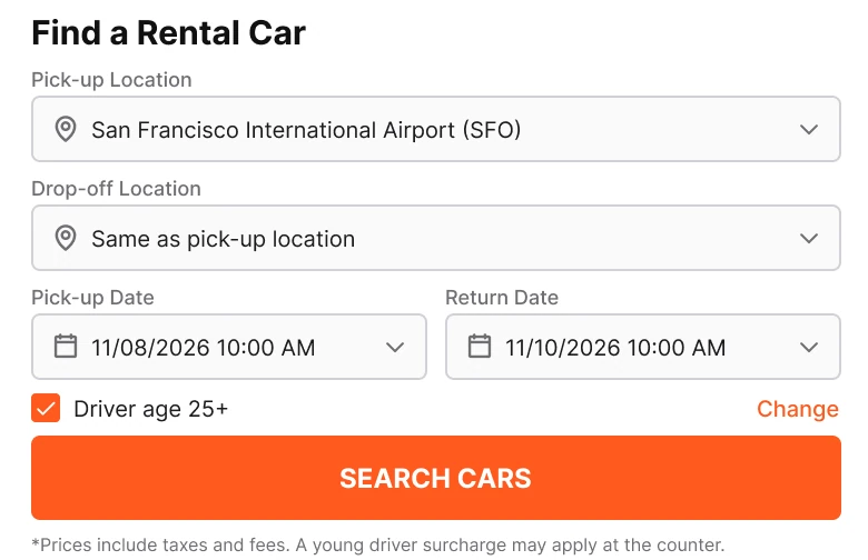
Find a Rental Car with a pick-up location, a drop-off location, a pick-up date, a return date, a driver age checkbox with a Change link, an orange Search Cars button and a line of fine print. Against one rounded field: a magnifier, Pick up at SFO, and Nov 8 to 10 at the right edge.
The draft asks a driver to fill a form before showing a single car. Most of the answers are already known: the drop-off is the same as the pick-up, the age is 25 plus, and the dates are this weekend. The form still asks for all of them, in the same weight, so the one thing the driver must decide gets no more attention than the four they will not touch.
The fixed screen keeps the two answers that matter, where and when, and puts them in one field. This is the same pattern Uber uses for its destination field. Tap it and a sheet opens with drop-off, return time and driver age, so nothing was removed, only moved one tap away.
Rule to reuse: show the defaults, ask only for what changes.
Fix 2: put the offer on a real car
Before

After
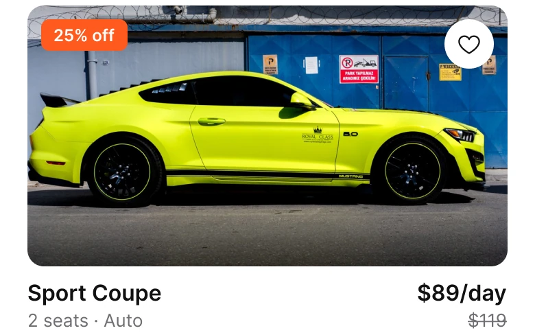
An orange banner, full width: UP TO 25% OFF THIS WEEKEND!!! with *T&C apply at the right. Against a tall car card: a 25% off tag on the photo, Sport Coupe, 2 seats and Auto, $89/day and $119 struck through.
A banner that says "up to 25% off" does not say on what. The driver has to scroll and guess which car it applies to, and the three exclamation marks and the "T&C apply" in 10 px type read like a warning more than an offer.
On the fixed screen the discount sits on the car it belongs to. A small tag on the photo says 25% off, and the price line shows $89/day with the old $119 beside it. $119 less 25% is $89.25, so the number is honest, and the offer finally has something to sell. Turo does the same, with the deal on a listing instead of above it.
Rule to reuse: an offer needs an object. Attach it to the thing it discounts.
Fix 3: swap three dropdowns for one row
Before

After

Three equal dropdowns reading Type, Price and Seats, each with a chevron. Against one row of pill chips: All selected in black, then Electric, SUV, Coupe and Convertible running off the right edge.
A dropdown hides its options until it is tapped, so the driver has to open Type to learn that Electric, SUV and Coupe exist. Three of them side by side also give Price and Seats the same weight as the one filter people actually use, the kind of car.
The chips show the options without a tap. The selected chip is filled black, the row swipes, and the last chip is cut by the screen edge, which tells the driver there is more. Price and Seats still exist, they now open from the search field's filters.
Rule to reuse: if a filter has five or fewer values, show them. Do not hide them behind a menu.
Fix 4: give every car a full-width photo
Before
After
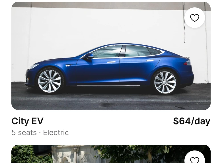
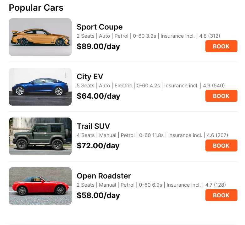
Four rows under Popular Cars, each with a 100 by 60 photo, a name, a line of specs in 8 px, a price and an orange BOOK button. Against two full-width cards: a 350 by 190 photo with a heart, then the name and the price on one line and one detail line underneath.
This is the product, and the draft gives it the least room. At 100 by 60 a car is a colored shape. The spec line packs seats, gearbox, fuel, 0-60 time, insurance and a rating into 8 px, so none of it is readable and all of it competes with the price.
The fixed card gives the car a 350 by 190 photo with rounded corners and puts the name and the daily price on one line. Under them sits one 13 px detail line, seats and gearbox. The BOOK button is gone because the whole card is the button: tap it and the car's own page shows the specs, the ratings and Book.
Rule to reuse: a list of products is a list of photos. Everything that is not the photo, the name or the price goes one tap deeper.
The smaller fixes
- One brand color. Orange (#FF5A1F) marks the 25% off tag and nothing else. The draft uses it on the banner, the search button, the checkbox, the Change link, four BOOK buttons and the active tab.
- A bigger margin. 20 px on both sides in place of 14 on the left and 12 on the right, with 14 between blocks.
- A calmer header. The draft's heart and bell sit next to the wordmark. The fixed header keeps the bell, and the heart is now the Saved tab.
- A floating tab bar. Four tabs (Explore, Trips, Saved, Profile) in a 62 px floating bar, and the third car runs under it, which says the page keeps going.
- One icon style. Filled and outline icons were mixed in the draft's tab bar, now they are all outline.
- Names that match tasks. Bookings became Trips, and Search became the field at the top.
- Cut copy. "Car of the Week" and the 0-60 line are gone, since neither helped someone choose a car.
Audit your own rental app
| Question | Why it matters |
|---|---|
| How many fields stand between the driver and the first car? | Every field is a reason to leave |
| Does the screen ask for answers it already knows? | Defaults should be shown, not asked |
| What does your discount point at? | An offer with no object reads as noise |
| Are filter values hidden behind dropdowns? | Five options fit in a row |
| How wide is the car photo? | The car is what people are buying |
| Does the card need a button, or is the card the button? | A tap target the size of the card is easier to hit |
| How many colors does your brand color mark? | One job per color |
Get the Figma file
The free file has the junior draft, the fixed screen and every part as a component.
Free Figma file
Car rental home screen redesign, before and after
Both screens and every part as a Figma component. Free, view only, duplicate it to your drafts.
FAQ
How should a car rental app home screen be designed?
Open on one search field with the pick-up place and the dates, then a row of car types, then full-width car cards with the name and price under each photo. Keep drop-off, return time and driver age one tap behind the search field.
How many fields should a car rental search have?
As few as the first screen needs: where and when. Drop-off, return time and driver age usually keep their defaults, so they can sit in a sheet that opens from the search field.
Where should a car rental discount go?
On the car it applies to. A tag on the photo and the old price struck through beside the new one, such as $119 and $89/day, tells the driver what is discounted and by how much. A banner that points at nothing does not.
Should car types be dropdowns or chips?
Chips, when there are five or so. A swipeable row shows All, Electric, SUV, Coupe and Convertible without a tap, and a chip cut by the screen edge shows that there are more.
How big should car photos be in a rental app?
Full width of the column, around 350 by 190 pixels on a phone. A 100 by 60 thumbnail turns a car into a colored shape, and a driver cannot judge it.
Sources
- Both screens are our own, designed and measured in Figma. The app, Torque, the prices and the specs are made up, and no make or model is named. The layout follows Turo: a white ground, one search field and full-width car cards with the price under the photo. The one-field search follows the destination field in Uber.
- $119 less 25% is $89.25, shown as $89/day.
- Icons are from Phosphor (MIT). The status bar is drawn from a measured real iPhone screenshot.
- Photos are from Pexels: Dextar Studio, Jae Park, miata7 MX-5, Furkan Ceylan and Can AGBULUT.
- First published as a carousel on App Brainy.
Want this for your own app? Our team redesigns app screens like this one, from the first audit to the finished components.
Get StartedGet new papers by email
New Brainy papers in your inbox. Confirm once, unsubscribe anytime.