Responsive Logo Systems: How to Build a Logo That Works at Every Size
A complete guide to responsive logo design. The four-tier ladder every modern brand needs, the simplification rules that keep marks legible at 16 pixels, and the file inventory designers should actually ship.
Responsive Logo Systems: How to Build a Logo That Works at Every Size
A logo that ships at one size is a logo that breaks at every other size.
That is not hyperbole. Every brand lives at dozens of scales simultaneously: a 16-pixel browser tab, a 32-pixel app icon, a 200-pixel product thumbnail, a three-meter building wrap. The brands that look sharp at all of them are running a system. The brands that look muddy at half those sizes shipped a single file and called it done.
This is the guide to building the system.
A logo is a system, not a file
The job of a logo is to identify the brand at every size it will ever appear at, and a single SVG cannot do that without compromise. A full lockup with wordmark and tagline that reads beautifully at 300 pixels becomes a smeared mess at 32. A favicon-optimized monogram that snaps in a browser tab looks barren and incomplete on a letterhead.
The compromise is always present. The only question is whether you design around it deliberately or discover it by accident when a developer asks for an app icon and you send them the print file.
Responsive logo design is not a trend or a nice-to-have. It is basic craft. The brands that get it right have built a ladder, four tiers that each do a specific job at a specific scale range.
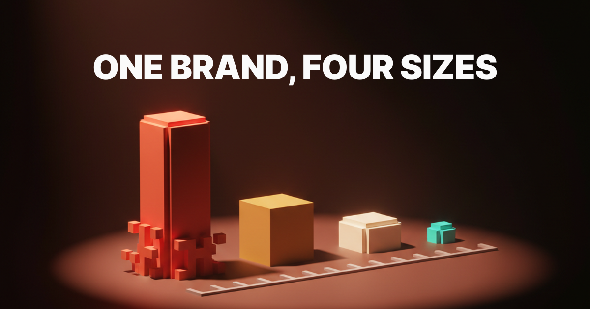
The four-tier responsive logo ladder
Full lockup, primary mark, simplified mark, monogram or favicon. Every working responsive logo system is some version of these four tiers. The exact forms change brand by brand, but the structural logic does not: each step down removes complexity to preserve legibility, and each step up adds context to carry authority.
The ladder is not a set of optional extras. It is the minimum viable logo system for any brand that appears at more than two sizes. If you are building or briefing a logo for a modern brand and the deliverable is fewer than four tiers, the system is incomplete.
| Tier | Common Name | Typical Use Range | What It Contains |
|---|---|---|---|
| 1 | Full lockup | 200px and up, print, signage | Mark + wordmark + tagline |
| 2 | Primary mark | 80px to 300px, most digital touchpoints | Mark + wordmark |
| 3 | Simplified mark | 32px to 80px, UI components, thumbnails | Simplified mark alone or with abbreviated wordmark |
| 4 | Monogram / favicon | 16px to 32px, browser tabs, app icons | Single glyph, initial, or geometric reduction |
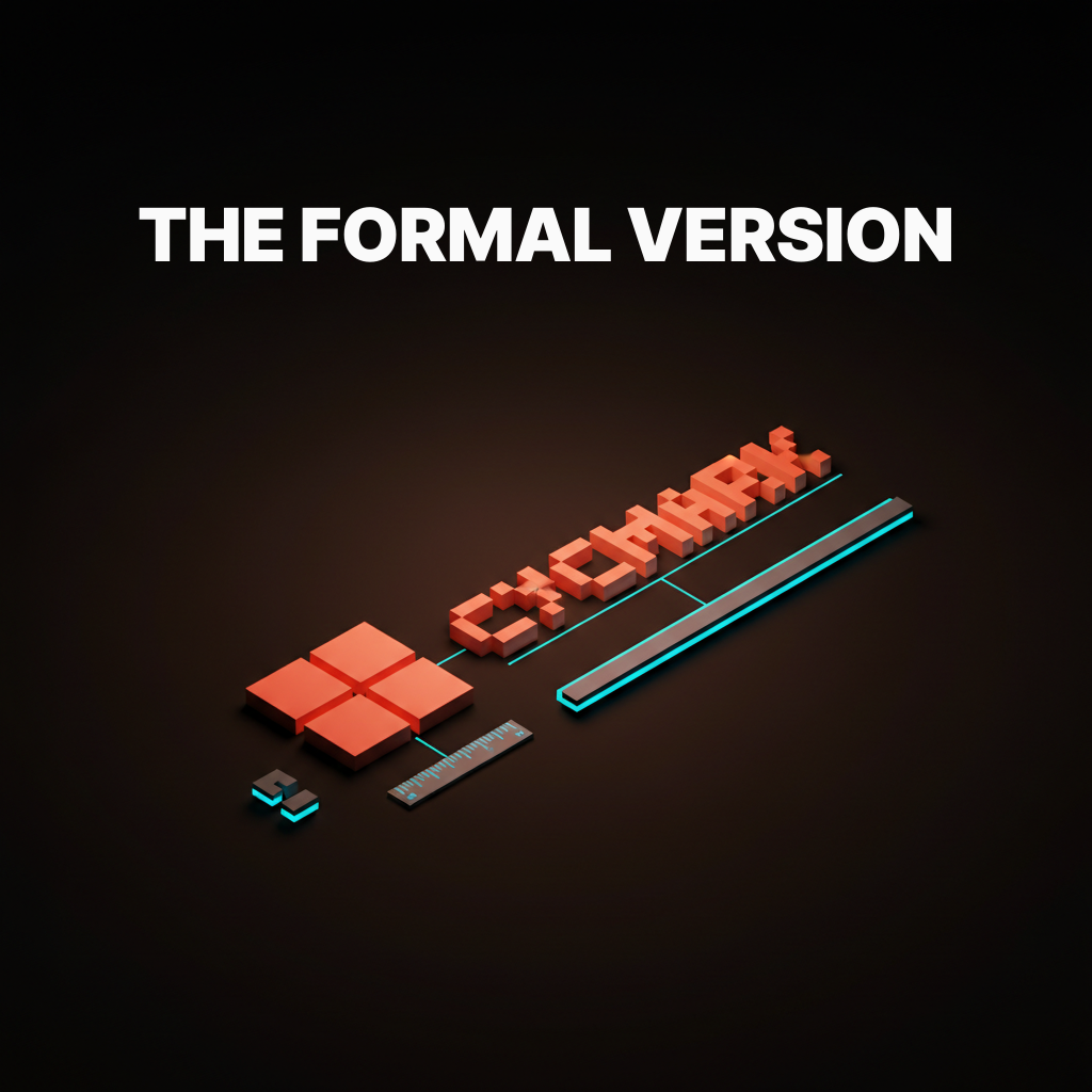
Tier one: the full lockup
The full lockup is the formal version of the brand, with mark plus wordmark plus tagline if there is one, and it ships in print, signage, and hero placements only. It is the version you see on business cards, the homepage header at desktop scale, and the side of a delivery truck. It carries the most information and requires the most space to do that job without crowding.
The rule for full lockups is that they should never be forced into digital UI components. A logo in a mobile navigation bar is not a full lockup placement. A favicon is not a full lockup placement. When brands try to shrink the full lockup into those contexts, the tagline dissolves, the wordmark becomes illegible, and the mark fights for space with text it was never designed to sit next to at that density.
The lockup is a formal composition, and formal compositions have minimum sizes. Define that minimum, put it in the brand guidelines, and enforce it.
Tier two: the primary mark
The primary mark is the version most people will see most of the time, and it is the version every other tier is derived from. It is mark plus wordmark, tagline removed, and it covers the widest range of contexts: website headers, email signatures, social bios, product UI at medium scale, presentation decks, and the opening frame of a logo animation.
Getting the primary mark right is the most consequential decision in the system. The spatial relationship between mark and wordmark here sets the proportional logic that all other tiers inherit. Too much space between them and the simplified mark will feel disconnected. Too tight and the monogram will feel cramped.
The primary mark is also where typographic decisions lock in. If the wordmark uses optical spacing corrections, those corrections need to be baked into the vector file at this tier, not left as a note in the guidelines.
Tier three: the simplified mark
The simplified mark drops detail to survive at small UI sizes, and the rule of thumb is to remove anything that disappears below 32 pixels. This is not a small version of the primary mark. It is a redesigned version that makes deliberate sacrifices to preserve the most recognizable features of the brand.
The decisions are always uncomfortable. Thin strokes become fills. Serifs become stubs or disappear entirely. Counters that were elegant at 200 pixels become optical mud at 40. Designers who resist these decisions ship simplified marks that look fine in Figma at 1x and fall apart on an actual device.
At this tier, wordmarks typically get dropped or replaced with a short abbreviation. If the mark alone cannot carry the brand at 40 pixels, that is useful information about the strength of the mark, not an argument for keeping the wordmark in a 40-pixel component.
Tier four: the monogram or favicon
The smallest tier is a single character, glyph, or geometric reduction that has to read at 16 pixels in a browser tab. This is not a design challenge with much gray area: either it reads at that size or it does not.
The monogram or favicon is usually one of three things: the first letter of the brand name, a single iconic shape from the mark, or a geometric reduction that carries the color and proportion of the brand without any of the detail. Google's G, Mailchimp's Freddie head, Slack's hashtag, Notion's N. Each one is immediately readable at 16 pixels and clearly tied to the tier-two mark it came from.
The most common failure at tier four is designers sending the tier-three simplified mark to the favicon slot and hoping it works. At 16 pixels, anything that needed 32 pixels to read is no longer readable. The favicon needs its own design pass.
The simplification rules
Reducing a logo for small sizes is governed by four rules: drop hairlines, increase counter spacing, simplify curves, and prefer mass over outline. These are not aesthetic preferences. They are legibility physics.
Drop hairlines. Any stroke below 1px at the target size will render as nothing or as an optical artifact. Remove it or convert it to a filled shape with a minimum 2px optical weight at the target size.
Increase counter spacing. The negative space inside enclosed letterforms closes at small sizes. Open it deliberately in the simplified version or the letterforms will fill in and unify into unreadable blobs.
Simplify curves. Bezier curves with many control points render with subtle rounding artifacts at small sizes. Reduce control points. The simpler the path, the sharper the render.
Prefer mass over outline. An outlined shape at small sizes becomes a thin ring. A filled shape at the same size stays readable. Wherever the brand allows, convert outlines to solid fills for tiers three and four.
These rules apply in both directions: small-to-large derivation runs forward through the tiers, but the simplification rules should also be used to audit tier-one and tier-two files for paths that will cause rendering problems if the system ever ships without proper tier separation.
The lockup rules
Scaling a logo up follows different rules: the wordmark gets more breathing room, the tagline becomes optional, and any photographic or texture treatments earn their place. The governing logic at large scale is authority, not legibility.
At billboard scale, legibility is not the constraint. No one misreads a building-wrap logo from thirty feet. The constraint is presence. Logos that look fine on screen can look weak at large format because the proportions that read well at 200 pixels read as timid at three meters. Wordmark tracking often needs to open at large scale, and the relationship between mark and wordmark sometimes needs to shift.
This is not about creating a fifth tier. It is about giving the full lockup a minimum AND a maximum intended scale, with explicit guidance on what changes when it scales beyond that maximum.
Seven brands that nailed it
Google, Mailchimp, Slack, Notion, Vercel, Linear, and Stripe each solve the responsive logo ladder differently, and each is worth studying.
Google built the system by necessity. The G favicon is a perfect geometric reduction of the full wordmark's color logic. It carries no letterform complexity, just the quadrant color split and the proportional weight of the G. It reads at 16 pixels because it was designed for 16 pixels, not derived from the wordmark by someone who needed an icon by Friday.
Mailchimp uses Freddie, the chimpanzee mascot, as the tier-four reduction. The Freddie icon is a face crop that drops the body, drops the hat detail, and keeps only the features readable in a 32x32 grid. The full Cavendish wordmark never appears below tier two.
Slack replaced a mark that failed at small sizes, the asterisk with eleven colors, with a four-color, four-shape geometric that stays crisp from 16 pixels to billboard. The simplification was not cosmetic. It was structural.
Notion uses the N glyph as a clean monoweight icon that works at every size from app icon to print header. The wordmark and mark are designed with enough spatial separation that cropping to just the N never feels incomplete.
Vercel runs a triangle that is pure geometry: no strokes, no details, no counter issues. It is impossible to break at small sizes because it has no breakable components. The wordmark separates cleanly at every tier.
Linear uses the L mark, a geometric shape with slightly unusual proportions that is immediately distinctive at any size. No hairlines, no counters that close, no curves that simplify poorly.
Stripe solves the system differently: their wordmark is effectively their mark. At small sizes, the S functions as a standalone glyph with enough weight to read clearly. The stripe motif in brand applications scales separately from the logo itself.
Three brands that broke it
Some major brands ship logos that fall apart at small sizes, and the failures are almost always in tier three or tier four.
FedEx has one of the most celebrated logos in design history, and it has a responsive system problem. The negative-space arrow between the E and the X is completely invisible at favicon scale. The brand awareness is strong enough that a plain "FedEx" wordmark in a browser tab works by recognition alone, but the logo system as a formal construct collapses below about 80 pixels because no tier-three or tier-four simplification of the mark can preserve the arrow. The celebrated design detail is a large-size-only feature, and the system was never built to acknowledge that honestly.
Citi runs an arc mark alongside a wordmark, and the arc is thin enough that at 32 pixels and below it becomes a hairline that disappears against anything but a stark white background. Their favicon has historically been the wordmark alone, which is a tier-two placement dropped into a tier-four slot. The brand survives on recognition, not on system design.
Hilton ships a shield lockup with typographic detail inside the shield. Below 64 pixels, the text inside the shield becomes illegible. Below 32 pixels, the shield reads as an undifferentiated shape. There is no widely published simplified mark that strips the interior type for small-scale use, which means every small-scale digital touchpoint is running a degraded version of the full lockup and calling it the logo.
The pattern across all three is the same: the logo was designed for large formats, small-scale behavior was left to whoever was placing it, and no formal simplification work was done to create tiers three and four.
Want a logo system that holds up from billboard to favicon without compromise? Hire Brainy to design your responsive logo system with all four tiers, the simplification ruleset, and the complete file inventory developers and printers can ship without asking follow-up questions.
The file inventory every system needs
A working responsive logo system ships fifteen to twenty files, not three, and the inventory below is what to actually deliver.
| # | File | Format | Size / Use | Color Variants |
|---|---|---|---|---|
| 1 | Full lockup | SVG | Print, signage, hero (200px+) | Color, reversed, monochrome |
| 2 | Full lockup | Print production | Color, reversed, monochrome | |
| 3 | Full lockup | PNG | 2000px wide minimum | Color, reversed, monochrome |
| 4 | Primary mark | SVG | Digital UI, general use | Color, reversed, monochrome |
| 5 | Primary mark | PNG | 800px wide | Color, reversed, monochrome |
| 6 | Primary mark | PNG | 400px wide | Color, reversed, monochrome |
| 7 | Primary mark | PNG | 200px wide | Color, reversed, monochrome |
| 8 | Simplified mark | SVG | UI components 32-80px | Color, reversed, monochrome |
| 9 | Simplified mark | PNG | 80px | Color, reversed, monochrome |
| 10 | Simplified mark | PNG | 40px | Color, reversed, monochrome |
| 11 | Favicon | ICO | 16x16, 32x32, 48x48 multi-size | — |
| 12 | Favicon | PNG | 32x32 | Color |
| 13 | App icon | PNG | 1024x1024 (platform scales down) | Color |
| 14 | Social avatar | PNG | 400x400 | Color |
| 15 | OG image mark | PNG | For social share card templates | Color |
That is the minimum. For brands with a defined brand color palette, each SVG ships in every approved color combination, not just the primary. A brand with two color modes (light and dark) ships double the count. A brand with a wordmark-only variant ships that separately.
File naming convention matters as much as file count. brand-logo-primary-color.svg is a file a developer can place without asking questions. Logo Final v3.ai is a file that generates three emails and a Slack thread before it gets used. Deliver the files. Name them clearly. Write a one-page spec that documents minimum sizes, clear-space rules, and the three things you are not allowed to do with the mark. That spec is the core of any working brand identity guidelines document, and it is how the file inventory becomes an actual system.
The art-direction rules for size triggers
When a tier swaps in for another is a design decision, not a CSS afterthought, and the three common breakpoints are 64 pixels, 32 pixels, and 16 pixels. At 64 pixels, the primary mark swaps to the simplified mark. At 32 pixels, the simplified mark swaps to the favicon. At 16 pixels, only the favicon renders, and anything more complex has been dropped.
These are thresholds, not hard rules. A mark with strong legibility at small sizes can hold the primary mark down to 40 pixels. A mark with fragile detail might need to swap at 80. The thresholds are design decisions that should be documented in the spec alongside the file inventory, not left to developer judgment at implementation time.
The CSS implementation is straightforward. The design decision is the work.
How to retrofit a single-file logo
If your brand already has one logo, the upgrade path is to define the four tiers, derive each tier from the existing mark, and ship the inventory. This is not a rebrand. It is a system build on top of an existing mark.
Start by auditing the existing mark at 16 pixels, 32 pixels, 64 pixels, and 200 pixels. Note every element that fails at each step. That failure inventory is the brief for the simplified mark and favicon. The existing mark becomes the primary mark and, with the tagline added back, the full lockup.
Most single-file logos have all the raw material needed to build the system. The work is isolation, simplification, and documentation, not reinvention. A focused designer can build all four tiers from an existing mark in two days. See the brand identity examples to understand what the before-and-after looks like across real systems.
The barrier is never technical. It is the willingness to treat the logo as a system problem rather than a single-file problem.
FAQ
What is responsive logo design?
Responsive logo design is the practice of building a logo as a multi-tier system where each tier is optimized for a specific size range. The full lockup works at billboard scale. The favicon works at 16 pixels. The simplified mark and primary mark fill in the middle. The alternative, a single logo file used at every size, produces degraded results at most sizes.
How many logo variations does a brand actually need?
Four tiers at minimum: full lockup, primary mark, simplified mark, monogram or favicon. Each tier ships in color, reversed, and monochrome, giving twelve base files. Add size-specific PNGs and the total lands between fifteen and twenty files for a complete system. That number sounds large until a developer asks for an app icon and you send them the print lockup.
What is the difference between a responsive logo and an adaptive logo?
They are the same concept described with different words. Responsive logo, adaptive logo, scalable logo system: all refer to a logo built in multiple tiers that swap based on size context. Some designers use "adaptive" to emphasize design intention (each tier is deliberately different) versus "responsive," which can imply automatic CSS behavior. In practice the terms are interchangeable.
Do small brands need a responsive logo system?
Yes. A small brand appears in a browser tab, on a mobile app icon, in a social media avatar, and on a business card. Those four contexts alone require three of the four tiers. The only context where a single-file logo is genuinely sufficient is a brand that never appears at more than one size, which describes no real brand.
When should the simplified mark appear instead of the primary mark?
Below 64 pixels, or earlier if the primary mark has fine detail that begins to close or blur. The exact threshold is a design decision made during the system build, based on testing the primary mark at decreasing sizes until the first point of legible failure. That threshold becomes the documented trigger for tier switching, not a guess left in the developer's hands.
Can the monogram just be the first letter of the wordmark in the brand typeface?
It can, and for many brands it is the right call. The test is whether that letter, in that typeface, at 16 pixels, is distinctively readable and clearly tied to the brand. If yes, ship it. If it looks like several other brands' monograms, consider a custom letterform or a geometric reduction instead.
Does responsive logo design require a rebrand?
No. It requires a system build, which is a different exercise. The existing logo becomes one tier of the system, and the other tiers are derived from it. The mark itself does not change. The deliverable expands from one file to fifteen to twenty.
The shift responsive logos actually unlock
A responsive logo system is not a deliverable, it is a competitive advantage at every screen size, and the brands that get this right keep their identity intact at scales the single-file logos cannot reach.
The brands that get this wrong are not making a design mistake. They are making a systems mistake. They designed a mark, not a system. They shipped a file, not an inventory. They defined the logo by what it looks like at one size, and everything else became a best-effort approximation.
The shift is conceptual before it is practical. Once you see the logo as a system spanning from a 16-pixel browser tab to a building wrap, the four-tier ladder is obvious. The simplification rules follow from the physics of small-scale rendering. The file inventory follows from the contexts the brand actually ships into.
Build the system. Ship the inventory. Every size the brand appears at becomes a designed outcome, not a compromise.
Want a logo system that holds up from billboard to favicon without compromise? Hire Brainy to design your responsive logo system with all four tiers, the simplification ruleset, and the file inventory developers and printers can ship without asking follow-up questions.
Want a logo system that holds up from billboard to favicon without compromise? Brainy designs responsive logo systems with all four tiers, the simplification ruleset, and the file inventory developers and printers can ship without asking follow-up questions.
Get Started