Who Designed Famous Logos? Mastercard, Amazon, NBC, Airbnb, Burger King and Starbucks
Pentagram drew Mastercard, Turner Duckworth drew Amazon, Chermayeff & Geismar drew NBC. Who designed six famous logos, the year, and what each studio changed.
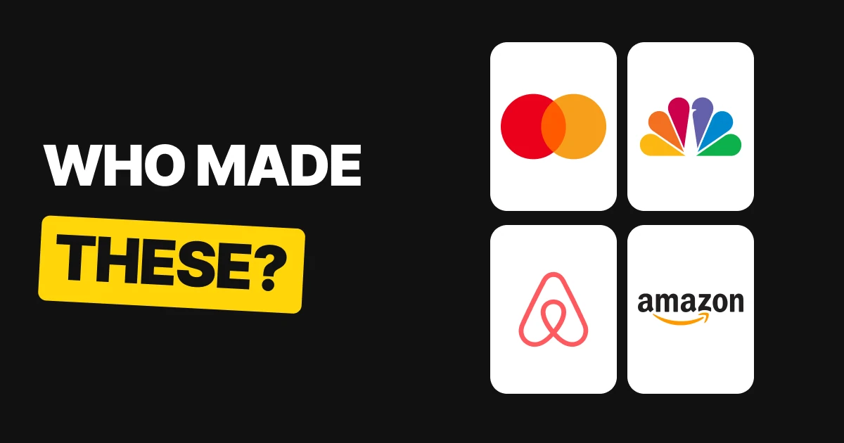
Every famous logo has a design studio behind it, and most of them are redraws, not blank-page inventions. Six of the best known are below: who made each one, when, and the single thing the studio changed.
| Logo | Studio | Year | What it changed |
|---|---|---|---|
| Mastercard | Pentagram | 2016 | More weight on the interlocking circles, name set in lowercase under them |
| Amazon | Turner Duckworth | 2000 | The line became a smile that runs from a to z |
| NBC | Chermayeff & Geismar | 1986 | Eleven feathers became six, and the peacock now faces right |
| Airbnb | DesignStudio (now Further) | 2014 | A new symbol, the Bélo, simple enough to draw by hand |
| Burger King | Jones Knowles Ritchie | 2021 | The bun shape returned, replacing the blue swoosh |
| Starbucks | Lippincott | 2011 | The words came off the ring around the siren |
Mastercard: Pentagram, 2016
Pentagram's Mastercard identity put "an increased emphasis on the interlocking circles", according to the studio's own case page, and used the typeface FF Mark. In 2016 the name sat in lowercase under the circles. A later update took the name off the circles altogether.
What changed: the two circles became the logo, and the name became a supporting line.
Amazon: Turner Duckworth, 2000
Turner Duckworth writes that in 1998 it took a brief from Jeff Bezos: "we took their existing frown and turned it upside down. The once generic line became a simple arrow curved into the shape of a smile". The studio adds that the company "sold everything from A to Z", which is why the arrow runs from the a to the z. The logo launched in 2000.
What changed: a plain underline turned into a smile that also tells you what the store sells.
NBC: Chermayeff & Geismar, 1986
The NBC peacock debuted in 1986. The studio's page says "the number of feathers reduced from eleven to six" and "the peacock had been facing left... so we flipped it to face right." The firm was Chermayeff & Geismar at the time. Sagi Haviv became a partner later, so the firm now carries his name too.
What changed: fewer feathers and a new direction, so the mark reads faster and looks forward.
Airbnb: DesignStudio, 2014
Airbnb launched its Bélo in July 2014. The studio's page says the symbol "represents Belonging, transcends language and is simple enough to be drawn by anyone." DesignStudio relaunched as Further in September 2025, so its case page now lives under the new name.
What changed: the company got a symbol that does not depend on any language and that anyone can sketch from memory.
Burger King: Jones Knowles Ritchie, 2021
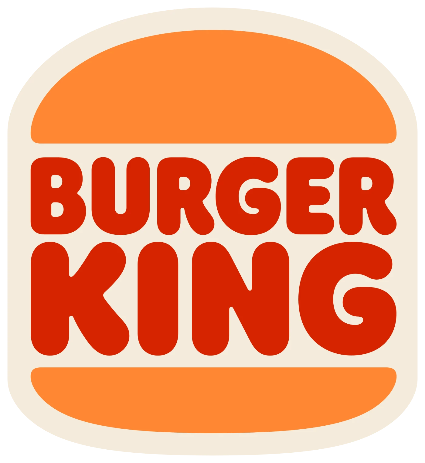
In January 2021 Burger King changed its logo for the first time in about 20 years. Jones Knowles Ritchie, which goes by JKR, replaced the blue swoosh logo used since 1999 with a flat burger that has the name between the buns. It goes back to the bun shape of the brand's earlier logos.
What changed: the swoosh went, and the old bun shape came back.
Starbucks: Lippincott, 2011
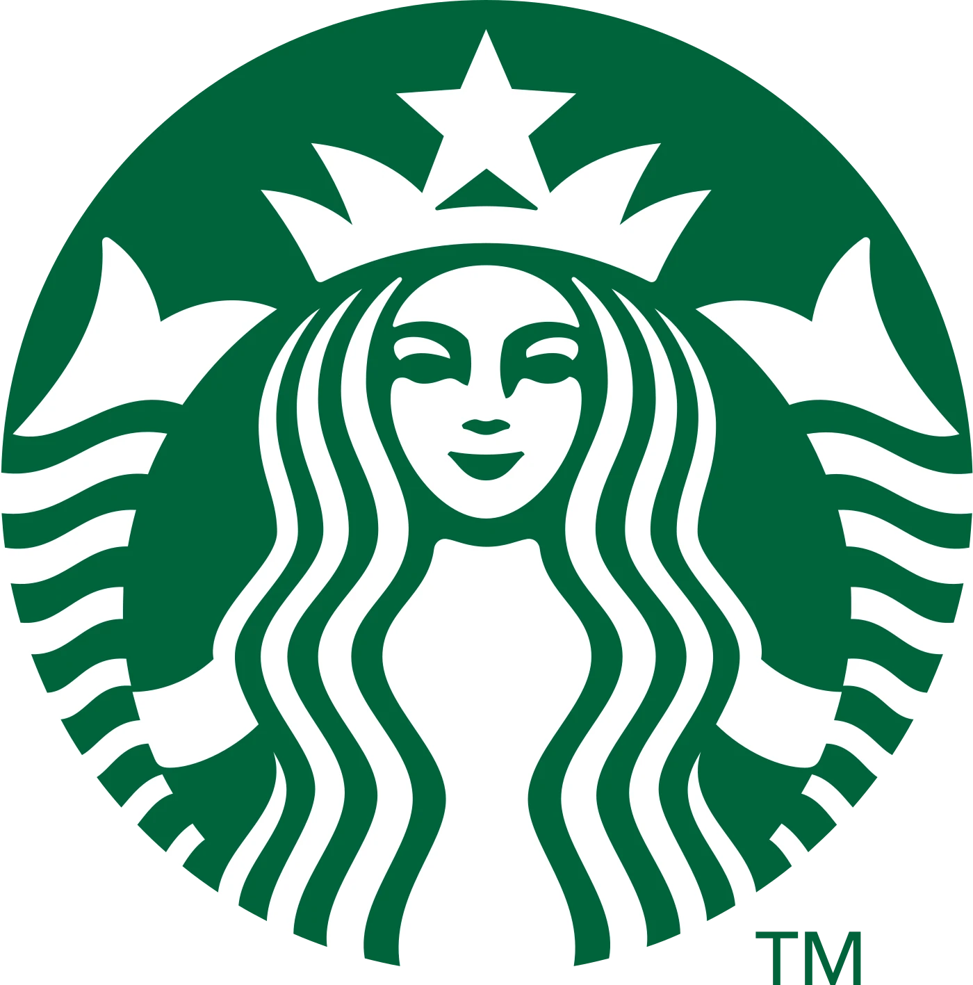
For the brand's 40th anniversary, Lippincott "partnered with Starbucks... beginning with the logo". By removing the "Starbucks Coffee" banner around the siren, the studio's page says, the brand "signaled their departure from coffee-centricity".
What changed: the words came off the ring, so the siren stood alone.
What the six have in common
- One change per logo. Each studio's own description comes down to a single move: count the feathers, flip the bird, drop the words, bring back the bun.
- Most were redraws. Mastercard, Amazon, NBC, Burger King and Starbucks all had a logo already. The studio sharpened it. Our logo redesign process paper covers how that kind of change is planned.
- Simple enough to draw from memory. Airbnb says it in so many words, and the others follow the same rule. See minimalist logo design for why that holds up.
- The date is part of the story. Some of these marks are from 1986, one from 2021. A famous logo is usually a mark that was kept up over the years, not drawn once.
Where the studio credit comes from
A studio's credit is normally on its own work page, with the year and the brief. That is where the quotes above come from, and the links are in the sources below. If you want to see how a logo gets from brief to final files, the steps are in the logo design process.
FAQ
Who designed the Mastercard logo?
Pentagram. Its 2016 identity put more emphasis on the interlocking circles and set the name in lowercase under them. Michael Bierut was the Pentagram partner on the project.
Who designed the Amazon logo?
Turner Duckworth. The studio took a brief from Jeff Bezos in 1998, and the smile logo that runs from a to z launched in 2000.
Who designed the NBC peacock?
Chermayeff & Geismar designed the 1986 version, with six feathers and the peacock facing right. The older peacock had eleven feathers and faced left.
Who designed the Airbnb logo?
DesignStudio, now called Further, drew the Bélo in 2014. The studio describes it as a symbol of belonging that anyone can draw.
Who designed the Burger King logo?
Jones Knowles Ritchie (JKR) made the 2021 version, a flat burger with the name between the buns. It replaced the blue swoosh logo used since 1999.
Who designed the Starbucks logo?
Lippincott worked with Starbucks on the 2011 version for the brand's 40th anniversary. It took the words off the ring and left the siren on its own.
Sources
- Pentagram, Mastercard: the interlocking circles and FF Mark. The 2016 date, the lowercase name and Michael Bierut as partner: Creative Review and Dezeen's 2019 follow-up on the name coming off the circles.
- Turner Duckworth, Amazon: the 1998 brief, the frown turned into a smile and the A to Z line. The 2000 launch: It's Nice That and The Drum.
- Chermayeff & Geismar & Haviv, NBC: eleven feathers to six and the flip to face right. The 1986 debut: Advertising Week, "The History of the NBC Peacock".
- Further, formerly DesignStudio, Airbnb: the Bélo. July 2014 launch: Dezeen and Design Week. The relaunch as Further in September 2025: Design Week.
- Jones Knowles Ritchie, Burger King: the January 2021 rebrand and the return to the bun shape, with news coverage from January 2021 on the swoosh it replaced.
- Lippincott, Starbucks: the 2011 change for the 40th anniversary.
- Logo files from Wikimedia Commons, shown for commentary and never redrawn: Mastercard-logo.svg (2016), Amazon logo.svg, NBC Peacock 1986.svg, Airbnb Logo Bélo.svg, Burger King 2020.svg, and English Wikipedia's Starbucks Corporation Logo 2011.svg. Trademarks of their owners.
- First published as a carousel on Logo Brainy.
Want a logo with one clear idea behind it? Brief our team on yours.
Get StartedGet new papers by email
New Brainy papers in your inbox. Confirm once, unsubscribe anytime.