New Logo Backlash: Why You Won't Love Your Logo on Day One
Nike's founder did not love the swoosh, Airbnb's 2014 logo was mocked and Instagram's 2016 icon was slammed. All three stayed. Gap backed down in a week. What to say when a new logo feels wrong.
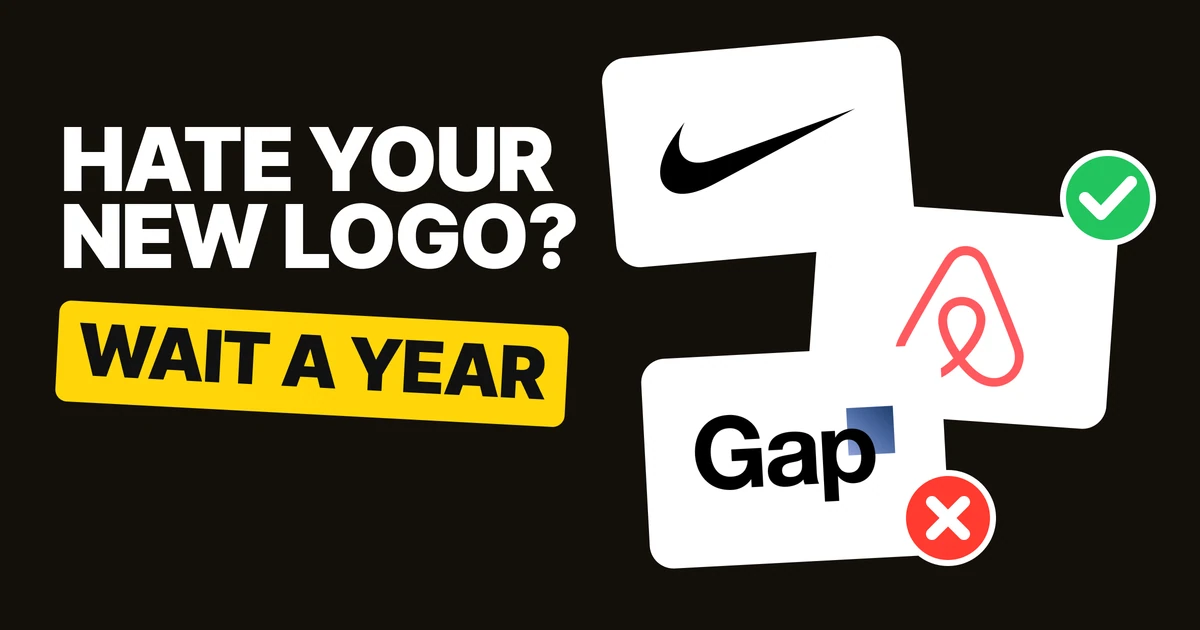
If your new logo feels wrong on the first day, that is normal, and it is not evidence the logo is bad. The old logo had years to become familiar. The new one has had an afternoon. Three of the best-known logos in the world went through exactly this, kept the logo, and one company went the other way.
Nike: the founder who did not love the swoosh
Carolyn Davidson drew the swoosh in 1971. Nike's own history quotes Phil Knight's reaction: "Well, I don't love it. But it will grow on me." It has been Nike's mark ever since.
What it shows: the person who commissioned the logo did not love it at first either. The first reaction was not the verdict.
Airbnb 2014: laughed at, then everywhere
The Bélo, by DesignStudio, launched on 16 July 2014 and was mocked on social media straight away. Gizmodo called it a "Sexual Rorschach Test", as Dezeen reported the next day. It is still Airbnb's logo.
What it shows: a logo can be the joke of the day and the brand's mark for a decade.
Instagram 2016: slammed on launch day
When Instagram replaced its camera icon in 2016, the reaction was mostly negative. Amobee's data, reported by Adweek, put it at 53 percent negative. The glyph is the same today: the gradient was brightened in 2022, so it has been the logo for ten years.
What it shows: a logo that millions use every day gets a loud first week. It still stayed.
Gap 2010: the logo that lasted a week
Gap unveiled this logo the week before, and on Monday 11 October 2010 it said it would scrap it and go back to the blue box, after online complaints (NBC News).
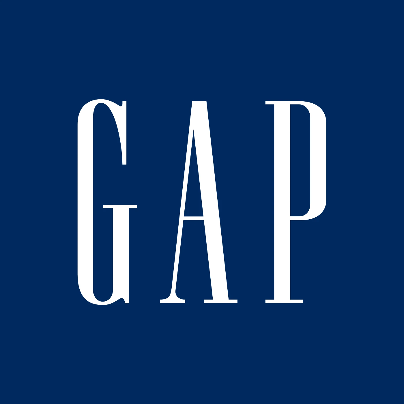
What it shows: Gap listened to the first week of complaints. We cannot say Gap would have won the argument by waiting, only that it never found out. Gap's rollout is covered further in the logo redesign process.
The pattern
| Logo | Year | First reaction | Result |
|---|---|---|---|
| Nike swoosh | 1971 | The founder: "I don't love it." | Still the logo |
| Airbnb Bélo | 2014 | Mocked online | Still the logo |
| Instagram icon | 2016 | 53 percent negative on launch day | Same glyph ten years on |
| Gap | 2010 | Online complaints | Gone in about a week |
Three of these logos survived a bad start by being kept long enough to become familiar. The fourth was withdrawn before it could.
Why it feels wrong on day one
A new logo has no history for anyone yet. Instagram's old camera icon had sat on home screens for years before 2016, and Gap's blue box had been on shopfronts for far longer than a week. Comparing them is not a fair test, because the old logo has familiarity working for it and the new one has none.
That is why "I don't love it" is the wrong thing to ask about a new logo: it measures the gap in familiarity, not the quality of the design.
Judge it in a year
This one is our rule and our opinion, not a measured law: judge a new logo in a year, by whether it works where you need it.
- Does it read at the small sizes it will be used at, like an app icon or a profile picture?
- Does it sit properly on the grounds you actually use, light and dark?
- Do your customers recognize it, and do they still know who you are?
If the answers are yes, the strange feeling is familiarity catching up. If the answers are no, you have a real problem, and it is one you can fix. A fix is also how Google handled its logo: see Google logo history.
Say this when a new logo feels wrong
The ask-sheet below swaps a gut reaction, like the ones Airbnb and Gap heard in 2014 and 2010, for a question you can test.
| Instead of | Ask |
|---|---|
| "I don't love it." | Does it work where we need it? |
| "Can we see ten more?" | Let's live with it for a month. |
| "My cousin hates it." | Do our customers get it? |
| "Let's poll our followers." | Let's test it with real customers. |
If the question is whether a change should be a refresh or a full rebrand in the first place, read rebrand vs brand refresh. If you are the designer presenting a new logo, see presenting brand identity to clients.
FAQ
Why do people hate new logos?
A new logo has no familiarity yet, and the old one had years to build it. People react to the change, not to how well the new logo works.
What did Phil Knight say about the Nike swoosh?
"Well, I don't love it. But it will grow on me." The swoosh was drawn by Carolyn Davidson in 1971.
Was the Airbnb logo hated when it launched?
Yes. The Bélo launched on 16 July 2014 and was mocked on social media, including a Gizmodo comparison covered by Dezeen. It is still Airbnb's logo.
Did people hate the new Instagram logo?
Mostly, on launch day in 2016. Amobee's data put the reaction at 53 percent negative. The same glyph is in use today.
Did Gap change its logo back?
Yes. Gap unveiled a new logo in October 2010 and said on 11 October it would scrap it and return to the blue box, about a week later.
How long does it take to get used to a new logo?
There is no fixed number. Our rule is to judge it after a year, by whether it works where you need it.
Should you change a logo because of backlash?
Not in the first week. Wait, then check whether the logo works at the sizes and on the grounds you need, and whether customers recognize it.
Sources
- Nike: Nike, Never done leaving a mark: Swoosh, 1 May 2022. The swoosh is by Carolyn Davidson, 1971.
- Airbnb: Dezeen, New Airbnb logo compared to automotive, anywhere, habitat and genitalia, 17 July 2014.
- Instagram: Adweek, New Instagram Logo Gets Mostly Negative Reaction, with Amobee data.
- Gap: NBC News, Gap scraps new logo after taking flak online.
- Logo files from Wikimedia Commons, shown for commentary and never redrawn: Logo NIKE, Airbnb Bélo, Instagram 2016, Gap, October 2010, Gap. Trademarks of their owners.
- "Judge a logo in a year" and the ask-sheet wording are our own opinion.
- First published as a carousel on Logo Brainy.
Rolling out a new logo and nervous about launch day? Our team designs identities and plans the rollout, so the first week of reactions does not decide the logo.
Get StartedGet new papers by email
New Brainy papers in your inbox. Confirm once, unsubscribe anytime.