
Design Tokens: असली Design Systems कैसे Consistent रहते हैं
Design tokens क्या होते हैं, तीन-स्तरीय model जो असली systems इस्तेमाल करते हैं (Shopify Polaris, IBM Carbon, GitHub Primer), उन्हें नाम कैसे दें, dark mode के लिए theming, और कब tokens ज़रूरत से ज़्यादा हो जाते हैं।
Design Tokens: असली Design Systems कैसे Consistent रहते हैं
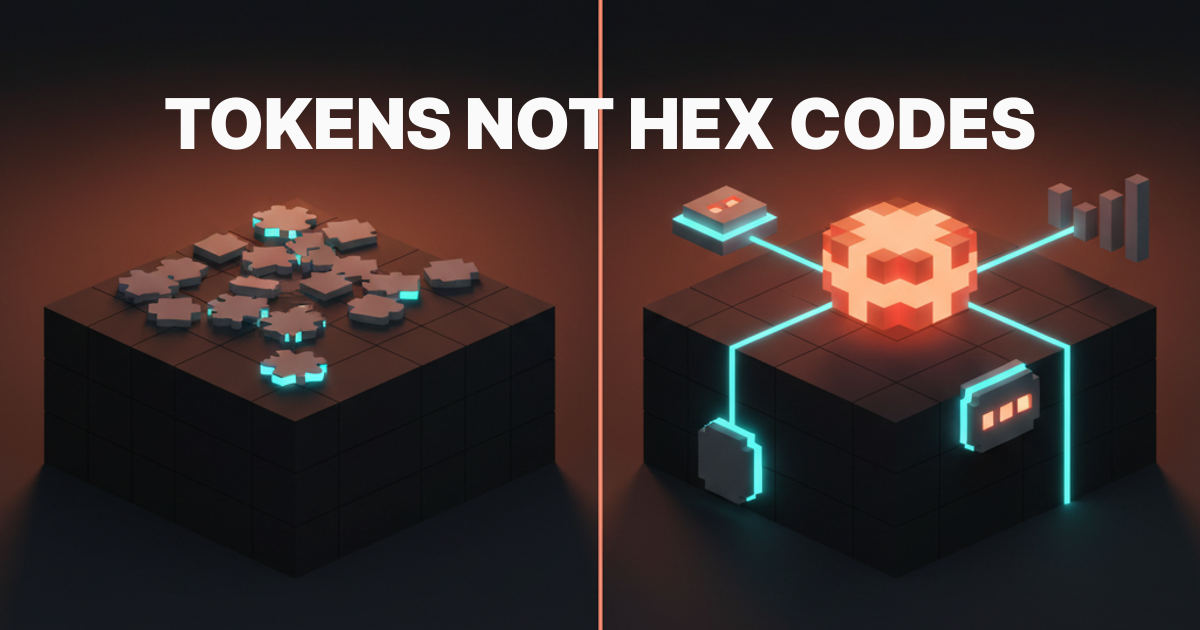
एक hex code एक value है। एक token एक नाम वाला फैसला है। Design systems values से नहीं, फैसलों से बनते हैं।
यही फर्क पूरी बात का सार है। #0EA5E9 को चौदह Figma components में hardcode करें, फिर dark mode की मांग आए, और आप एक हफ्ते के find-and-replace में फंस जाते हैं। इसे color-interactive-primary नाम दें और एक value बदलने पर हर surface अपडेट हो जाती है। यह कोई जादू नहीं, बस नाम वाले फैसले हैं।
Design Token असल में क्या होता है
Design token एक नाम वाला variable है जो एक design decision स्टोर करता है। यह कोई color, spacing value, font size, border radius, shadow, या duration रख सकता है। नाम ही contract है। नाम के पीछे की value बदल सकती है बिना उसे use करने वाली किसी चीज़ को तोड़े।
पुराना token-रहित तरीका तब शुरू होता है जब designer primary buttons के लिए #1D4ED8 चुनता है, उसे button component में hardcode करता है, फिर वही hex card, badge, और link में copy करता है। छह महीने बाद brand बदलती है। अब एक maintenance problem है जो हर ship किए गए component के साथ बढ़ती जाती है।
Tokens इसे पलट देते हैं। आप फैसले को नाम देते हैं (color-action-default), value एक बार assign करते हैं, और token reference करने वाली हर चीज़ sync में रहती है। Value implementation detail है। नाम ही system है।
तीन तहें जो Tokens को काम का बनाती हैं
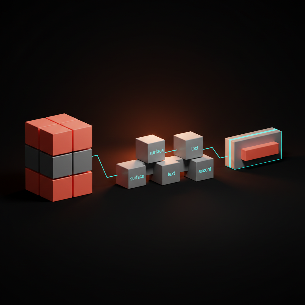
Raw tokens सिर्फ variables हैं। जो चीज़ token system को असल में उपयोगी बनाती है वह है hierarchy। हर production system जो पढ़ने लायक है, तीन तहें इस्तेमाल करता है।
| तह | और भी कहा जाता है | क्या स्टोर करता है | उदाहरण |
|---|---|---|---|
| Primitive | Global, Base | Raw values, कोई अर्थ नहीं | color.blue.500 = #3B82F6 |
| Semantic | Alias, Role | Primitives से mapped named roles | color.interactive.default = color.blue.500 |
| Component | Specific | Component-scoped decisions | button.background.default = color.interactive.default |
Primitives आपका palette हैं। हर blue, हर spacing step, और हर radius यहाँ एक named value के रूप में रहता है, बिना किसी राय के कि इसे कहाँ use किया जाएगा। आप components में primitives को directly consume नहीं करते।
Semantic tokens roles को primitives से map करते हैं। Token color-surface-default light mode में near-white और dark mode में near-black की तरफ point कर सकता है, और component को कभी नहीं पता चलता कि उसे कौन-सी raw value मिल रही है। उसे बस role पता है।
Component tokens सबसे specific हैं। ये तब exist करते हैं जब किसी component को ऐसा फैसला चाहिए जो जानबूझकर semantic default से अलग हो। Danger button अपना background default interactive role की जगह critical-feedback role पर point करता है। ज़्यादातर components को अपने tokens की ज़रूरत नहीं होती; वे सीधे semantic tokens consume करते हैं।
Tokens Hardcoded Values से बेहतर क्यों हैं
बदलाव की रफ्तार obvious argument है, लेकिन असली argument precision है।
जब designer raw hex codes से भरी file handoff करता है, developer को नहीं पता कि कौन-से intentional हैं और कौन-से accidental। क्या #1A1A2E background है, या किसी ने गलत layer से eyedrop किया? Tokens ambiguity हटाते हैं। एक semantic token नाम documentation है जो value के साथ चलती है।
Tokens 2026 में design tools और code के बीच handoff contract भी हैं। Figma variables CSS custom properties से directly map होते हैं। Figma file में define किया गया token बिना किसी manual step के export, commit, और code में consume किया जा सकता है। Design और implementation के बीच की खाई तब खत्म होती है जब दोनों sides एक ही token names बोलते हैं।
Accessibility work करने वाली teams के लिए tokens safety की एक और layer जोड़ते हैं। आप semantic palette को एक जगह audit करते हैं और guarantee करते हैं कि color-text-default हमेशा color-surface-default के against 4.5:1 contrast clear करे, चाहे कोई भी theme active हो।
असली Design Systems अपने Tokens कैसे Structure करते हैं
तीन systems जानने लायक हैं: Shopify Polaris, IBM Carbon, और GitHub Primer। ये तीन-तह model को अलग-अलग तरीके से handle करते हैं, और अंतर instructive हैं।
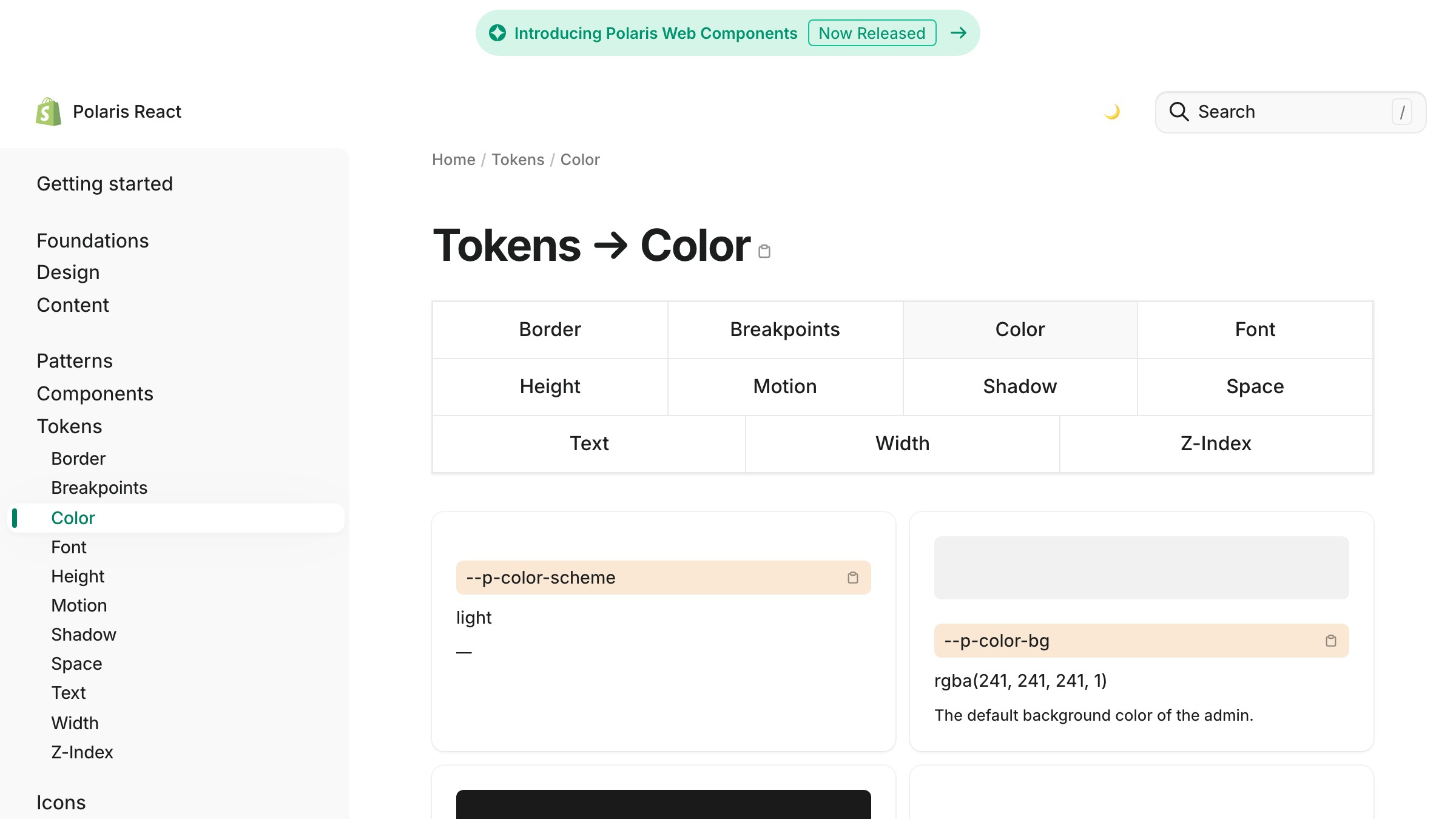
Shopify Polaris primitives को color scale में रखता है (color-sky-100 से color-sky-900 तक) और उन्हें --p-color-bg-fill-active जैसे semantic roles से alias करता है। Component tokens sparse हैं, इसलिए ज़्यादातर components semantic tokens consume करते हैं। Convention है role-then-state, जो code में naturally पढ़ी जाती है, क्योंकि आपको बिना extra context के पता चल जाता है कि bg-fill-disabled किस लिए है।
polaris.shopify.com पर live देखें
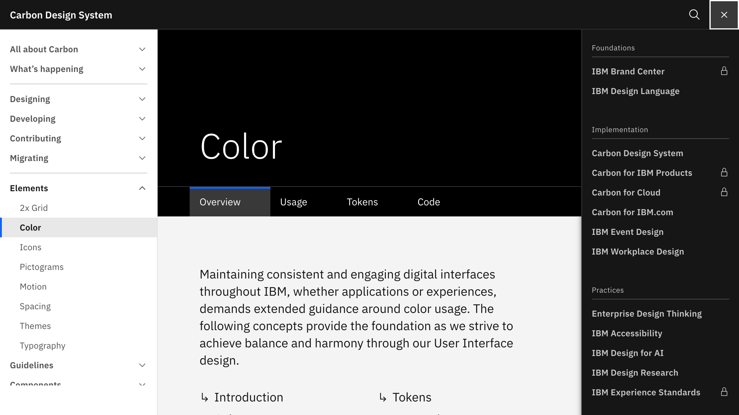
IBM Carbon semantic layers पर गहरा जाता है। इसके color set में explicit feedback tokens जैसे support-error और support-success, interactive state tokens, और nested surfaces के लिए layer tokens शामिल हैं (एक page पर एक panel पर एक component को हर एक अलग surface value चाहिए)। यह ज़्यादा complex है, लेकिन IBM enterprise software ship करता है जहाँ हर nested state matter करती है।
carbondesignsystem.com पर live देखें
GitHub Primer अपनी primitive layer को "primitives" और semantic layer को "functional tokens" के रूप में expose करता है, जो primer.style पर publicly documented है। Primer की theming GitHub को एक ही component set से light, dark, light high contrast, और dark dimmed ship करने देती है। हर theme एक ही token names को अलग value assignment है।
तीनों में pattern consistent है: primitives as a scale, semantic tokens as role names, और theming as a value swap at the semantic layer। Components untouched रहते हैं।
Brainy designers को ऐसे systems बनाने में help करता है जो scale करते हैं, one-off screens नहीं। देखें हम creators के लिए क्या बना रहे हैं /creators पर।
Tokens को नाम देना बिना दिमाग खोए
Token naming teams को तोड़ देती है। बहुत generic और नाम कोई जानकारी नहीं देते। बहुत specific और हर component के लिए नया token लिखते रहो।
एक naming convention जो काम करती है वह चार parts नाम देती है: category, role, variant, और state। आप हर बार चारों use नहीं करेंगे, लेकिन यह structure ad-hoc chaos रोकता है।
| भाग | क्या Capture करता है | उदाहरण |
|---|---|---|
| Category | Design property | color, spacing, radius, shadow, font |
| Role | Semantic purpose | surface, text, border, interactive, feedback |
| Variant | Sub-role या modifier | primary, secondary, danger, subtle |
| State | Interactive condition | default, hover, active, disabled, focus |
Working examples, CSS custom properties के रूप में लिखे जैसे developer actually consume करता है:
color-surface-defaultdefault page background सेट करता हैcolor-text-subtleकम contrast पर secondary text हैcolor-interactive-primary-hoverprimary action की hover state हैspacing-component-mdcomponents के लिए medium internal padding हैradius-interactiveclickable elements का corner radius है
दो rules सबसे ज़्यादा arguments बचाते हैं। नाम में raw value कभी encode न करें, क्योंकि color-blue-500 role के बारे में कुछ नहीं बताता। Semantic layer पर component के नाम से कभी नाम न दें, क्योंकि semantic tier में button-primary-color का मतलब है आपने semantic layer ही skip कर दी।
Type systems जो scale करते हैं उनके लिए भी यही convention लागू होती है, और font-size-body-lg हर बार text-18px से बेहतर है।

एक Token Set, Light और Dark Mode
Dark mode वह जगह है जहाँ token systems सबसे ज़्यादा visibly pay off करते हैं। अगर आपने tokens को role के हिसाब से नाम दिया है, तो dark mode एक value swap है, redesign नहीं।
Mechanism सीधा है। आपका semantic token color-surface-default एक primitive की तरफ point करता है जो light mode में near-white और dark mode में near-black है। इसे consume करने वाला component कभी नहीं बदलता। आप themes switch करते हैं semantic layer पर value mapping swap करके।
CSS custom properties इसे mechanical बनाते हैं:
:root {
  --color-surface-default: #ffffff;
  --color-text-primary: #111827;
}

[data-theme="dark"] {
  --color-surface-default: #0f172a;
  --color-text-primary: #f8fafc;
}
var(--color-surface-default) reference करने वाला हर component अब बिना किसी additional code के theme attribute पर respond करता है। Shopify Polaris, GitHub Primer, और IBM Carbon सभी production scale पर यही pattern use करते हैं।
Failure mode semantic और primitive tokens को components में mix करना है। जब कोई component सीधे color-blue-600 reference करता है color-interactive-primary की जगह, वह component theming पर respond करना बंद कर देता है। एक careless primitive reference पूरे model को तोड़ देता है। Lint rules जो component code में direct primitive consumption को flag करें, setup time के लायक हैं।
Color choices कैसे land होती हैं यह समझना conceptual grounding देता है, और tokens आपको हर theme में उस पर act करने का structure देते हैं।
Design Tokens कब ज़रूरत से ज़्यादा हो जाते हैं
Tokens indirection जोड़ते हैं। Indirection की costs हैं। इस बारे में honest रहें कि वे costs कब worth paying हैं।
| Situation | Tokens? | कारण |
|---|---|---|
| 3+ products serve करने वाला Design system | हाँ | Shared tokens तुरंत खुद के लिए pay करते हैं |
| Single product, 5+ designers | हाँ | Team में palette drift रोकता है |
| Single product, 1-2 designers, active iteration | शायद | Semantic layer only, component tokens skip करें |
| Marketing site, कोई component library नहीं | नहीं | एक stylesheet बदलना तेज़ है |
| Prototype या MVP 3 महीने से कम | नहीं | Design stabilize होने के बाद abstract करें |
| Existing system में dark mode add करना | हाँ | यही exactly वह है जिसके लिए tokens हैं |
छोटी teams tokens के बिना तेज़ चलती हैं। Product-market fit खोज रहा तीन-लोगों का startup तीन-तह hierarchy नहीं चाहता। जब आप हर दो हफ्ते में visual direction बदलते हैं, एक Figma style library काफी है।
Avoid करने वाला anti-pattern है premature semantic naming। color-blue और color-gray नाम वाले tokens बिना अर्थ के indirection जोड़ते हैं। या तो color-surface और color-text से role के हिसाब से नाम दें, या primitives पर टिके रहें जब तक आपके पास इतने components न हों कि आप जान सकें roles actually क्या हैं।
बुरी token naming कोई tokens न होने से भी बदतर है। Semantic layer में button-color-for-the-checkout-page नाम का token एक maintenance trap है। Naming discipline optional नहीं है, यही वह reason है जिससे tokens काम करते हैं।

FAQ
क्या Design Tokens Figma styles को replace करते हैं?
नहीं, लेकिन वे उन्हें extend करते हैं। Figma variables, 2023 में release हुए, Figma के अंदर closest native equivalent हैं, और जब आप दोनों तरफ naming conventions share करते हैं तो ये code tokens से map होते हैं। Figma styles typography और color fills handle करती हैं, जबकि variables पूरी token hierarchy handle करते हैं जिसमें states और component-level decisions शामिल हैं।
क्या Tokens Design System के बिना काम करते हैं?
Tokens design system के अंदर सबसे valuable हैं, लेकिन CSS custom property level पर semantic naming से single product भी benefit करता है। Hex values hardcode करना बंद करने के लिए formal system ज़रूरी नहीं।
Tokens manage करने के लिए कौन-सा tool use करूं?
छोटी teams के लिए, Figma variables plus एक JSON export काफी है। बड़ी teams के लिए, Style Dictionary (open source, Amazon द्वारा) standard build tool है। यह token JSON structure लेता है और CSS custom properties, iOS Swift constants, और Android XML output करता है। Tokens Studio for Figma Figma और Style Dictionary के बीच popular plugin bridge है।
Component Tokens कितने granular होने चाहिए?
सिर्फ उतने granular जितने ज़रूरत हो। ज़्यादातर components सीधे semantic tokens consume कर सकते हैं। Component-specific tokens तब sense बनाते हैं जब कोई component जानबूझकर semantic layer से diverge करे, जैसे destructive action button या unusual surface वाला banner। Doubt हो तो semantic consume करें और component tokens सिर्फ तब बनाएं जब आप खुद को exceptions लिखते हुए पाएं।
क्या Tokens Spacing और Typography भी handle कर सकते हैं, या सिर्फ Color?
Tokens किसी भी discrete value के लिए काम करते हैं: color, spacing, typography, border radius, box shadow, motion duration, motion easing, और z-index। सबसे mature systems, जैसे IBM Carbon और Atlassian Design System, इन सभी के लिए tokens रखते हैं। Color और spacing से शुरू करें, फिर system mature होने पर बाकी add करें।
Values Hardcode करना बंद करें
Practical path complicated नहीं है:
- Primitives को एक scale के रूप में नाम दें
- उन primitives को semantic roles से map करें
- हर component को semantic tokens consume करने दें, primitives नहीं
- Token values को एक source से export करें (Figma variables, JSON file, या design system package) और build tools को CSS, iOS, और Android में distribute करने दें
शुरू करने के लिए तीन महीने की migration ज़रूरी नहीं। एक component चुनें, उसके फैसलों को नाम दें, और वह फर्क महसूस करें जब आप एक value बदलते हैं और सब कुछ update होते देखते हैं। वह experience ही argument है।
Design systems के बारे में और लेखों के लिए, देखें Brainy और क्या cover करता है /paper पर।
Brainy helps designers build systems that scale, not one-off screens. See what we are building for creators.
Get Started