
Digital Product Design 2026: वह साल जब टूल्स ने खुद डिज़ाइन करना शुरू किया
Digital product design 2026 में असली प्रगति: interface के रूप में AI, design engineering, generative UI, और craft एक बुनियादी ज़रूरत बनी, नामी उदाहरणों के साथ।
Digital Product Design 2026: वह साल जब टूल्स ने खुद डिज़ाइन करना शुरू किया
2026 वह साल नहीं था जब AI ने product designers की जगह ले ली। यह वह साल था जब काम एक स्तर ऊपर चला गया, screens बनाने से हटकर यह तय करने तक कि system को क्या करना चाहिए, क्योंकि screens तो अब टूल्स खुद संभाल लेते हैं।
यह hype नहीं है। यह उस बदलाव का तार्किक अंत है जो तब शुरू हुआ जब Figma ने visual design को तेज़ बनाया और Tailwind ने front-end को। हर बार जब tooling automation की लहर आई, designer का असली judgment काम की सतह के और करीब आता गया।
अब वह लहर अपने शिखर पर पहुंच चुकी है। screen अब deliverable नहीं रहा। decision deliverable बन गया है।
यहां वे छह ठोस बदलाव हैं जिन्होंने इस साल digital product design को सच में बदला, हर एक के साथ एक असली product जो इसे साबित करता है।
2026 में असल में क्या बदला (संक्षेप में)
2026 में काम पिछले पांच सालों के मुकाबले ज़्यादा बदला। एक product designer का दिन दो साल पहले कैसा दिखता था बनाम अब कैसा दिखता है, यहां देखें।
| काम | 2024 | 2026 |
|---|---|---|
| शुरुआती UI exploration | Figma में 8-12 screens बनाएं | v0 में 6 variants prompt करें, बेहतर direction चुनें, refine करें |
| Responsive layout | Breakpoints hand-spec करें, dev के लिए annotate करें | उसी pass में generate होता है; आप approve या reject करते हैं |
| Component production | शुरू से बनाएं या system से लें | Prompt से assemble हो जाता है; आप consistency enforce करते हैं |
| Motion और micro-interaction | Cycle के अंत में optional polish | पहले review से ही expected |
| Handoff documentation | Figma specs + Zeplin annotations | तेज़ी से: deployed code ही handoff है |
| मुख्य काम | Product जैसा दिखाना | Product क्या होना चाहिए और कैसे behave करना चाहिए, यह तय करना |
टूल्स तेज़ हैं। इससे उनके पीछे की सोच का bar ऊंचा हो गया है।
AI एक feature बनना बंद हुआ और interface बन गया
AI वह feature बनना बंद हो गया जिसे आप bolt on करते थे, और खुद interface बन गया। सालों तक इसका मतलब था sidebar में एक छोटा sparkle icon, एक summarize बटन, एक dropdown suggestion। AI बतौर garnish।
वह model अब काफी हद तक खत्म हो चुका है। 2026 के leading products में AI एक feature नहीं है। AI ही surface है, वह interface जिससे आप हर session में interact करते हैं।
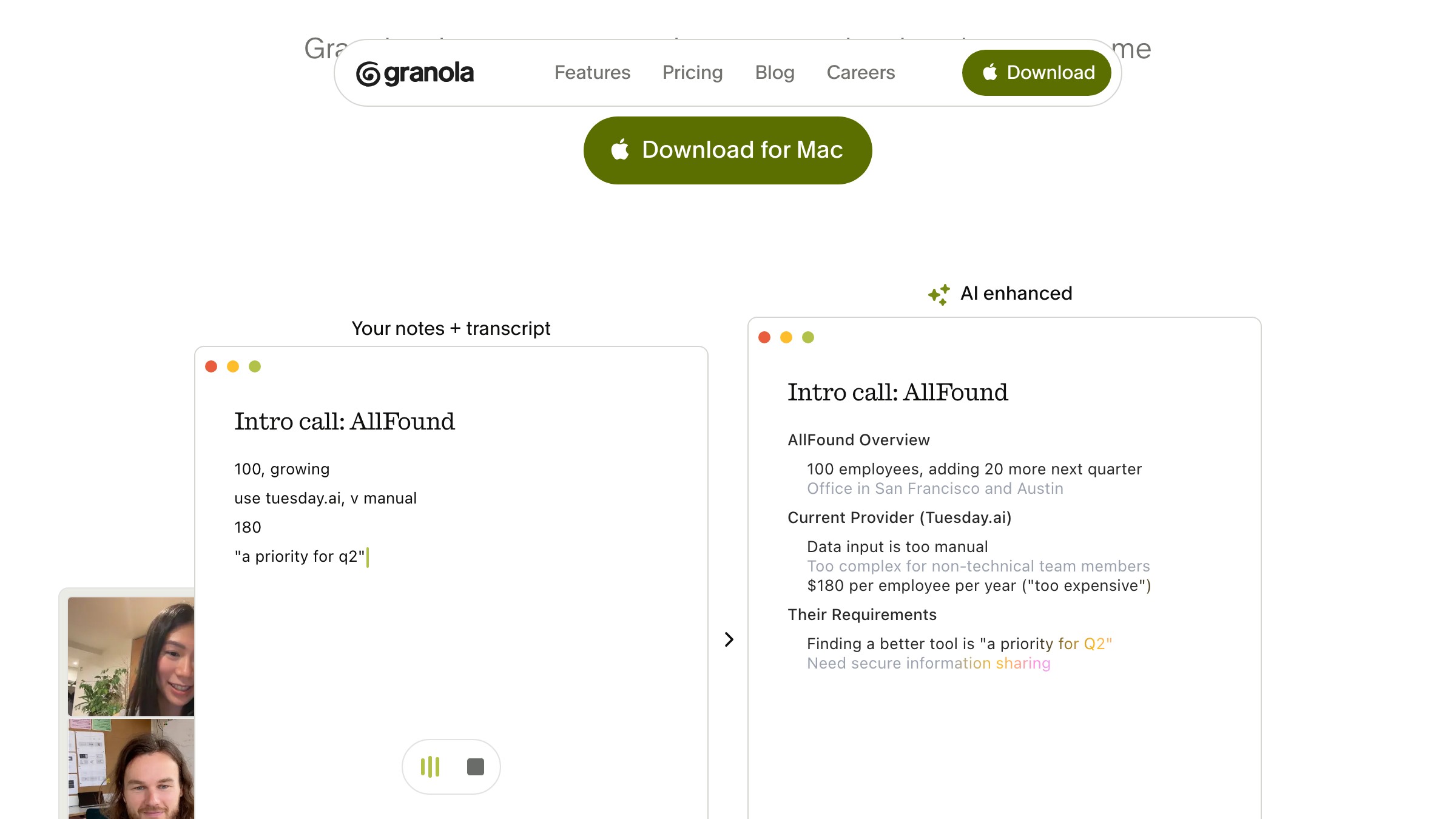
Granola सबसे स्पष्ट प्रमाण है। यह एक meeting notepad है जहां AI किसी corner panel में transcribe नहीं करता जबकि आप अलग से notes लेते हैं। AI और आपके notes एक ही चीज़ हैं।
आप जो मायने रखता है वो लिखते हैं, AI जो छूट गया वो भर देता है, और output सच में काम का होता है, न कि transcript की दीवार। Product UI को AI output को primary content मानकर बनाया गया है, न कि traditional notes view पर बाद में ठूंसे गए afterthought की तरह।
यह design decision सब कुछ बदल देता है:
- Information architecture
- Interaction model
- Error states
- Trust signals
जब AI output आपका primary canvas है, तो आप इसे document editor या settings panel की तरह design नहीं कर सकते।
ये patterns अभी exist नहीं करते। AI-native products बनाने वाले designers शून्य से playbook लिख रहे हैं।
Product designers के लिए इसका सीधा मतलब है। अगर AI product design के बारे में आपका mental model अभी भी यही है कि AI button कहां जाएगा, तो आप गलत problem solve कर रहे हैं। असली सवाल यह है कि trust खोने से पहले AI कितना own कर सकता है।
Design और code के बीच की खाई लगभग बंद हो गई
Design और code के बीच की खाई 2026 में लगभग बंद हो गई। Design engineering कुछ सालों से एक job title रही है, और अब इसकी वजह नज़रअंदाज़ नहीं की जा सकती। वह handoff ritual जो दो disciplines को अलग करता था, लगभग खत्म हो चुका है।
Zed टूल्स की दुनिया में खुद सबसे तेज़ उदाहरण है। AI-native development के लिए rebuild किया गया code editor इस साल के सबसे carefully designed software products में से एक भी है। Typographic care, native performance, एक ऐसा interface जहां AI canvas में बुना हुआ है, न कि ऊपर से layered।
इसे बनाने वाली team, साफ तौर पर, design को engineering से अलग नहीं कर रही। Product ऐसा लगता है जैसे किसी एक coherent mind ने बनाया हो।
यह convergence product teams में भी हो रहा है। जो designers production code पढ़-लिख सकते हैं, या जिन developers ने visual और interaction craft को internalize किया है, वे एक ही pass में वह काम कर रहे हैं जिसके लिए पहले दो लोग और एक हफ्ते का back-and-forth चाहिए था। Role का distinction अभी भी है, लेकिन workflow का distinction खत्म हो रहा है।
Product leaders के लिए, यह hiring calculus बदलता है। हर surface के लिए ज़रूरी नहीं कि एक designer और एक front-end engineer चाहिए। आपको ऐसे लोग चाहिए जो दोनों को hold कर सकें, और वे coordination loss के बिना तेज़ ship करते हैं।
Designers के लिए, असुविधाजनक सच यह है। अगर आप implementation layer से बिल्कुल engage नहीं कर सकते, तो आप आधी craft टेबल पर छोड़ रहे हैं। यह समझना कि क्या बनाना आसान है बनाम महंगा, अब अच्छे design decisions लेने का हिस्सा है।
कोई product बना रहे हैं और चाहते हैं कि design 2021 का नहीं, 2026 का हो? Brainy product interfaces design और ship करता है।
Generative UI demo से daily driver बन गया
Generative UI 2026 में party trick से daily production tool बन गया। एक साल पहले, v0 और Lovable generic Tailwind-plus-shadcn layouts थूकते थे, prototyping के लिए ठीक लेकिन shipping के लिए नहीं।
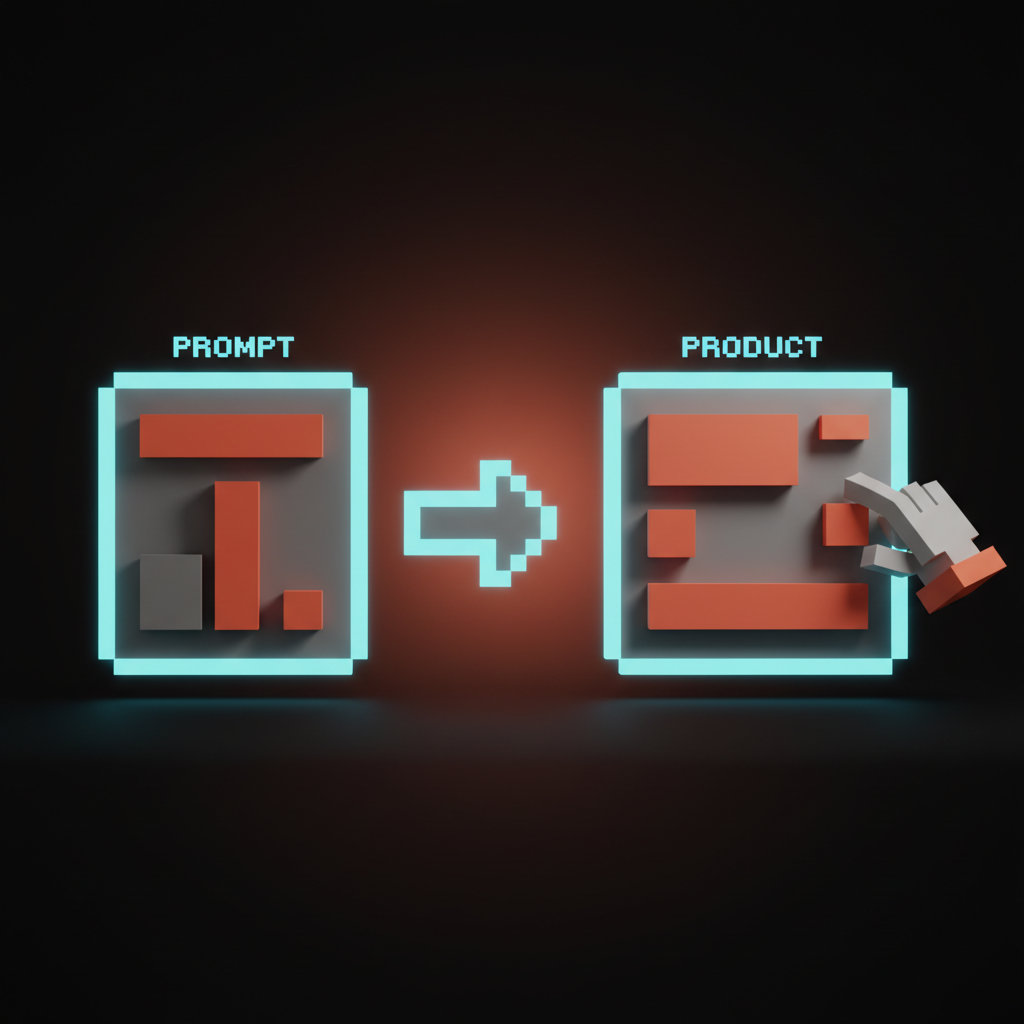
यह बदल गया। Output अब इतना differentiated है कि production work के लिए genuine starting point बन सकता है। Workflow भी mature हुआ, और designers ने समझा कि generative UI को one-shot answer की जगह first draft की तरह कैसे use करें।
मायने रखने वाला shift यह नहीं है कि AI आपके लिए UI लिख रहा है। यह है कि design exploration के लिए अब direction validate करने के लिए घंटों की Figma work नहीं चाहिए। आप real data के साथ browser में एक layout concept test कर सकते हैं, मिनटों में।
यह speed बदलती है कि आप honestly कितने options evaluate कर सकते हैं। ज़्यादा options का मतलब है बेहतर final decisions।
दूसरी तरफ, generative UI उन patterns पर default करता है जिन पर वह trained था। अगर आपकी strong opinion नहीं है कि आपके product का UI distinct क्या बनाता है, तो generator आपको कुछ ऐसा देता है जो बाकी सब जैसा दिखता है। Creative pressure process में पहले shift हो गई, brief और taste call पर, न कि execution पर।
Web design कहां जा रहा है इस पर अधिक के लिए, pattern दोहराता है: टूल्स तेज़ हुए, judgment premium ऊंचा हुआ।
Motion और craft entry का price बन गए
Motion 2026 में entry का price बन गया, finishing touch नहीं। Motion design पहले एक nice-to-have था जो असली काम के बाद आता था, अगर समय और budget हो। Motion polish वाली team कुछ special कर रही होती थी।
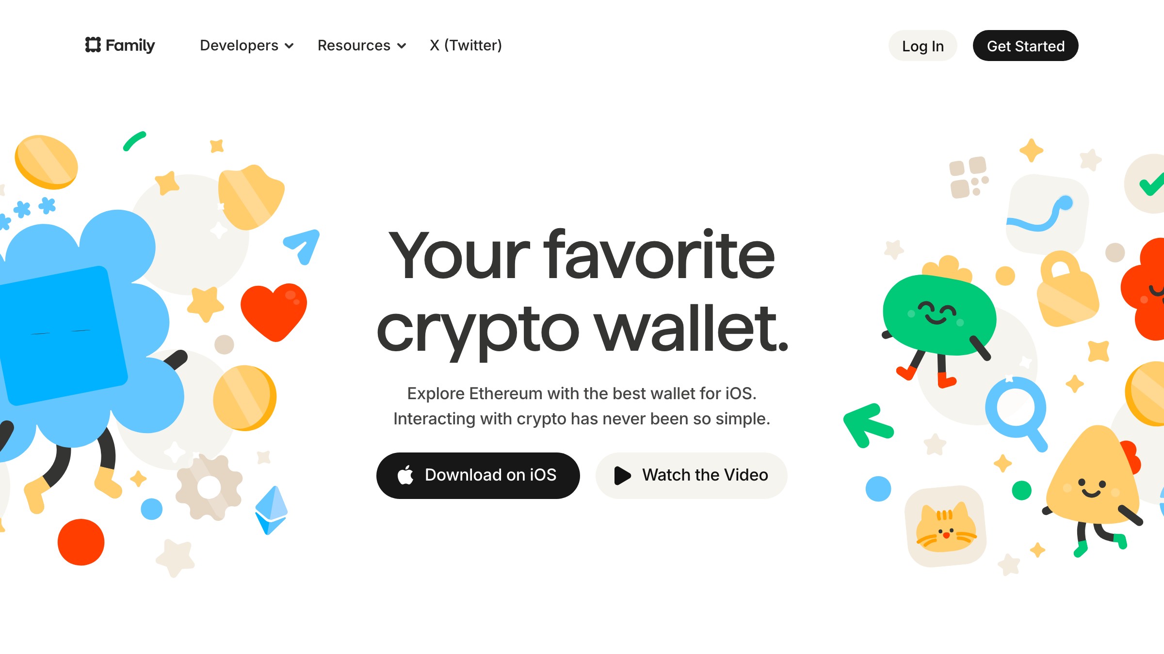
अब यह expected है, bonus नहीं बल्कि baseline। जो users उन products के साथ interact करते हैं जो अच्छे से move करते हैं, उन्होंने recalibrate कर लिया है कि finished कैसा feel होता है। अगर यह अच्छे से नहीं move करता, तो incomplete लगता है।
Family reference है। Wallet app ने ऐसे motion के लिए reputation बनाई है जो actually meaning communicate करता है, न कि सिर्फ transitions को decorate करता है। Animations window dressing नहीं हैं।
अच्छा motion user को तीन चीज़ें बताता है:
- अभी क्या हुआ
- क्या होने वाला है
- System कैसे respond कर रहा है
यह motion design बतौर information design है, और इसे अच्छे से करने के लिए serious craft चाहिए।
सीख यह नहीं है कि ज़्यादा animation डालें। Motion अब quality का एक dimension है जिसे reviewers, investors, और sophisticated users तुरंत notice करते हैं। जो teams इसे optional decoration मानती हैं, वे ऐसा काम ship कर रही हैं जो सबसे important audience को incomplete लगता है।
Product designers के लिए, इसका मतलब है कि motion thinking interaction design phase के दौरान होनी चाहिए, post-production में नहीं। अगर आप किसी action को design करते समय यह नहीं सोच रहे कि user उस action को complete करने पर क्या होगा, तो आप काम की एक layer miss कर रहे हैं।
Dense data interfaces अब ugly नहीं रहे
Dense data और visual craft 2026 में trade-off नहीं रहे। पुरानी मान्यता binary थी। Data ठूंसो और craft छोड़ो, या इसे beautiful बनाओ और वह आधी information काटो जो users को चाहिए। ज़्यादातर enterprise software ने density चुनी, ज़्यादातर consumer software ने craft।
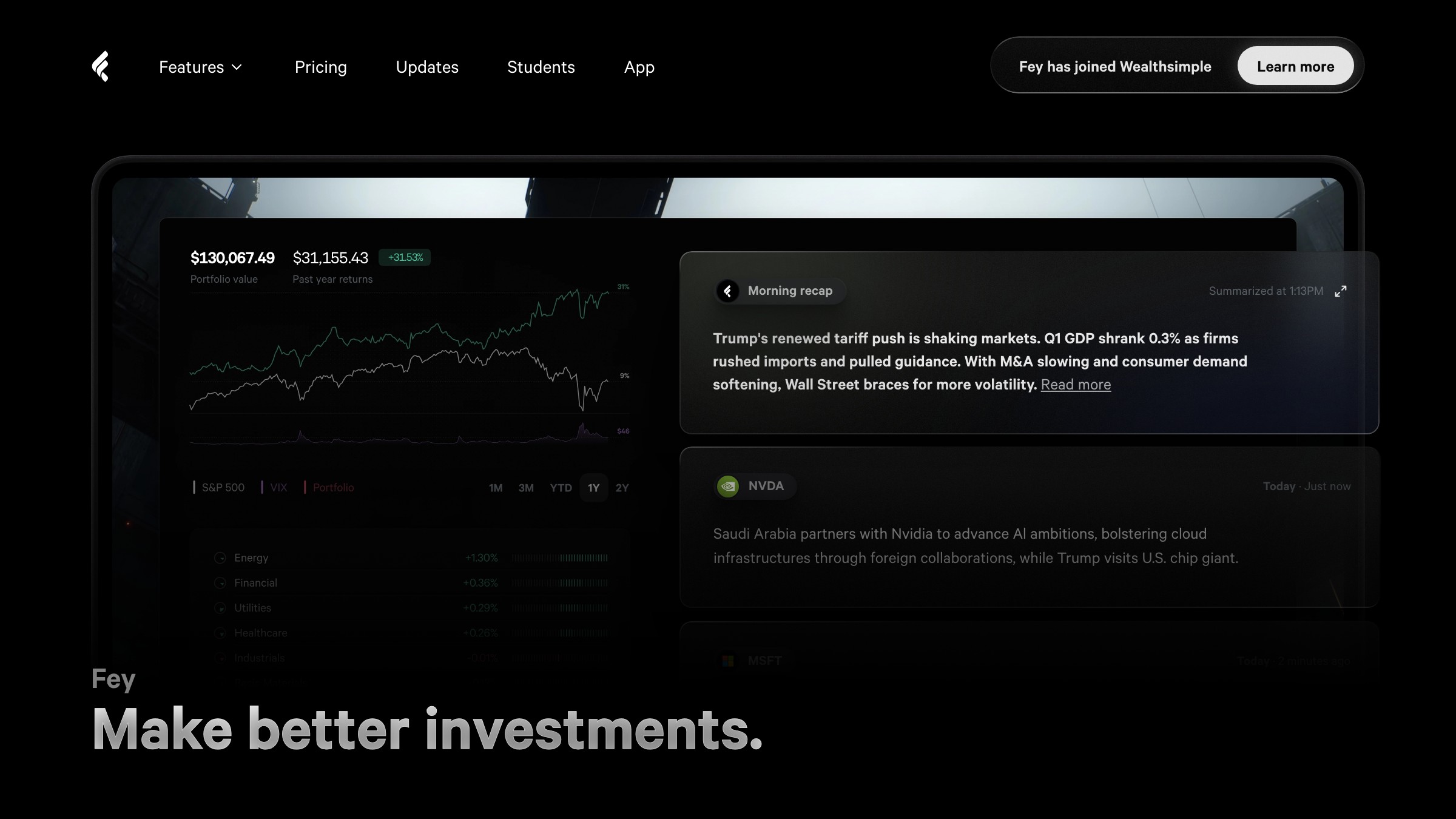
वह compromise अब ज़रूरी नहीं है, और Fey ने यह साबित किया। Financial portfolio tracker एक genuinely beautiful interface दिखाता है जो data से भरा है। Charts, portfolio weights, performance breakdowns, और watchlist data सब एक ही screen share करते हैं।
यह 2009 के Bloomberg terminal जैसा नहीं दिखता और न ही किसी stripped-down consumer app जैसा जो complexity छुपाता है। यह ऐसा दिखता है जैसे किसी को दोनों चीज़ों की बराबर परवाह थी और किसी के लिए किसी को sacrifice नहीं किया।
तीन decisions इसे काम करते हैं:
- Tight typographic hierarchy
- Restrained color, सिर्फ वहां इस्तेमाल जहां यह कुछ signal करे
- Spatial organization जो related data को box किए बिना group करे
कोई decorative borders नहीं, cards पर कोई gradient fills नहीं, कोई noise नहीं जो content से compete करे।
Dense data design हमेशा solvable रहा है। जो बदला वह यह है कि ज़्यादा designers उस problem-solving rigor को इस पर ला रहे हैं, और results user expectations को shift कर रहे हैं। अगर आपका product data में deal करता है और यह ऐसा लगता है जैसे केवल engineers ने design किया हो, तो Fey जैसे products से comparison अब दिखने लगी है।
Software ने user के हिसाब से ढलना शुरू किया, उल्टा नहीं
Software ने user के काम का shape लेना शुरू किया, उल्टा force करने की जगह। पिछले दशक का हर CRM एक fixed data model लेकर आया, contacts, deals, stages, और आपको अपना business उस पर map करना पड़ता था। यही deal था।
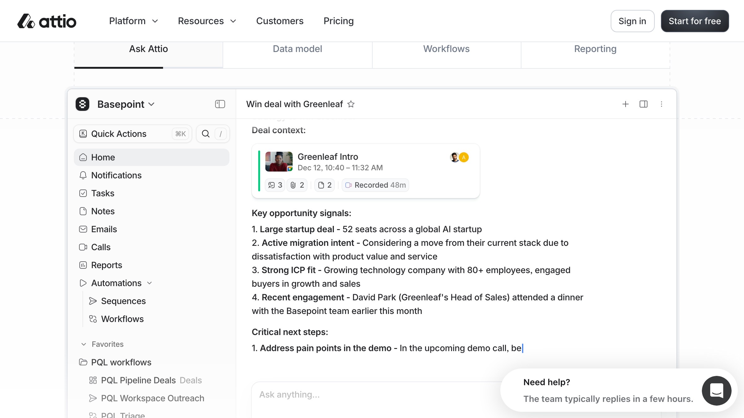
Attio ने वह deal तोड़ी। CRM users को अपने objects और relationships define करने देता है, ताकि software business का shape ले ले। अगर आपका sales motion किसी predetermined schema में fit नहीं होता, तो आपको उसमें खुद को ठूंसना नहीं पड़ता।
यह एक कठिन design problem है। User-defined structure के हिसाब से adapt करना fixed schema के लिए design करने से बहुत मुश्किल है, क्योंकि तीन चीज़ें एक साथ hold करनी होती हैं:
- UI infinite configurations को बिना break किए handle करे
- Information architecture तब काम करे चाहे user के तीन objects हों या तीस
- Interaction model learnable रहे चाहे users के बीच content completely vary करे
Attio ने जो सही किया वह था configuration layer को उसी craft attention से design करना जितना daily-use UI को। ज़्यादातर flexible software power-user controls को एक ugly settings panel में दफना देता है जो एक अलग product जैसा feel करता है। Attio ने structure-building experience को native feel कराया।
यह pattern फैलेगा। जिन users ने ऐसा software experience किया है जो उनके actual workflow में fit होता है, वे खुद को किसी और के schema में force करने नहीं जाएंगे। अगली generation के workflow tools बना रहे product designers को configurability को first-class concern की तरह design करना होगा, premium feature की तरह नहीं।
Designers के लिए इसका क्या मतलब है (असुविधाजनक हिस्सा)
इस साल design work की value दो हिस्सों में बंट गई: execution की value कम हुई, judgment की बढ़ी। यह वह हिस्सा है जो ज़्यादातर 2026 roundups skip कर देते हैं।
Junior work सबसे तेज़ सिकुड़ रहा है। Screen-pushing, component production, responsive layout specification, और basic icon creation generative UI और AI-assisted design के पहले casualties हैं। गए नहीं, लेकिन per hour पहले से कम value के।
जो appreciate हो रहा है: judgment, taste, product thinking, systems design, और एक साथ design problem और implementation constraint दोनों को head में hold करने की ability। वह काम जिसके लिए trained human perspective चाहिए कि अच्छा कैसा दिखता है और क्यों मायने रखता है।
| Skill | Trajectory | क्यों |
|---|---|---|
| Figma component production | Per hour declining value | Generative टूल्स तेज़ी से catch up करते हैं |
| Prompt-to-UI iteration speed | Rising expectation | Baseline table stakes बनता है |
| Motion और interaction design | Appreciating | Craft premium, convincingly generate करना मुश्किल |
| Design systems thinking | Appreciating | AI output को governance चाहिए |
| Product strategy और prioritization | Appreciating | टूल्स तेज़ execute करते हैं, judgment ज़्यादा मायने रखती है |
| AI-native interface patterns | High demand, undersupplied | New category, कोई established playbook नहीं |
| Design engineering fluency | Appreciating | Handoff friction एक competitive disadvantage है |
यह AI की आपकी job replace करने का take नहीं है। यह job बदलने के बारे में है, और जो हिस्से बदल रहे हैं वे boring हिस्से हैं। अभी सबसे ज़्यादा stressed designers वे हैं जिनकी value execution speed पर बनी थी, क्योंकि टूल्स अब execution speed पर competitive हैं।
जो designers energized हैं वे वो हैं जिन्हें हमेशा drawing से ज़्यादा thinking interesting लगती थी।
AI tools के साथ designing के बारे में अधिक के लिए, वही pattern holds करता है: tool rote handle करता है, human judgment call handle करता है।
FAQ
क्या digital product design actually उतनी तेज़ी से बदल रहा है, या यह hype है?
Fast relative है। छह shifts को interesting experiments से competitive baseline तक जाने में 18-24 महीने लगे। Industry standards के हिसाब से यह genuinely fast है, और अगर आपने हाल ही में कुछ ship किया है, तो velocity change subtle नहीं है।
क्या product designer के रूप में relevant रहने के लिए मुझे code सीखनी होगी?
नहीं, लेकिन आपको medium को इतना समझना होगा कि बेहतर decisions ले सकें। यह जानना कि क्या build करना मुश्किल है बनाम आसान, क्या performant है बनाम expensive, designers को हमेशा बेहतर बनाता रहा है। अब यह ज़्यादा मायने रखता है क्योंकि टूल्स आपके decisions पर तेज़ी से execute करते हैं।
Production में generative UI actually किसके लिए अच्छा है?
First-draft exploration, rapid component prototyping, और variance testing। Significant curation और strong design system के बिना final production output के लिए अच्छा नहीं। इसे एक बहुत तेज़ junior की तरह treat करें जिसे direction चाहिए, autonomous collaborator की तरह नहीं।
मैं कैसे evaluate करूं कि मेरे product का design up to date है?
छह shifts के against audit करें। खुद से पूछें:
- क्या AI core interface का हिस्सा है या side में bolt on है?
- क्या design-to-code handoff अभी भी एक हफ्ता waste करता है?
- क्या product अच्छे से move करता है, और क्या dense data अभी भी cared-for दिखता है?
- क्या software user के actual workflow के हिसाब से fit होता है?
उन सवालों के honest जवाब बताते हैं कि gaps कहां हैं।
AI-native interface design patterns सीखने का सबसे अच्छा तरीका क्या है?
Products use करें। Granola, Linear, Notion AI, Cursor, और Perplexity सभी AI as interface surface के बारे में live design decisions ले रहे हैं। उन्हें एक designer की तरह use करें, जिसका मतलब है notice करना कि क्या काम करता है, क्या trust तोड़ता है, और क्या off feel होता है।
क्या B2B products के लिए motion design में invest करना worth it है?
हां, अगर आपके users product में significant daily time बिताते हैं। असली distinction high-use daily driver बनाम occasional utility है, B2B बनाम B2C नहीं। Motion quality तब मायने रखती है जब users घंटों आपके product में हों।
काम एक स्तर ऊपर चला गया
छह shifts ठोस हैं। लेकिन सभी एक ही underlying change की तरफ इशारा करते हैं।
Product design, practice में, interfaces बनाने की craft हुआ करती थी जो communicate और function करें। वह काम अभी भी है, लेकिन टूल्स ने इतना execution burden ले लिया है कि एक छोटी team जो ship कर सकती है उसकी ceiling dramatically बढ़ गई है। जब execution तेज़ होता है, तो constraint कुछ और बन जाता है।
यह बन जाता है: क्या आप जानते हैं कि आप क्या build करने की कोशिश कर रहे हैं और क्यों? क्या आप confident call ले सकते हैं कि product क्या होना चाहिए और कैसे behave करना चाहिए, किसी tool को touch करने से पहले? क्या आपकी taste इतनी strong है कि आप जान सकें कब AI का first draft काफी अच्छा है बनाम कब यह quietly wrong है?
वे सवाल हमेशा important थे। अब वे determinative हैं। जो teams उन्हें जल्दी answer कर सकती हैं वे ऐसे products ship कर रही हैं जो 3x design investment वाले feel करते हैं, जबकि जो नहीं कर सकतीं वे high velocity पर generative slop produce कर रही हैं।
टूल्स ने designing back शुरू कर दिया। 2026 में जीत रहे designers वे हैं जो execution hand over करने और call पर focus करने के लिए तैयार थे।
Brand, type, और system design को cover करने वाले और design breakdowns के लिए, वही principle हर discipline में दिखता है।
कोई product बना रहे हैं और चाहते हैं कि design 2021 का नहीं, 2026 का हो? Brainy product interfaces design और ship करता है।
Building a product and want the design to match 2026, not 2021? Brainy designs and ships product interfaces.
Get Started