Warm Color Palettes: 8 Blue, Orange and Spice Brand Palettes
Eight warm color palettes for brands and logos with exact hex codes: four blue and orange palettes and four earth and spice palettes, and the quiet color or dark that makes each one readable.
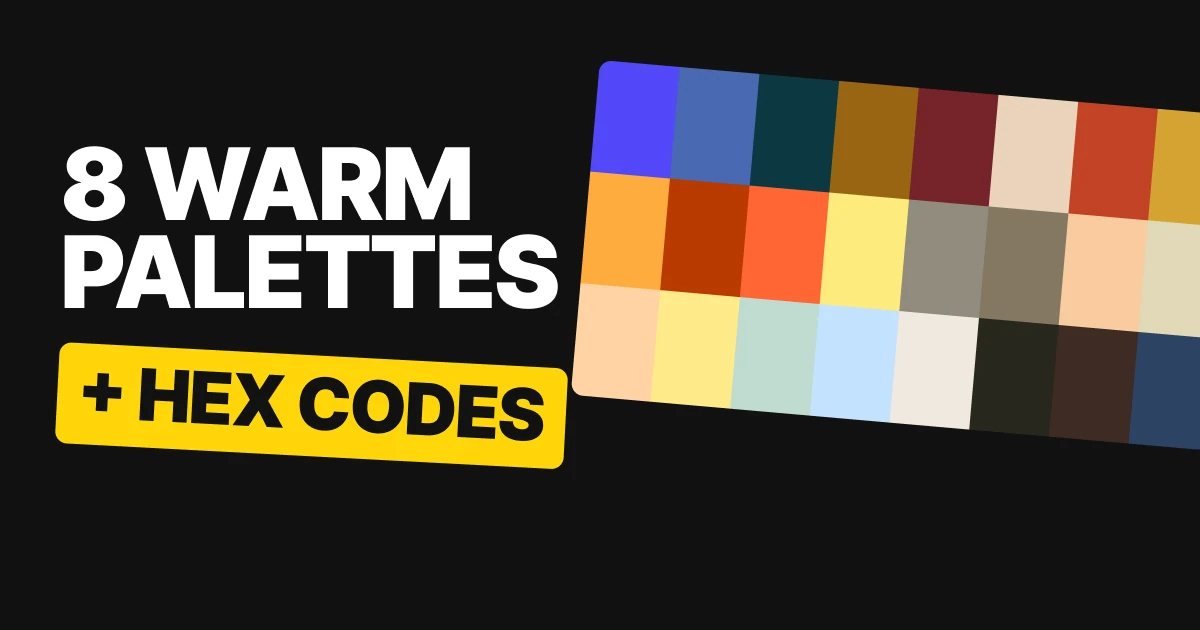
Warm colors are the easiest to like and the hardest to put words on. Orange, paprika and curry all sit close together, which is why they glow, and also why they struggle to read on each other. Here are eight warm palettes with every hex code, and the color in each one that does the reading.
Why warm colors need a partner
A warm palette has two problems. Warm colors are close to each other on the wheel, so side by side they glow but cannot carry words, as with Paprika Kisses #C24325 and English Walnut #3E2B23. And when you reach across the wheel for contrast, the new color can fight the first one.
The eight palettes below solve it in two ways. The first four use blue as the opposite of orange, with a quiet third color between them. The last four stay inside the warm family and bring in one dark that reads.
The fourth tile under each palette shows the pairing a mark would use, built only from that palette with no white or black added. For how these opposites are chosen, see our paper on color harmony.
Blue and orange, four ways
Blue and orange is the oldest trick in branding, and the easiest one to get wrong. They sit opposite each other on the wheel, so together they fizz.
The catch is lightness. Azraq Blue and Mahogany are the same lightness, so wherever they touch, the edge vibrates. That is fine in a pattern and painful for a logo on a background.
The fix in all four is the third color. Vacherin Cheese, Apricot Sherbet, Silverton and Broad Daylight give the loud pair somewhere quiet to land.
Saturated Sky
Saturated Sky
Mandarin Sorbet
Apricot Sherbet
Apricot Sherbet on Saturated Sky
The brightest blue with a soft orange and a pale apricot. Apricot Sherbet is the landing place between them.
Mahogany
Azraq Blue
Mahogany
Vacherin Cheese
Vacherin Cheese on Mahogany
The pair that vibrates. Azraq Blue and Mahogany stay apart, and Vacherin Cheese is the quiet third color that holds them.
Raw Sunset
Sunken Harbour
Raw Sunset
Silverton
Raw Sunset on Sunken Harbour
The blue goes deep here. Sunken Harbour is dark enough to carry big orange type, and Silverton gives a calm, pale ground.
Cinnamon
Cinnamon Brown
Lemon Peel
Broad Daylight
Lemon Peel on Cinnamon Brown
The gentlest of the four. Cinnamon Brown is the darkest color here and it is not very dark, so this is a set for big marks and headlines, with Broad Daylight as the cool pale.
Spice colors and the dark that reads
Spice colors look warm because they sit close together. That is also why they fight when you put words on them. Paprika Kisses and English Walnut are both red-brown. Side by side they glow.
As text on each other they are hard to read, so the paprika never carries a word on the walnut. Chai Latte is the color that can: walnut on chai reads easily.
Curry and Sesame Seed are even closer. Black Turmeric is the color that holds them both: easy to read on the sesame, and just enough on the curry.
Sun Dried Tomato
Sun Dried Tomato
Laurel Oak
Gardenia
Gardenia on Sun Dried Tomato
Sun Dried Tomato on Gardenia reads easily. Laurel Oak is the quiet middle, lovely for a pattern and never for small print.
Golden Sandalwood
Almond Light
Golden Sandalwood
Green Velvet
Green Velvet on Almond Light
Green Velvet on Almond Light reads easily. Golden Sandalwood is the quiet middle here, so use it for a pattern or a large shape.
Paprika Kisses
Paprika Kisses
Chai Latte
English Walnut
English Walnut on Chai Latte
Paprika Kisses and English Walnut glow together, but the words go in English Walnut on Chai Latte.
Curry
Curry
Sesame Seed
Black Turmeric
Black Turmeric on Sesame Seed
Curry and Sesame Seed are almost one color. Black Turmeric is the dark that holds them both, and it is easy to read on the sesame.
Every color in the last two palettes is a real name from the open color-name list: Paprika Kisses, Chai Latte, English Walnut, Curry, Sesame Seed and Black Turmeric.
All eight palettes in one table
| Palette | Colors | Best pairing for a mark |
|---|---|---|
| Saturated Sky | Saturated Sky #5248F8, Mandarin Sorbet #FFAC3E, Apricot Sherbet #FFD3A4 | Apricot Sherbet on Saturated Sky |
| Mahogany | Azraq Blue #4969B3, Mahogany #BA3901, Vacherin Cheese #FFEB88 | Vacherin Cheese on Mahogany |
| Raw Sunset | Sunken Harbour #0C3842, Raw Sunset #FF6634, Silverton #C1DBD0 | Raw Sunset on Sunken Harbour |
| Cinnamon | Cinnamon Brown #996513, Lemon Peel #FDEB7D, Broad Daylight #C2E2FF | Lemon Peel on Cinnamon Brown, big marks only |
| Sun Dried Tomato | Sun Dried Tomato #752329, Laurel Oak #918C7E, Gardenia #F1E8DF | Gardenia on Sun Dried Tomato |
| Golden Sandalwood | Almond Light #EBD3BB, Golden Sandalwood #847862, Green Velvet #27271F | Green Velvet on Almond Light |
| Paprika Kisses | Paprika Kisses #C24325, Chai Latte #F9CBA0, English Walnut #3E2B23 | English Walnut on Chai Latte |
| Curry | Curry #D6A332, Sesame Seed #E1D9B8, Black Turmeric #2C4364 | Black Turmeric on Sesame Seed |
How to use a warm palette for your brand
- Pick the reader first. Decide which color will carry the words, like Black Turmeric #2C4364 or Sunken Harbour #0C3842, before you choose the glow.
- Keep the loud pair apart. Orange next to a blue of the same lightness vibrates. Put the quiet third color between them.
- Use close warm colors as texture. Two near neighbors make a good pattern or a stripe, and a poor text pair.
- Test the logo in one color. If it only works in orange, it will fail on a stamp or a dark photo. Our brand color palette paper covers the full system, and bold color palettes has the loud versions of the same idea.
Get the files for each family
Each family is a free color set on Forge, with tap-to-copy codes, swatch files for Figma and Adobe (ASE), CSS variables and design tokens.
Free color set
Blue and orange, four ways: Saturated Sky, Mahogany, Raw Sunset, Cinnamon
Every hex, plus ASE swatches, CSS variables and design tokens.
Free color set
Spice colors, and the dark that reads: Sun Dried Tomato, Golden Sandalwood, Paprika Kisses, Curry
Every hex, plus ASE swatches, CSS variables and design tokens.
FAQ
What is a warm color palette?
A warm color palette is built from colors on the orange, red and yellow side of the wheel, such as Paprika Kisses #C24325, Chai Latte #F9CBA0 and Curry #D6A332. For a brand, it works best with one dark that carries the words.
What colors go well with orange?
Blue is the classic partner, because it sits opposite orange on the wheel. Raw Sunset #FF6634 with the deep blue Sunken Harbour #0C3842 is a strong pair. Add a quiet third color such as Silverton #C1DBD0 so the two have somewhere calm to land.
What is a good blue and orange color palette?
Saturated Sky #5248F8 with Mandarin Sorbet #FFAC3E and Apricot Sherbet #FFD3A4 is the brightest option. Raw Sunset #FF6634 on Sunken Harbour #0C3842 is the deep one, and Mahogany #BA3901 with Azraq Blue #4969B3 is the one to use as a pattern because the two are the same lightness.
What are spice colors for a brand palette?
Spice colors are earth tones named for what they look like, such as Paprika Kisses #C24325, Curry #D6A332 and Black Turmeric #2C4364. They work as a palette when one of them is dark enough to carry text.
Why does text look hard to read on warm colors?
Neighbors on the wheel can sit close in lightness too. Paprika Kisses and English Walnut are both red-brown, so words on one in the other are hard to read. English Walnut #3E2B23 on Chai Latte #F9CBA0 reads easily.
Are these color palettes free to use?
Yes. The hex codes are free to use in any project, and each family is a free download on Forge with swatch files and CSS.
Sources
- Color names and hex codes from the palette cards on our team's color board, checked against the published Forge color sets. Paprika Kisses, Chai Latte, English Walnut, Curry, Sesame Seed and Black Turmeric are names from the open color-name-list.
- Readability of each pairing checked with the WCAG 2 contrast formula. Azraq Blue and Mahogany sit at the same lightness, so their edge vibrates. Sunken Harbour carries large orange type. Cinnamon is the softest of the blue and orange sets, and it suits large marks. In the spice sets, English Walnut on Chai Latte and Black Turmeric on Sesame Seed read easily, while Laurel Oak and Golden Sandalwood are quiet middle colors for patterns.
- First published as two carousels on Logo Brainy: Blue and orange, four ways and Spice colors, and the dark that reads.
Want a palette built for your own brand, tested on your logo, your packaging and your screens? Our team designs brand identities that hold up everywhere.
Get StartedGet new papers by email
New Brainy papers in your inbox. Confirm once, unsubscribe anytime.