UI Shadows: Why the 25% Black Drop Shadow Looks Wrong and the Layered Shadows to Use
A black shadow at 25% looks like a smudge under the card. Why soft shadows use about 8% opacity, two layers and a tint, how elevation should grow, and four ready shadow tokens as CSS.
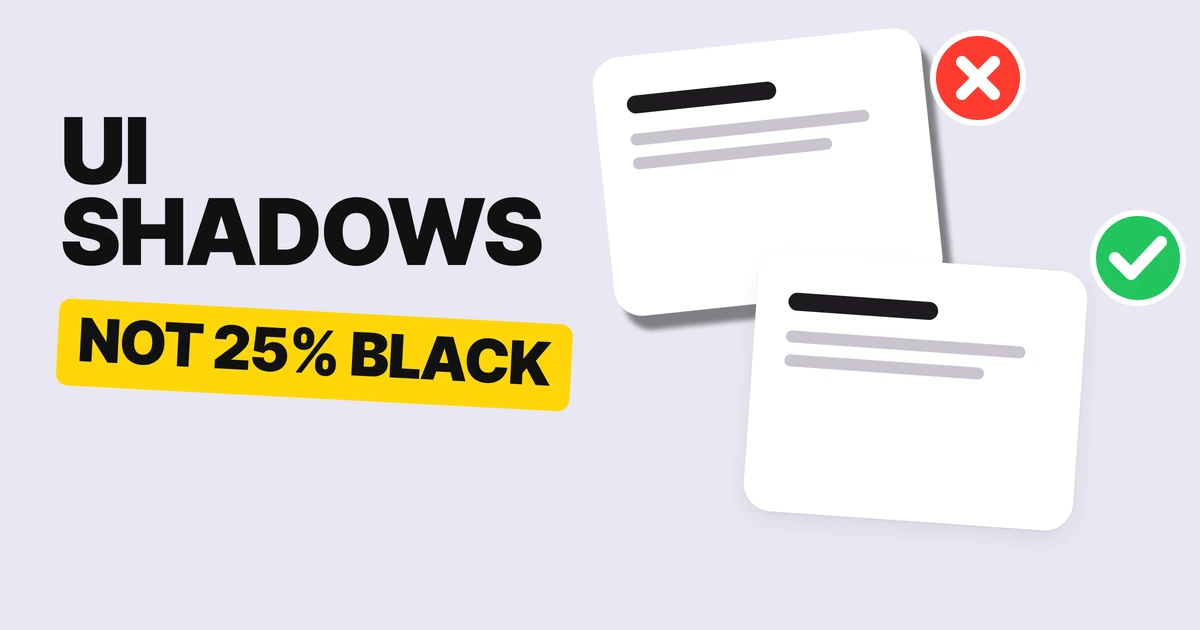
The shadow most designers reach for is black at 25%. At that strength it does not look like light. It looks like a smudge under the card.
A good shadow is nearly invisible: you feel the lift before you see the shadow. Here is how to get there, with four tokens to copy.
Why the default looks like a smudge
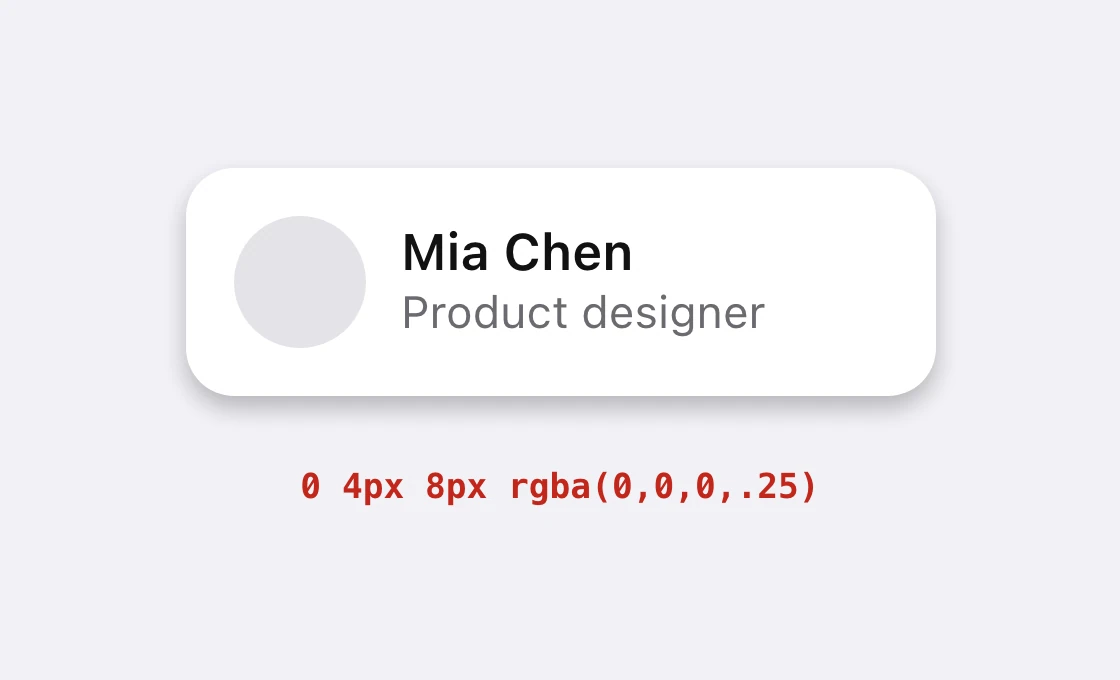
Figma's default drop shadow is black at 25% opacity, offset 4 down. Two common tutorials repeat it, so it spreads: a tool default becomes a design decision nobody made.
A real shadow is soft. Light wraps around an object, so the edge of a shadow fades out gradually, and the shadow gets fainter as it gets farther from the object. A single hard dark layer has none of that. It has one edge and one strength, and the eye reads it as dirt, a gray stain, not a lifted surface.
Fix 1: 8 percent, not 25
Black at 25%
Black at 8%, wider blur
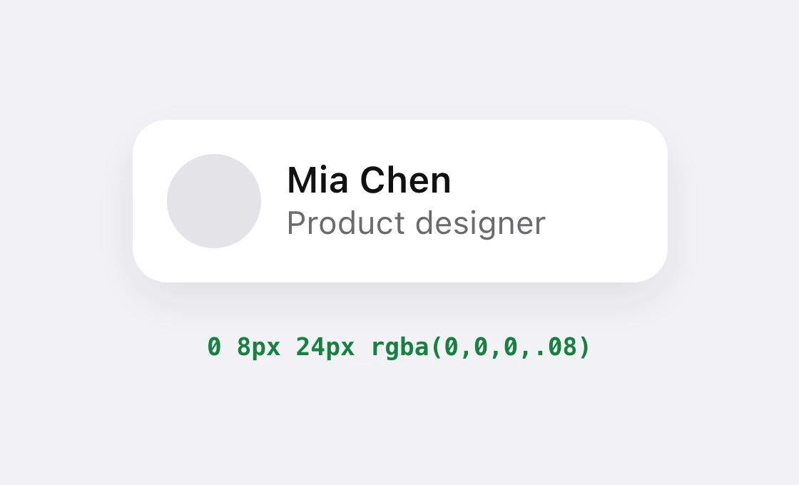
As the blur grows, the same amount of shadow spreads over a bigger area, so it gets lighter on its own. That is why a wide shadow at 8 percent looks more natural than a tight one at 8 percent. Start at 8 percent and raise it only if the card disappears on your background.
Fix 2: stack two shadows
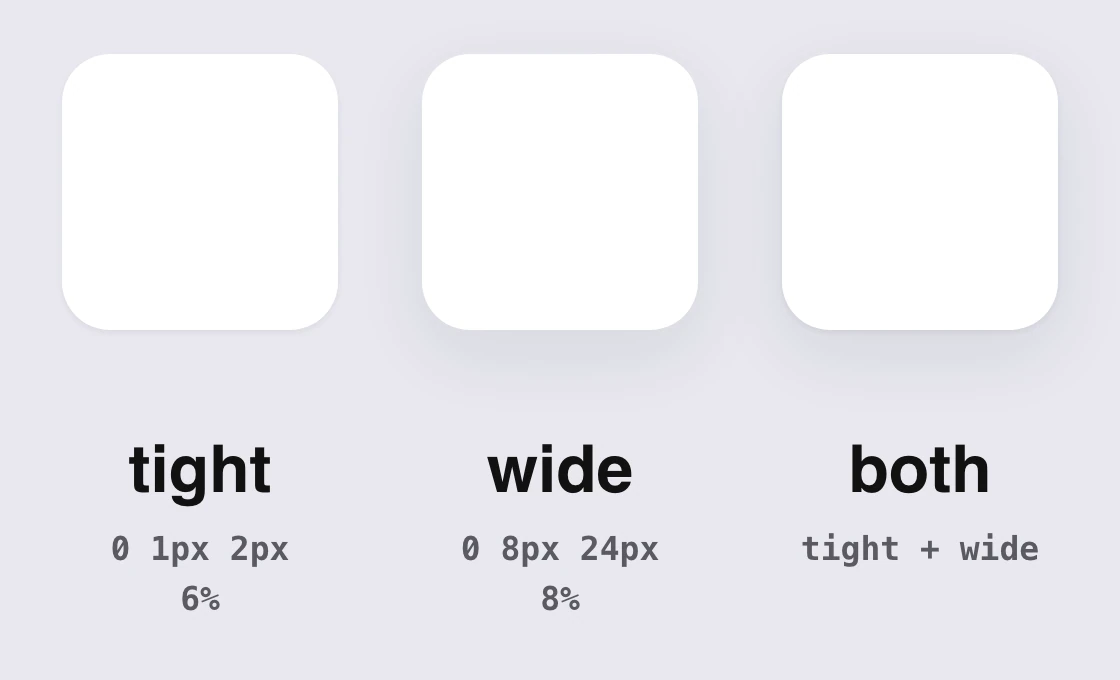
One shadow has to do two jobs and does neither well. Two shadows split them.
The tight one sits right under the edge and says "this is touching the surface". The wide one is the soft halo that says "this is lifted off it". Together they look like one natural shadow, because that is what real light does: a dark contact line plus a broad, faint fall-off.
In CSS the two layers are one declaration, separated by a comma:
box-shadow:
  0 1px 2px rgba(27, 21, 48, 0.06),
  0 8px 24px rgba(27, 21, 48, 0.08);
Fix 3: tint it, do not gray it
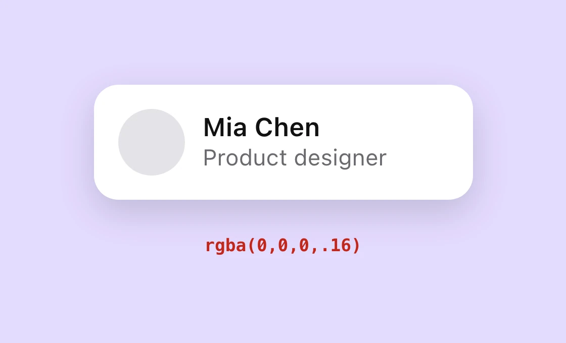
Pure black
Tinted with the ink
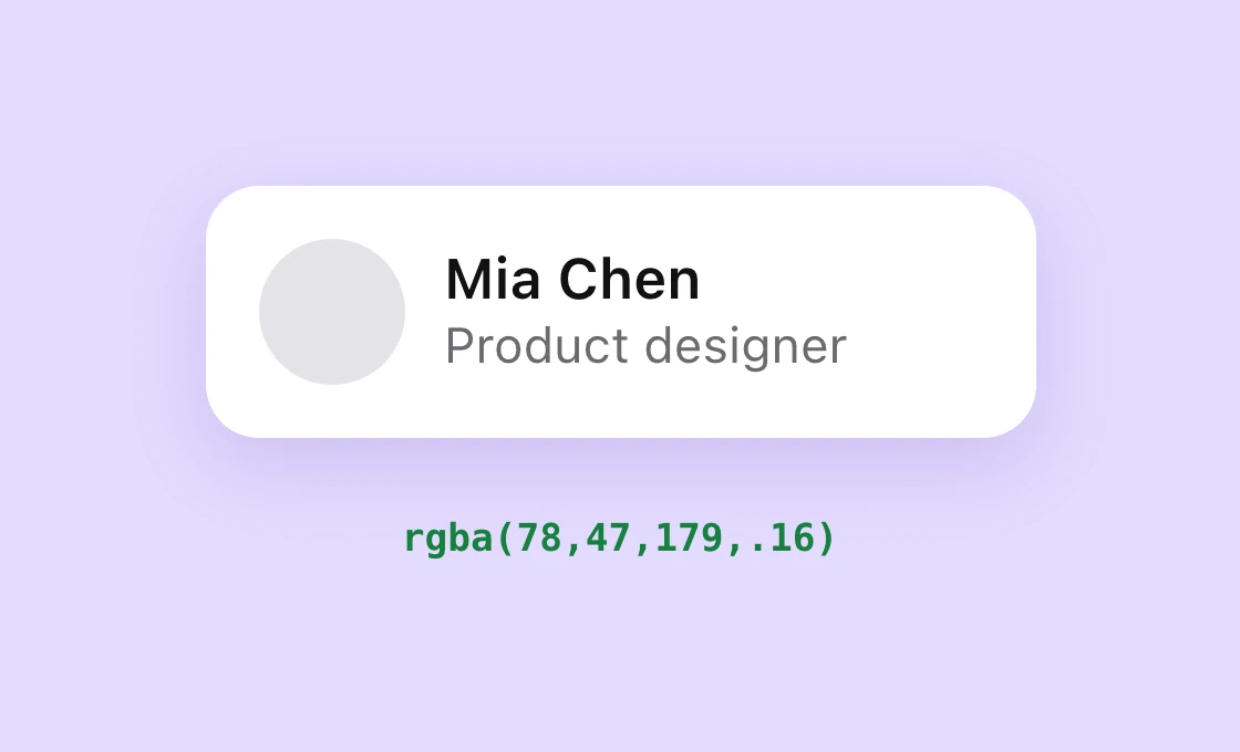
The rule is to use your ink, the darkest color in your palette, as the shadow color, at low opacity. In our own tokens the ink is #1B1530, a very dark violet. On a white page the tint is hard to see. On a colored page, a brand panel or a tinted section, it is the difference between a shadow that belongs and one that looks pasted on.
Fix 4: higher means bigger
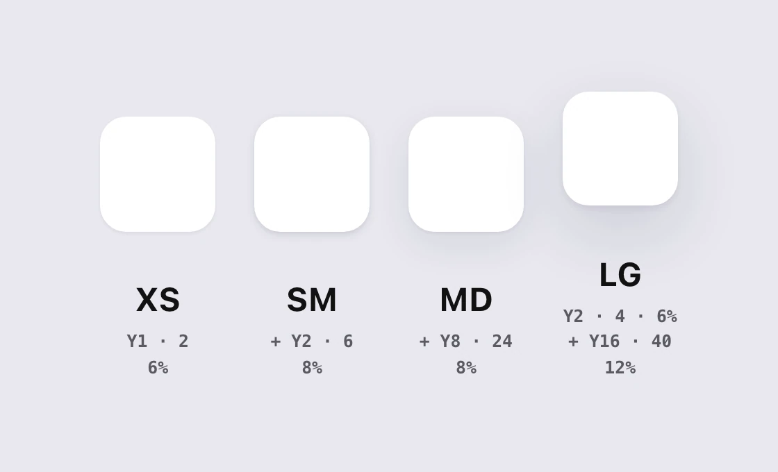
When a thing sits higher, a menu above a card, a modal above a page, its shadow gets larger and softer, because light has more room to spread. It does not get darker. A designer who makes the higher thing's shadow darker ends up back at the smudge.
That gives a small, closed set of tokens:
| Token | Layer 1 | Layer 2 | Use it for |
|---|---|---|---|
| XS | 0 1px 2px, 6% | none | Inputs, small chips |
| SM | 0 1px 2px, 6% | 0 2px 6px, 8% | Cards at rest |
| MD | 0 1px 2px, 6% | 0 8px 24px, 8% | Raised cards, popovers |
| LG | 0 2px 4px, 6% | 0 16px 40px, 12% | Modals, menus above everything |
Every layer uses X 0 and spread 0, colored with the ink #1B1530. Figma's X, Y, blur and spread fields map straight onto the four numbers in CSS box-shadow.
The tokens as CSS
:root {
  --shadow-xs: 0 1px 2px rgba(27, 21, 48, 0.06);
  --shadow-sm: 0 1px 2px rgba(27, 21, 48, 0.06),
               0 2px 6px rgba(27, 21, 48, 0.08);
  --shadow-md: 0 1px 2px rgba(27, 21, 48, 0.06),
               0 8px 24px rgba(27, 21, 48, 0.08);
  --shadow-lg: 0 2px 4px rgba(27, 21, 48, 0.06),
               0 16px 40px rgba(27, 21, 48, 0.12);
}
.card { box-shadow: var(--shadow-md); }
These four are our recommendation, not a platform value. Swap the ink color for your own darkest brand shade and keep the structure.
Where shadows stop working: dark mode
Shadow on dark
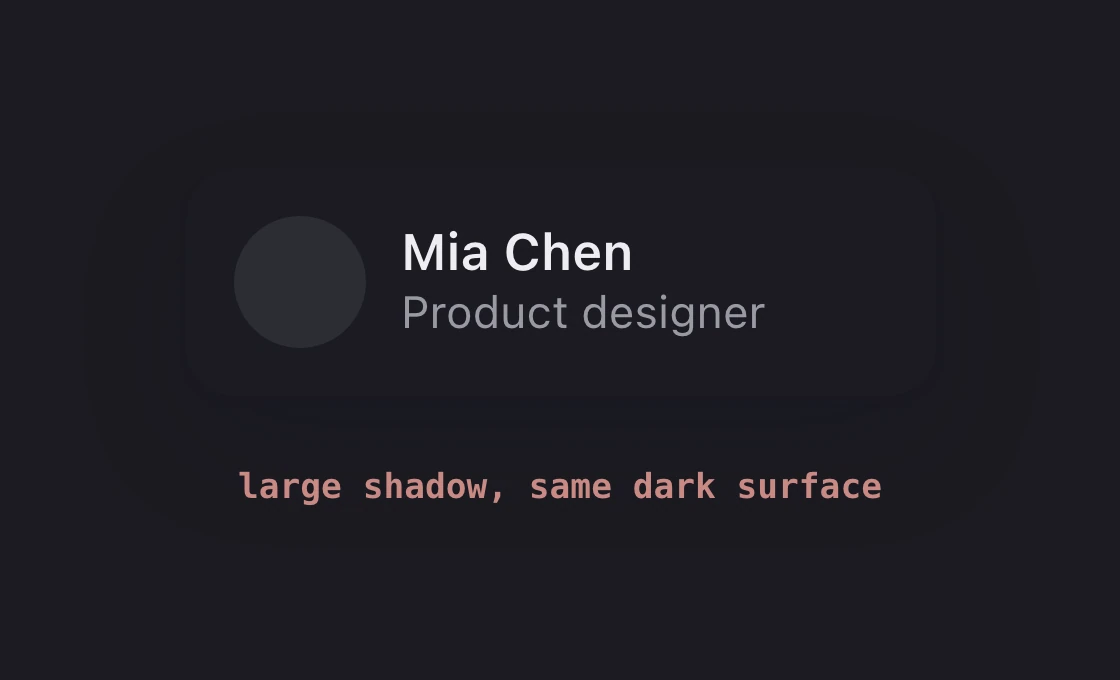
Lighter surface
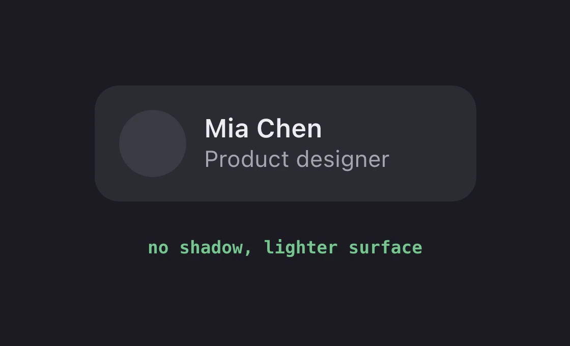
So in a dark theme, raise a layer by making it lighter, not by shadowing it. Our paper on dark mode color systems covers the surface ramp, and light mode background color covers the grays on the other side.
The squint test
Squint at the screen, or step back from it. If you can still see each shadow as a dark shape, it is too strong. If the card edges vanish on your worst monitor, raise the opacity one step. The right shadow disappears when you look at it directly and shows up when you take it away.
FAQ
What is the best drop shadow for UI?
Two stacked layers in a dark tint of your own ink: a tight one such as 0 1px 2px at 6 percent, and a wide one such as 0 8px 24px at 8 percent. It reads as natural light instead of a stain.
What opacity should a UI shadow be?
Our four tokens run from 6 to 12 percent. Start at 8 percent for a card and raise it only if the edge disappears. Black at 25 percent, a common default, is rarely right on a clean interface.
What is Figma's default drop shadow?
Black (#000000) at 25 percent opacity, with an offset of 4 down. It is a starting point for the tool, not a design decision, so most designs improve by changing it.
Should shadows be pure black?
No. Use a very dark version of your brand or ink color. On a colored background, pure black turns the shadow gray and muddy, while a tinted shadow keeps the color clean.
How do I show elevation with shadows?
Make the higher element's shadow bigger and softer, not darker. Use a small set of tokens, such as XS, SM, MD and LG, so every layer of the interface uses one of four shadows.
Do shadows work in dark mode?
Poorly. There is little light background left to darken, so large shadows disappear. Raise a layer by giving it a lighter surface color instead.
How do I write a layered box-shadow in CSS?
List the layers in one box-shadow declaration, separated by commas: box-shadow: 0 1px 2px rgba(27,21,48,.06), 0 8px 24px rgba(27,21,48,.08);.
Sources
- Figma's default drop shadow is #000000 at 25% opacity, X 0, Y 4. Tutorials agree on the 25% black; they disagree on the default blur, so this paper never states it.
- #00000040 is #000000 at 25% in 8-digit hex (0x40 is 64 of 255, about 25%).
- The four tokens and the ink #1B1530 (violet 900) are our UX Brainy effect styles. They are a recommendation, not a platform value.
- The cards above are our own examples. The tint demo uses #4E2FB3 at 16 percent beside black at 16 percent.
- More one-rule posts like this one on UX Brainy.
Want a design system where shadows, spacing and color are decided once and used everywhere? Our team designs and builds product UI on tokens.
Get StartedGet new papers by email
New Brainy papers in your inbox. Confirm once, unsubscribe anytime.