Starbucks Logo History: 4 Logos, and Every Detail They Cut
The Starbucks logo from 1971 to 2011, one version at a time. What each redesign removed, why the 1971 drawing turns to mud small, and what to cut from a logo that is too detailed.
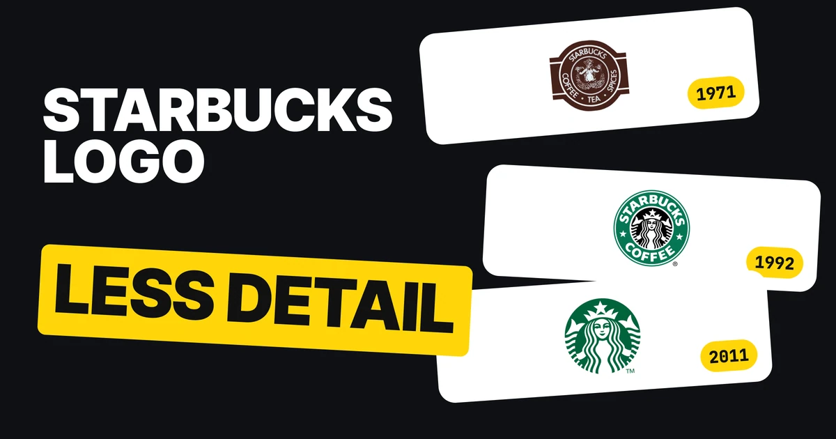
The first Starbucks logo was a brown drawing of a siren with two tails, ringed by four words. The one on the cup today is a green circle with her face in it and nothing else. Three redesigns sit between them, and every one took detail away. Here is each version, what was cut, and how to use the same test on a logo of your own.
| Year | What the logo showed | What was cut |
|---|---|---|
| 1971 | A brown siren, two tails, four words in a ring | Starting point |
| 1987 | Green, "Starbucks Coffee" only | Two of the four words |
| 1992 | A tighter crop on her face and the tips of her tails | Most of her body |
| 2011 | The siren alone, no ring, no words | The ring and the last two words |
1971: brown, with every detail drawn
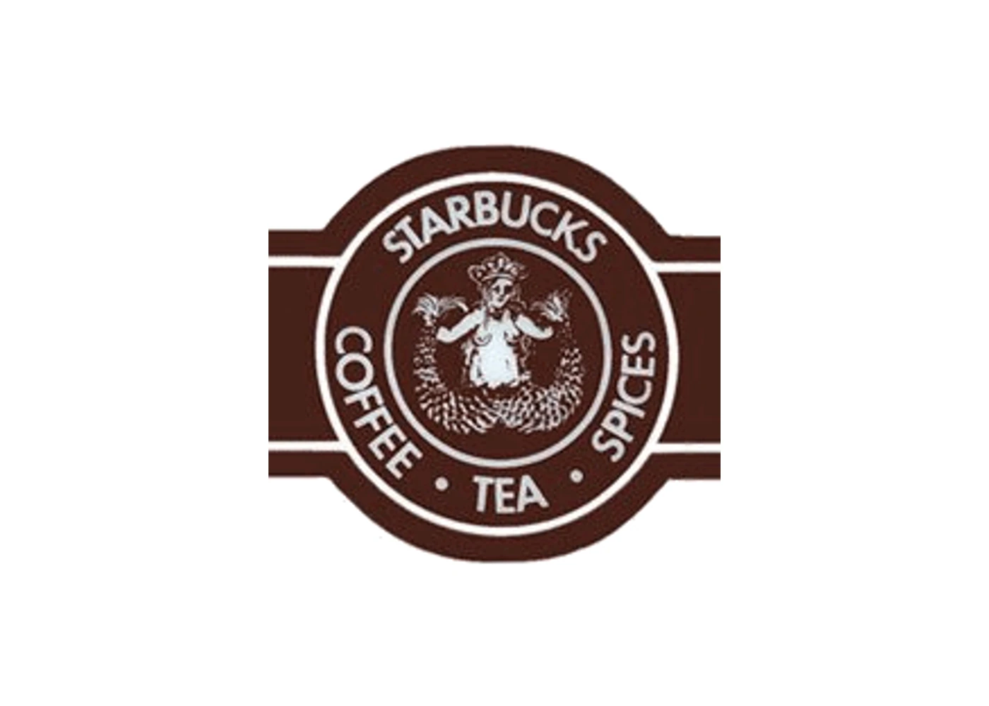
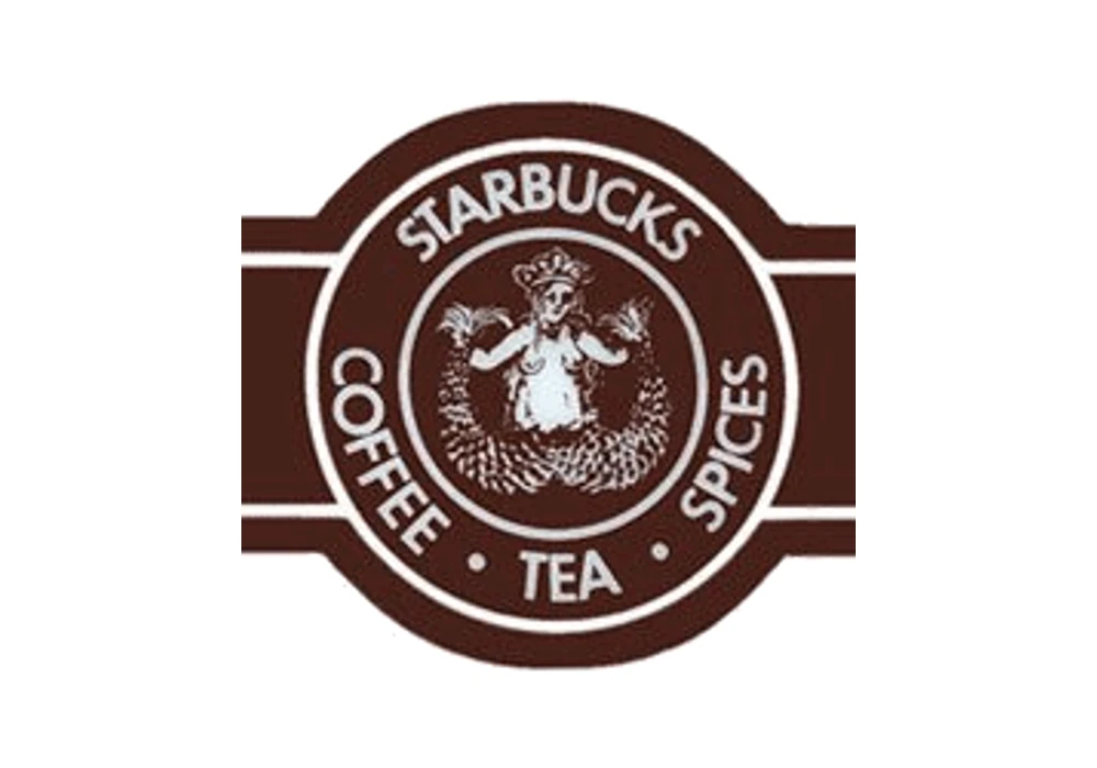
Terry Heckler designed the first logo. Creative Bloq says he chose to render it in coffee-bean brown and wrapped the products and the name around it. The siren is the whole figure with both tails, and the ring holds four words: Starbucks, Coffee, Tea, Spices.
The only copy of this file we could find is 200 pixels wide, so it is shown here at about three times that height and never redrawn. It is a logo made for a shop sign and a paper bag, where it can be as big as you like.
What it teaches: a first logo often tries to say everything the business is. That is fine on a sign. It is a problem on a phone.
Why the 1971 logo turns to mud
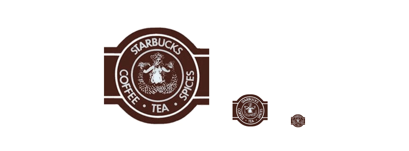
This is the same 1971 file at 360, 120 and 48 pixels tall. At the first size you can read the ring, the siren and her tails. At the middle size the four words are a dotted line. At the last it is a brown lozenge with a pale smudge in the middle.
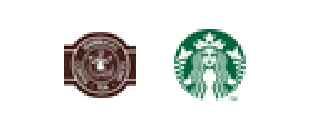
Here are the 1971 and 2011 logos, both rendered at 29 pixels tall and then enlarged so you can see the pixels. The old one turns into brown noise with no ring and no face. The new one is still a crown, a face and two tails. The 1971 file is small to begin with, so read this as an illustration, not a measured test.
What it teaches: test your logo at the smallest size it will ever appear, before you fall in love with the large one.
1987: green, and two words cut
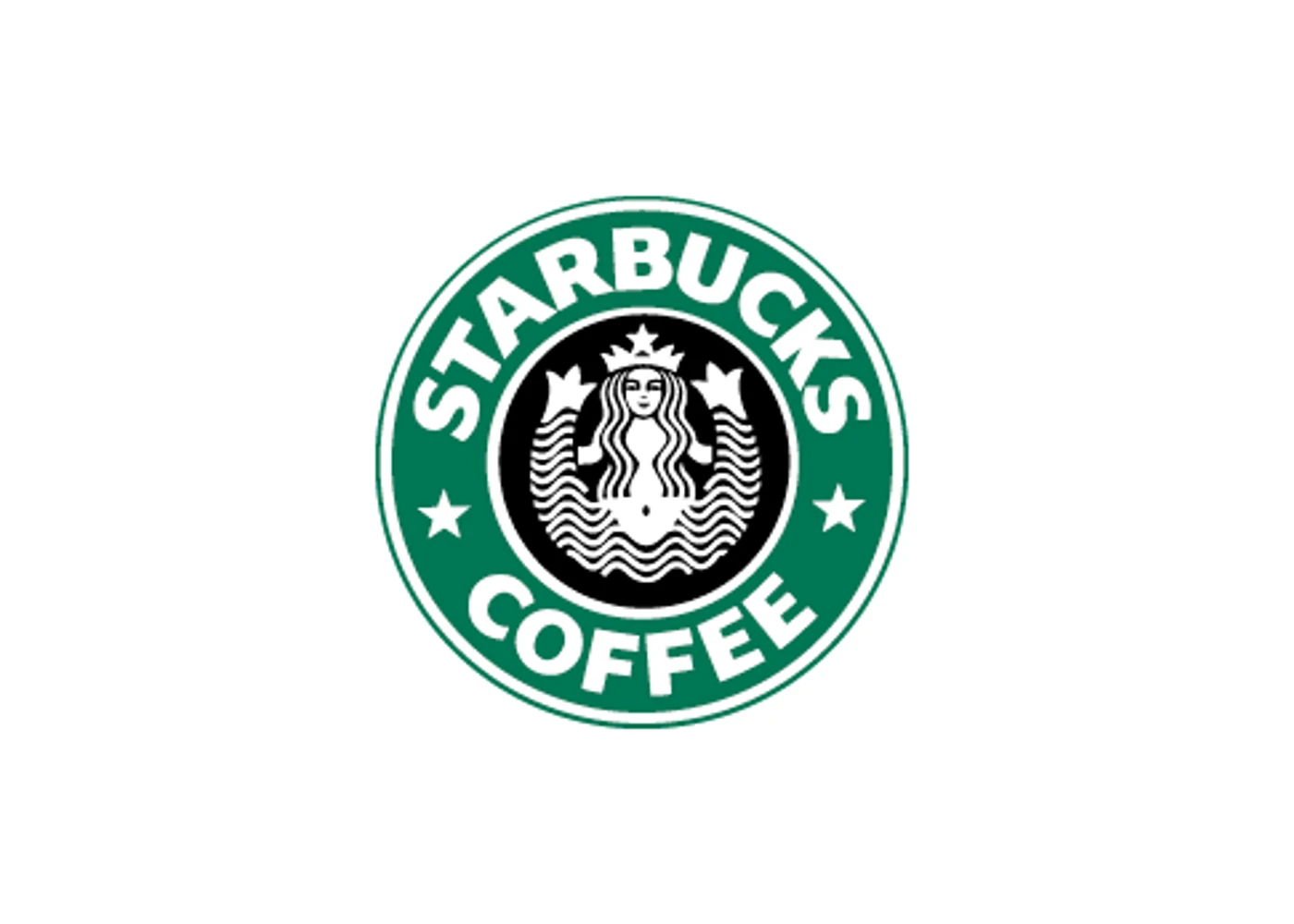
In 1987 Howard Schultz bought Starbucks. Creative Bloq says the team "turned to Terry Heckler, this time briefing him to elegantly combine the logos of Starbucks and Il Giornale." The result was green, and the words "Tea" and "Spices" were gone. Only "Starbucks Coffee" stayed in the ring.
Two of the four words went, and the logo got simpler to read for it.
What it teaches: the cheapest detail to remove is a word that no longer tells people anything they need.
1992: a closer crop
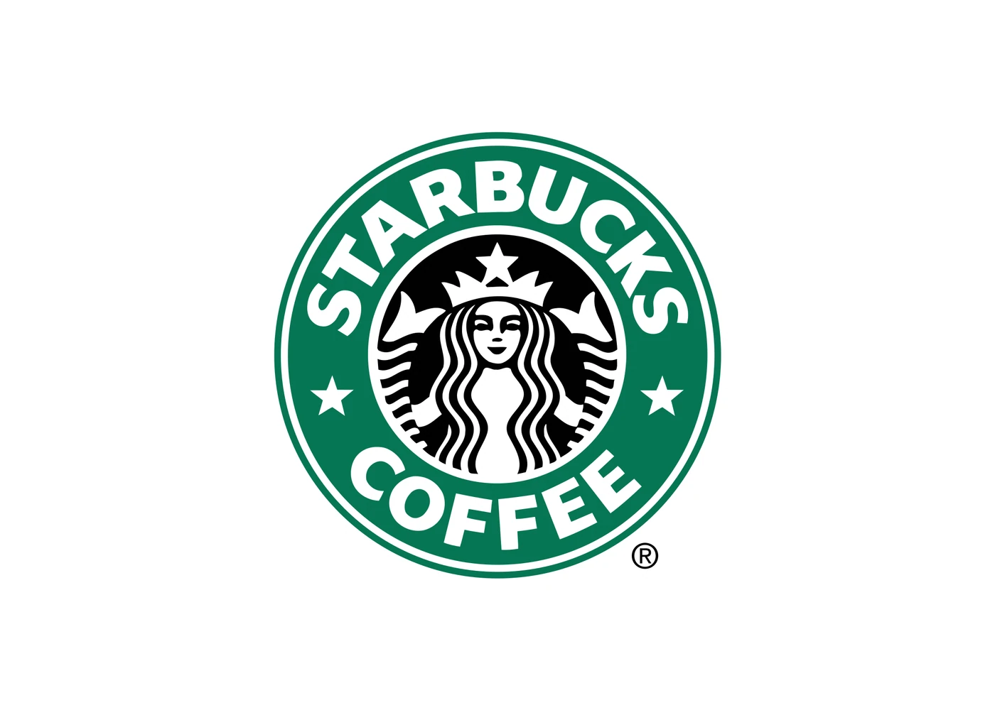
Creative Bloq sums up the 1992 change: "The navel is gone, with a much tighter crop on just her face and the tips of her twin tails." The figure went from a whole woman to a face, a crown and two curls.
Nothing was added. The logo got bigger by getting closer to the part people recognize.
What it teaches: if the whole picture is too much, crop in to the part people already know.
2011: no ring, no words
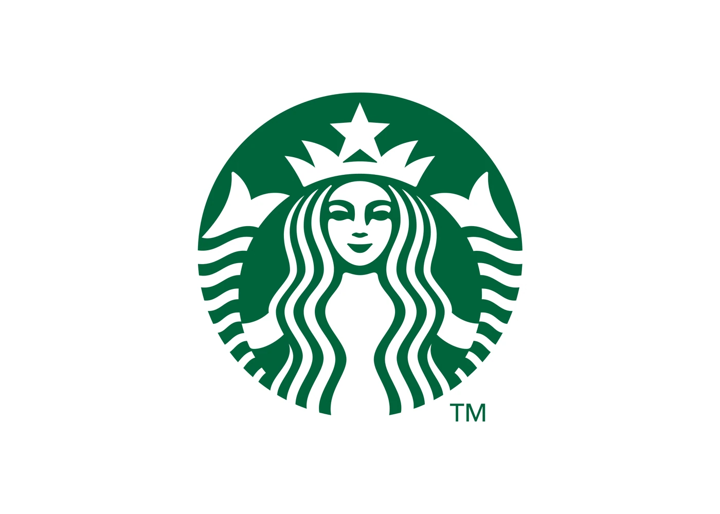
Starbucks announced the new logo on 5 January 2011, for its 40th anniversary. Lippincott, the studio that worked on it, shows the siren alone, with the ring and the words removed. CNN Money reported the same change at the time.
This is the logo that reads at any size. The siren, the crown and the two tails are all one flat green shape, and nothing in it needs to be read. Our logos that dropped their name paper covers why Starbucks could let the words go in 2011. This paper is about the detail that went with them.
What it teaches: when the symbol is enough, remove everything around it.
All four, small

Here are all four at the same 120 pixel height. The 1971 logo is a brown badge you have to squint at. 1987 and 1992 are readable but busy, with words you cannot read at this size. 2011 is the only one you read without trying.
1971
2011
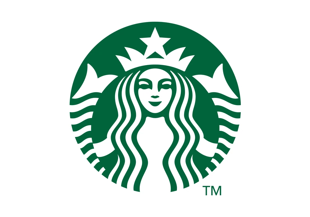
The 1971 logo has a ring, four words and a whole figure. The 2011 logo has one shape. You could describe the second in a sentence and draw it from memory. That gap is what three redesigns bought.
What to remove from your logo
- Words in a ring. Starbucks cut every one of its four words by 2011. Small words around a mark are the first thing to vanish on a phone. If your name sits in the logo, ask whether a wordmark or a symbol does the job on its own.
- Fine lines and shading. They turn to mud when the logo is small. Flat shapes survive. Our responsive logo design paper shows how a mark is built for each size.
- The whole picture. Crop in to the part people already know, the way the 1992 logo did.
Cut one thing, then test the logo at 48 pixels tall, then cut another. If you are not sure how far to go, read minimalist logo design, and see the logo redesign process for how to change a logo without upsetting people.
FAQ
What was the first Starbucks logo?
A brown drawing of a two-tailed siren inside a ring that read "Starbucks Coffee Tea Spices", designed by Terry Heckler in 1971.
How many times has the Starbucks logo changed?
Three times: 1987, 1992 and 2011. That makes four logos in all, counting the 1971 original.
Why did Starbucks change its logo in 2011?
It was the 40th anniversary. The ring and the last words were removed so the siren stands alone, as announced on 5 January 2011.
How do I know if my logo is too detailed?
Shrink it to 48 pixels tall, the size of a small app icon. If you cannot see what it is, or the words in it cannot be read, it has too much detail.
What should I remove first from a detailed logo?
Words in a ring, then fine lines and shading, then everything outside the part people know. Starbucks removed all three over 40 years.
Sources
- Creative Bloq, "The Starbucks logo: a history": creativebloq.com/features/starbucks-logo-history. The 1971 brown logo by Terry Heckler, the 1987 brief to combine the Starbucks and Il Giornale logos, and the 1992 "much tighter crop" quote.
- CNN Money, "Starbucks unveils new logo", 5 January 2011: money.cnn.com/2011/01/05/news/companies/starbucks_new_logo. The 2011 change.
- Lippincott, Starbucks: lippincott.com/work/starbucks. The 2011 siren alone.
- Logo files from English Wikipedia (non-free logos shown for commentary): "Sbux logo pre 1987.gif", "Starbucks Coffee logo 1987.png", "Starbucks Coffee Logo.svg" and "Starbucks Corporation Logo 2011.svg". Trademarks of Starbucks.
- The size demonstrations are our renders of the real files at 360, 120, 48 and 29 pixels tall. They show what happens when a logo is shrunk, and are not a measured test. The 1971 file is 200 pixels wide, the only copy we found.
- First published as a carousel on Logo Brainy.
Get new papers by email
New Brainy papers in your inbox. Confirm once, unsubscribe anytime.