Instagram Logo History: Every Change From 2010 to 2022, and Why
Instagram fixed its logo 3 times. The 2010 camera drawing, Cole Rise's brown camera icon, the 2016 outline and the 2022 brighter gradient, with who made each and what it teaches.
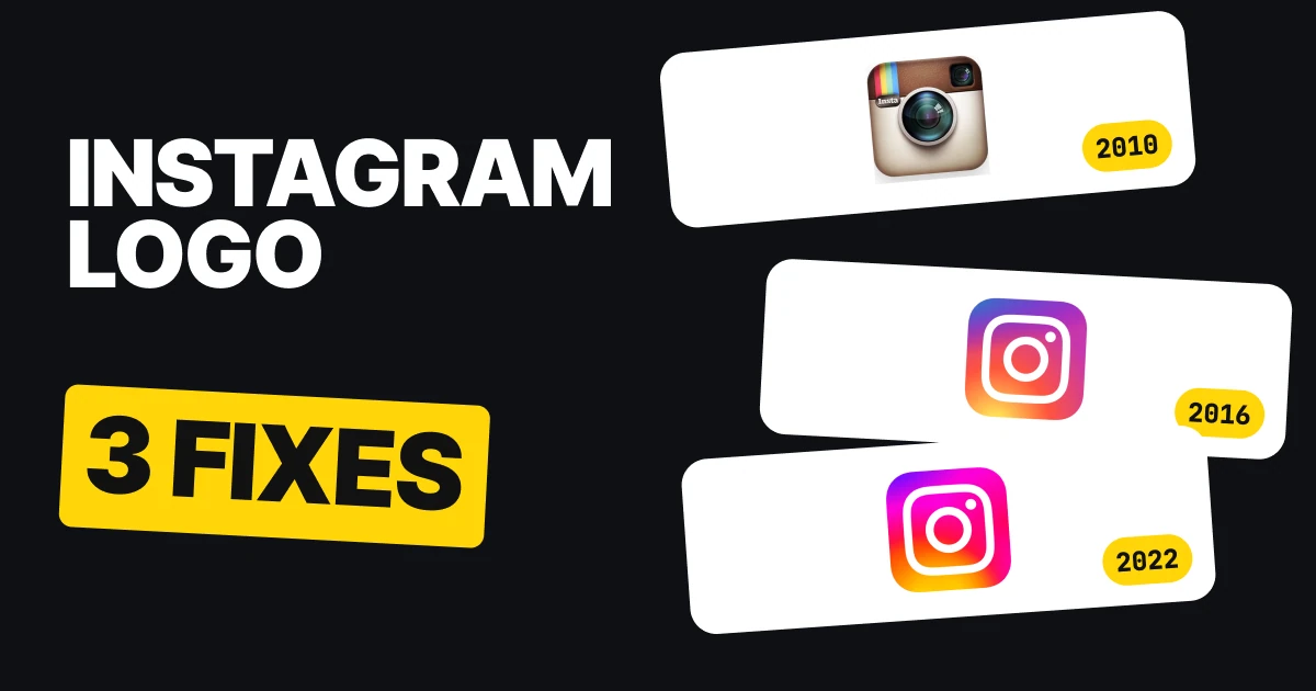
The first Instagram logo was a drawing of a camera with a flash, buttons, stripes and the name. The one on your phone today is a rounded square, a circle and a dot on a gradient. Three fixes sit between them, and each one took something away. Here is every version, who made it and what it teaches if you are drawing an app icon of your own.
| Year | The logo | The fix |
|---|---|---|
| 2010 | A drawing of a camera with the name | Starting point |
| Late 2010 | A tiny photo of a brown camera with a glass lens and a rainbow | A drawing became a picture |
| May 2016 | A rounded square, a circle and a dot on a gradient | A picture became an outline |
| May 2022 | The same outline, brighter gradient | The color was tuned, the shape kept |
2010: a drawing of a camera
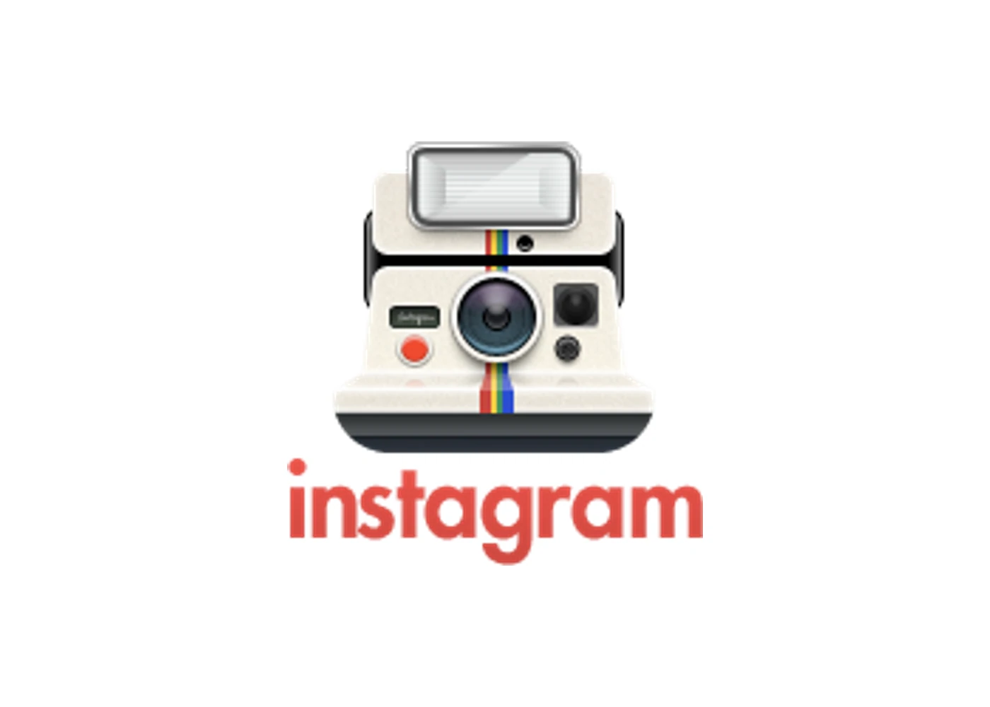
The first logo comes straight from Instagram's own site, archived by the Wayback Machine. It is a drawing of a camera with a flash, buttons and stripes, and the name set under it. The original file is only 147 by 150 pixels, so it is shown here at about twice that size, never redrawn.
It is a logo that explains itself, which is its charm and its weakness. Every part of the camera is there, and none of it is needed to know what the app does.
What it teaches: a first logo often tries to show everything the product is. That is a fine place to start, and a bad place to stay.
Late 2010: a tiny photo of a brown camera
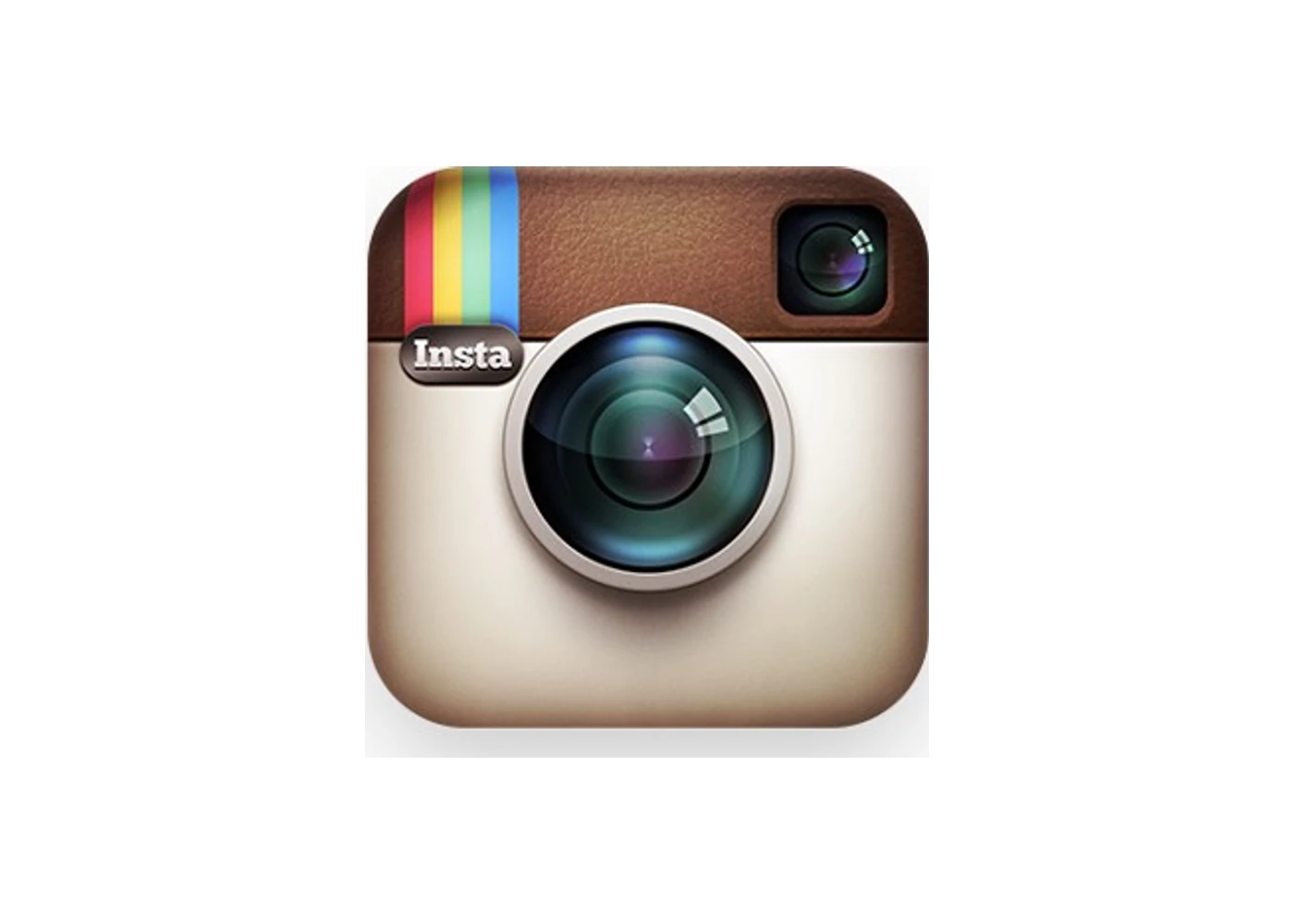
The icon most people remember was by Cole Rise. Ian Spalter, who wrote Instagram's 2016 redesign post, thanked "Cole Rise and Tim Van Damme for their work on the original app icon and glyph." The instagr.am favicon already shows it on 30 November 2010, which is why we say 2010. Some sources date it 2011.
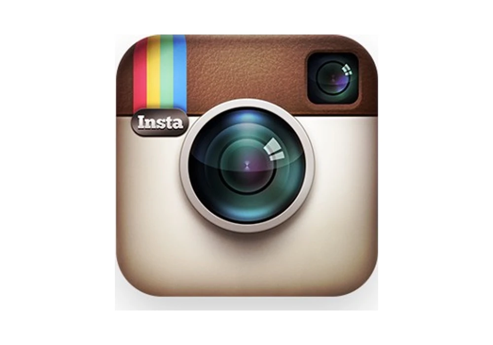
It looks like a small photograph of a real camera: leather, glass, a rainbow stripe and a tiny "Insta" label. People loved it for six years, from late 2010 to May 2016.
What it teaches: a detailed, realistic mark can earn real affection. It also sets a trap.
The trap: a photo cannot survive small
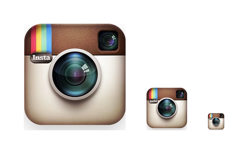
This is the same icon file at 360, 144 and 58 pixels tall. At the first size you can read the lens, the leather and the label. At the last it is a brown smudge with a dot in it. An app icon lives at the small end, next to dozens of others.
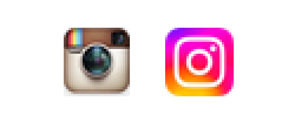
Here are the 2010 icon and today's, both rendered at 29 pixels tall and then enlarged so you can see the pixels. The old one turns into mud inside the lens. Today's still reads as a camera made of three simple shapes.
What it teaches: test the logo at the smallest size it will ever be shown before you fall for the large version.
May 2016: just the outline and a gradient
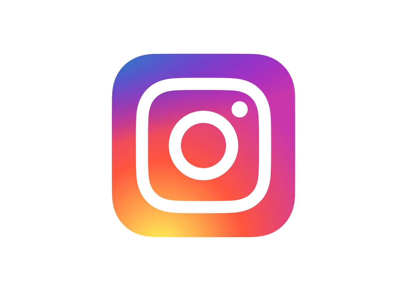
In May 2016 Instagram replaced the photo with a new icon. Its own announcement says: "Inspired by the previous app icon, the new one represents a simpler camera and the rainbow lives on in gradient form." Spalter put the reason this way: "we needed to move past a rendered camera to get a flexible, scalable glyph."
The Wikimedia Commons file credits Ian Spalter, Joy-Vincent Niemantsverdriet, Eric Goud and Robert Padbury. We call them Instagram's in-house team.
Look at what was kept and what was cut. The camera idea and the rainbow stayed. The leather, the glass, the label and the realism went.
What it teaches: keep what people love and cut everything else. The rainbow survived because it was the part people recognized.
May 2022: brighter colors, the same shape
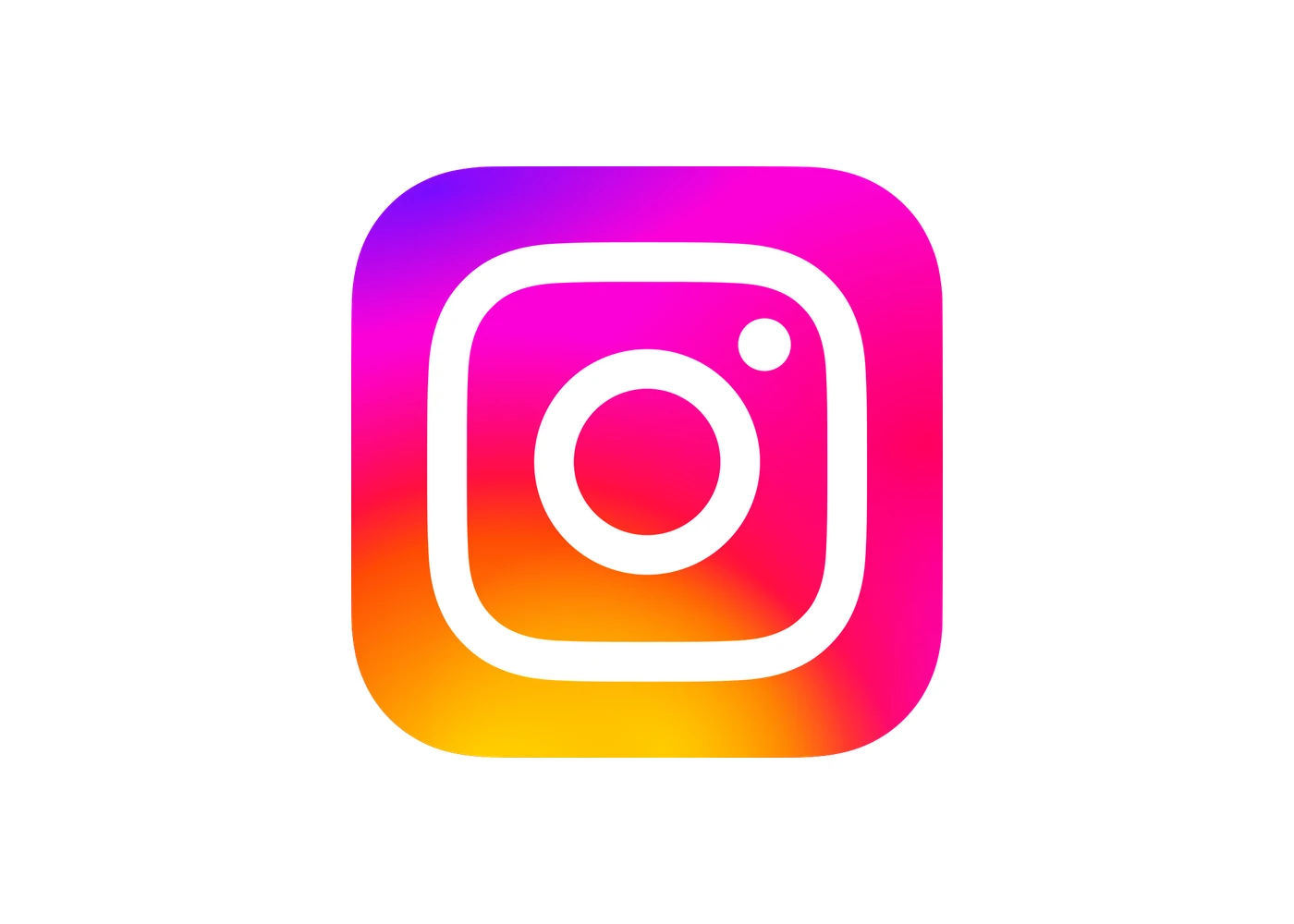
In May 2022 Instagram's "Visual Refresh" rebuilt the gradient so it looks illuminated and more vibrant. Wikimedia Commons describes the file as "the 2022 version of 2016 Instagram icon." The outline, the circle and the dot did not move.
What it teaches: once a shape works, later updates should change the finish, not the idea. That is why the count stays at three and a fourth redraw would not count.
First against last
2010
Today
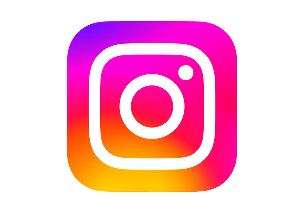
The 2010 icon is a photograph of an object. Today's is three shapes and a color blend. You could draw the second one from memory in a few seconds and almost nobody could draw the first. That gap is what three fixes bought.
What this means for your logo
- Outlines beat pictures. If your logo is a photo or a detailed rendering of a thing, it will not survive small. Draw the outline of the idea instead. Our responsive logo design paper shows how the same mark is built for each size.
- Keep what people love. Instagram cut the leather and the label and kept the lens and the rainbow. Find the one part of your logo people already recognize and protect it. The new logo backlash paper explains why people resist change, and how to avoid triggering it.
- Once it works, just tune it. The 2022 change touched the color and left the shape alone. Plan your next update the same way.
If your logo is closer to the 2010 end, the safe way to change it is in the logo redesign process. For another famous logo that got simpler over time, read the Apple logo history or the Google logo history.
FAQ
What was the first Instagram logo?
A drawing of an instant camera with a flash, buttons and stripes, with the word instagram under it, from Instagram's own site, archived by the Wayback Machine.
Who designed the old Instagram camera icon?
Cole Rise, with Tim Van Damme credited for the original app icon and glyph, according to Ian Spalter's May 2016 post on the redesign.
Why did Instagram change its logo in 2016?
Spalter wrote that they "needed to move past a rendered camera to get a flexible, scalable glyph." A photo-style camera did not hold up at small sizes.
When did Instagram change its logo?
Late 2010 (the brown camera icon), May 2016 (the outline and gradient) and May 2022 (the brighter gradient). The 2010 drawing is the starting point.
Did the Instagram logo change in 2022?
Yes, in May 2022 Instagram's Visual Refresh rebuilt the gradient to look illuminated and more vibrant. The shape stayed the same as 2016.
How many times has Instagram changed its logo?
Three times: late 2010, May 2016 and May 2022. Each one took something away, and the shape got simpler.
Sources
- Ian Spalter, "Designing a New Look for Instagram, Inspired by the Community", Medium, 11 May 2016: Cole Rise and Tim Van Damme credit, the "flexible, scalable glyph" quote.
- Instagram, "A New Look for Instagram", Instagram blog, 11 May 2016: the "simpler camera ... rainbow lives on in gradient form" quote. Index: about.instagram.com/blog.
- Instagram, "Introducing Instagram's Visual Refresh", May 2022: the brighter, more vibrant gradient.
- The first logo is Instagram's own site file, archived by the Wayback Machine: logoCamera.png, 2011 capture. Cole Rise's icon is cropped from Instagram's own 2016 post, shown for commentary and never redrawn.
- Logo files from Wikimedia Commons: Instagram logo 2016.svg and Instagram logo 2022.svg. Trademarks of Instagram.
- The size demonstrations are our renders of the 2010 icon at 360, 144 and 58 pixels tall, and of the 2010 and 2022 icons at 29 pixels tall.
- First published as a carousel on Logo Brainy.
Get new papers by email
New Brainy papers in your inbox. Confirm once, unsubscribe anytime.