Responsive Logo Design: How to Build a Logo That Works at Every Size
A working guide to designing logos that survive the favicon, the billboard, and everything in between. The four-tier system, the size thresholds that matter, and the brands doing it right in 2026.
Responsive Logo Design: How to Build a Logo That Works at Every Size
A logo that only works at one size is not a logo, it is a placeholder waiting to be replaced.
Most logos are designed at a comfortable 500px, approved in a pitch deck, and handed off. Then reality hits: a 16x16 favicon, a 32px browser tab, a 64px app icon, a 256px notification badge. The wordmark dissolves into noise. The brand loses before a user even lands on the page.
Responsive logo design is not a trend. It is the baseline expectation for any mark that needs to survive the internet.
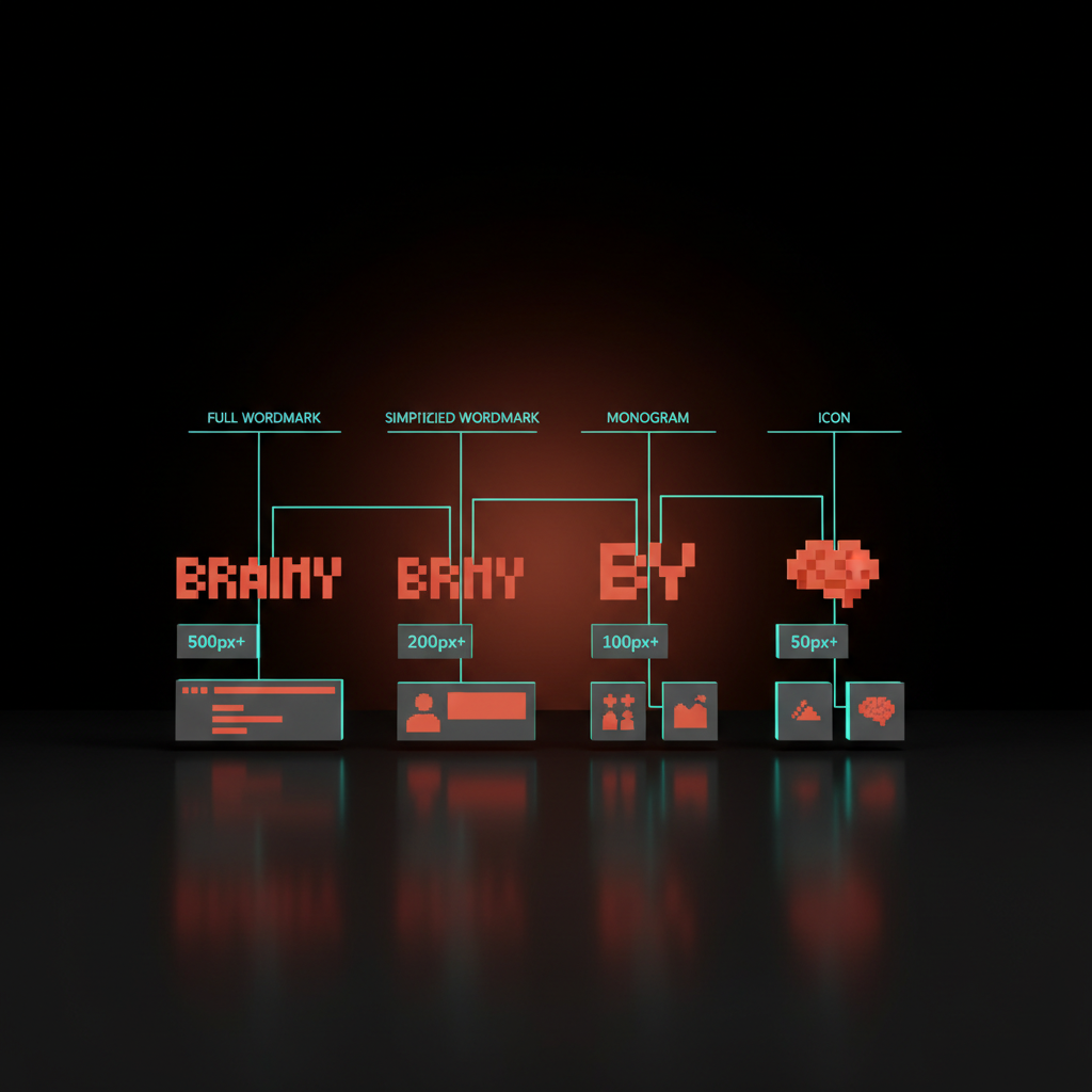
A logo is not a single mark, it is a system
The idea of one master logo file is outdated. A real brand identity system treats the logo as a set of related marks, each optimized for a different context.
The full wordmark is one expression, a simplified version is another, the monogram and the icon are two more. Together they form a system where each tier covers what the others cannot.
Designers who ignore this ship the same complex SVG to a 16px favicon and a 1200px hero header. Both surfaces suffer. The small mark turns to mud. The large mark looks thin because it was never designed to breathe at scale.
The four tiers of a responsive logo system
Every mature brand identity resolves to four working tiers:
| Tier | What it includes | Typical surfaces |
|---|---|---|
| Full wordmark | Logomark + full brand name, all detail | Hero header, print, presentations |
| Simplified wordmark | Logomark + lighter or abbreviated name | Sub-nav, footer, email signature |
| Monogram / symbol | Letterform or isolated symbol only | App icons, social profile images |
| Icon | Stripped to a single shape or letter | Favicon, notification badge, 16-32px |
The wordmark tier carries full brand meaning. The icon tier carries brand recognition. The two tiers in between are translators, keeping the system coherent rather than jarring.
Some brands add a fifth tier for billboard, building signage, or stage backdrop, where the wordmark needs extra weight and spacing. Most digital-first products do not need it.
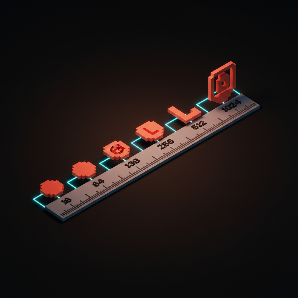
Size thresholds: when each tier shows up
Size is the primary trigger. These thresholds hold across most use cases:
| Pixel width | Tier | Why |
|---|---|---|
| 16-32px | Icon only | No wordmark survives here. Shape and color are the only tools. |
| 32-64px | Icon or monogram | Depends on mark complexity. Test at 1x and 2x. |
| 64-128px | Monogram or simplified wordmark | First range where type becomes legible under normal conditions. |
| 128-256px | Simplified or full wordmark | Full mark starts working here if proportions are right. |
| 256px+ | Full wordmark | Designed for this range. All detail is intentional. |
These are starting points, not rules. A logo with heavy weight and tight letterforms may read cleanly at 48px. A script wordmark may fall apart at 128px.
Test every tier at target size, in context, on the target background. Contrast compounds the problem: a mark that passes at 256px on white can fail at 32px on a dark nav.
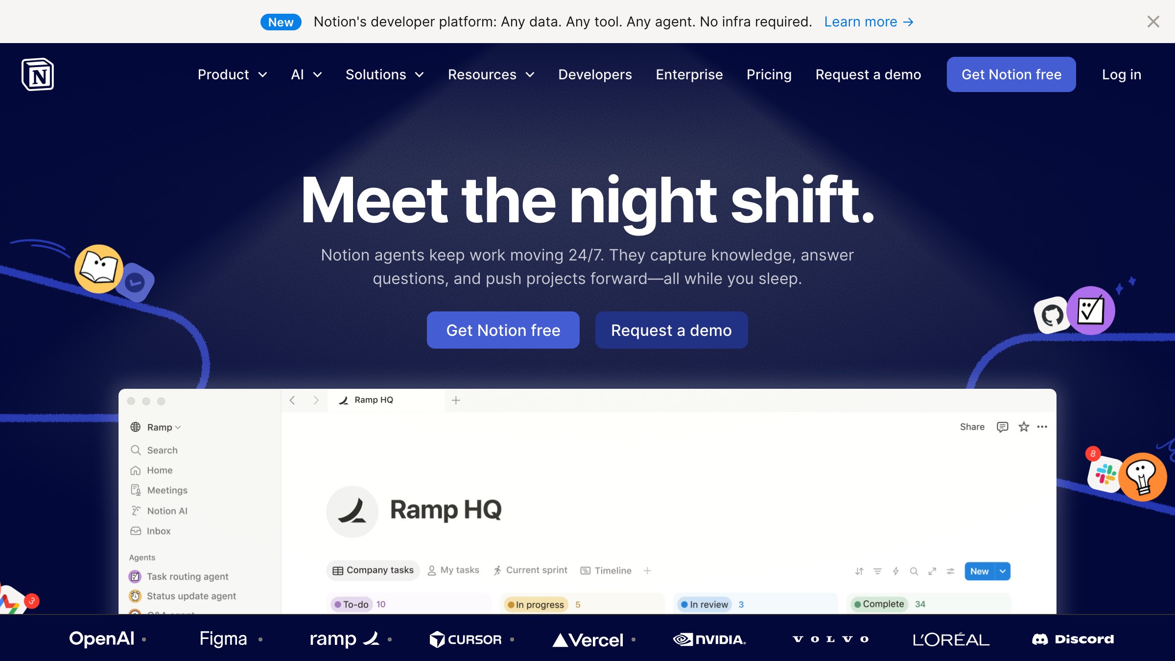
Notion's wordmark-to-symbol system
Notion's logo system is a controlled simplification. The full wordmark uses their custom sans-serif with a chunky, seriffed "N" logotype. At smaller sizes the type drops and the standalone "N" takes over, a blocky letterform that reads cleanly at favicon scale.
What makes it work is that the "N" was designed for small sizes first, not extracted from the wordmark after the fact. It is a discrete mark with its own geometry, proportions tuned for the contexts where it spends most of its life.
This is where most brands get it backwards: they design the wordmark, then try to derive the symbol from it. Notion reversed that. The symbol is the anchor.
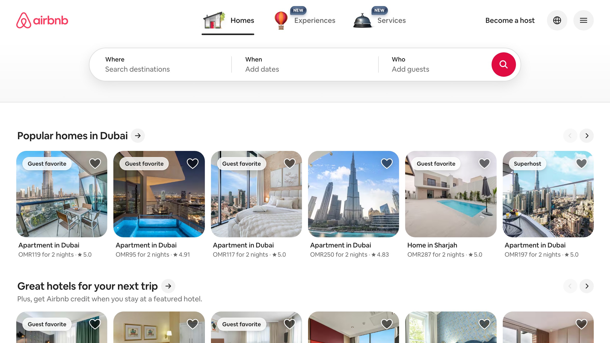
Airbnb's belo and what it taught the industry
Airbnb introduced the belo in 2014 and it became a near-instant case study in symbol design. The shape encodes four meanings (people, places, love, and the letter A) using a single continuous line. That geometric simplicity is the reason it scales without losing anything.
At 16px the belo is a recognizable loop. At 256px it has depth, presence, and intention. The wordmark "Airbnb" lives alongside the belo as a distinct element: they travel together at full size, separately when reduced. Neither tier feels like a compromise.
The industry lesson: a symbol strong enough to stand alone at 32px will outperform any wordmark-dependent mark. If your logo cannot be identified as a silhouette at small sizes, the symbol is not doing its job.
Building a brand from scratch or auditing one that breaks below 64px? Brainy designs logo systems, not just logos.
Spotify's monogram strategy
See it live on open.spotify.com
Spotify has refined their symbol (three curved lines over a circle) through several iterations. The standalone symbol is Spotify's workhorse: app icon, share links, browser tabs, social profile images. The wordmark travels with it at large sizes and disappears at small ones.
The reason the symbol works is weight. The three wave lines carry enough stroke thickness to hold at 32px without bleeding together. Thin-line symbols fail at this scale consistently.
Spotify's lines are deliberately heavy relative to the circle. That decision was not aesthetic, it was engineering for the favicon.
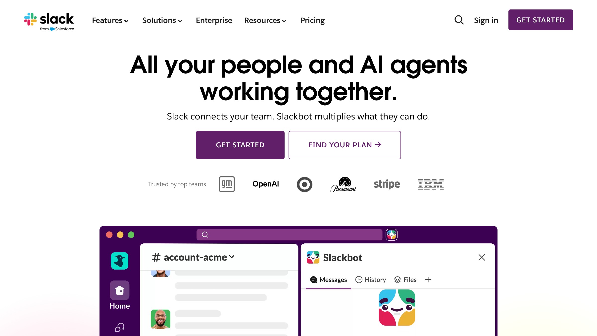
Slack's redesign and why the simplified mark won
Slack's original logo was a 45-degree hashtag built from colored shapes. At small sizes it turned into a muddy blob: too many similar-value colors, shapes too small to read individually.
In 2019, Slack redesigned. The new mark kept the same concept but increased contrast between the colored segments, reduced visual complexity, and made each shape large enough to hold at 32px. The wordmark shifted to a cleaner sans-serif. The redesign was driven entirely by the failure of the symbol tier, because Slack lives in notification badges and dock icons, surfaces that demand a mark that punches at 32px.
Slack's 2019 case is worth remembering: redesigns forced by small-size failure are legitimate, not vanity. If your 32px mark is not representing your brand, the brand is losing surface area every day it stays broken.
The checklist for designing a responsive logo from scratch
Build responsiveness in from the brief. Treating small sizes as a late QA pass almost always fails.
During design:
-
Design the icon tier first, at 32x32px. If it works there, scale up.
-
Keep stroke weight heavy enough that nothing renders below 2px at minimum size.
-
Limit the symbol to three colors or fewer. More than three at 16px is indistinguishable.
-
Test the monogram in a real app icon context: iOS squircle and Android adaptive shapes.
Before handoff:
-
Render at 16px on white and black backgrounds. The hardest test.
-
Render at 32px in a browser tab mock. Does it read as distinct or generic?
-
Render the full wordmark at 600px. Does it have enough presence to justify the space?
-
Export one file per tier per use case. Never hand off one SVG and tell the developer to scale it.
Auditing an existing logo: where it breaks first
Most logos break at the same points. Run through this in order:
-
Contrast at 16px. Paste the favicon into a browser tab mock on light and dark modes. Can it be seen at all? Most common failure.
-
Recognition at 32px. Can someone who knows the brand identify it at this size, out of context? If not, the symbol tier needs work.
-
Distinctiveness at 64px. Does the mark look like this brand specifically, or a generic tech logo? At 64px there is room for differentiation.
-
Presence at 256px. Full wordmark size. The mark should look intentional, weighted, designed. Thin or unbalanced means it was scaled up, not designed for this range.
Steps 1 and 2 failing means the icon tier needs redesign. Step 4 failing means the wordmark needs more design investment. These are separate problems with separate fixes.
FAQ
What is a responsive logo?
A responsive logo is a system of related marks, not a single file. Each mark is optimized for a specific size range and context, from a 16px favicon to a full-size wordmark in a hero section.
How many logo versions does a brand actually need?
The working minimum is four: full wordmark, simplified wordmark, monogram or standalone symbol, and a stripped icon for the smallest sizes. Brands with physical presence often add a fifth tier for large-format use.
Should I design the symbol or the wordmark first?
Symbol first, always. Designing the wordmark first and trying to simplify down almost always produces a symbol that looks like an afterthought. Design the icon at 32x32px, get it right, then build the wordmark system around it.
Can an existing logo be made responsive without a full redesign?
Sometimes. If the wordmark holds at 128px and above, it may be salvageable. The icon and monogram tiers almost always need to be purpose-built. Trying to derive them from the full mark is the wrong direction.
What file formats should each tier use?
| Format | When to use |
|---|---|
| SVG | All tiers above 64px (wordmark and simplified wordmark) |
| PNG | Icon and monogram tiers, exported at 1x and 2x |
| ICO | Favicon only |
Do not ask the developer to convert between formats.
How does this connect to a broader brand identity?
The logo system is one layer of a full brand identity system. The same responsiveness principle applies across typography in branding, brand color palette, and iconography. Everything needs to work at multiple sizes and on multiple surfaces.
The bigger pattern: brand identity as a system, not an asset
A single-file logo is an asset. A four-tier logo system is infrastructure. Infrastructure supports every surface the brand touches without requiring a redesign every time the context changes.
The brands above, Notion, Airbnb, Spotify, Slack, do not swap marks at random. They built systems with deliberate reduction paths.
Each tier was designed, each threshold decided. The favicon looks like the brand because someone decided what the brand looks like at 16px, not because someone shrunk the wordmark and hoped.
That decision, made once during the design phase, pays back on every notification badge, every browser tab, every app icon, every social profile image served from that point forward. That is the return on a well-designed wordmark vs lettermark decision made early and built out properly. Hire Brainy to build a logo system that holds at every size.
Building a brand from scratch or auditing one that breaks below 64px? Brainy designs logo systems, not just logos.
Get StartedNot ready to hire? Run the free Business Genome, an 11-dimension diagnostic for your venture.
Get your free GenomeGet new papers by email
New Brainy papers in your inbox. Confirm once, unsubscribe anytime.