Typography in Branding: How Fonts Shape What People Think About Your Business
Typeface choice is brand strategy, not brand decoration. How type creates trust, signals positioning, and moves conversion, with real brand examples and a 5-question audit.
Typeface choice is brand strategy, not brand decoration. The font on the homepage is doing more positioning work than the tagline above it, more trust work than the testimonial wall below it, and more conversion work than most marketers will ever credit it for. Customers form an opinion of the brand in the first 50 milliseconds of looking at a page, and the type is what they look at first.
This piece is the strategic and psychological side of the question. Not "serif is traditional, sans is modern." That framing is wrong on both counts and useless either way. The real question is what the typeface signals, who it signals it to, and whether that signal matches the position the brand is trying to claim.
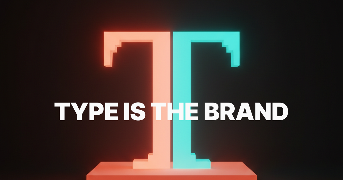
Type is the brand before the brand says anything
A logo gets seen for a moment. A typeface lives across every word the brand publishes. That is thousands of impressions per customer per year, shaped by a decision most teams treat as a five-minute Figma question.
Tiffany & Co has used a custom didone wordmark for over a century, paired with the same robin's-egg blue on every box, ad, and receipt. The serif is not nostalgia. It is the trust that justifies a four-figure markup on a silver chain. Swap that serif for a generic geometric sans and the price ceiling collapses overnight.
That is what brand typography does. It carries the position the rest of the brand is trying to claim. The brand identity guidelines piece covers the full brand book. This is the slice where typeface choice becomes strategy.
Typography signals market position before the price tag does
Customers categorize brands by type before they read a word of copy. The typeface answers three questions on contact: what category, what tier inside that category, and is this for me.
The New York Times uses Cheltenham, Imperial, and a bespoke serif system, signaling authority, history, institutional trust. Bloomberg uses a custom monospace plus a tight neo-grotesk and signals data, terminal, finance. Stripe uses Söhne and signals modern infrastructure, developer-first, calm. None of those brands have to explain their position because the type has already done it.
The wrong typeface forces the brand to spend ad dollars correcting the signal. A luxury hotel using a free Google sans pays twice per impression: once for the ad, once to overcome the type. The right typeface is the cheapest brand strategy you can buy because the work is done before the reader reads anything.
How type creates trust (or quietly destroys it)
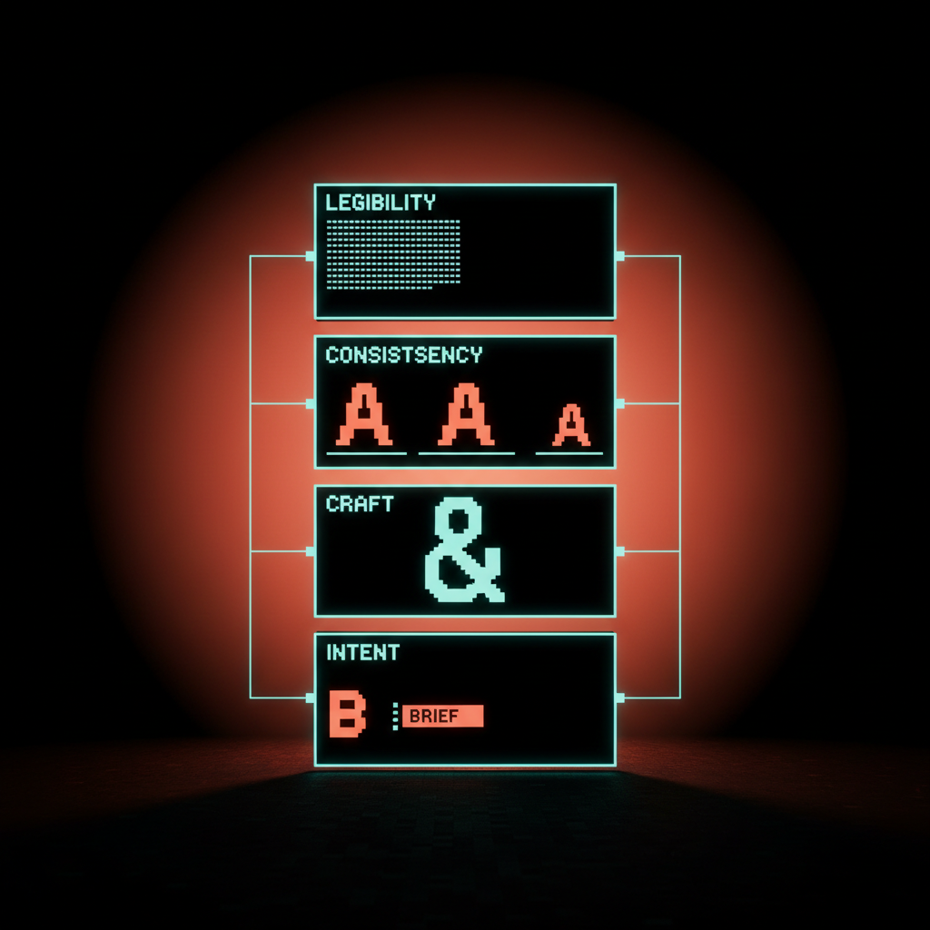
Trust in branding is a sum of small signals, and typography carries more of them than any other element. Four levers do most of the work.
Legibility under pressure. The type has to hold up at small sizes, low contrast, and on bad screens. A typeface that looks beautiful at 96px and falls apart at 14px is performative, not trustworthy. Apple's San Francisco was engineered to stay legible across iOS, watchOS, and macOS at every size. That engineering shows up as trust without the user ever noticing why.
Consistency across surfaces. The same typeface, sized and spaced in the same disciplined way across web, app, email, packaging, and ads. IBM Plex was commissioned in 2017 to do exactly that job globally, replacing a chaotic mix of Helvetica licenses and Arial fallbacks. Trust comes from never seeing a seam.
Crafted detail. A custom or premium typeface tells the user the brand cared enough to invest. Mailchimp's 2018 rebrand into Cooper Light read quirky on day one and confident by day 90, because the type had genuine craft in the curves, terminals, and ampersand. Generic fonts read as generic brands.
Intent. The choice has to look like a decision, not a default. Comic Sans destroys trust because it reads as accidental. Helvetica reads as a default unless the brand owns it deliberately. Type that looks chosen builds trust. Type that looks settled-for destroys it.
Brand archetype to typeface logic
The serif-versus-sans debate is the wrong frame because it skips the question that actually decides the answer. The right frame is the brand archetype. What is this brand trying to be in the customer's head, and what typographic family supports that position.
Five archetypes cover most of the work.
Heritage. Earns trust through age, authority, or institutional credibility. Reach for high-contrast modern serifs, classical old-style serifs (Garamond, Caslon), or bespoke editorial serifs. The New York Times, Tiffany & Co, Vogue, The Economist. The serifs are inheritance, not decoration.
Challenger. Taking on an incumbent and signaling sharper, faster, more rational. Reach for tight neo-grotesks (Söhne, Inter, Untitled Sans). Stripe, Linear, Vercel, Notion. The sans serif here is not "modern" in some abstract sense, it is "we removed everything you do not need."
Craft. Earns trust through care, taste, and human judgment. Reach for humanist serifs, contemporary text serifs, or warm humanist sans. Aesop, Mailchimp post-rebrand, Glossier. The type has visible drawing and intent in it. Geometry would feel cold.
Systems. Infrastructure, software, anything that lives across thousands of UI states. Reach for engineered geometric sans designed for screens. Apple's San Francisco, Google's Product Sans, Airbnb's Cereal, IBM Plex, Stripe's Söhne. Performance, hinting, and weight range matter more than personality. The personality lives in the discipline.
Expressive. Media, fashion, hospitality, anywhere personality is the product. Reach for wedge serifs, display serifs, or custom display cuts paired with a quiet workhorse sans. Bloomberg Businessweek, Hermès, Off-White. The display type carries the personality.
A brand that reads as one archetype but uses type from another sounds like it is lying.

Custom type is a strategic moat, not a vanity buy
Commissioning a custom or semi-custom typeface used to be a luxury for airlines and Fortune 500s. In 2026 it is one of the cheapest brand differentiators available, and the brands that figured it out are pulling away.
Airbnb commissioned Cereal in 2018 to solve a global, multi-script brand problem in one move. Apple invested in San Francisco to control the OS ecosystem. Google built Product Sans for the same reason. Stripe standardized on Söhne and made it feel custom through discipline of use. IBM open-sourced Plex and turned a brand asset into a developer goodwill engine.
A custom or semi-custom typeface protects three things: visual ownership of every brand surface, a clean global licensing position, and the ability to scale type without per-seat foundry fees forever. Above a certain size, not having one is the more expensive position.
Typography moves conversion, and the data is real
Type is not aesthetics, it is conversion. Microsoft's 2012 study with the British Cabinet Office showed that fonts and font sizes measurably affect form completion. NN/g has documented for two decades that line length, font size, and contrast drive task completion, comprehension, and trust ratings.
The applied version is simple. Body copy at 14px in a thin weight loses readers who would have stayed at 18px regular. A checkout flow in a quirky display sans converts worse than the same flow in a workhorse text sans. A pricing page in a low-contrast custom serif looks beautiful and underperforms a clean neo-grotesk every time we have tested it.
Three rules. Body type 16px minimum, 18px preferred, regular weight, adequate line height. Headlines in a typeface with personality but proven legibility at size. Numbers, prices, and CTAs in a typeface with disciplined tabular figures. The brand can be expressive in the headline. The body and the CTA earn the conversion. For the system that turns these into a real type scale, see typography system design.
What the rebrand winners get right
The rebrands that landed in the last decade share a pattern. They picked typography that signaled the new position before the launch video loaded.
Mailchimp moved to Cooper Light plus a Helvetica system and shifted from cute startup to enterprise platform without losing personality. Airbnb standardized globally on Cereal. Burberry retreated from its 2018 all-caps geometric sans rebrand back to a bespoke serif in 2023, because the sans had stripped the heritage that justified the price tag. Each of those moves cost millions and earned multiples back, because the type was carrying the position.
The losers share the opposite pattern. They picked typography that fought the rest of the brand, or signaled a position the company could not deliver. The fix is rarely new colors or a new logo. It is the type. For the broader rebrand decision, see how to create a brand identity and brand naming process.
The 5-question brand-typography audit
Before locking a typeface, run the brand through these five questions. If any answer is shaky, the typeface is wrong.
- What position does the brand need to claim, in one sentence? Heritage, challenger, craft, systems, or expressive. If the team cannot agree on the archetype, no typeface will save the brand.
- Does the typeface signal that position to a stranger in under one second? Show the wordmark plus a paragraph of body to five people who have never seen the brand. Ask what they would expect this brand to charge, who it is for, and how old the company is. If the answers miss the position, the type is wrong.
- Will it hold up across every surface the brand actually ships on? Web, mobile UI, packaging, social, email, deck, OOH. A typeface that fails any of these is a partial answer.
- Is the license honest about how the brand will use it? Web, app embedding, employee count, ad units, reseller rights. A typeface the brand cannot afford to deploy at scale is not a real choice.
- Will it still feel right in five years? Trends are seductive and short. Bias toward typefaces with proven longevity over typefaces having a moment.
A brand that can answer all five with confidence has a typography system. A brand that cannot has a moodboard. For the broader brand book, see brand identity guidelines. For the technical pairing decision once the typeface is chosen, see the font pairing guide.
FAQ
How does typography affect brand perception in a measurable way?
Typography drives the first-impression read inside the 50 millisecond window before any copy is processed. Studies from NN/g, Microsoft, and the British Cabinet Office show measurable effects on perceived trust, perceived price, comprehension, and form completion. The typeface is a primary input to perception, not decoration.
Should a small business invest in custom typography?
Almost never on day one. A small business should pick a high-quality licensed typeface from a reputable foundry, use it with discipline, and revisit the question once volume justifies the investment. Custom type starts to make sense when licensing fees, global script support, or platform control become real constraints.
Can a brand change its typeface without rebranding?
Yes, and it happens more than people realize. A typeface refresh inside an otherwise stable identity is a common move when the original no longer holds up technically (no variable version, no global scripts) or strategically (the position shifted). The logo can stay, the colors can stay, the type quietly upgrades, and the brand reads as more current the next morning.
Lock the type, lock the position
Brand typography touches every customer, every day, on every surface. Treat it like a logo decision and the brand will overpay for ads correcting the signal for five years. Treat it like the strategic asset it is and the type does the positioning, the trust, and a measurable share of the conversion before the copy ever has to.
Use the five archetypes. Run the audit. Pick the typeface that tells the truth about the brand the company is actually trying to build.
If you want a team that treats typography as strategy and ships brand and product type systems as one project, hire Brainy. We pick type the way we pick the rest of the brand. Against the position, not the moodboard.
Need a brand whose typography earns the trust before the copy does? Brainy designs brand and product type systems that work as strategy, not as decoration.
Get Started